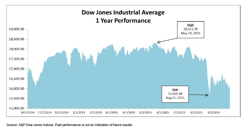
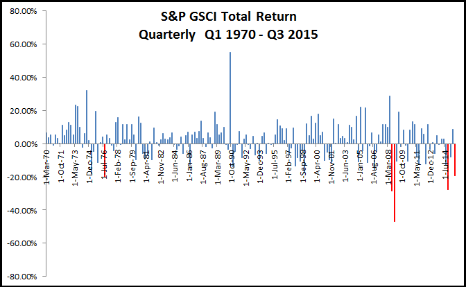
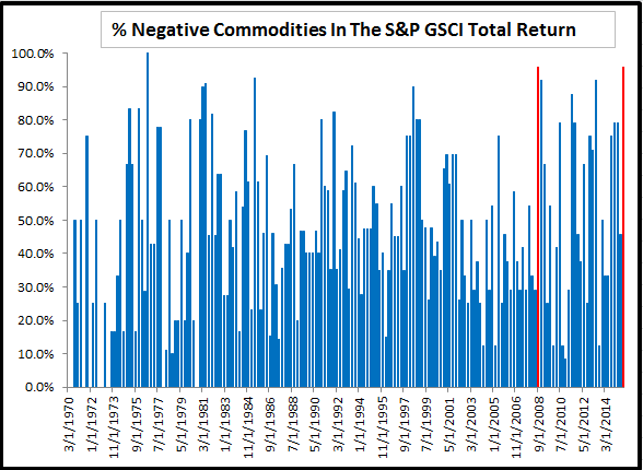
Commodities have faced many headwinds this year from the strong U.S. dollar, high supply from OPEC and the slowing Chinese demand growth. The S&P GSCI Total Return hit a 15 year low in August, 23 of 24 commodities dropped in July and the 3rd quarter was the 3rd worst in history. For the year, all sectors are negative and all commodities are negative but one – that is cocoa. However, cocoa may not stay hot for long.
In a note published a few months ago, agriculture was identified as the sector that performed best in periods following El Niño, and the performance is getting stronger through time with each successive El Niño. Since that note, several questions have come in about which commodities inside the agriculture sector will perform best following the El Niño.
Below are some of the most popular questions with historical analysis of data going back to 1973 where available. Cotton starts in 1977, Coffee in 1983, Cocoa in 1988 and Kansas Wheat in 2003. The El Niño data is from NOAA. In this analysis, there are 13 El Niño periods ending 1973, 1977, 1978, 1980, 1983, 1988, 1992, 1995, 1998, 2003, 2005, 2007, 2010. Below is a table of spot returns of commodities in the agriculture sector of the S&P GSCI:
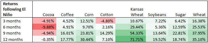
- Which agricultural commodity is affected the most from El Niño? Generally, the volatile weather brought by El Niño has disrupted the crop yields that has pushed prices higher. Wheat and Kansas Wheat have historically been most impacted, though all agricultural commodity returns have benefitted from El Niño except cocoa.
- Following the previous question, what kinds of agricultural commodities have gained or dropped due to El Niño? Why is that and what’s the price fluctuation range respectively? In order of highest average historical return in the 12 months following El Niño: Kansas Wheat, Wheat, Corn, Soybeans, Sugar, Coffee and Cotton. Only Cocoa has dropped historically following El Niño periods. In the 12 months following El Niño periods, cocoa has lost on average 35 basis points and Kansas Wheat has gained on average 72%. It depends on the specific weather pattern impacting supply, individual demand models per commodity, perishability and storage capacity.
- For those affected commodities, how long does it take to show the price spike/plunge after the effect occurs? For most of the agricultural commodities, the price increases start happening soon after the El Niño. Cotton is the slowest to be impacted, taking over 3 months post the El Niño periods. Wheat is the quickest to be impacted, followed by corn. Again, cocoa doesn’t perform any better from El Niño periods.
- Is there any signs based on which investors can determine the timing for investment? The main signal has been detrimental weather that disrupts the crop production. Watching weather patterns in regions where the specific crops grow and learning how supply is disrupted helps determine timing. It is important not to forget other drivers of supply and demand, like the imbalance of powder to butter in the cocoa market from the demand growth of high-end chocolate.
- This year’s El Niño is considered to be the strongest in decades, what’s your suggestion to investors to prepare for the climate impact? Historically, investors and consumers protect themselves in different ways. In some cases, food processors hedge so the price impact does not flow to the retail consumers. In other cases, investors may use agriculture and other inflation sensitive commodities to diversify their risk. Last, some consumers have protected themselves by buying frozen goods and storing them until prices return to lower levels.
The posts on this blog are opinions, not advice. Please read our Disclaimers.


 Source: S&P Dow Jones Indices
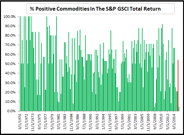 Source: S&P Dow Jones Indices