Get Indexology® Blog updates via email.

In This List

SPIVA® Europe Scorecard 2014: How did active funds perform versus their benchmarks?

Is GDP Growth Over?

It’s Not So Much the Current Weight, But the Weight That’s Put On

Grant vs. Bogle

Tools for Managing Home Price Risk Are Emerging

SPIVA® Europe Scorecard 2014: How did active funds perform versus their benchmarks?

Contributor Image
Daniel Ung

Former Director

Global Research & Design

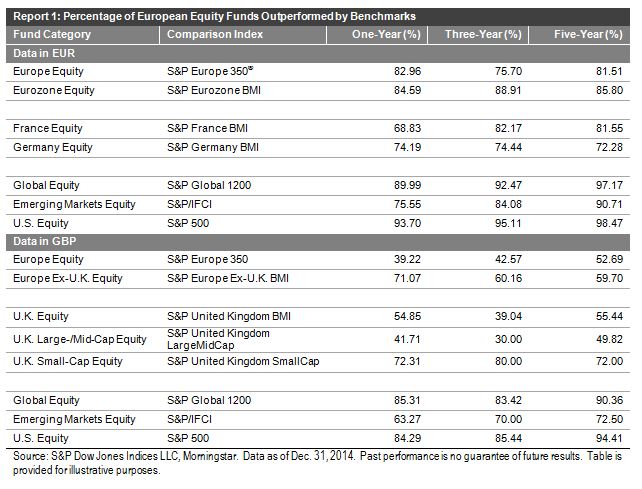
Published every six months, the SPIVA Europe Scorecard aims to measure the performance of active funds against their corresponding benchmarks.  The results for the Year-End 2014 Scorecard are now in, and they reveal few surprises.

Euro-Denominated Funds
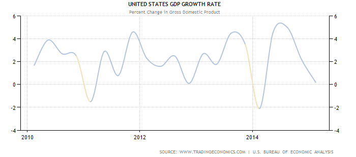
In spite of a slight improvement in the last quarter of the year, growth in Europe for the other quarters of 2014 was generally anemic.  At the start of the year, the markets had generally been optimistic that the European Central Bank (ECB) would start quantitative easing in the event of continued slow growth, but they were disappointed that the ECB did not announce any concrete measures.  This led to bouts of high volatility throughout the year and a generally lackluster performance in the equity markets.  Normally, these conditions would be ideal for active managers, but our report indicates that the majority of euro-denominated funds invested in European equities trailed their respective benchmarks over the one-, three-, and five-year periods.

This pattern of underperformance[1] was not only limited to European equities. We saw a similar pattern of underperformance in euro-denominated funds invested in other regions, such as emerging markets, the U.S., and international markets (see Report 1).

Sterling-Denominated Funds
In regards to sterling-denominated fund categories, some categories of active funds invested in U.K. equities performed well.  Across all time periods, the majority of U.K. large- and mid-cap funds posted higher returns than their benchmark, suggesting that active management opportunities may be present in the U.K. large- and mid-cap spaces.

However, sterling-denominated funds invested in emerging markets, the U.S., and international equities underperformed their corresponding benchmarks.  This is in line with the finding for euro-denominated funds invested in these markets.

Capture

[1] In order to be consistent with SPIVA reports in other regions, funds that have disappeared during the relevant reporting period are now considered to be underperforming the benchmark in the computation of the results in Report 1.

The posts on this blog are opinions, not advice. Please read our Disclaimers.

Is GDP Growth Over?

Contributor Image
Jodie Gunzberg

Former Managing Director, Head of U.S. Equities

S&P Dow Jones Indices

In April, the S&P GSCI gained 11.1%, posting its 19th best month in history with data back to January, 1970.  The last time the index had performance this strong was in May, 2009 but what is most interesting is that all commodities in energy and industrial metals were positive.

When the economy slows, people still consume agriculture and livestock, and many use the precious metals as a safe haven. However, demand for energy and industrial metals are more sensitive to the growth of the economy but still may perform differently based on the type of growth – for example, automobile demand may increase energy consumption while construction may drive industrial metals.

Using historical monthly returns back to February 1983, energy and industrial metals only have a correlation of 0.20 and only move up together less than 1/3 of the time.  Below is the chart of cumulative returns where you can see there is some relationship, though far from perfect.

Source: S&P Dow Jones Indices. Past performance is not a guarantee of future results.

Given this less than perfect positive correlation but notion of economic sensitivity, when the two sectors spike together, it may be indicative.  Since 1983, in only 12 months have energy and metals moved together on average in a month as much as in April 2015. The last time the sectors increased on average in a month as much as they did last month was in May 2009. The table below shows the months in history where the simple average of the two sectors was greater than in April 2015:

Source: S&P Dow Jones Indices. Past performance is not a guarantee of future results.

While the combined positive returns of at least today’s magnitude haven’t necessarily occurred in consecutive months, there are distinct general periods when the energy and industrial metals spiked, and with the exception of the 1999-2000 time that was clearly driven by energy, both sectors had relatively strong returns.

Given only four blocks of time where energy and industrial metals have moved this much, it seemed a comparison to real GDP growth might be interesting.  Below is a chart of yoy% change of GDP data by per capita terms of the Americas. Notice the dips that follow each block of energy and industrial metal performance.

Source:http://www.worldeconomics.com/papers/Global%20Growth%20Monitor_7c66ffca-ff86-4e4c-979d-7c5d7a22ef21.paper Real GDP data was taken from the World Economics Global GDP database Population data was obtained from the Maddison and the United Nations tables 2012/14 data was calculated from the year on year estimated % increase in real GDP from the IMF tables[1] (Gross domestic product, constant prices, % change)
Source: http://www.worldeconomics.com/papers/Global%20Growth%20Monitor_7c66ffca-ff86-4e4c-979d-7c5d7a22ef21.paper. Real GDP data was taken from the World Economics Global GDP database. Population data was obtained from the Maddison and the United Nations tables. 2012/14 data was calculated from the year on year estimated % increase in real GDP from the IMF tables[1] (Gross domestic product, constant prices, % change).
When the next dip will be is yet to be determined, but the first quarter of 2014 showed the first negative quarter-over-quarter growth rate since the last quarter of 2010 and the first quarter of 2015 only showed growth of 0.2% quarter-over quarter. This plus the strong combined energy and industrial metal performance of the S&P GSCI could be telling of the first annual contraction since the global financial crisis.

Source: http://www.tradingeconomics.com/united-states/gdp-growth


The posts on this blog are opinions, not advice. Please read our Disclaimers.

It’s Not So Much the Current Weight, But the Weight That’s Put On

Contributor Image
Kevin Horan

Former Director, Fixed Income Indices

S&P Dow Jones Indices

In addition to liquidity concerns in the credit markets, the rising amounts of debt have become a topic for discussion.

The S&P U.S. Issued Investment Grade Corporate Bond Index has seen its market value actually decline from the beginning of the year’s USD 4.126 trillion to  USD 4.077 trillion as of April 30, 2015.

  • Although the overall market value of the index has declined by 1.2%, certain issues within the index have increased their weight.
  • As of April 30, 2015, Medtronics and 21st Century Fox are both up by 0.4% in weight, while recent issuers of large deals such as Verizon (0.3%), Microsoft (0.26%), and Apple (0.15%) have also added to their weight within the index.
  • For April, the index returned -0.73% MTD and 1.36% YTD.

High-yield bonds, as measured by the S&P U.S. Issued High Yield Corporate Bond Index, have increased by 3.4%.  The index has gone from its Dec. 31, 2014 value of USd 1.169 trillion to  USD1.209 trillion as of April 30, 2015.

  • Issues that have been part of the index since the beginning of the year and have increased their weight include names such as Navient (0.41%), GM (0.33%), Scientific Games (0.26%), and Murray Energy (0.23%).
  • Household names like Heinz (0.18%), Rite Aid (0.15%), Netflix (0.13%), and Sprint (0.11%) have also increased their weight in the index.
  • The index returned 1.13% in April and is at 3.75% YTD.

The S&P/LSTA U.S. Leveraged Loan 100 Index continues to yield approximately 4.75%, as the index returned 0.73% MTD and is at 2.59% YTD.  Repricing activity has intensified.  PetSmart, which recently agreed to a large loan in March, has returned to the market with lower rates.  Additional issues are expected to create loans ahead of any long-term increase in interest rates.

The yield of the U.S. Treasury 10-year as measured by the S&P/BGCantor Current 10 Year U.S. Treasury Bond Index ended the week 20 bps wider, at 2.11%, as yields rose going into the end of April and May 1, 2015 added 7 bps to the total.  The index’s rise in yield over the month of April was 11 bps wider, and tightening in the first and third week helped offset some of the increase in month-end yield, which closed at 2.04% on April 30, 2015.  For April, the index returned -0.80% MTD, while the YTD is 2.24%.

Exhibit-1: Market Value
Market Value Chart


Source: S&P Dow Jones Indices LLC.  Data as of April 30, 2015.  Past performance is no guarantee of future results.  Chart is provided for illustrative purposes only.

The posts on this blog are opinions, not advice. Please read our Disclaimers.

Grant vs. Bogle

Contributor Image
David Blitzer

Former Managing Director and Chairman of the Index Committee

S&P Dow Jones Indices

Jason Zweig, writing in the Wall Street Journal  reports on an on-going debate between John Bogle, founder of Vanguard funds, and Jim Grant of Grants’s Interest Rate Observer.   Zweig notes: “[Grant] pointed out that investing in an S&P 500 index fund means buying stocks picked by the committee at S&P Dow Jones Indices headed by David Blitzer and holding them in a market fueled by low interest rates determined by Janet Yellen’s Federal Reserve ‘When you buy ‘the market,’ you are buying David’s market and Janet Yellen’s [policies]… are you quite sure you want it all?’”

John Bogle needs no assistance from S&P Dow Jones or anyone else in explaining or defending index investing. His comments about fees and expenses are correct. Jim Grant argues that an “accomplished professional investor” should achieve superior returns without indexing.  Given Grant’s experience and the research in his newsletter and books, he would qualify as an accomplished investor. S&P Dow Jones Indices publishes a series of SPIVA reports (for S&P Index vs. Active) comparing the returns earned by indices and actively managed mutual funds. These confirm Jack Bogle’s views that expenses matter. Moreover the reports show that in a typical period of a year or more, indices outperform two out of three actively managed funds.  The results, which extend back ten years, are consistent with numerous other index vs. active studies.  If you knew which one of three active funds would outperform, choosing the right fund and investing would be easy. The real problem is that fund performance has very little if any persistence – selecting the one right fund of three is very difficult and how a fund did last year says nothing about how it  will do this year.

I would like to thank Jim Grant — it is a pleasure to be mentioned alongside Janet Yellen, the chairwoman of the Federal Reserve. As for index investing, the SPIVA  reports and the recent returns on the S&P 500 are available on our web site, www.SPDJI.com; Jim Grant can check which accomplished professional investors are among the one third who outperform the index.

The posts on this blog are opinions, not advice. Please read our Disclaimers.

Tools for Managing Home Price Risk Are Emerging

Contributor Image
Reid Steadman

Former Managing Director, Global Head of ESG & Innovation

S&P Dow Jones Indices

S&P Dow Jones Indices offers information for hundreds of indices on our website, but two in particular drive a large portion of our traffic: the S&P 500 and the S&P/Case-Shiller Home Price Indices.

It’s easy to understand why people would be searching for the S&P 500. By using this popular index and the financial products tied to it, you can measure your portfolio’s relative performance, invest in the equity market, hedge against risk, and even lever up your exposure.

And what can you do with the S&P/Case-Shiller Home Price Indices? Well, up to now, exactly this: see how much aggregate home prices have gone up or down.

You may wonder why the S&P 500 is presently so much more useful than the S&P/Case-Shiller Home Price Indices. This is due to the fact that investment companies can buy, hold, and sell the shares that make up the S&P 500. This allows investable products to exist.

But what can be done with an index made up of single, residential homes that are privately held and rarely bought and sold? So far, the answer has been “not much,” but this is changing.

Some clever product designers are exploring how the S&P/Case-Shiller Home Prices Indices can be used to shift home price risk from one party who wants less of it to another party that wants more. This article highlights one such solution, which allows homeowners to monetize today the future appreciation of their homes. Other interesting concepts will likely follow.

These products work by carefully matching investors willing to assume opposing sides of a trade. The first task is for these parties to agree on a price, which, in the case featured in the article, is to be determined by the S&P/Case-Shiller Home Price Indices at a point in the future. The people using the product must also agree to a holding period for the transaction.

It’s important that better tools emerge to help homeowners manage risk. A lot is at stake. Homes represent approximately half of the net worth of US households. Currently, this wealth is difficult to unlock without selling your home, and no one wants to go through that costly transaction unless they really have to.

The posts on this blog are opinions, not advice. Please read our Disclaimers.