Get Indexology® Blog updates via email.

In This List

Why are active managers lagging?

Sector Investing: Another Approach

Creating a Performance Tailwind

Average Performance

To Have and to Hold in Residential Real Estate

Why are active managers lagging?

Contributor Image
Craig Lazzara

Former Managing Director, Index Investment Strategy

S&P Dow Jones Indices

In late 2013 and early 2014, we heard considerable chatter about the coming “stock picker’s market.”  2014 would favor stock selection strategies, it was said, because intra-market correlation was falling as macro-economic risks receded.  This morning’s Wall Street Journal reports that the contrary view — that low levels of stock market dispersion would make 2014 an especially difficult year for active managers — has been vindicated.  “So far in 2014, more actively managed mutual funds are trailing market benchmarks than in any full year since 2011…”  Hedge fund performance is said to be equally disappointing.  

The critical variable in understanding why active performance has been disappointing is the continuing low level of equity market dispersion.  Computationally, dispersion is a (weighted) standard deviation of cross-sectional returns.  Conceptually, it helps us gauge by how much the “better” performing stocks beat the “worse” performing stocks.  Economically, dispersion tells us how much over- or under-performance we are likely to experience.  When dispersion is low, there is less opportunity either to succeed or to fail.

An easy way to see this is to consider the difference in returns between the equally-weighted S&P 500 and its “standard” capitalization-weighted counterpart.  The equally-weighted S&P 500 tells us the performance of the average stock in the index.  (The cap-weighted 500, in contrast, tells us the performance of the average invested dollar.)  In 2013, the equal-weight 500 outperformed the cap-weighted version by 3.8% (36.16% vs. 32.39%).  For the first half of 2014, the spread was only 1.5% (8.66% vs. 7.14%).

The spread between equal- and cap-weighted performance tells us how much incremental return an investor could achieve by choosing a random stock — figuratively, by throwing darts at the financial page.  At 1.5%, this payoff to blind luck is quite low by historical standards.  Since the average manager typically underperforms random selection, and since fixed investment costs do not vary with dispersion — it’s not surprising that the first half of 2014 has been a particularly difficult environment for active stock selection strategies.

Unless dispersion increases substantially in the next six months, the rest of the year is likely to be just as difficult.

The posts on this blog are opinions, not advice. Please read our Disclaimers.

Sector Investing: Another Approach

Contributor Image
Koel Ghosh

Former Head of South Asia

S&P Dow Jones Indices

As markets are becoming more advanced and mature, investment strategies are incorporating different styles and methods to achieve desired returns.  There are growth and value styles, fundamentally driven strategies, tactical allocation strategies, sector-based strategies and the list goes on.

We never know when a trend toward a certain style or strategy may take off and gain popularity among portfolio managers and investors.  If we were to explore the sector-based approach, we could easy identify some clear advantages.  First, it showcases a clear classification in which the focus toward that sector and its trends can easily be tracked with changing conditions, as companies within that sector will tend to behave similarly.  Sectors can also be used as a basis for various investment strategies, and they may help manage risk efficiently by titling sector preferences based on required risk exposures.

In my previous blog “Building the Hope for Change,” I mentioned the Indian Planning Commission’s 12th Five Year plans that have outlined some major projects.  The new Indian government seems to have recognized the much-needed boost for infrastructure and is reviewing plans toward the same.

Last month, we launched the S&P BSE India Infrastructure Index amid a positive sentiment in the market. This index is focused on primarily five clusters: utilities, energy, transportation, telecommunications and the non-banking financial institutions that are categorized by the Reserve Bank of India as “Infrastructure Finance Companies” or derive major business revenue from Infrastructure Finance.  As spirits in the markets are soaring high, this index has reflected the mood with an annualized one-year return of 54.03% (one-year annualized total return as of June 16, 2014).  A comparison with the bellwether S&P BSE SENSEX at 33.39% (one-year annualized total return as of June 16, 2014) and the S&P BSE 500 at 35.77% (one-year annualized total return as of June 16, 2014) showcases the S&P BSE India Infrastructure Index’s outperformance in the one-year category.

Exhibit 1: Comparison of One-Year Annualized Total Returns

sector


Source: Asia Index Private Limited. www.asiaindex.co.in  One-year annualized Total return for the year ending June 16,, 2014.  Charts and graphs are provided for illustrative purposes.  Past performance is no guarantee of future results.  This chart may reflect hypothetical historical performance.  Please see the Performance Disclosures for information regarding the inherent limitations associated with back-tested performance. 

If we evaluate the performance of the indices over a longer term, we see that the trend of out performance may not be similar, hence it is important to evaluate the investment profile and time horizon when investment strategies are formulated.

Index investing can easily facilitate sector investing.  With lower costs and ease of transaction, this form of investing helps support various investment strategies.

To learn more about Infrastructure Investing, listen to our our webinar from last week “Trains, planes & Infrastructure Investing.”


The posts on this blog are opinions, not advice. Please read our Disclaimers.

Creating a Performance Tailwind

Contributor Image
Craig Lazzara

Former Managing Director, Index Investment Strategy

S&P Dow Jones Indices

Some stock selection schemes seem silly.  This weekend’s Wall Street Journal reports the results of two hypothetical portfolios which are clearly intended to be nonsensical.  One example, the so-called “Graham and Buffett Portfolio” comprises stocks whose ticker symbols consist only of the letters found in the names “Benjamin Graham” and “Warren Buffett.”  Silly it may sound, but a 20-year backtest of the Graham-Buffett portfolio shows that it handily outperformed the S&P 500.

The Graham-Buffett portfolio is a more complicated variation on a theme sounded earlier by Vanguard Group.  The Vanguard “AlphaBet” portfolios depend only on the first letter of each stock’s ticker.  Like the Graham-Buffett portfolio, the backtested Vanguard AlphaBets also outperformed the S&P 500.  (This is especially impressive given that active large-cap U.S. managers typically underperform.)

The Journal argued that these results depend on data mining — that is, the ability of backtesters to keep trying various rules until they find “something, anything, that would produce groups of stocks with high returns.”  “Data mining” thus connotes a degree of intellectual dishonesty.  We agree that investors should regard any backtest results with a fair degree of skepticism, but the explanation for the Journal and Vanguard results may be much simpler — and reveal an important truth.

Building a portfolio, in either a backtest or real time, is a two-stage process:

  • The first step is security selection— the process by which we determine which stocks should be part of the portfolio.  Selection mechanisms can be fundamental or technical or quantitative — or some combination.  They can also be nonsensical, as with the Journal and Vanguard examples.  Importantly, when we say that a stock selection mechanism is nonsensical, we’re also saying that you’d do just as well by selecting stocks at random.
  • The second step is portfolio construction — the process of weighting and constraining that combines the stocks we’ve selected into a final portfolio.

The most important thing about the Journal and Vanguard portfolios is not their (somewhat similar) stock selection processes.  The most important thing is that after they determine what stocks they want to own, the portfolio construction process weights each stock equally.

Equally-weighted indices tell us the performance of the average stock in the selection universe.  What return should we expect if we pick stocks randomly (or with a selection rule that is no better than random)?  With enough trials and enough time, random selection will produce the return of the average stock in the index. That means that the best estimate of the return of a randomly-selected portfolio is the return of an equal-weight index.  Over time, and certainly during the interval covered by the Journal and Vanguard portfolios, equal-weight indices outperformed their cap-weighted counterparts.

The Journal/Vanguard results are not only, and arguably not most importantly, about the perils of relying on backtests.  The most important point they illustrate is that equal weighting creates a powerful tailwind for a strategy’s performance.  Astute portfolio construction can mask flaws in security selection.

The posts on this blog are opinions, not advice. Please read our Disclaimers.

Average Performance

Contributor Image
Craig Lazzara

Former Managing Director, Index Investment Strategy

S&P Dow Jones Indices

This morning’s Wall Street Journal advised us that the performance of many large institutional investors has lagged that of the equity market since the beginning of the recovery five years ago.  The Journal attributed this performance gap to institutions’ moves into alternative investment categories such as hedge funds and private equity.  The explanation may be even simpler than that.  Any large endowment or pension fund will be diversified across a number of asset classes, and by definition the whole portfolio must underperform its best-performing component.

The most striking part of the article was a short quotation from Yale Professor William Goetzmann: “Alternative asset classes are expensive, especially if you have to live with the average fund instead of stellar funds.”  Of course, at the end of the day, the average fund is exactly what the average investor has to live with.

This is a direct consequence of what Sharpe called “The Arithmetic of Active Management.”  All asset owners own all the assets there are to be owned.  Therefore the weighted average return of all asset owners will be the weighted average return of all assets — in other words, the capitalization-weighted market return.

As a group, passive managers accept the market’s return, which means that as a (weighted) group, active managers must also accept the market’s return.  But the cost of running an active strategy means that the average active manager will typically underperform an index appropriate to his investment style, as our SPIVA reports have long demonstrated.  All the children in Lake Woebegon may be above average.  The average active investor is not.

The posts on this blog are opinions, not advice. Please read our Disclaimers.

To Have and to Hold in Residential Real Estate

Contributor Image
Marya Alsati

Former Product Manager, Commodities, Home Prices, and Real Assets

S&P Dow Jones Indices

Homeowners choose the time to sell their home for various personal and socioeconomic reasons but also for financial considerations such as mortgage rates, tax consequences, current property values, and the holding period. The holding period is the time frame between the day the residential property was purchased to the day it was sold. The general belief is that the longer the holding period the larger the gains and the smaller the losses.

In this post, we will analyze this assumption using the S&P/Case-Shiller Home Price Indices.  The indices use the repeat sales method for index calculation. The repeat sales method analyzes data on single family properties that have two or more recorded sales transactions. This arm’s length view can be used to capture the holding period.

The analysis was performed on the S&P/Case-Shiller 10-City Composite Home Price Index, which measures the change in the value of residential real estate in 10 metropolitan areas of the U.S.

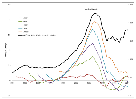
The left axis in the chart below depicts rolling returns of the 10-City Composite Index on 1-year, 3-year, 5-year, 7-year, and 10-year holding period durations. The rolling returns refer to the mathematical process of comparing one year of data to the previous period’s data. For example, the 10 year holding period returns compares January 2010 with January 2000, February 2010 with February 2000 and so on.  The right axis of the chart depicts index levels of the composite index.

Capture

It can be seen from the graph above that the 10-year holding period  yields larger gains and smaller declines than the shorter periods.

The table below shows summary statistics on different holding periods for the 1987-2014 timeframe. The 20-year and 10-year holding periods have the largest gains and smallest declines and the 10-year and 7-year holding periods have the largest deviation from the mean.  This means there is a large variance in the highest and lowest returns one can earn during the holding period.

The table below shows summary statistics on different holding periods for the 1987-2014 timeframe. The 20-year and 10-year holding periods have the largest gains and smallest declines and the 10-year and 7-year holding periods have the largest deviation from the mean.  This means there is a large variance in the highest and lowest returns one can earn during the holding period.

Capture

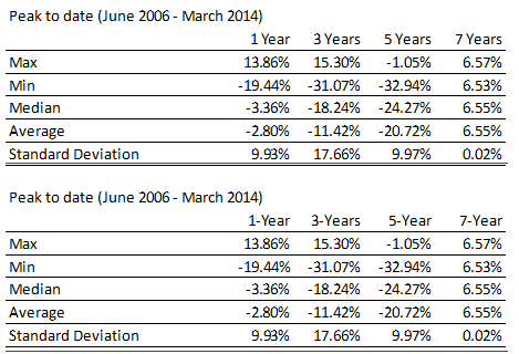
The table below portrays the gains and losses earned if the holding period began during the 2006 peak.

Capture

While the longer 7-year holding period fared better than the shorter duration periods, the 3-year period performed better that the 5-year period during that time frame, likely due to the trough being in 2012.

By comparing the 3-year, 5-year, and 7-year holding periods across the two holding periods, it can be seen that a long holding period results in larger gains and smaller declines. This, however, is dependent on when the holding period actually starts.  For example, the average gain or loss for a  5-year holding period that spans the entire length of the data is 30.67%, and is however -20.72% for the peak to present holding period.  It can be concluded that longer holding periods do yield better results, but depending on when the holding period begins one might have to have and to hold their property a little longer.

The posts on this blog are opinions, not advice. Please read our Disclaimers.