Get Indexology® Blog updates via email.

In This List

An Immediate Risk Measure

Index of Leading Indicators Kicks-Off the Week

Housing Looking for Good Old Days

Internet Intercedes in the Market

What’s the Canadian Preferred Market Made Of?

An Immediate Risk Measure

Contributor Image
Tim Edwards

Managing Director, Index Investment Strategy

S&P Dow Jones Indices

Volatility and correlation are history.

In fact this is a consequence of their definitions.  The calculation of volatility and correlation – the preeminent measures of risk – requires multiple observations.  Quite a few periods are needed if the resulting estimates are to be relied upon as robust.   Because of this, volatility and correlation are not particularly quick to capture new and changing market dynamics[1].

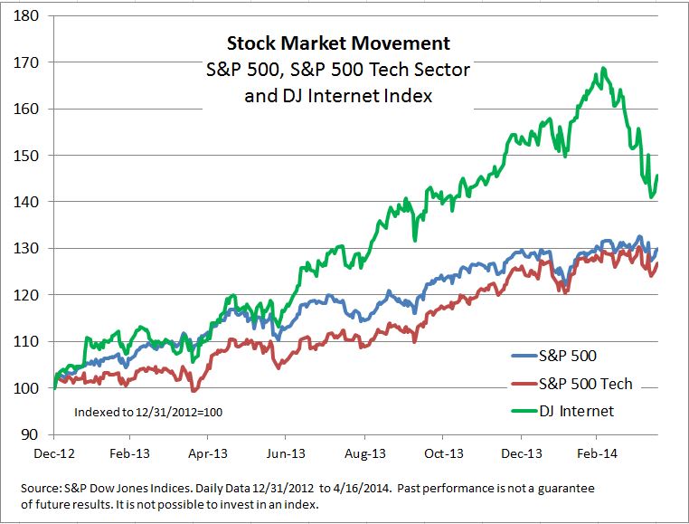
Shorter term measures can help.  For any market – the S&P 500® for example – at any given moment in time the price of each stock (or the level of the index) provides an immediate indication of market outlook.  Looking over a single period tells us, at the most basic level, if and by how much the market was up or down.  But within a single period there is more information — such as the percentage of winners and losers, or how different the performances were among individual stocks. This last measure we call dispersion, and because dispersion is a single period measure, we can use it to capture changes in market dynamics more immediately.

Periods2

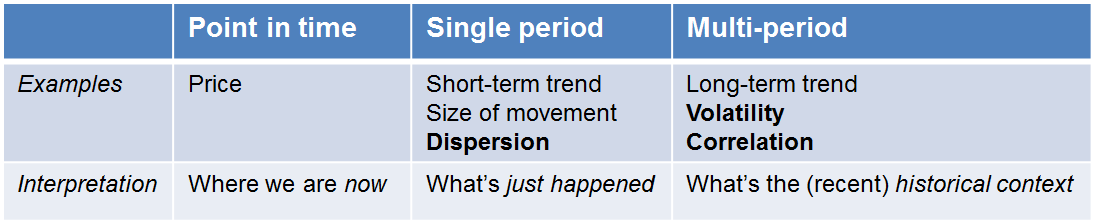
Dispersion is a useful concept considered in isolation, but the question of how it is connected to the multi-period measures arises naturally.  Our most recent research describes the conceptual link between dispersion, market volatility and correlation.

Just as “How much did the market move today?” provides an indication for future measures of volatility that include today’s returns, one can use dispersion to provide intelligence about how volatility and correlation will evolve, as “history” catches up with new dynamics. The relationship is more subtle and occasionally technical.  But three practical conclusions emerge:

  1. Dispersion is driven by the difference between the volatility of an index and the average volatility of the index’s components. Otherwise said, it measures the “diversification benefit”.
  2. It’s not too much to say that volatility, dispersion, and correlation are like three legs of a right triangle – if you know two, you can figure out the other. This relationship can be particularly useful in using volatility and dispersion to estimate the average correlation among an index’s components. 
  3. We’re recently been in a period of relatively low dispersion and relatively low volatility.  If market volatility is to increase, either correlations or individual stock risk (i.e. dispersion) must rise.


[1] A 60-day rolling calculation of market volatility is only 1/60th influenced by the most recent day. Part of the widespread popularity of the VIX as a measure of market sentiment is due in no small part to its more forward-looking nature.

The posts on this blog are opinions, not advice. Please read our Disclaimers.

Index of Leading Indicators Kicks-Off the Week

Contributor Image
Kevin Horan

Former Director, Fixed Income Indices

S&P Dow Jones Indices

The yield on the 10-year Treasury as measured by the S&P/BGCantor Current 10 Year U.S. Treasury Index suddenly moved higher to 2.78% from the previous day’s 2.64%.  Thursday’s upward movement before the Good Friday Holiday was a result of negotiations over the Ukraine crisis possibly resulting in an accord to defuse the conflict.

Yields in the U.S. have remained lower as political tensions in Ukraine have kept Treasuries as the safety trade.  In addition to global political issues, domestic indicators that measure the U.S. labor market have not shown a consistent amount of improvement.

This week’s economic calendar started with the Chicago Fed Activity Index coming as expected at a 0.2 and the U.S. Leading Index stronger than the expected 0.7% and the previous 0.5%, at a 0.8% for March.  The week is full of reporting’s that will affect the bond markets and their indices.  Tuesday kicks off the housing numbers with the FHFA House Price Index (0.5% expected), Existing Home Sales for March (4.55m expected) and the Richmond Fed Manufacturing Index (2 expected).  Wednesday continues the housing and manufacturing theme as MBA Mortgage Applications, New Home Sales (450k) and the Markit US Manufacturing PMI (56 expected) are due.  Later in the week Durable Goods Orders (2% expected), Initial Jobless Claims (313K expected), and the University of Michigan Confidence Survey (83 expected) close out the week.


The S&P U.S. Issued Investment Grade Corporate Bond Index is returning 0.6% month-to-date which is a much better start than all of March’s return of 0.04%.  Thursday’s jump in Treasury yields was evident in corporates as well with the index giving up 0.37% in one day.  Year-to-date the index has returned 3.52%.

The S&P U.S. Issued High Yield Corporate Bond Index is slightly behind the investment grades returning 0.3% for the month and 3.27% year-to-date.  The spread to Treasuries of the high yield bonds is only slightly wider than from the beginning of the month.  Presently the BB and single B indices are only slightly wider on the month while the S&P U.S. Issued CCC & Lower High Yield Corporate Bond Index is 29 basis points wider.


One of the big headlines last week was TIAA-CREF’s $6.25 billion acquisition of Nuveen Investments.  The single B rated term loan B-structure issued by Nuveen Investments Inc., holds a 1.15% weight in the S&P/LSTA U.S. Leveraged Loan 100 Index which returned 0.02% last week.  Month-to-date this index is down-0.01% while returning only 1% year-to-date.


Source: S&P Dow Jones Indices, Data as of 4/17/2014, Leveraged Loan data as of 4/20/2014.

The posts on this blog are opinions, not advice. Please read our Disclaimers.

Housing Looking for Good Old Days

Contributor Image
David Blitzer

Former Managing Director and Chairman of the Index Committee

S&P Dow Jones Indices

Rising Home Prices are boosting property taxes while mortgage lenders may be getting more generous.

Bloomberg reports that property tax collections are rising at the fastest pace since the financial crisis with gains spread across the country. Among cities cited as enjoying renewed revenue gains were San Jose CA, Nashville TN, Houston TX and Washington DC.  Rising home prices, as chronicled by the S&P/Case Shiller Home Price Indices are a key factor in the rebound.  With some communities under pressure from lower revenues in recent years, the rebound will be welcome.

A different development in housing finance may remind some people of darker memories however. The Wall Street Journal reported over the weekend that one major bank is offering mortgages with only 5% down payments.  This does not appear to be a return to the sub-prime days of years past and the loans are not being offered to all comers.  It may also reflect the decline since last May in mortgages for refinancing. Since the Fed first hinted about tapering and the end of QE last year, the refi business has dropped from 75% of all mortgages to roughly half.  Nevertheless, some may wonder if the generosity will turn out badly for the lender.

The posts on this blog are opinions, not advice. Please read our Disclaimers.

Internet Intercedes in the Market

Contributor Image
David Blitzer

Former Managing Director and Chairman of the Index Committee

S&P Dow Jones Indices

The last month has been marked with worries that the stock market is about to (finally) have a correction and drop some 10% or more.  While it is impossible to tell if, or when, this might happen; a few numbers may explain some of the recent action. Stocks were seized with a bit of mania for growth and the internet which over-shadowed other parts of the market.  The Dow Jones Internet Index peaked at the beginning of March after climbing almost 70% from the start of 2013. Then it turned down and slid 16.4% to April 11th; as of this afternoon it has regained about three percentage points.  One factor in the down move may have been valuation: the PE is over 70 and has risen substantially more than the index level.

The rest of the market hasn’t shown these kinds of large shifts.  The S&P 500 is up about 30% since the beginning of 2013. While the PE is at 17, earnings have more than kept pace with stock prices and the PE is up about 21%.  Growth stocks slightly out-performed value stocks in the S&P 500 over the last two years. However, since the beginning of March when the Dow Jones Internet index peaked, growth lagged value by a four and a half percentage point spread.  The worry of the last six weeks was the passing, at least for now, of that internet infatuation.

The chart shows the S&P 500, the S&P 500 tech sector and the DJ Internet index, all rebased to 100 at the end of 2012.  The rise and subsequent decline of the DJ Internet index stands out.stocks 4-16


The posts on this blog are opinions, not advice. Please read our Disclaimers.

What’s the Canadian Preferred Market Made Of?

Contributor Image
Phillip Brzenk

Managing Director, Global Head of Multi-Asset Indices

S&P Dow Jones Indices

Shift in the Makeup of the Preferred Market

As we noted in an earlier post, the Canadian preferred share market has undergone a significant expansion over the past five years, approximately doubling in market size.  In addition to the growth of the market, the Canadian preferred market has seen a shift from most outstanding preferreds being fixed-dividend to a majority being rate-resets.  The proliferation of fixed-rate-reset preferreds and their unique distribution characteristics make it possible for investors to get a degree of protection in a rising interest rate environment.

If we take a look at the S&P/TSX Preferred Share Index, which is a proxy for the Canadian Preferred market, by count rate-reset preferreds made up one-sixth of the index in 2008.  At the end of 2013, over half of the index was made up of rate-resets.

Historical Security Type Makeup of SP-TSX Preferred Share Index

Types of Preferred Shares Explained

Perpetuals have no set maturity date.  The dividend rate is determined at the issuance date and is fixed for the life of the preferred share.  With the long time horizon and fixed dividend amount, perpetual shares carry the highest interest rate risk amongst all preferred types.

Retractables pay a fixed dividend and have a pre-determined maturity date, usually redeemable at par value.  Most redemption payments are via cash, while some issuers also have the option to pay the equivalent amount in common shares.

Rate Resets are variable dividend payment preferreds, where the dividend rate is reset every five years.  The initial dividend rate is determined by adding a spread above a reference rate, most using the Bank of Canada’s five-year bond yield.  This spread amount is based on several factors such as the credit quality of the issuer and present market conditions.  At each reset date, the dividend rate is adjusted by taking the current interest rate of the reference instrument and adding the spread determined at issuance.  Most issuers also hold the option to call the security on each reset date.  Because the dividend rate resets based on current market interest rates, the duration and thus interest rate risk, of rate-resets are lower than perpetuals and retractables.

Floating Rate preferreds feature a dividend that floats at each payment, based on a spread above a prime interest rate, such as LIBOR.  Typically, a minimum dividend rate is promised to investors to protect them against low market interest rates.

For more on preferreds in Canada, read our recent paper, “Looking Under the Hood of Canadian Preferred Indices.”

The posts on this blog are opinions, not advice. Please read our Disclaimers.