Get Indexology® Blog updates via email.

In This List

Nat Gas Is HOTTEST In 4 Years

Low Dispersion Implies Low Value Added

A Tough Day for the Dow

Munis - Once again a 'risk off' asset class

Looking Back for Forward Guidance

Nat Gas Is HOTTEST In 4 Years

Contributor Image
Jodie Gunzberg

Former Managing Director, Head of U.S. Equities

S&P Dow Jones Indices

Every conversation I’ve had today with people from Nashville to Toronto has started with how cold it is outside.  After the shock of the cold and when the heating bills come due, the conversation may turn to how expensive heat was in January.  That, of course, is at least for those who don’t invest in commodities to offset price spikes.

After natural gas posted the biggest one-day gain of 9.2% on Jan 24, 2014 since June 14, 2012, the S&P GSCI Natural Gas has gained 19.3% this year.  It has gained 25.9% in just 10 days since Jan. 9, 2014 and is also up 44.6% since it’s low for the prior year on Nov. 4, 2013.

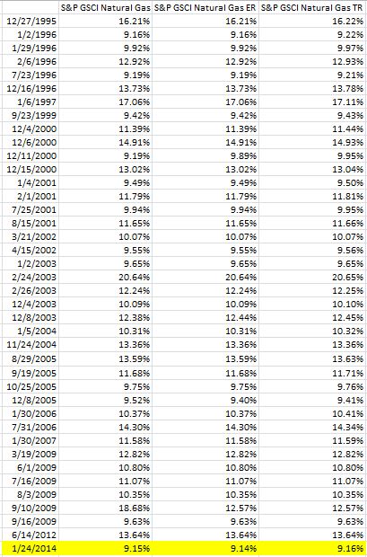
In the history of the index since Jan 8, 1994, it has been calculated on 5,053 days and only 39 of 5,053 days have had a higher gain than the 9.2% seen on Friday  – that is only 0.77% of days. That puts Friday’s gain in the top 1% of big daily gains for the natural gas index.  See the table below for days gaining more than 9.2%:

Source: S&P Dow Jones Indices. Data from Jan 1994 to Jan 2014. Past performance is not an indication of future results. This chart reflects hypothetical historical performance. Please see the Performance Disclosure at the end of this document for more information regarding the inherent limitations associated with backtested performance.

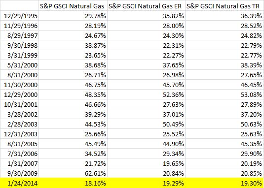
Also, January 2014 MTD has posted the biggest monthly gain since September 2009.  Only 17 months of the 240 in the history of the index have seen bigger gains than 19.3%.  Although natural gas can be considered in a bull market from the bottom, many will watch to see if natural gas will earn the bull market stamp in January by breaking break the mark of a 20% gain for the month. Please see below for the table of natural gas bull market months:

Source: S&P Dow Jones Indices. Data from Jan 1994 to Jan 2014. Past performance is not an indication of future results. This chart reflects hypothetical historical performance. Please see the Performance Disclosure at the end of this document for more information regarding the inherent limitations associated with backtested performance.

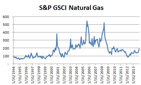
Last, below is a chart of the index, where you can see the level is highest since Jan. 29, 2010.

Source: S&P Dow Jones Indices. Data from Jan 1994 to Jan 2014. Past performance is not an indication of future results. This chart reflects hypothetical historical performance. Please see the Performance Disclosure at the end of this document for more information regarding the inherent limitations associated with backtested performance.


The posts on this blog are opinions, not advice. Please read our Disclaimers.

Low Dispersion Implies Low Value Added

Contributor Image
Craig Lazzara

Former Managing Director, Index Investment Strategy

S&P Dow Jones Indices

Understanding a market’s dispersion provides important insights into its internal dynamics and the opportunities and pitfalls that might await both active and passive investors.  Dispersion measures the average difference between the return of an index and the return of each of the index’s components.  In times of high dispersion, the gap between the best performers and the worst performers is relatively wide; when dispersion is low, the performance gap narrows.

We recently updated our volatility and dispersion dashboard to reflect full calendar year 2013 results.  Dispersion is at or near its all-time low in every market we surveyed.  This has important implications for an investor who owns anything other than a broad market capitalization-weighted index fund.  Dispersion doesn’t tell us anything about what the market’s overall performance will be, nor does it tell us what strategies are likely to outperform or underperform.  What it can do, however, is to help us estimate how much over- or under-performance we are likely to experience.

For example, consider the historical performance of the S&P 500 Dividend Aristocrats index.  Since 1991, when the market has been in its least-disperse quartile, the average monthly deviation of the Aristocrats index relative to its parent S&P 500 has been 0.71%.  In the next least-disperse quartile, the average deviation rose to 0.95%, then to 1.36%, and finally, in the market’s  most-disperse quartile, to 3.31%.  Its average monthly deviation was 4.6 times larger in the most disperse quartile than in the least.

What is true for the Dividend Aristocrats is equally true for other strategy indices and emphatically also true for active managers.  When dispersion is low, there is less opportunity either to succeed or to fail.  With dispersion at its current levels, strategies that deviate from market cap weighting — whether active or indicized — should expect relatively low incremental returns.

The posts on this blog are opinions, not advice. Please read our Disclaimers.

A Tough Day for the Dow

Contributor Image
Jamie Farmer

Former Chief Commercial Officer

S&P Dow Jones Indices

Friday, January 24 was a rough day for the US equity markets with the Dow Jones Industrial Average shedding 318.24 points or 1.96%.  Driven by increasingly wide spread expectations of a market correction and slowing manufacturing in China, the Dow experienced its worst single day point drop since June 20th of last year.  On that day, the markets gave back over 353 points after comments from former Fed Chairman Ben Bernanke fueled fears of an imminent stimulus taper.

Lowlights from today’s tape:

  • Today’s drop leaves the DJIA down nearly 700 points or 4.21% on the year.  It’s a pretty arbitrary measurement, but that’s the worst 16 day start since 2009 when the DJIA lost over 7.50% over those early days.
  • Visa (V), responsible for the loss of nearly 45 points, was the worst performer.  Boeing (BA) was responsible for taking off nearly 30 points and 3M (MMM) nearly 29.  Procter & Gamble (G), adding just over 6 points, was the best performer and one of only 3 Dow stocks up on the day.
  • As a group, Financials were the worst performer today (-97.42 points) and year to date (-174.36).  None of the 9 industries represented in the DJIA were up today, nor are any up on the year.

The posts on this blog are opinions, not advice. Please read our Disclaimers.

Munis - Once again a 'risk off' asset class

Contributor Image
J.R. Rieger

Former Head of Fixed Income Indices

S&P Dow Jones Indices

Municipal bonds yields have come down at a faster pace than U.S. Treasury bond yields helping to push up bond prices. Equity and currency market volatility is helping to drive cash inflows for municipal bond funds and when combined with manageable new issue supply has helped foster a stronger muni bond market. The S&P National AMT-Free Municipal Bond Index tracking investment grade bonds has started 2014 with a positive total return of 2.34%. The average yield of bonds in the index has fallen by 36bps since year end out pacing the drop in yield of the 10 year US Treasury bond.

Puerto Rico municipal bonds stung the bond market in 2013 with the S&P Municipal Bond Puerto Rico Index falling over 20% during the year.  That index has seen a rally of 3.7% in January as the average yield of Puerto Rico bonds in that index has improved to 7.19% from 7.44% at year end. Possible new bond issuance from Puerto Rico will test the depth of market’s appetite for these bonds in coming weeks.

Tobacco settlement bonds have benefited from yields coming down. The S&P Municipal Bond Tobacco Index has seen a positive total return of 4.72% year to date as average yields of bonds in the index have dropped by 33bps in January.

Five year municipal bonds tracked in the S&P AMT-Free Municipal Series 2019 Index have seen yields come down by 33bps to end at 1.63%. The S&P AMT-Free Municipal Series 2023 Index have seen yields come down by 36bps to end at 2.88%. Out longer, 20 year bonds tracked in the S&P Municipal Bond 20 Year High Grade Rate Index have seen yields come down by 45bps to end at 4.1%.

The posts on this blog are opinions, not advice. Please read our Disclaimers.

Looking Back for Forward Guidance

Contributor Image
David Blitzer

Former Managing Director and Chairman of the Index Committee

S&P Dow Jones Indices

Investors and some central bankers believe in forward guidance – that announcing what the bank will do well before it does anything can control the economy.  One proponent is Mark Carney the governor of the Bank of England (BOE) and previously head of the Bank of Canada. In a speech earlier today at Davos he told people to ignore statements made last summer about how the BOE would respond to a falling unemployment rate and offered a new twist to forward guidance: the BOE’s Monetary Policy Committee would re-think how to do forward guidance if they needed to change their mind.

Forward guidance, the idea that central banks can use announcements of future policy moves as a way to affect the economy gained popularity in recent years. In simple terms, if the Fed, or the Bank of England, says it won’t raise interest rates until unemployment drops, people respond by confidently borrowing and spending.  Central bankers were once tight lipped fearing that any comment might spook bond traders and damage the economy. After the financial crisis with interest rates pegged at their zero lower bound, a new tool for economic management was needed.  The answer was to tell the markets what the bank would do and then watch the economy follow instructions.

Forward guidance apparently works – markets and investors take note and respond as desired.  Central bankers can move the economy in the direction they want just by issuing official statements. But it only works as long as people believe what they hear. This is issue before Mark Carney and the Bank of England – and the issue about to confront the Fed and its soon-to-be chairperson Janet Yellin.  Unemployment rates in both the US and the UK dropped more than expected in recent months. Both banks’ forward guidance is on the record with unemployment targets for when interest rates might increase.  The Bank of England is sufficiently close to their target that they hint they may change their mind. We will need to read their upcoming February Inflation Report in hope of finding forward guidance 2.0.

Over at the Fed the details differ. The last employment report was unexpectedly weak so now everyone is wondering if another weak report will change their plans for tapering QE, their last public statements indicated.  A few days ago a page one article appeared in the upper right hand corner of the Wall Street Journal quoting two of the regional Federal Reserve bank presidents commenting that the Fed would continue to taper QE regardless on the employment report due on February 7th.   While this isn’t official forward guidance from the Fed, it is journalism – and some parts old time jaw boning, whispering and hinting.

A decade or two ago, before Central Bankers believed in maximum transparency, when the Wall Street Journal was a monotone grey paper only read within a few blocks of its namesake location, the way the Fed communicated with the markets was an occasional story in the upper right hand corner of page one quoting an unnamed senior Fed official. Unstated was the belief that the senior Fed official might be the chairman himself.  What was said sounded a bit vague and much less definite than today’s official statements. The element of uncertainty in the article forced investors to think through their own market forecasts and strategies knowing that the Fed might change its plan when the data changed.

Maybe some other senior officials at the Fed or the Bank of England today might prefer the old fashioned kind of forward guidance.

The posts on this blog are opinions, not advice. Please read our Disclaimers.