Get Indexology® Blog updates via email.

In This List

BACKWARDATION IS BACK!

The Dow Jones Industrial Average in 2013? Yeah, that went well…

What Is The Golden Link Between $275,000, 750 Million AND -32.8%?

Why Bubbles Aren’t as Dangerous Today

A Battered Municipal Bond Market Enters 2014

BACKWARDATION IS BACK!

Contributor Image
Jodie Gunzberg

Former Managing Director, Head of U.S. Equities

S&P Dow Jones Indices

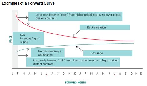
2013 is the first year commodities have been in backwardation since 2003.  For those of you who need a refresher on the definition of backwardation, you are not alone, so here it is: “When a near-month futures contract is trading at a premium to more distant contracts, we say that a commodity futures curve is in “backwardation” or that the commodity is “backwardated.” This occurs when inventories of commodities are tight so market participants are willing to pay a premium to buy the immediate deliverable commodity. Theoretically there is no value to carrying costs such as storage, insurance and interest costs since there is a scarcity of the commodities.”

Also, for illustrative purposes, this graph may help:

Chart is provided for illustrative purposes only.

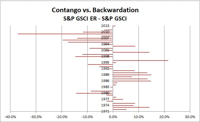
The measurement of the historical backwardation (and contango, which is the converse of backwardation) shown in the chart below calculates the annual roll yield by taking the annual return of the S&P GSCI Excess Return (which measures the price return plus the roll return) less the annual returns of the S&P GSCI Spot Return (which measures the price return only). Backwardation was implied by a positive result, whereas contango was implied by a negative result. Notice 2013 had the first positive result since 2003.

Source: S&P Dow Jones Indices. Data from Dec 1970 to Dec 2013. Past performance is not an indication of future results. This chart reflects hypothetical historical performance. Please see the Performance Disclosure at the end of this document for more information regarding the inherent limitations associated with backtested performance.

The implication of this, as mentioned in a paper titled “Identifying Return Opportunities In A Demand-Driven World Economy” published by Marya Alsati-Morad, Peter Tsui and me, is that when commodities are backwardated, indices like the S&P GSCI and DJ-UBS that hold the near-month commodity futures contracts may earn a positive return from rolling into a cheaper contract before expiry.

For extra valuable insight on the impacts of contango and backwardation, please watch this special interview with Bob Greer, Executive Vice President & Manager of Real Return Products, PIMCO and Boris Shrayer, (former) Managing Director & Global Head of Commodities Marketing, Morgan Stanley.

For more on the environment and the index development and rolling versus weighting please see the links aforementioned.

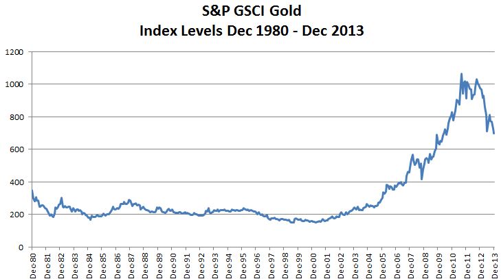
Last but not least, something that is particularly interesting is that the last long streak of backwardation happened in 1984-1991, following a precipitous drop in gold of 48% from 1980-84.  During this the time of backwardation, the S&P GSCI returned positive every year between 1984-1990 for a total of 221%.

Source: S&P Dow Jones Indices. Data from Dec 1983 to Dec 1990. Past performance is not an indication of future results. This chart reflects hypothetical historical performance. Please see the Performance Disclosure at the end of this document for more information regarding the inherent limitations associated with backtested performance.

The posts on this blog are opinions, not advice. Please read our Disclaimers.

The Dow Jones Industrial Average in 2013? Yeah, that went well…

Contributor Image
Jamie Farmer

Former Chief Commercial Officer

S&P Dow Jones Indices

A steadily improving economy and no small amount of performance-enhancing stimulus from the Fed re-enthused equity investors in 2013, leading the Dow Jones Industrial Average to finish in record territory.

Let’s go to the tape:

  • Impressive Climb – The DJIA finished the year at 16,576.66, up 3,472.52 or 26.50%.  That performance leaves us with the latest in a series of record closes, the best annual percentage gain since 1995 and the largest annual point gain in history.
  • Leader & Laggard – Boeing (BA) was the standout contributor of the Dow, adding 444.47 points in 2013.  IBM subtracted 27.48 points to finish as the biggest detractor.
  • Industry Performance – All industries added to the DJIA’s advance in 2013 – Industrials led, followed by Financials and Consumer Services.
  • The Good – The biggest single day point gain – up 323.09 or +2.18% – was posted on October 10.  Despite finding themselves on Day 8 of the US government shutdown, investors were heartened by indications that House Republicans would offer a deal to raise the debt ceiling.
  • The Bad – The biggest single day point loss – down 353.87 or -2.34% – was June 20 when the market had an – ahem – adverse reaction to Bernanke’s comments about tapering of the Fed’s bond buying program.
  • Changes – There were three additions/deletions in 2013:  Hewlett Packard (HPQ), Alcoa (AA) and Bank of America (BAC) were removed after the close on September 20 and Goldman Sachs (GS), Visa (V) and Nike (NKE) were added for the opening of trading on September 23.
  • Dividends – All 33 stocks that were components in 2013 paid cash dividends, with nearly $124 billion paid.  Exxon paid out the most with nearly $11 billion distributed to shareholders.
  • Volatility – at 9.40, the DJIA’s realized annual volatility continued a downward trend from a peak of over 26 seen during 2009.
  • Potpourri – there were 52 record closes in 2013, the most since 1995; as of the close of 2013, the DJIA is up 153.19% from its financial crisis low of 6,547.05 hit on March 9, 2009; and, we experienced two major milestones in 2013 with the DJIA eclipsing both 15,000 and 16,000 about 6.5 months apart

The posts on this blog are opinions, not advice. Please read our Disclaimers.

What Is The Golden Link Between $275,000, 750 Million AND -32.8%?

Contributor Image
Jodie Gunzberg

Former Managing Director, Head of U.S. Equities

S&P Dow Jones Indices

The hint in the title is GOLD and the answer is the year 1981.  In 1981, a Superbowl ad was $275,000, 750 MILLION people watched Prince Charles and Lady Di get married and GOLD lost 32.8%.  In 2013, the cost of a Superbowl ad was $4 million, Prince William and Kate Middleton welcomed Prince George, and GOLD lost 28.3%, the most since 1981.

If history repeats itself, Superbowl ads may get more costly, the royal family may have more babies, and gold may be doomed for a long recovery period. In fact, the recovery period for gold after the 1981 loss lasted 25 years – that is 10 years longer than the marriage of Prince Charles and Princess Diana.

Source: S&P Dow Jones Indices. Data from Dec 1980 to Dec 2013. Past performance is not an indication of future results. This chart reflects hypothetical historical performance. Please see the Performance Disclosure at the end of this document for more information regarding the inherent limitations associated with backtested performance
Source: S&P Dow Jones Indices. Data from Dec 1980 to Dec 2013. Past performance is not an indication of future results. This chart reflects hypothetical historical performance. Please see the Performance Disclosure at the end of this document for more information regarding the inherent limitations associated with backtested performance.

Given the severity of the loss of 28.3% in 2013 for both the S&P GSCI and DJ-UBS Gold, many questions have been asked by the media today about the future of gold.  Here are some of the most popular questions:

1.  After the large gold selloff in 2013, do you believe gold can still be viewed as a safe-haven? The idea of gold as a safe haven doesn’t mean it is always a profitable investment – it just means investors are comfortable with gold as a store of value in uncertain economic times. In fact, in 2013 it was the safe-haven concept that drove gold down the most since 1981. Investors feared the fed tapering all year long, which might indicate a stronger economy.

2. Do you believe investors are no longer comfortable with gold as a store of value?  Gold as a store of value can be defined by the framework of super asset classes where capital assets, such as stocks, bonds and real estate, provide an ongoing source of value that can be measured using the present value of future cash flows technique.  Consumable or transformable assets, like commodities, only provide a single cash flow. Store of value assets such as currency and fine art are not consumed and do not generate income but do have a monetary value. Gold is a unique commodity that has a dual purpose of currency and whether investors are comfortable with gold as a store of value may depend on their view of the relative value to the U.S. dollar, where a stronger dollar is generally bearish for gold.

3. Anything that might replace gold as a store of value that investors might turn to in the new year? The most likely substitutes for gold as a store of value are other currencies or assets like artwork that have a value but no cash flows.  It is more logical to replace gold with an asset like the U.S. dollar than with an industrial metal that is consumed/transformed, though cases have been made for using other precious metals like silver or platinum.

4.  Besides the fed tapering, what else may drive gold down for 2014?  A stronger dollar, low inflation and an increase in producer hedging may be bearish for gold.  Higher producer hedging is especially important as an indicator since it is evidence of negative sentiment by the companies that are at most risk from a gold price drop.

5.  Are there any bullish factors for gold in 2014?  Strong Chinese demand growth may be better for copper than gold, given its economic sensitivity. However, the physical demand growth for jewelry in China has been strong (18% yoy q3 2013 according to the World Gold Council) and Indian consumption may rebound after the government crackdown on imports. Also, it is possible the fear of the slowdown in quantitative easing has been priced into gold already.

6.  What do you see going forward for gold? In 2013, the S&P GSCI and DJ-UBS Gold fell 28.3%. The last time gold fell this much was in 1981 when it lost 32.8% and it took 25 years to recover its drawdown.  Although in 1982, gold rebounded 12.5%, it lost another 32% in the next 2 years. If history repeats itself, it could take a long time for gold to recover but it could be viewed as a bump in the road of the long bull trend that has gained over 700% in the prior 12 years.

7. Do you have a bullish outlook on any other metals for 2014?  There may be a bullish case for industrial metals if Chinese demand growth is strong.  Copper is most economically sensitive, though palladium is particularly responsive to the automobile market.  However, after the financial crisis, the surplus of inventories has largely depleted in metals like aluminum, lead, nickel and zinc that make them more sensitive to supply shocks and demand increases to support their prices. 2014 may hold the turning point for the inventories from excess to shortage, which is generally profitable.


The posts on this blog are opinions, not advice. Please read our Disclaimers.

Why Bubbles Aren’t as Dangerous Today

Contributor Image
David Blitzer

Former Managing Director and Chairman of the Index Committee

S&P Dow Jones Indices

Both the surprisingly strong 2013 US stock market performance and the surging rebound in US home prices are sparking fears of another round bursting bubbles among many investors and market pundits.  While we don’t know the chances that either stocks or home prices will plunge in 2014, the collateral damage from either will be less than it was in 2008 because the underlying leverage in the economy is substantially smaller today than it was back then.

The financial crisis was a two-step (or double dive) event.  First home prices collapsed, wiping out about a third of the value of American homes. Second, a lot of the mortgage debt collateralized by those homes failed creating a cascade of defaults, foreclosures and worse.  The higher the loan to value ratio on a home with a mortgage, the smaller the price drop needed to put the mortgage under water.  The chart shows the loan to value ratio for all owner-occupied housing in the United States, including homes owned without mortgages or with mortgages before the boom times of no money down mortgages.  From about the beginning of 2006 to the beginning of 2009 it rose by half from 40% to 60%.  When home prices plunged, homeowners and their mortgages were vulnerable.  Today conditions are improved – the economy-wide loan to value ratio is down to 49%, not as comfortable as ten years ago, but better and safer for the economy than in the financial crisis.


Source: Financial Accounts of the United States, Federal Reserve Board, Table B:100, 3rd Quarter 2013.

This change did not just happen. Rather, the appetite for borrowing and debt is much less today than seven years ago. The total growth in mortgage debt in the 12 quarters ended with the 3rd quarter of 2013 was -7.2% — mortgage debt fell. Compare this to the increase in the 12 quarters ending with the 2007 4th quarter: 35.6%.  The same story, with somewhat different numbers is true across most of the economy. Growth in debt outstanding in the last 12 quarters to 2013:3 for the entire economy was 12.7% versus 29.3% for the 12 quarters ended in 2007:4.  The only sector where debt rose more quickly in the recent period was the Federal government, largely due to supporting the economy.  Even with the federal government, debt is under more control with the deficit as a percentage of GDP down by more than half to 4.1% currently from 10% during the financial crisis.

The lower leverage and debt overhang will not prevent a bubble from bursting, doesn’t mean stock prices or home values can’t slide and doesn’t mean we shouldn’t be concerned that some markets may be over-valued.  But, less debt and leverage means less damage if markets fall. That alone should ease some fears as we start a new year with higher prices on houses and stocks.

The posts on this blog are opinions, not advice. Please read our Disclaimers.

A Battered Municipal Bond Market Enters 2014

Contributor Image
J.R. Rieger

Former Head of Fixed Income Indices

S&P Dow Jones Indices

Since the S&P Municipal Bond Index was launched in 2000 it never has had two years in a row of negative returns.  However, a new year begins with all the uncertainty and expectations of any other year.  Municipal bond funds are entering 2014 following a long string of monthly cash outflows indicating that retail investors remain skeptical of the short term prospects of the muni market.

Helping to drive investor sentiment are:

  • Puerto Rico: The S&P Municipal Bond Puerto Rico Index was down over 20% in total return in 2013.  Puerto Rico bonds hang on a precipice of a down grade by Moody’s, S&P or Fitch to below investment grade.  A downgrade by any one of those ratings providers would most likely continue to foster the junk bond trading environment that these bonds face today and make it more difficult and costly for the Territory to borrow in the future.  On average, bonds in the S&P Municipal Bond Puerto Rico Index trade at higher yields than corporate bonds in the BB rated category.  Who is hurt the most?  Investors in bond funds with high exposure to triple tax-exempt Puerto Rico bonds.
  • High profile defaults:  The City of Detroit bankruptcy filing in 2013 followed other headline making defaults in 2012.  While representing a very small fraction of the municipal bond market, these defaults have been powerful reminders that buying bonds is simply lending money in anticipation of being repaid on time and in full.   In reality, new monetary defaults, as tracked by the S&P Municipal Bond Index totaled 19 bonds so far in 2013, down from 30 bond defaults in 2012. 
  • Tapering and rising risk free rates:  Bonds in general, particularly long term bonds, are impacted negatively by rising interest rates.  Investor rotation to shorter duration bonds in anticipation of rising rates began in 2013. The prices of shorter term bonds simply move less given a change in interest rates then do longer term bonds.  A possible increase in demand for short term bonds can be expected in a rising interest rate environment. Rising interest rates should negatively impact the demand for longer term municipal bonds. 
  • New issue supply:  Municipalities have decreased their new issue borrowing in 2013.  Supply of new issues is difficult to predict but an increase in supply without a parallel demand increase would potentially weigh heavily on the municipal bond market.
  • Transaction costs: It is not easy to buy bonds as the transaction costs of buying individual bonds can be hard to figure out. This cost can erode the returns of holding individual bonds.  According to our statistical studies, the transaction cost for high grade bonds in the S&P National AMT-Free Municipal Bond Index has been approximately 170bps each way (buy and sell) for bond trades of $100,000 par value and lower.  In the past, during down markets, we have seen that transaction cost rise.  If the market gets weaker in the future, the possibility of higher transaction costs for retail positions can be expected.
Municipal Bond Market Annual Returns
Source: S&P Dow Jones Indices LLC. Data as of December 31, 2013.

The posts on this blog are opinions, not advice. Please read our Disclaimers.