Get Indexology® Blog updates via email.

In This List

Only a Few Hours Left, but June’s Returns Have Not Been Seen Since 2008

Remembering the Great Bond Rally

Stanley Cup Index: What happened to the holy grail?

Muni Bonds Suffering in June; Worst Month Since September 2008

"Hello Passive, goodbye active"

Only a Few Hours Left, but June’s Returns Have Not Been Seen Since 2008

Contributor Image
Kevin Horan

Former Director, Fixed Income Indices

S&P Dow Jones Indices

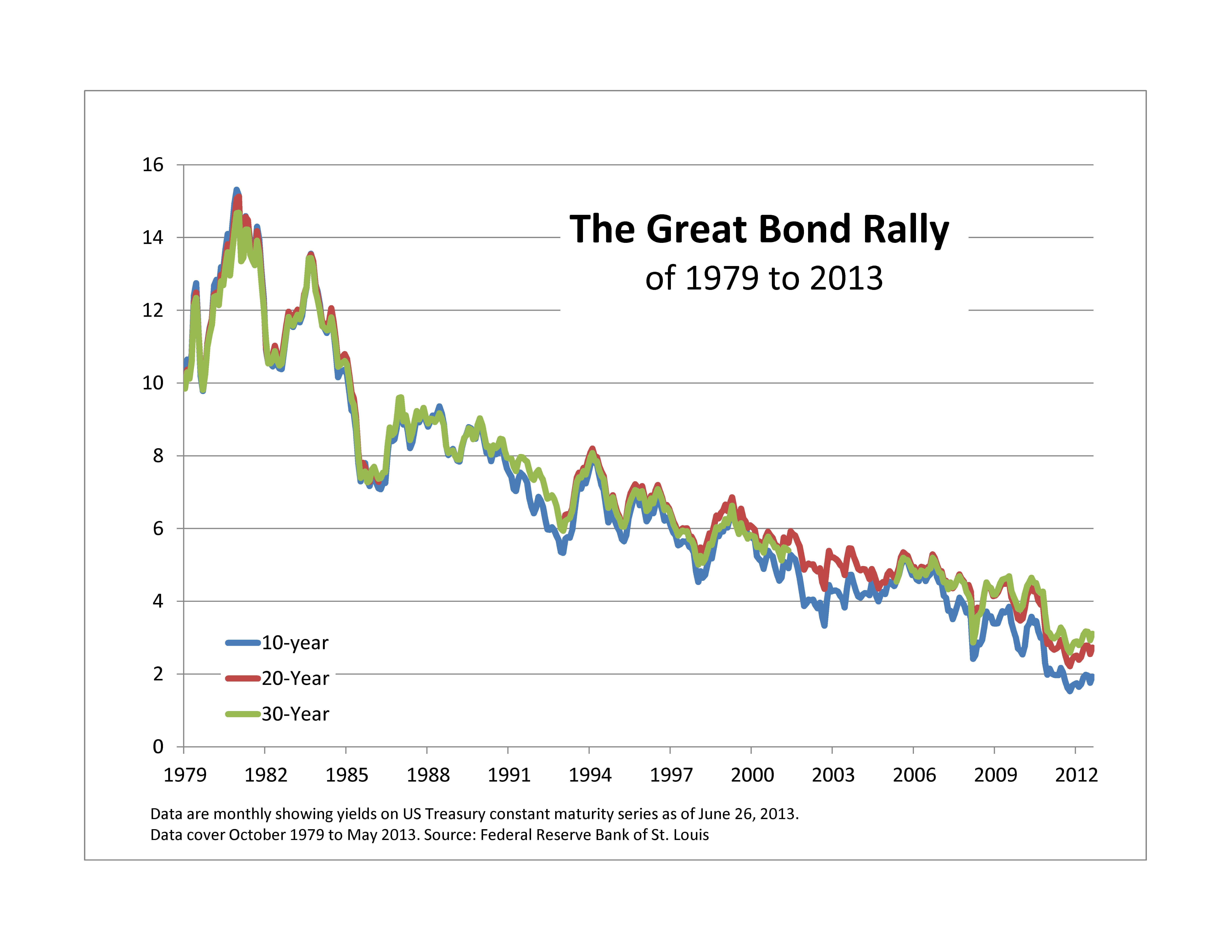
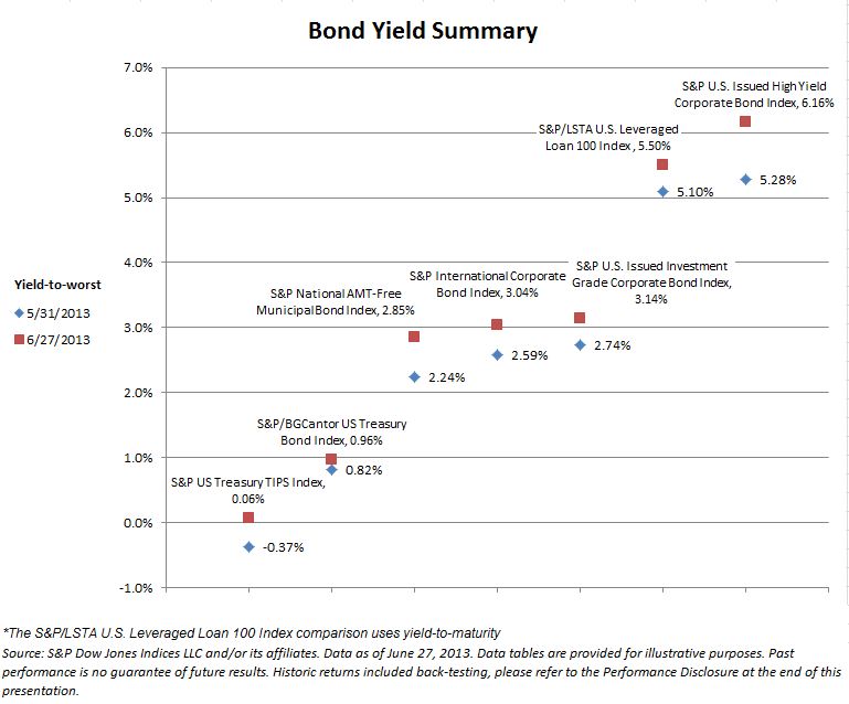
U.S. Treasury Bonds:
There are just a few hours of trading left to the month of June, but on the whole the month took its toll on fixed income products.  Treasuries, as measured by the S&P/BGCantor U.S. Treasury Bond Index, are down -0.91% for the month.  Year-to-date this index is returning -1.55%.  Yields are up across fixed income products as seen by the Bond Yield Summary Chart.

U.S. Corporate Bonds & Senior Loans:
Only giving up -0.83% for the month, the S&P/LSTA U.S. Leveraged Loan 100 Index stayed out of the fixed income fray and has returned a positive 1.99%, year-to-date.

After reaching a year-to-date low Option Adjusted Spread (OAS) of 378 bps on May 8, the spread for the S&P U.S. Issued High Yield Corporate Bond Index reversed direction.  Throughout June the spread rose and peaked on June 24 at 483 bps.  Since then it has come down to 464 bps.  On the month, the index is returning -2.79%. For the year it is at +0.92%.

The FOMC meeting took its toll on investment grade credit as well.  June 19 and 20 showed the two worst daily returns of -0.72% and -0.93%, respectively for the S&P U.S. Issued Investment Grade Corporate Bond IndexThe current month-to-date return of -2.71% will be the largest monthly loss since October of 2008’s -5.38%.

Bond Yield Summary


The posts on this blog are opinions, not advice. Please read our Disclaimers.

Remembering the Great Bond Rally

Contributor Image
David Blitzer

Former Managing Director and Chairman of the Index Committee

S&P Dow Jones Indices

Bond-Rally

The markets and the pundits are calling for an upturn in interest rates and announcing the end of the Great Bond Rally. Rather than lamenting the end of low interest artes, it is worth looking back at how we got here to consider the prospects going forward. The bond rally goes back decades to inflation rates and yields that sound impossible today. In the late 1970s inflation was well into double digits at 12% to 15%.  Though interest rates were rising, they were not quite keeping up with inflation so the real (inflation adjusted) cost of money was low and investors  rushed to buy houses and hard assets.  Despite repeated government efforts, inflation — and the damage it wrought on the economy — seemed unstoppable.  Paul Volcker, the newly appointed Fed chairman, led a sharp shift in Fed policy in October, 1979 which drove interest rates sky high, sent the economy into two back-to-back recessions and knocked inflation out.  Inflation dropped from 14.8% in March, 1980 to 2.6% in June, 1983.  The bank prime rate — the analogy to Libor today — peaked at 21% and in November of 1981 the Treasury sold 30 year bonds with a 14% coupon which out-performed the S&P 500 the next  year as bond yields collapsed  So much for ancient history.

The turmoil in 1979-81 whipped inflation and sparked the bond rally that either ended last week or, hopefully, is still with us. The chart shows how long it has run and how far yields have dropped — from 14% to 2%.  The legacy the rally is more than last week’s low yields; it is the almost complete absence of inflation.  Unlike the 1970s and early 1980s, investors don’t have to constantly worry about inflation eating into their wealth or pushing bonds yields up and bond prices down.  The result is a fixed income market that responds to monetary policy and credit conditions, allowing investors to both gauge the attractiveness and hopefully profit from different fixed income assest classes. Who would look at municipal bonds were inflation at 8%, 10% or 12%.  There is no guarantee that inflation will remain low into the future, but if investors recognize the benefits of keeping price increases in control, the odds are that the Fed and others will hold inflation in check.

The Great Bond rally may, or may not, be fading, but its legacy of low inflation is with us to the benefit of fixed income investing.

The posts on this blog are opinions, not advice. Please read our Disclaimers.

Stanley Cup Index: What happened to the holy grail?

Contributor Image
Jodie Gunzberg

Former Managing Director, Head of U.S. Equities

S&P Dow Jones Indices

Congratulations to the Chicago Blackhawks on their awesome win last night! I must admit I was very excited watching the most amazing finish I have ever seen in hockey, but as a commodity lady my first thought was about the metal in the Stanley Cup and what is it worth, especially given the current environment of a strengthening U.S. dollar and rising U.S. bond yields.

From the economic backdrop, silver and nickel, the two metals that form the cup, are the worst performing metals in their respective sectors. Year-to-date in 2013, the S&P GSCI Silver is down 35.8% and the S&P GSCI Nickel lost 20.8%. The cup is made up of 97% silver and 3% nickel, so just for fun, we thought we would chart a “Stanley Cup Index” to reflect historical levels of the alloy.

Source: S&P Dow Jones Indices. This is for illustrative purposes only and is not a real index. The data used is as of January 8, 1993 and are daily to 6/24/2013. The "Stanley Cup Index" is computed using 3% of the S&P GSCI Nickel Total return and 97% Silver Total Return index levels. Past performance is not a guarantee of future results.
Source: S&P Dow Jones Indices. This is for illustrative purposes only and is not a real index and does not intend to represent a real index. The data used is as of January 8, 1993 and are daily to 6/24/2013. The “Stanley Cup Index” is computed using 3% of the S&P GSCI Nickel Total Return and 97% Silver Total Return index levels. Past performance is not a guarantee of future results.

Who won the most valuable Stanley Cup? The last time the Chicago Blackhawks took the title, the cup had about the same value as yesterday, only slightly higher at 213 versus yesterday’s level of 205. However, while they were holding it, the index increased 153% to a high value of 538 on April 29, 2011 – just before the Boston Bruins would take it over but at a value 27% off the high at an index level of 391.  

Although our hypothetical “Stanley Cup Index” only begins 20 years ago, as far back as we have the single commodity index data for nickel, there was a time where the cup was worth more. To illustrate roughly the cup in history as far back as 1927, the first time the Cup was solely contested by National Hockey League teams, one can look at the historical silver prices on an inflation adjusted basis.  The approximate value of the original cup (100% sliver,) the historical price can be multiplied by the weight of 459.74 troy oz. According to this method, for example, yesterday the price was roughly $19.50 so the value of the cup was about $8,964.93. According to the chart, in 1979, when the Montreal Canadiens won, the value was approximately $12,307.24 and rose to a value of about $47,256.67 by Jan 1980. Not unlike the 2010-11 drop before the Bruins last won, the value of the cup dropped 55% to roughly $21,106.66 before the New York Islanders earned it.

Historical real (inflation-adjusted)  silver prices back to 1915. Each series is deflated using the headline Consumer Price Index (CPI) with a base of January 2012. Sources:  London Bullion Market Association Updated: June 25, 2013 at 8:57 AM EDT Series:historical gold prices - economic indicators
Historical real (inflation-adjusted) silver prices back to 1915. Each series is deflated using the headline Consumer Price Index (CPI) with a base of January 2012. Sources: London Bullion Market Association
Updated: June 25, 2013 at 8:57 AM EDT Series: historical gold prices – economic indicators

In both the recession of the early 80’s and post the global financial crisis of 2008, correlations spiked from an aggregate increase in demand. This only happened one other time in history post the 2001 tech-bubble bust. Stay tuned for more about correlations.

The posts on this blog are opinions, not advice. Please read our Disclaimers.

Muni Bonds Suffering in June; Worst Month Since September 2008

Contributor Image
J.R. Rieger

Former Head of Fixed Income Indices

S&P Dow Jones Indices

Investment grade municipal bonds tracked in the S&P National AMT-Free Municipal Bond Index have seen a negative total return of 4.97%  in June so far, the worst month since September 2008 when the index was down 5.13%.  The yield (Yield to worst) on bonds in the index has risen by 95bps since the end of May.

High yield municipal bonds tracked in the S&P Municipal Bond High Yield Index have seen a negative return of 7.08% for June so far, the worst month since December 2008 when the index recorded a negative return of 9.12%.  Yields of bonds in the index have risen by 88bps for the month of June so far.

Puerto Rico remains the worst performing State & Territory with the S&P Municipal Bond Puerto Rico Index down 7.63% for June so far.  The S&P Municipal Bond Illinois Index is down 4.66% and it’s California counterpart is down 5.35%.

In comparison:

The S&P U.S. Issued Investment Grade Corporate Bond Index is down 3.16% for June to date.

The S&P U.S. Issued High Yield Corporate Bond Index is down 3.46% for June to date.

The posts on this blog are opinions, not advice. Please read our Disclaimers.

"Hello Passive, goodbye active"

Contributor Image
David Blitzer

Former Managing Director and Chairman of the Index Committee

S&P Dow Jones Indices

The title is in quotes because it comes from FTFM, a supplement to the Financial Times reporting recent developments in the long running debat about active vs passive investing.

The SPIVA reports published by S&P Dow Jones Indices  show that actively managed mutual funds under-perform their index benchmarks more often than not.  For a long time this seemed to be a well kept secret. However, the rising popularity of ETFs have boosted the share of assets in passive or index-based investments.  Now comes a report that more and more investors — including active managers — are investing in passive or index-based investments.  FTFM reports that a “survey of 1001 fund management professionals — many of whom make their living promoting active products — showed that two-thirds have invested a sizeable amount of their personal savings in passive products. And 45% said they have invested a ‘significant portion’ in such funds.”

One source of the rising popularity of index investing, even among active fund managers, is the growth in strategy indices offering a wide range of investment strategies through ETFs.  While market cap weighted index funds based on the S&P 500 and other recognized indices continue to dominate the market, new ideas generate interest and attract assets.  A second reason for the growth of index investing is the fee differentials between passive and active management which favors passive investing.  Burton Malkiel who started the rush to passive investing with his book A Random Walk Down Wall Street  surveyed the field in a recent article in the Journal of Economic Perspectives.

The posts on this blog are opinions, not advice. Please read our Disclaimers.