


Meet the S&P 500 Futures Intraday Edge Indices, a dynamic index series built to react to changes in market conditions as they seek to capitalize on trends, optimize S&P 500 exposure, maintain stability and enhance growth potential.
The posts on this blog are opinions, not advice. Please read our Disclaimers.Systematic S&P 500 Strategies Targeting Stability and Growth Potential
Critical Fixed Income Considerations amid RBA’s Swift Policy Moves
Mapping Liquidity across S&P 500 Sectors
What Do the SPIVA Australia Results Imply for Active Portfolio Construction?
Return of the Macro: Declining Dispersion and Climbing Correlations
Systematic S&P 500 Strategies Targeting Stability and Growth Potential
Critical Fixed Income Considerations amid RBA’s Swift Policy Moves

In May 2022, the Reserve Bank of Australia (RBA) was among the last major central banks to begin raising interest rates during the post-COVID-19 monetary tightening cycle. In Q1 2026, the RBA is not taking any chances with inflation, becoming the first major central bank to implement two consecutive 25 bps rate hikes (in February and March), increasing the cash rate target from 3.6% to 4.1%, returning the rate to levels last seen in May 2025. The decision was driven by persistently above-target inflation and further reinforced by the disruptions in energy supply due to the ongoing conflict in the Middle East.
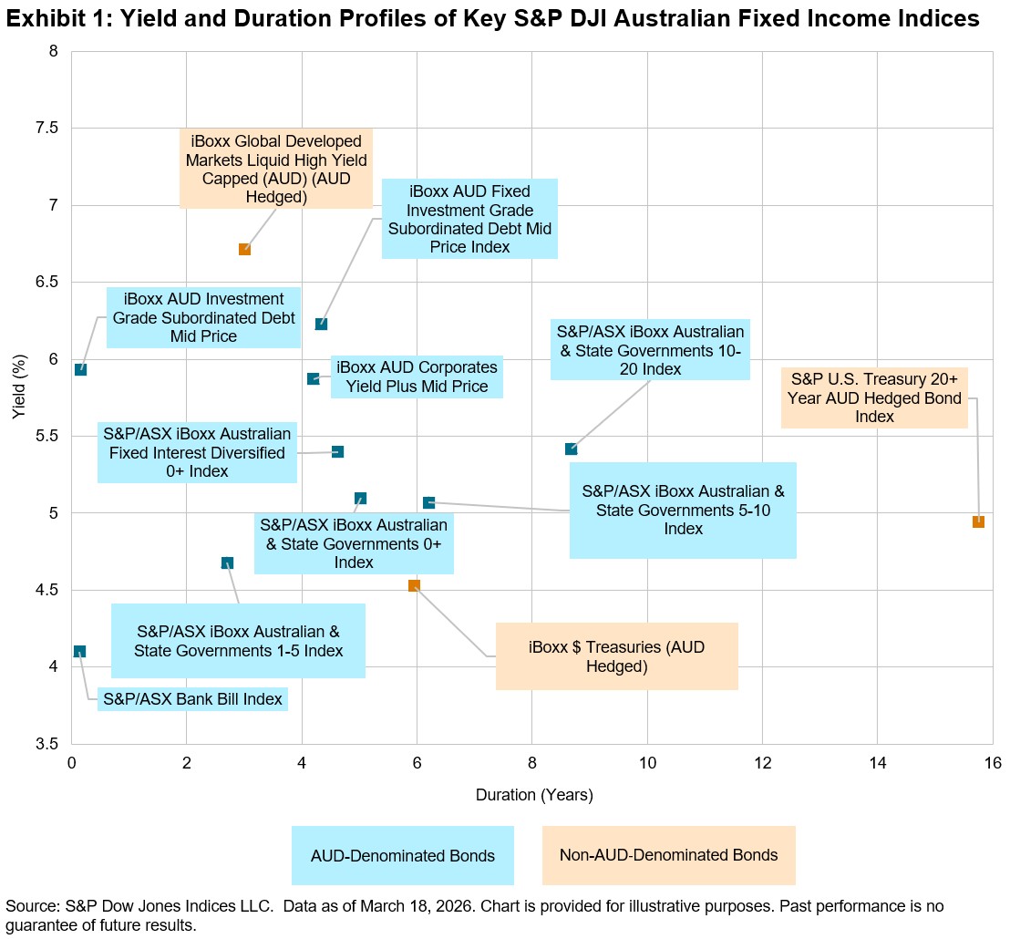
AUD Bond Yields Are above 5% Again
All of the AUD-denominated bond indices in Exhibit 1, except for the S&P/ASX iBoxx Australian & State Governments 1-5 Index, had yields above 5% as of March 18, 2026. The S&P/ASX Bank Bill Index, which generally emulates the RBA cash rate targets, had the shortest duration of 0.13 years and the lowest yield of 4.1%.
The iBoxx AUD Investment Grade Subordinated Debt Mid Price Index, which reflects floating-rate subrdinated Tier 2 instruments, had the second-shortest duration at 0.16 years and the third-highest yield at 5.93%. The ultrashort duration is due to the coupon resetting frequently (floating rate). Its fixed-rate sibling, the iBoxx AUD Fixed Investment Grade Subordinated Debt Mid Price Index, had a yield of 6.23% and duration of 4.34 years. The higher yields for both subordinated debt indices were driven by the higher credit and capital-structure risk.
With the U.S. Federal Fund Rate sitting at 3.75%, the USD Treasury indices had lower yields, between 4.5% and 5%. Even with a significantly longer duration of 15.75 years, the S&P U.S. Treasury 20+ Year AUD Hedged Bond Index yield remained below 5%, providing less than 50 bps in spread for the additional duration risk.
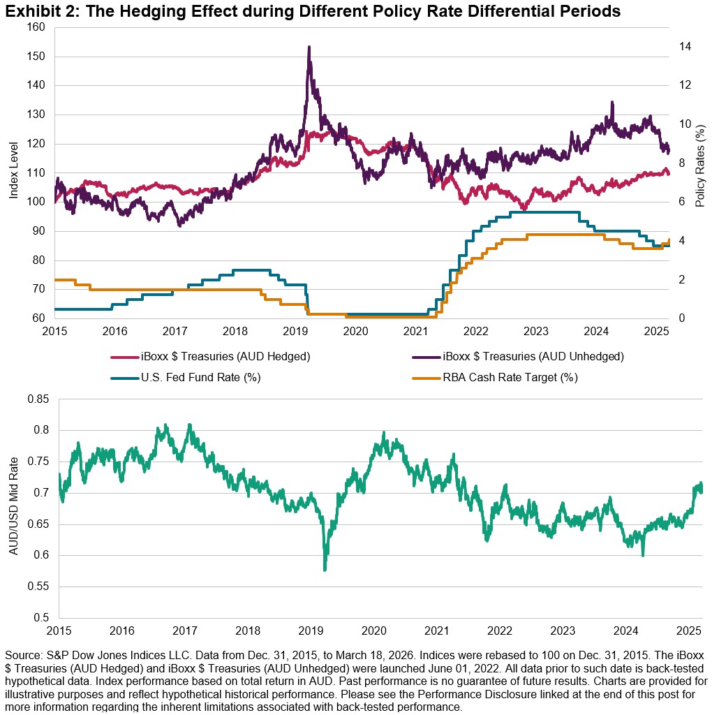
Hedging Is Increasingly Important
With the RBA cash rate at 4.1%—above the U.S. Fed Funds rate for the first time since 2017—AUD-based investors should note that this shift can impact both AUD/USD trends and FX hedging costs. Historically, the iBoxx $ Treasuries (AUD Hedged) outperformed its unhedged counterpart when AUD appreciated between 2015-2017, but unhedged returns became more volatile as AUD/USD fluctuated. Recently, as AUD strengthened since late 2025, the performance gap between hedged and unhedged indices narrowed. With higher Australian rates and rising commodity prices, the Australian dollar may continue to appreciate, making currency hedging for non-AUD exposures more crucial but also potentially more costly, meaning there may be both benefits and costs for hedging in this environment.
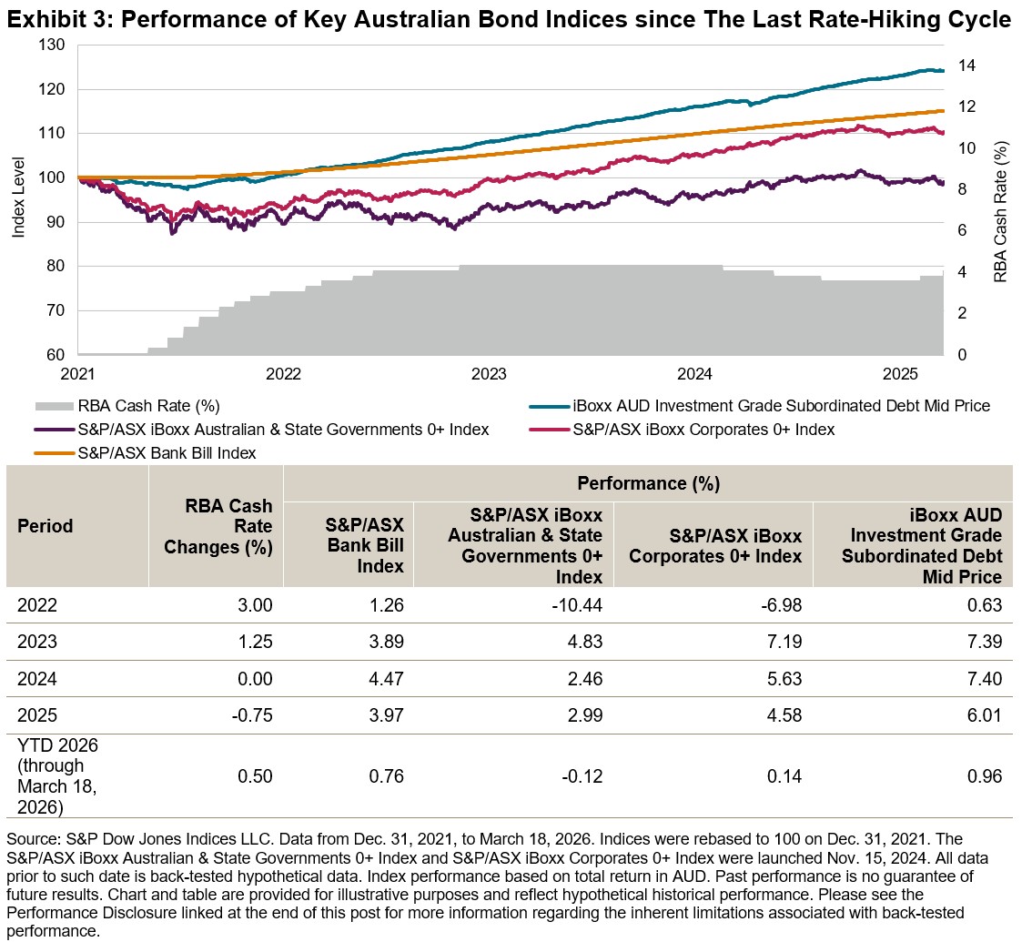
Returns since the Previous Rate Hiking Cycle
Between May 2022 and late 2023, the RBA raised the cash rate target from 0.1% to 4.35%. Over the past five years, the S&P/ASX Bank Bill Index mirrored the changes in the cash rate, delivering steady positive performance in line with policy rates (see Exhibit 3).
The S&P/ASX iBoxx Australian & State Governments 0+ Index and S&P/ASX iBoxx Corporates 0+ Index underperformed the S&P/ASX Bank Bill Index due to their longer duration and greater sensitivity to rising rates. However, higher yield (carry) from corporate bonds allowed the S&P/ASX iBoxx Corporates 0+ Index to outperform the S&P/ASX iBoxx Australian & State Governments 0+ Index every year reflected in Exhibit 3.
Frequent coupon resets from the floating rate structure of the iBoxx AUD Investment Grade Subordinated Debt Mid Price Index constituents helped limit interest rate risk and volatility, while higher yields from additional credit and capital structure spreads boosted performance—delivering a total return of 24.22% since Dec. 31, 2021.
As the RBA embarks on yet another monetary policy tightening cycle to combat inflation, understanding how these indices performed previously can provide valuable insights for navigating this current environment.
Mapping Liquidity across S&P 500 Sectors

- Categories Equities
- Tags 2026, ETPs, futures, IIS, liquidity, Liquidity Monitor, S&P 500, sectors, US FA
Trading linked to S&P 500® sectors has expanded meaningfully in recent years, as market participants increasingly use sector instruments to allocate capital, hedge risk and express relative views within U.S. equities. As participation in index-linked markets has grown, liquidity has become an informative signal, revealing where attention is focused and how risk is being transferred. The U.S. Sector Dashboard’s new Liquidity Monitor brings these dynamics together, providing a structured framework for analyzing trading across S&P 500 sectors, combining volume composition with evolving trends across exchange-traded products (ETPs) and futures.
Sector-based instruments have long been embedded in the S&P 500 trading ecosystem, but their role continues to deepen.1 Used across strategies, from long-term allocation and rotation to short-term tactical positioning and hedging, these tools now sit within a steadily expanding liquidity environment. As shown in Exhibit 1, aggregate trading across S&P 500 sector ETPs and futures has climbed, with USD 480 billion traded in February 2026. This sustained growth indicates sector rotations are unfolding within a robust trading environment, where positioning is increasingly expressed through sector products.
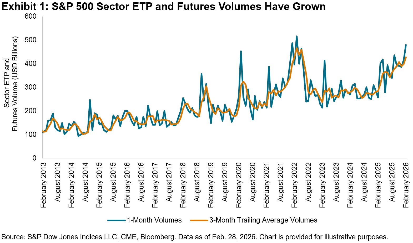
Raw trading volumes offer a first look at market activity, but on their own they can mask underlying shifts in participation. The monthly data in Exhibit 1 highlights a recurring rhythm in sector trading, driven in part by futures contract rolls, that can distort month-to-month comparisons. Smoothing techniques, such as trailing averages, help filter out short-term noise and reveal a clearer view of underlying liquidity trends.
To isolate these fundamental shifts more precisely, the Liquidity Monitor applies seasonal adjustment ratios based on historical patterns. These adjustments scale trading activity according to typical changes observed at similar points in prior quarters, using a 20-quarter rolling window. Exhibit 2 shows that futures volumes tend to peak in the third month of each quarter, averaging roughly 2.82 times the level observed earlier in each quarter. Accounting for this behavior helps distinguish meaningful changes from seasonal effects.
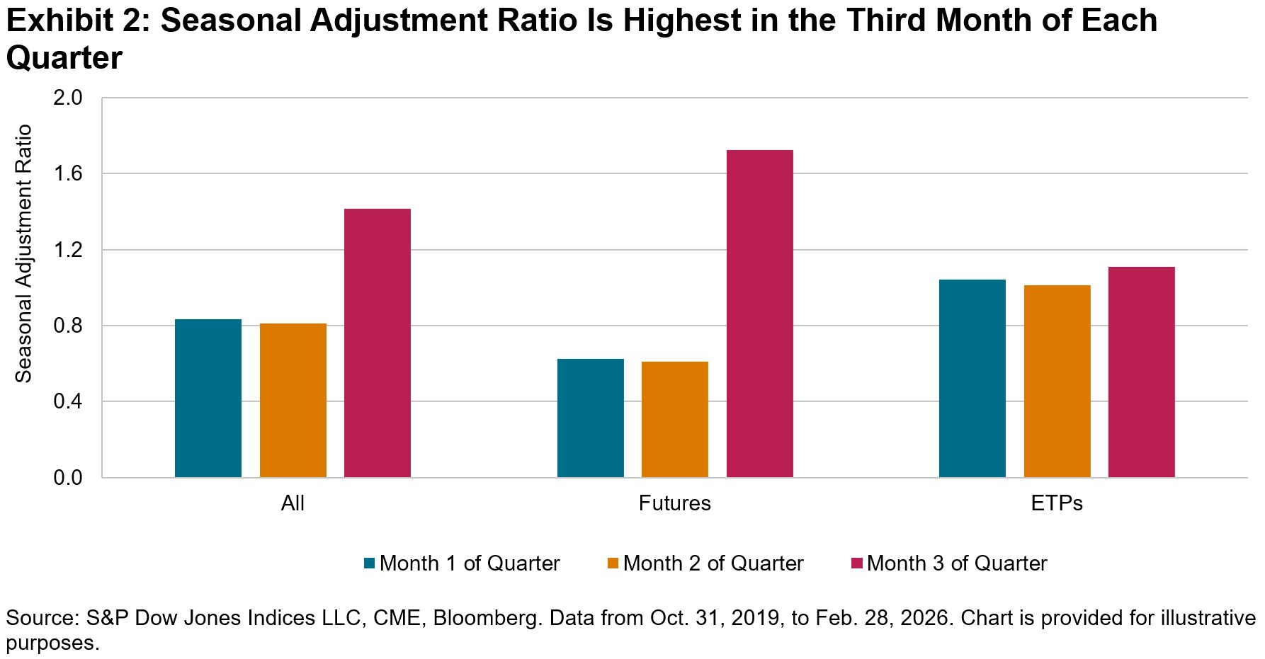
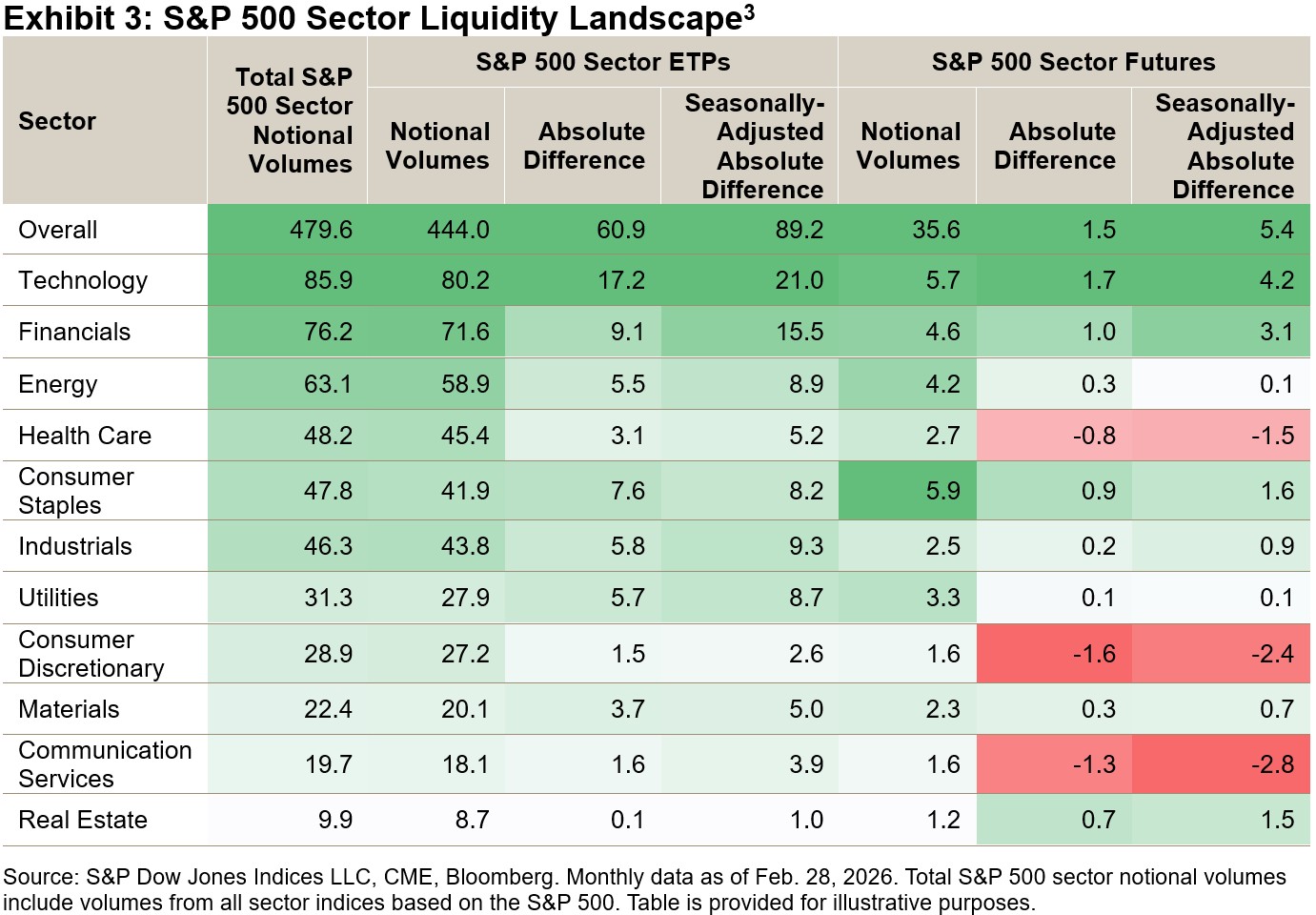
Exhibit 3 shows raw notional volumes and the monthly absolute differences for both raw and seasonally adjusted notional volumes across S&P 500 sector ETPs and futures. In February 2026, total sector volumes increased, driven by Technology, Financials and Energy. ETP volumes rose broadly, while futures activity declined in Health Care, Consumer Discretionary and Communication Services.
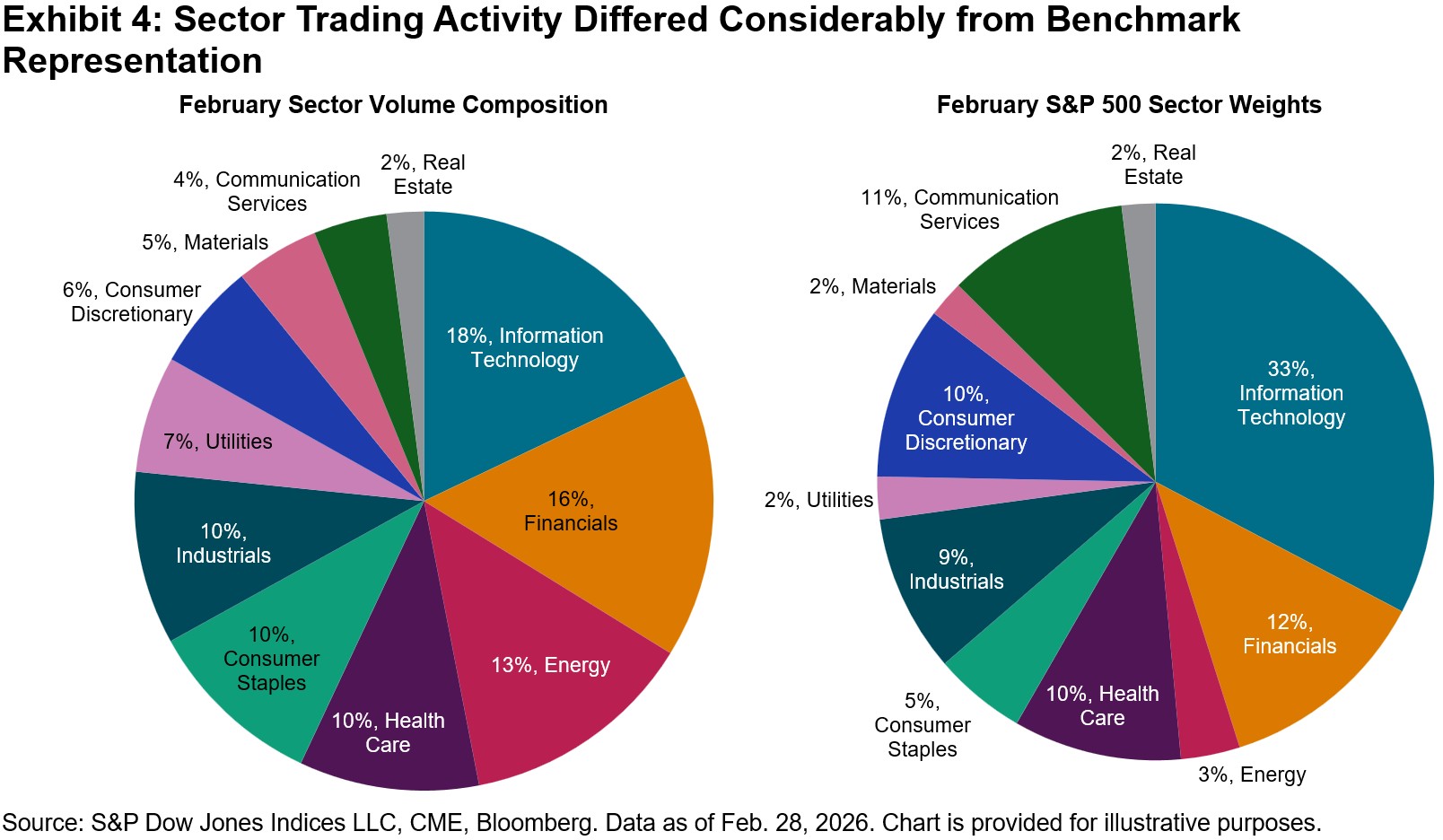
Beyond changes in volumes, comparing trading activity with sector weights in the S&P 500 offers additional perspective on the balance between participation and investment. As shown in Exhibit 4, Energy’s share of trading was roughly 10% above its index weight in February, while Information Technology’s was notably 15% below what its larger market capitalization would suggest. These differences highlight where liquidity, activity and investor engagement are most focused, both in absolute and relative terms.
Taken together, measures of trading activity and sector composition provide a structured lens for interpreting liquidity across S&P 500 sectors. By linking trading patterns with broader market dynamics, the Liquidity Monitor helps identify where participation is building and how sector-level activity is evolving within the S&P 500 ecosystem. For additional insights, check out our U.S. Sector Dashboard.
1 Edwards, Tim et al, “Active and Passive Harmonics: Trading Frequencies of Index-Linked Products,” Journal of Beta Investment Strategies, Winter 2024.
2 Calculated as the ratio of the seasonal adjustment factor for futures during the third month of the quarter to the average of the first- and second-month factors.
3 Find more information on S&P 500 sectors indices here.
The posts on this blog are opinions, not advice. Please read our Disclaimers.What Do the SPIVA Australia Results Imply for Active Portfolio Construction?

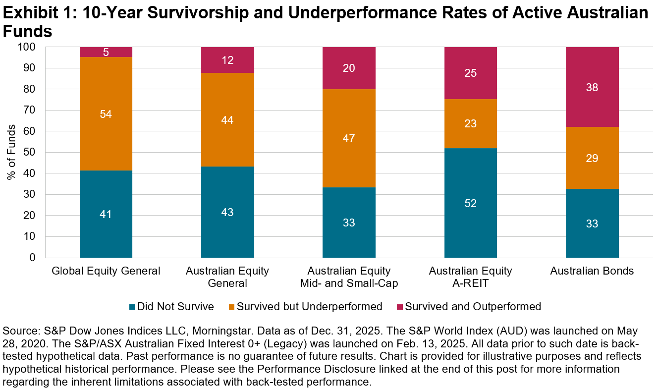
Our latest SPIVA® Australia Scorecard underscored the challenges that Australian active funds faced in converting a favorable stock-picking environment into meaningful results in 2025. Among the 831 active equity funds domiciled in Australia that we examined—spanning global equity, domestic equity and REITs—over two-thirds (570 funds) underperformed their category benchmarks. In contrast, active Australian bond funds extended their strong performance, with a majority outperforming for the third consecutive year. While the performance of active funds may fluctuate in the short term, longer-term results have remained disappointing across all categories, with many funds either underperforming or failing to survive (see Exhibit 1).
In practice, investors and advisors construct portfolios by selecting and allocating across multiple funds, and strong performance from just one active fund could more than compensate for lagging performance by others. Our latest research1 examines how portfolios of active funds stacked up against similarly weighted blends of indices. An analysis of hypothetical multi-asset portfolios of active funds domiciled in the U.S. revealed similar challenges: 96.9% of 60/40 equity/bond portfolios of U.S. active funds would have underperformed the equivalent index blend over 10 years.
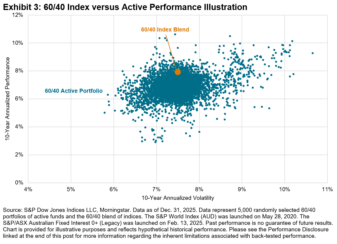
How would Australian investors have fared if they selected active Australian funds to build a multi-asset portfolio? To answer this question, we simulate portfolio construction by randomly selecting funds from the four major fund categories2 included in the SPIVA Australia Scorecard (see Exhibit 2). We then assign fixed weights to the four chosen active funds—specifically 30% in the Global Equity General fund, 24% in the Australian Equity General fund, 6% in the Australian Equity Mid- and Small-Cap fund, and 40% in the Australian Bonds fund—to build a hypothetical 60/40 equity/bond portfolio. These weightings were heuristically chosen to reflect the typical home bias among Australian investors, with equal weightings in global equity and domestic equity, while the allocation between domestic general equity and mid- and small-cap equity (at a 4:1 ratio) is based on their benchmark market capitalizations. The same weights are applied to the hypothetical blend of comparison indices, and both the active portfolio and index blend are rebalanced every 12 months.3
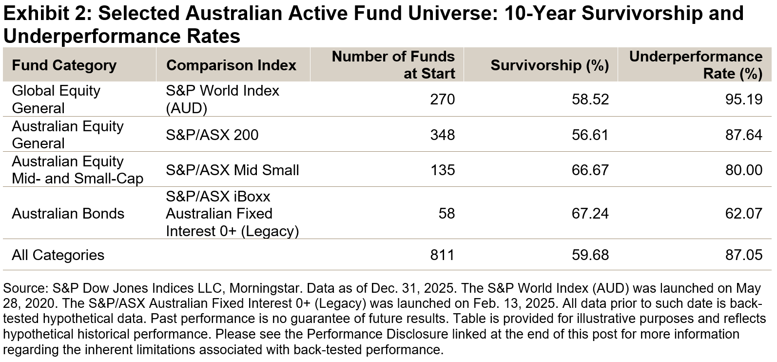
In cases where the selected active fund ceased to exist within the span of 10 years—which happened quite often as evidenced by the survivorship rates in Exhibit 2—the benchmark performance was assigned to that fund category from that month forward to the end of the 10-year period.4 We performed 5,000 simulations and their 10-year performance and volatility are shown in Exhibit 3, in comparison to the equivalent index blend.
The key observations from this analysis:
- Over the 10-year period, 91.4% of 60/40 portfolios of Australian active funds would have underperformed the equivalent index blend on an absolute return basis. This underperformance rate is lower than that of the Global Equity General category but higher than that of the other three fund categories (see Exhibit 4).
- The average performance (annualized) of active portfolios was 6.94%, well below 7.91% for the index blend.
- The average volatility of active portfolios was 7.51%, similar to 7.50% for the index blend.
- On a risk-adjusted return basis, 98.0% of 60/40 active portfolios would have underperformed the equivalent index blend.
- 85.8% of active portfolios contained at least one fund that merged or liquidated within the 10-year span.
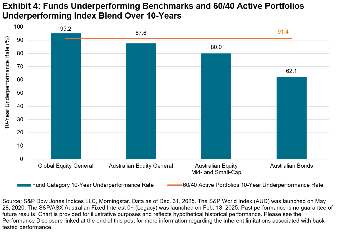
S&P DJI’s SPIVA Scorecards have provided the Australian community with a data-driven perspective on the prospects for selecting active funds that outperform benchmark performance. This new analysis highlights equally significant challenges for Australian portfolio building. When a majority of active funds underperformed their benchmarks across different asset classes and segments, portfolios comprising these funds also tended to underperform blends of indices, with an even higher probability.
1 Edwards, Tim and Nelesen, Joseph. “Heroes in Haystacks: Index Comparisons for Active Portfolio Performance” S&P Dow Jones Indices. December 2025.
2 Note that the Australian Equity A-REIT category is excluded due to the relatively smaller size of this segment. As of Dec. 31, 2025, index market capitalization was AUD 120,910 billion for the S&P World Index, AUD 2,648 billion for the S&P/ASX 200, AUD 665 billion for the S&P/ASX Mid Small, AUD 1,711 billion for the S&P/ASX iBoxx Australian Fixed Interest 0+ (Legacy) and AUD 173 billion for the S&P/ASX 200 A-REIT.
3 S&P Dow Jones Indices is not a registered investment advisor and does not provide investment or other advice. In this analysis, fund category selection, fund combinations and weightings, are intended to represent broad allocations—not as a suggestion or endorsement of any fund recommendation. Instead, we employ a heuristic approach to approximate the fund allocation process and to estimate the hypothetical performance of a portfolio of Australian active funds compared to similarly weighted blends of indices over the long term.
4 Replacing a liquidated fund with the benchmark performance in the months subsequent to its demise has a positive impact on average active portfolio performance, relative to leaving the subsequent months empty with no return during the examined period.
The posts on this blog are opinions, not advice. Please read our Disclaimers.Return of the Macro: Declining Dispersion and Climbing Correlations

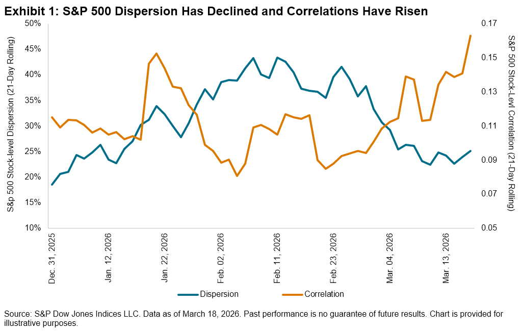
As we approach the end of the first quarter, the S&P 500® is down 3% QTD, and underneath the surface, there have been significant crosscurrents at play. Concerns about the impact of AI on software companies have been prevalent, with the S&P Software & Services Select Industry Index down 20% QTD, while chipmakers have remained relatively resilient, with the S&P Semiconductors Select Industry Index up 2%. As investors have grappled with the winners and losers of these technology changes, S&P 500 stock-level dispersion, which is a measure of cross-sectional volatility, rose through the first two months of the year,1 peaking at 38% on Feb. 27, 2026.
However, the tide has turned since the beginning of March. Investors globally have shifted their focus toward the war with Iran, and the impact of rising oil prices and corresponding inflation concerns across sectors have permeated the market. In other words, it seems that idiosyncratic risks have taken a back seat to macro risks. This shift has been reflected across the market’s volatility landscape, with S&P 500 stock-level dispersion declining to 25% as of March 18, 2025. Meanwhile, stock-level correlations, while still low by historical standards, have risen accordingly.
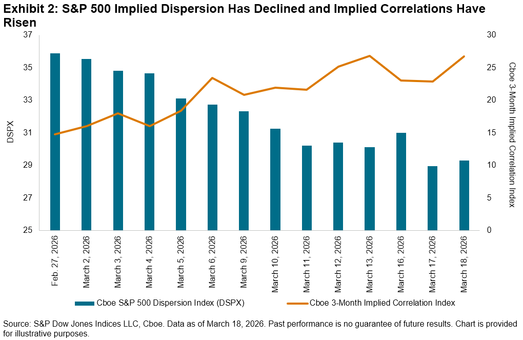
In addition to assessing observed large-cap dispersion and correlation, we can also analyze the market’s expectations of dispersion and correlation in the months ahead. The Cboe S&P 500 Dispersion Index (DSPX), which measures expected dispersion using listed options, has declined steadily from a high of 35.9 on Feb. 27 to 29.3 on March 18. Implied correlations, on the other hand, have generally risen during the same timeframe. Therefore, it appears that the market may continue to expect broader market concerns to be heightened compared to company-level risks.
Dispersion and correlation are both components of market volatility, which we explore in Exhibit 3 to offer additional perspective. Despite the recent decline in dispersion, rising correlations2 have led to a slight rise in realized S&P 500 index volatility since the end of February. Implied volatility, as measured by the Cboe Volatility Index (VIX®), has also ticked up.
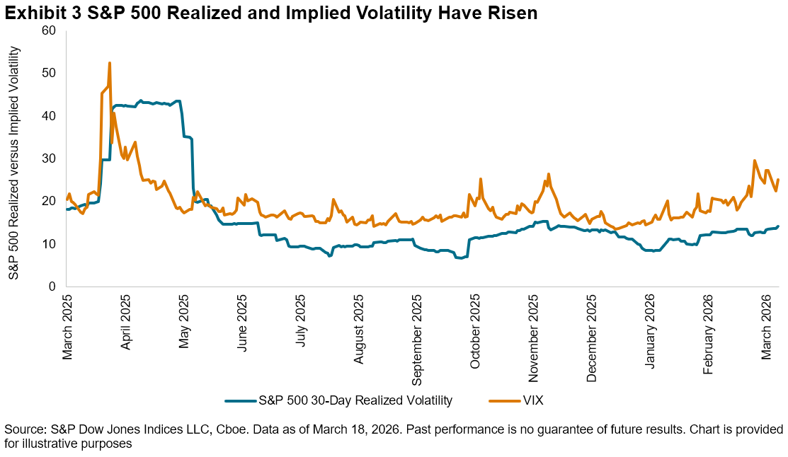
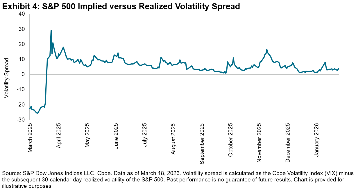
More notably, the spread between the two measures, or volatility premium, can be an indicator of the extent of continued geopolitical uncertainty. The current S&P 500 volatility premium of 3.9 volatility points as of Feb. 3, calculated as VIX minus the subsequent 30-calendar day realized volatility of the S&P 500, while still low compared to recent history, is slightly higher than the historical average of 3.3 observed over the past 20 years.3
As the market wrestles with worries about economic growth, a weakening job market and AI-related concerns, the evolving geopolitical backdrop looms in the background. Understanding the market’s shifting volatility landscape might help investors navigate these turbulent times.
1 Pitcher, Jack. “A Market Frenzy Is Lurking Beneath Those Calm Stock Indexes,” Wall Street Journal, March 3, 2026.
2 For details on the interaction of dispersion and correlation to create volatility, see: Edwards, Tim and Craig J. Lazzara. “At the Intersection of Diversification, Volatility and Correlation,” S&P Dow Jones Indices LLC, April 2014.
3 For more details on the volatility premium in options, see: Lee, Sue, Tim Edwards and Parth Shah. “Defining Paths with Options-Based Index Strategies,” S&P Dow Jones Indices LLC, Feb. 24, 2026.
The posts on this blog are opinions, not advice. Please read our Disclaimers.