Get Indexology® Blog updates via email.

In This List

Rallies, Records and Relentless Restlessness: A Tale of Markets in 2025

Factors for All Markets

Tracking the Mid-Cap Equity Sweet Spot

The S&P USD Select Leveraged Loan Index: A Comprehensive Approach to the Leveraged Loan Market

High Dividend Yield Meets Quality: Introducing the S&P 500 Quality FCF High Dividend Index

Rallies, Records and Relentless Restlessness: A Tale of Markets in 2025

Contributor Image
Benedek Vörös

Director, Index Investment Strategy

S&P Dow Jones Indices

As 2025 draws to a close, U.S. large caps boast impressive gains: after a rocky start that saw a 19% drawdown, the S&P 500® is up 18% including dividends, as of Dec. 12, significantly above its annualized total return of 10.8% since inception in 1957. The U.S. bellwether also recorded 37 all-time highs this year.

The largest of blue chips continued to drive The 500®, although the index’s performance this year has been less top heavy than in 2024: year-to-date, the top 20 stocks by market capitalization contributed 61% of returns, less than last year’s 68%. Nevertheless, this year’s statistics are still on the high side in a historical context.

As a consequence of their robust returns in recent years, the weight of the 20 largest stocks in The 500 has increased from 37% to 48% since 2020. That said, mega caps earned the increase in their weights: their combined contribution to S&P 500 forward earnings rose from 32% to 42% over the past five years. Thus, the ratio of the top 20 stocks’ index weight to their projected share of S&P 500 net income was unchanged from 2020 to Q3 2025.

Turning to markets outside of U.S. large caps, gold’s performance immediately stands out both in absolute terms and relative to its own historical returns. The yellow metal soared 62% this year compared to a compound annual return of 7% over the previous 30 years, placing this year’s performance more than three standard deviations above the historical average. The S&P Developed Ex-U.S. BMI also had an exceptionally strong year: its 33% performance, including dividends, is over one standard deviation above its 30-year average of 6%. U.S. small caps, on the other hand, have had a slightly below-average year, up just 9% YTD.

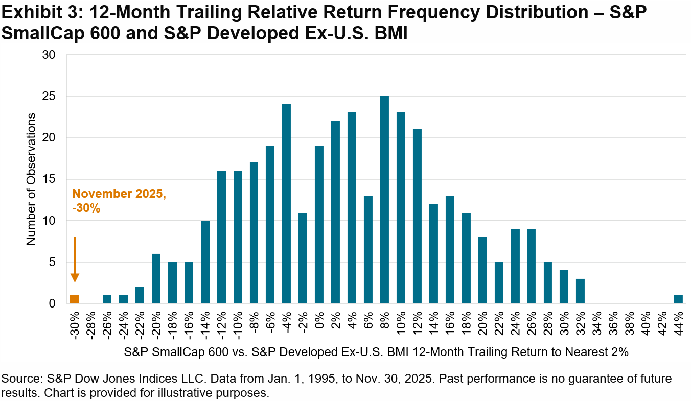
The combination of strong developed ex-U.S. performance and below par U.S. small-cap performance culminated in a significant differential between these two segments over the past 12 months. By the end of November, the S&P SmallCap 600® trailed the S&P Developed ex-U.S. BMI by 30%, the most of any 12-month period since January 1995.

Despite this year’s strong run for developed non-U.S. equities, their valuation has remained more compelling relative to the U.S.: the S&P World Ex-U.S. Index is currently trading at a forward price/earnings (P/E) ratio of 16.7, a discount of 9 points compared to U.S. equities. Many European equity markets are even cheaper, with Italy, Spain and the U.K. all trading below a P/E multiple of 15 as of the end of Q3 2025.

Notwithstanding this year’s impressive returns, some market watchers may feel as I do—although the scoreboard is telling a different story, the year felt volatile and even like a downturn. Such sentiment makes sense in one respect: as the S&P 500 continued to rise, there was never any real let-up in tension during the year; trade-related worries gave way to concerns about the labor market, which then shifted to questions about the payoff of AI-related corporate investments. Exhibit 2 illustrates the lowest end-of-day VIX® reading for each calendar year dating back to 2000. In 11 of the past 13 years, VIX dipped below its long-term mode of 14 at least once, but this year, we never saw that kind of breather.

As 2026 approaches and the Q4 2025 corporate earnings season draws closer, it remains to be seen whether developed ex-U.S. equities will continue to benefit from their lower valuation relative to U.S. markets or whether the coming year will mark a reversal of relative performance in global equity markets. In any case, attempting to forecast market outcomes for 2026 may prove futile, as the best guess of future returns is not dictated by the most recent past.

The posts on this blog are opinions, not advice. Please read our Disclaimers.

Factors for All Markets

Contributor Image
Euan Smith

Quantitative Analyst, Index Investment Strategy

S&P Dow Jones Indices

Recently, much of the financial media has been occupied with discussing the potential of a bubble in markets. Some have compared the current sentiment to the “animal spirits” of the late 1990s.1 Proponents of this view cite stretched valuations, retail-driven speculation and the circularity of transactions as evidence to support their claims. Whether or not one gives credence to these comparisons, understanding how different single- and multi-factor indices behave in such environments can help participants navigate conditions in a way that aligns with their level of conviction.

Factor performance can vary widely across regimes, particularly during periods marked by exuberance or correction. Reviewing S&P 500® Factor Indices through time highlights this fluctuation. First, observing the period from the mid-1990s to the peak of the first tech bubble in 2000, Exhibit 1 shows the performance of The 500® alongside the S&P 500 Quality Index, S&P 500 Enhanced Value Index and S&P 500 Momentum Index.

The back-tested data in Exhibit 1 shows that, prior to the bursting of the bubble, the S&P 500 Momentum Index was by far the best performer, while the S&P 500 Quality Index also outperformed The 500 and the S&P 500 Enhanced Value Index materially underperformed as growth-oriented stocks led the market upward.

In contrast, Exhibit 2 shows the back-tested performance of the same four indices in the period following the peak. The S&P 500 Enhanced Value Index was the strongest performer by a wide margin, while the S&P 500 Momentum Index struggled. The S&P 500 Quality Index again outperformed The 500, which remained nearly flat during the first part of its “lost decade.”

Finally, Exhibit 3 shows more recent performance, from January 2020 to November 2025. Compared with The 500, the S&P 500 Momentum Index has significantly outperformed, the S&P 500 Quality Index has also outperformed and the S&P 500 Enhanced Value Index has underperformed. This bares similarities to the late 1990s, though less extreme.

Exhibits 1-3 illustrate how factor performance can vary significantly across market regimes. Some may look to factor indices as short-term measures of performance. Others may view one, or several, factor indices for the long term, citing evidence of their risk and/or behavioral premia, while understanding the associated tracking error.

For those less enthused by the prospect of significant deviation from The 500’s performance, the S&P 500 Quality, Value & Momentum (QVM) Top 90% Multi-factor Index may be interesting. The index measures the performance of S&P 500 constituents after excluding the bottom 10% with the lowest combined quality, value and momentum multi-factor score, thus exhibiting some loading on each factor. Exhibit 4 shows that this approach has historically outperformed The 500 while maintaining low tracking error and lower volatility than The 500, S&P 500 Enhanced Value Index and S&P 500 Momentum Index.

No matter the view taken on whether or not the current market is a bubble akin to the late 1990s, our single- and multi-factor indices can assist in navigating all markets.

1 See: Makortoff, Kalyeena. “Bank of England warns of growing risk that AI bubble could burst.” The Guardian. Oct. 8, 2025; Wigglesworth, Robin. “The AI bubble has reached its ‘fried chicken’ phase.” The Financial Times. Oct. 31, 2025; and “Why Fears of a Trillion-Dollar AI Bubble Are Growing.” Bloomberg. Nov. 24, 2025.

The posts on this blog are opinions, not advice. Please read our Disclaimers.

Tracking the Mid-Cap Equity Sweet Spot

Is there a mid-cap equity sweet spot? Take a fundamental look at the S&P MidCap 400, including key performance drivers, sector and revenue exposures, as well as a new sustainability screened index built on the S&P 400 with State Street Investment Management’s Ryan Reardon and S&P DJI’s Hamish Preston. 

The posts on this blog are opinions, not advice. Please read our Disclaimers.

The S&P USD Select Leveraged Loan Index: A Comprehensive Approach to the Leveraged Loan Market

Contributor Image
Eric Pettinelli

Fixed Income Specialist, Index Investment Strategy

S&P Dow Jones Indices

The S&P USD Select Leveraged Loan Index is a new entrant in the leveraged loan landscape, developed to fill a critical gap in existing liquid leveraged loan index offerings that typically focus on the largest loans by market capitalization. This innovative index encompasses all USD-denominated fully funded term loans with a minimum facility size of USD 500 million and credit ratings below investment grade, providing a broader view of the market.

As the U.S. leveraged loan market surged to an estimated USD 1.5 trillion in July 2025, the diversity of borrowers expanded significantly, incorporating a wide range of loan types, credit qualities, spreads, covenants and other characteristics. This variety is often not fully captured when analyzing only the top 100 largest loans in the market. The back-tested performance of the index was positive over the last five years, as showcased in Exhibit 1.

This index not only provides a more holistic and representative view of the liquid leveraged loan market by including loans of USD 500 million and above, but also enhances sector diversification and risk/performance profile with a total of 930 constituents ending October 2025.

Examining the credit quality characteristics of loans beyond the top 100 by notional index value offers deeper insights into the broader market. These insights include tracking defaults of underlying loans, which serve as crucial early warning signs in the leveraged loan ecosystem—information that may be missed when focusing solely on the largest loans.

Additionally, potential risks such as credit deterioration become more evident with a larger dataset, allowing investors and market observers to make more informed decisions. The index also incorporates higher spreads into the overall mix, driven by the inclusion of smaller loans and lower average credit quality. Exhibit 2 illustrates the difference in credit quality between the top 100 loans in the S&P USD Select Leveraged Loan Index and the rest of the constituents as of October 2025.

The effects of broader loan inclusion also extend to sector profile, as the addition of lower notional value loans provides access to a wider array of business types within the index, as shown in Exhibit 3.1 For an index that focuses on including lower credit quality borrowers, diversifying across industries can have a positive effect, not only for encompassing additional sources of performance but also for moderating risk.

In summary, the S&P USD Select Leveraged Loan Index offers a benchmark for measuring larger loans within the leveraged loan universe, without sacrificing the risk/performance balance and diversification qualities that result from the additional inclusion of smaller issuances. As the leveraged loan market continues to evolve and expand, indices that adopt a comprehensive view of the leveraged loan market will serve as essential tools for more informed investment decisions.

1 The S&P USD Select Leveraged Loans Index follows the iBoxx Industry Classification Standard (iBICs). For further details, please see https://www.spglobal.com/spdji/en/landing/topic/ibics/

The posts on this blog are opinions, not advice. Please read our Disclaimers.

High Dividend Yield Meets Quality: Introducing the S&P 500 Quality FCF High Dividend Index

Contributor Image
George Valantasis

Director, Factors and Dividends

S&P Dow Jones Indices

The recently launched S&P 500® Quality FCF High Dividend Index measures high-dividend stocks supported by strong free cash flow (FCF), offering an approach that blends income generation and financial resilience. Companies that consistently generate excess cash may be better equipped to sustain and grow dividends, even during periods of market stress. This focus on income and FCF strength offers a framework for identifying healthier, more dependable companies with higher yields. In this blog, we will explore the index’s methodology, performance characteristics, dividend yield and positioning.

Methodology Overview

The index first excludes any company that has not maintained dividend payments for at least five consecutive years. Remaining constituents are then ranked by their FCF score, a composite of FCF margin and FCF return on invested capital (ROIC). These metrics reflect how efficiently revenue is converted into FCF (FCF margin) and how effectively capital is deployed to generate that cash (FCF ROIC). The top 50% of companies within each sector are selected to help ensure broad sector representation. From this subset, the 100 companies with the highest dividend yield are chosen and weighted according to their dividend yield. Exhibit 1 shows a snapshot of the index methodology.

Performance Comparison

Exhibit 2 illustrates that since April 2001, the S&P 500 Quality FCF High Dividend Index has outperformed the S&P 500 on both an absolute and risk-adjusted basis. On an absolute basis, it has delivered an annualized return of 10.35%, compared to 9.22% for the S&P 500. The index has also maintained comparable upside participation while offering stronger downside protection, as reflected in its upside and downside capture ratios of 95.9 and 85.7, respectively.

Dividend Yield Comparison

Exhibit 3 illustrates that, as of Oct. 31, 2025, the S&P 500 Quality FCF High Dividend Index had a yield of 3.59%—more than three times the S&P 500’s current yield of 1.15%. Exhibit 4 further highlights that the resulting 2.44% yield spread sits in the 97th percentile since 2002, surpassed only during major market declines in February 2009, March 2020 and briefly in June 2024.

Defensive Characteristics

Exhibit 5 ranks the S&P 500’s historical monthly returns, groups them into quintiles from highest to lowest and then calculates the S&P 500 Quality FCF High Dividend Index’s average excess return within each quintile. This analysis highlights the index’s defensiveness: in the bottom quintile—when the S&P 500 delivered its weakest monthly returns—the index outperformed by an average of 0.8%.

Sector Comparison

Exhibit 6 shows that combining FCF-based quality metrics with high dividend yield has produced a broadly balanced sector profile on average, with 8 of the 11 GICS sectors staying within ±5% of the S&P 500 over the full period. The index currently exhibits meaningful overweights in Consumer Staples, Energy and Financials, and a notable underweight in Information Technology. This tech underweight likely reflects elevated sector valuations, which tend to suppress dividend yields and reduce representation in yield-focused strategies.

Conclusion

The S&P 500 Quality FCF High Dividend Index stands out as a distinctive dividend strategy, thanks to its methodology that combines FCF-based quality metrics with a focus on dividend consistency and high yield. Its historically wide yield spread relative to the S&P 500 is particularly relevant given the current market environment of anticipated rate cuts.1 Over the long term, the index has outperformed the S&P 500, exhibited defensive qualities and maintained a more balanced sector profile than a typical dividend strategy.


1 https://www.atlantafed.org/cenfis/market-probability-tracker

The posts on this blog are opinions, not advice. Please read our Disclaimers.