The S&P 500® and the Dow Jones Industrial Average® (DJIA) are two of the best known and most used indices in the world. They are both designed to represent U.S. large-cap companies. As we detailed in a recent paper, the S&P 500 and DJIA have similar long-term risk/return profiles. As of April 30, 2021, the DJIA posted a slightly higher 30-year annualized return of 11.16%, relative to 10.60% for the S&P 500. In addition, the three-year rolling correlation between the index returns was high, averaging 0.95 from April 1993 to April 2021.
However, when we look under the hood, we can see that these iconic indices followed different paths to achieve similar results. The S&P 500 currently includes 505 constituent companies, whereas the DJIA only has 30. They also employ different weighting schemes. The S&P 500 is float market capitalization weighted. This means that the weight of each stock depends on the total size of the company, adjusted for shares that do not trade publicly. In contrast, the DJIA is price weighted, so the stock weights are determined simply by their price.
Here we will highlight three key takeaways from the paper.
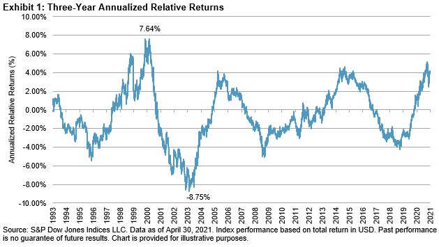
The Two Indices Have Experienced Cycles of Relative Performance
In Exhibit 1, we have charted the three-year annualized relative returns between the S&P 500 and the DJIA. During periods when the blue line is above zero, the S&P 500 had outperformed the DJIA over the preceding three years. During the period of the tech bubble burst from June 2000 to June 2003, the S&P 500 significantly underperformed the DJIA. Part of this underperformance was due to the S&P 500 having a higher weight in the Information Technology sector.
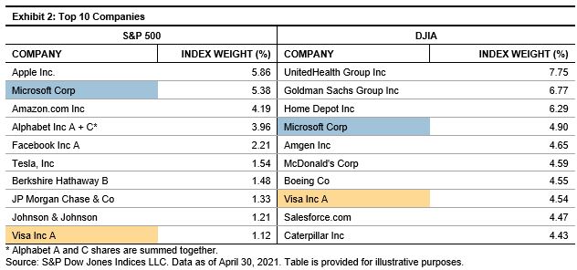
The Top 10 Holdings of the Two Indices Are Quite Different
An analyst who first reviewed the top 10 companies in the S&P 500 and DJIA would not guess that the indices have performed similarly over the long term. As shown in Exhibit 2, as of April 30, 2021, there were only two names in common in each list—Microsoft and Visa. In the paper, we walk through the details of how the weight of Microsoft is calculated for each index.
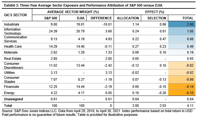
The Indices Have Provided Different Sector Exposures, Which Can Result in Meaningful Return Discrepancies in the Medium Term
Over the three-year period ending April 30, 2021, the S&P 500 outperformed the DJIA by 4.11% annualized. Exhibit 3 shows the results of a three-year Brinson performance attribution to explain the outperformance. In total, Industrials accounted for 2.00% / 4.11% = 49% of the difference. On average over the past three years, the S&P 500 was underweight Industrials by 10.01% during a time when Industrials underperformed the broad market. We can further decompose the Industrials’ 2.00% return contribution into an allocation effect of 1.14% and selection effect of 0.86%.
When first reviewing the S&P 500 and DJIA, market participants may note their similar long-term risk/return profile and high correlation. However, when we look closer, we can analyze a range of important differences including the number of constituents, top 10 holdings, weighting scheme, and sector exposures. Once investors understand these differences, they can make more informed decisions about using these iconic indices as benchmarks or the basis for passive investment.
The posts on this blog are opinions, not advice. Please read our Disclaimers.