Get Indexology® Blog updates via email.

In This List

Learning from Sector Changes in the S&P Composite 1500

What Drives the S&P PACT Indices’ Weights?

The Distribution of Alpha

Why Building a Strong Core Starts with the Index

Reversal or Recovery?

Learning from Sector Changes in the S&P Composite 1500

Contributor Image
Rachel Du

Senior Analyst, Global Research & Design

S&P Dow Jones Indices

The S&P Composite 1500® serves as a benchmark for around 90% of the U.S. equity market and offers a comprehensive perspective on it.1 Companies in the S&P Composite 1500 are classified into sectors based on the Global Industry Classification Standard (GICS®). As with the benchmark, the S&P Composite 1500 Sector Indices are weighted by float-adjusted market cap, and each contains stocks from its respective GICS sector. Hence, the sector changes in the S&P Composite 1500 over the years can tell us of the trends of the U.S. market.

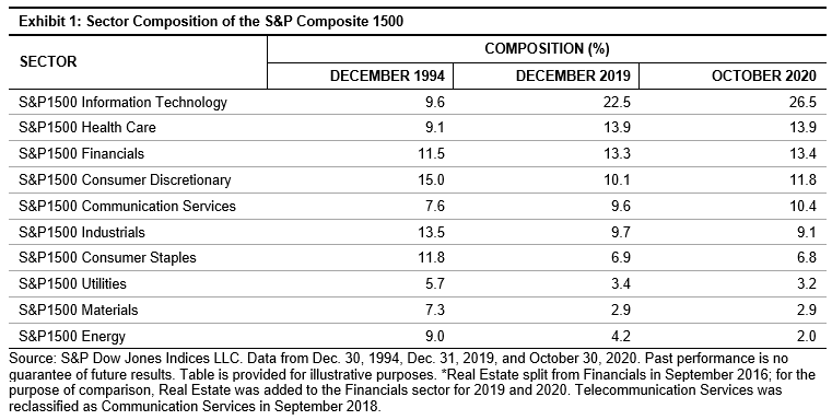
Exhibit 1 shows the sector weights as of Dec. 31,1994, Dec. 31, 2019, and Oct. 30, 2020. Information Technology has become the dominant sector, followed by Health Care as the second-largest sector, while Materials and Energy sectors weighed the least in the index.

The weights of the Information Technology and Health Care sectors had the most significant growth from Dec. 30, 1994, to Dec. 31, 2019, with increases of 134% and 53%, respectively.

The same trend has continued through 2020. The weight of the Information Technology sector grew from 22.5% to 26.5% in less than a year (from the end of 2019 to Oct. 30, 2020). In fact, the weight of the sector in the S&P Composite 1500 has increased 176% since the end of 1994, from 9.6% to 26.5%.

In contrast, the sectors with the largest declines were Materials and Energy. Their weights dropped 60% and 53%, respectively, from Dec. 31,1994, to Dec. 31, 2019. The decrease in market share of both sectors has continued in 2020.

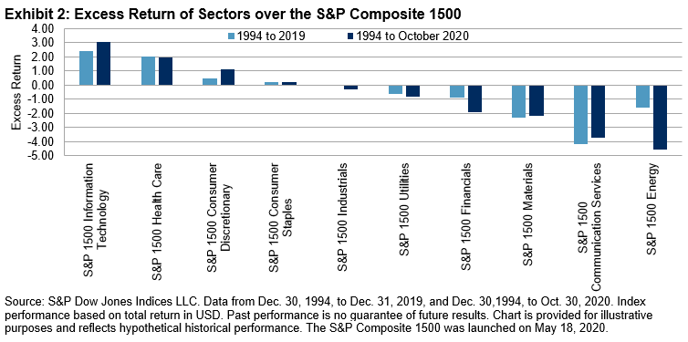
The performance of the sector indices reflects the sector changes over the history. Exhibit 2 shows the excess return of the sector indices versus the S&P Composite 1500 from Dec. 30, 1994, to Dec. 31, 2019, and to Oct. 30, 2020. Information Technology and Health Care were the top-performing sectors for both periods. Over the past 25 years, we observe continued outperformance in both sectors. This suggests that performance is one of the driving forces behind the sector expansion.

The leading constituents changed along with the sector changes. In 1994, the leading constituents were from diverse sectors, but a more concentrated composition is observed in 2019 and in 2020. As indicated in Exhibit 3, six out of ten stocks were from Information Technology and Communication Services sectors at the end of 2019 and October 2020. The three Information Technology companies together contributed 9.4% and 12.2% weight to the S&P Composite 1500 as of Dec. 31, 2019, and Oct. 30, 2020, respectively.

In society today, Information Technology is playing a larger role than ever. The advancement of technology has impacted people’s daily life, reshaped the economy, and is reflected in the stock market. Exploring the sector changes in the S&P Composite 1500, which is a gauge of U.S. market, can help us understand the transformed economic reality and could identify potential investment opportunities.


1 The S&P Composite 1500: An Efficient Measure of the U.S. Equity Market, Philip Brzenk, Hamish Preston, Aye Soe. May 2020.

The posts on this blog are opinions, not advice. Please read our Disclaimers.

What Drives the S&P PACT Indices’ Weights?

Contributor Image
Ben Leale-Green

Former Associate Director, Research & Design, ESG Indices

S&P Dow Jones Indices

In April 2020, we launched the S&P PACTTM Indices (S&P Paris-Aligned & Climate Transition Indices). The indices aim to align with the following: a 1.5oC climate scenario, the relevant aspects of the EU Low Carbon Benchmark regulation (BMR), and recommendations from the Task Force on Climate-related Financial Disclosures (TCFD), while maintaining a broad, diversified exposure. The S&P PACT Indices consist of the S&P Paris-Aligned (PA) Climate Indices and S&P Climate Transition (CT) Indices.

In this blog, we try to answer a simple question: what drives the S&P PACT Indices’ weights?

First, companies are excluded (exclusion effect) due to business activities, public controversies,1 and a low alignment score with the principals of the UN Global Compact—these companies receive zero weight.

Second, companies that remain are reweighted (reweighting effect) to achieve climate-related objectives.2 Companies that perform well from a climate perspective receive an overweight, while those that perform poorly receive an underweight or zero weight, as shown in Exhibit 1.

The S&P CT Indices (i.e., the indices that align with the EU’s minimum standards for EU Climate Transition Benchmarks) have fewer exclusions than their PA counterparts (i.e., the indices that align with the EU’s minimum standards for EU Paris-Aligned Benchmarks), with fossil fuel-based exclusions being the difference. Oil operations are particularly impactful in excluding companies. The additional exclusions are evident in the excluded columns in Exhibit 2, where the S&P PA Indices show more of their market cap is excluded.

When reweighting eligible companies to meet the climate objectives, we observe (see Exhibit 3) company performance on four climate metrics to have the largest and most significant impact on the change of company weights, across regions:

  • S&P DJI Environmental Score;
  • 1.5oC alignment via the transition pathway dataset;
  • Physical risk score; and
  • High climate impact revenues.

So how can companies improve the climate metrics that have the largest influence on their S&P PACT Indices weight? Ineligible companies can reduce undesirable exposures (e.g., public controversies and UNGC misalignment [as measured by the Arabesque GC Score]). Eligible companies can gain increased weight in the S&P PACT Indices by significantly reducing carbon intensity year-on-year (to improve their 1.5oC alignment), disclosing more information regarding environmental policies and metrics (to improve their S&P DJI Environmental Score3), improving performance against environmental policies and metrics (to improve their S&P DJI Environmental Score), divesting assets in locations highly exposed to physical risks and reduce assets’ physical risk sensitivity factors (to improve their physical risk score).

For further detail, please see our paper on S&P PACT Indices weight attribution.


1 Public controversies are judged by the SAM, part of S&P Global, Media Stakeholder Analysis (MSA), which monitors ongoing controversies from companies.

2 Climate-related objectives include the 7% year-on-year decarbonization, carbon intensity reduction, 1.5oC alignment using the Trucost, part of S&P Global, transition pathway dataset, S&P DJI Environmental Score improvement, green-to-brown share control/improvement, physical risk mitigation, high climate impact revenue constraint, carbon disclosure overweight cap, Science-Based Target overweight, and fossil fuel reserve exposure control/reduction.

3 The environmental score is the environmental pillar from the S&P DJI ESG Scores.

The posts on this blog are opinions, not advice. Please read our Disclaimers.

The Distribution of Alpha

Contributor Image
Craig Lazzara

Former Managing Director, Index Investment Strategy

S&P Dow Jones Indices

Investment management is a zero sum game. The source of outperformance for a market’s outperformers is the underperformance of the same market’s underperformers. Properly measured, the weighted average sum of the winners’ gains is exactly equal (before costs) to the weighted average sum of the losers’ losses. This identity, along with the professionalization of the investment management business globally, helps explain why our SPIVA reports consistently show that most active managers underperform most of the time.

Wins and losses might be, but need not be, distributed symmetrically. If half the assets in a market underperform by 3%, then the other half (on average) will outperform by 3%. But if 70% of assets underperform by the same 3%, the average outperformance of the winners will be a much more impressive 7%. A simple example will illustrate an important principle: if stock returns are skewed and portfolios are concentrated, most assets will underperform.

Exhibit 1 shows a simple model of positively-skewed returns; we assume a market with five stocks, one of which outperforms the others. Assuming each stock has the same capitalization, the market’s overall return is 6.0%, with a narrow dispersion.

In Exhibit 2, we use these five stocks to build portfolios of different sizes. There are, for example, five possible one-stock portfolios, four of which underperform the market. Alternatively, there are five possible four-stock portfolios, four of which outperform. Since the market, in this example, is up 6%, the average return of the portfolios is also 6%—if the market gives us 6%, it doesn’t matter how we slice it up. What changes is the distribution of returns across portfolios.

Exhibit 2 suggests that two things happen as portfolios become more concentrated:

These differences become more pronounced as the dispersion of returns grows. Exhibit 3 shows a hypothetical market with the same average return, similar skewness, and wider dispersion than in Exhibit 1.

If we repeat our portfolio construction exercise, Exhibit 4 shows identical probabilities of success, but with much wider gaps between winners and losers.

As before, concentration lowers the odds of success, but dramatically raises the payoff for the relatively small number of winners.

Why is this simplistic exercise relevant to the real world?

  • As is the case in most years, returns for 2020 look to be positively skewed, as the median stock in the S&P 500 underperforms the average.
  • Most active portfolios are relatively concentrated. Coupled with skewness, higher concentration implies that the majority of assets are likely to underperform.
  • Dispersion is well above historical average for every equity market we cover. This implies big gaps between winners and losers.

As the year draws to a close, we should expect to hear reports of spectacular successes. Don’t let the well-advertised big wins obscure the more dismal landscape of active underperformance.

The posts on this blog are opinions, not advice. Please read our Disclaimers.

Why Building a Strong Core Starts with the Index

What does the S&P 500 liquidity ecosystem means for investors? S&P DJI’s Craig Lazzara and State Street Global Advisors’ Rob Forsyth take a closer look at the global reach of this U.S. icon.

Learn more:  https://www.spglobal.com/spdji/en/research/article/a-window-on-index-liquidity-volumes-linked-to-sp-dji-indices/

The posts on this blog are opinions, not advice. Please read our Disclaimers.

Reversal or Recovery?

Contributor Image
Anu Ganti

U.S. Head of Index Investment Strategy

S&P Dow Jones Indices

When we think about reversals in the market, we likely think of brief turnarounds in performance.  But what if it’s more? What makes a reversal turn into a recovery is a full-fledged long-term improvement in performance.

We can apply this logic to Equal Weight’s recent experience.  After consistent underperformance since April 2017, the S&P 500® Equal Weight Index experienced a reversal in the past two months, outperforming the S&P 500 by 2% in October and by 3% in November.  As Exhibit 1 shows, Equal Weight reduced its 12-month underperformance versus the S&P 500 by half to 6.2%, compared to August, when underperformance had dipped to 13.5%.

This reversal was primarily driven by strength in smaller caps, as Equal Weight has a small-cap bias.  Another tailwind was the recent underperformance of the Technology sector, since Equal Weight has a significant underweight to Tech, which was flat over the past three months, compared to a gain of 4% for the S&P 500.

To provide historical context, we do know that Equal Weight outperforms over the long-term, and that there is a general trend of mean-reversion from observing the peaks and troughs in Exhibit 1.  Equal Weight’s trailing 12-month relative performance versus the S&P 500 has a mean value of 1.2% and a standard deviation of 7.6%.  Of course, on its own this doesn’t tell us whether Equal Weight’s recent performance is a temporary blip or the start of a new cycle of outperformance.  To understand this long-term outperformance and the mean-reversion effect, we ranked the months in our database by the 12-month relative performance of Equal Weight and divided them into deciles.  Then, we analyzed the median subsequent 5-year annualized performance in each of these deciles.

The results in Exhibit 2 show that we indeed see a reversion to the mean over the long-term: Lower decile months tend to outperform in the future, while higher deciles tend to underperform.  Decile 1, or the worst performing decile for Equal Weight, had the best subsequent median 5-year performance, outperforming by 8%.

In addition, Equal Weight has a natural anti-momentum bias, as by definition the strategy sells relative winners and purchases relative losers at each rebalance.  To measure the strength of this bias in the above mean-reversion analysis, we calculated the median 12-month relative return correlations of S&P 500 Equal Weight versus S&P 500 Momentum in each of the deciles.   Exhibit 3 illustrates that Decile 1, in addition to having the best subsequent median 5-year performance, also had the second-greatest negative correlation of Equal Weight versus Momentum.

To put things in perspective, Equal Weight’s relative performance for most of this past year was in Decile 1, and its correlation versus Momentum has been strongly negative, consistent with what we observe in Exhibit 3.  The recent underperformance of Momentum as well as the analysis from Exhibit 2 tell us that times of severe underperformance for Equal Weight can bode well for future outperformance.  Similar episodes have occurred in the past.  Time will tell whether Equal Weight’s recent outperformance moves from a reversal into a sustained recovery. 

The posts on this blog are opinions, not advice. Please read our Disclaimers.