Get Indexology® Blog updates via email.

In This List

Have Defensive Sectors Stood the Test of Time in Global Markets?

The Progression of Passive

Taking Up the Challenge of Turbulent Markets with ESG and Multi-Assets

Like the Virus, Credit Spreads Could Be at Risk of a Possible Second Wave

Not that wrong

Have Defensive Sectors Stood the Test of Time in Global Markets?

Contributor Image
Qing Li

Director, Global Research & Design

S&P Dow Jones Indices

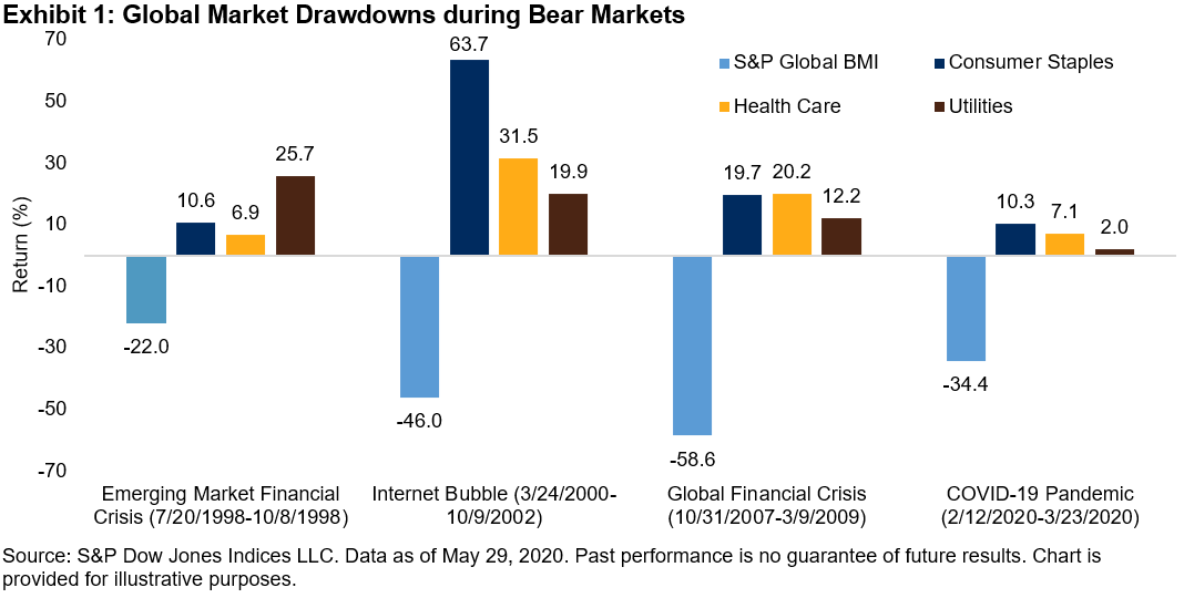
In March 2020, the S&P Global BMI TR declined 14.3%, marking its third-worst month over the past 25 years. Meanwhile, some sectors within the index recorded significant outperformances compared with the broader market. The S&P Global BMI Health Care, S&P Global BMI Consumer Staples, and S&P Global BMI Utilities surpassed the benchmark by 9.9%, 8.9%, and 2.4%, respectively.

Since Dec. 31, 1994, the global equity market has experienced four severe downturns when the S&P Global BMI TR declined 20% or more. However, three sectors—consumer staples, health care, and utilities—stayed in positive territory during all the drawdowns. Exhibit 1 shows how these sectors performed during the four worst drawdown periods. While the broader market suffered an average 40% loss, the gains from consumer staples, health care, and utilities sectors averaged 26%, 16%, and 15%, respectively.

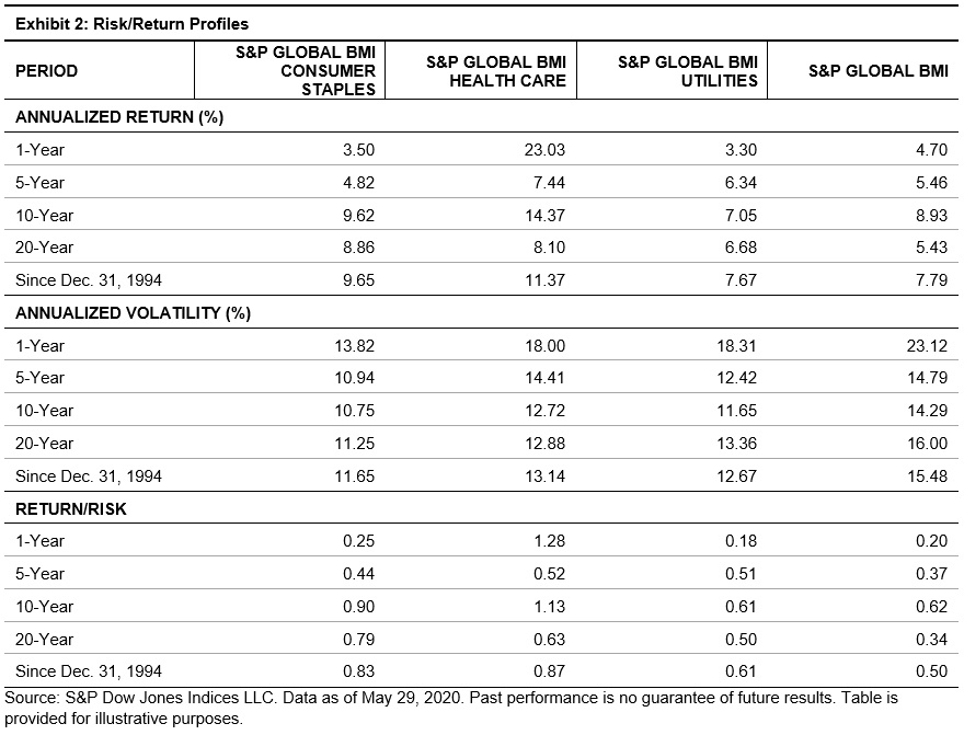
Over the long run, the consumer staples, health care, and utilities sectors generated the highest excess risk-adjusted returns. From the end of 1994 through May 29, 2020, the risk-adjusted returns from the consumer staples, health care, and utilities sectors were 0.83, 0.87, and 0.61, respectively, greatly exceeding the benchmark’s 0.50. In addition, as shown in Exhibit 2, the three sectors produced significant excess returns over almost all investment horizons. One year through 2020, consumer staples, health care, and utilities have delivered risk-adjusted returns of 0.0.25, 1.28, and 0.18, respectively, compared to the 0.20 generated by the benchmark.

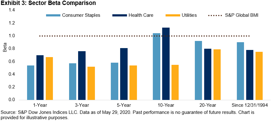
The underlying business models helped to make the consumer staples, health care, and utilities sectors less sensitive to economic cycles and more resistant to the market downturns. The consumer staples sector includes companies that provide goods and services such as food, beverages, and non-durable household products. The health care sector is composed of companies that provide medical and related products and services, and the utilities sector comprises companies that produce and deliver electricity, gas, or water to their customers. The products and services in these sectors are essential items that people need during all phases of the economic cycles, regardless of financial conditions. The stable demand can help these sectors generate steady revenues under various economic situations. As shown in Exhibit 3, the betas over various investment horizons indicate that these sectors were much less sensitive to the market.

The consumer staples, health care, and utilities sectors have had strong performance during the market slowdowns when observed over the short and long term. Understanding the sector characteristics, performance, and volatility profile can help investors decide on appropriate investments, participate in growth opportunities, and benefit during challenging times.

The posts on this blog are opinions, not advice. Please read our Disclaimers.

The Progression of Passive

Contributor Image
Anu Ganti

Senior Director, Index Investment Strategy

S&P Dow Jones Indices

The evolution of indexing is one of the most noteworthy trends in modern financial history. The rise of passive investing is the consequence of shortfalls in active performance, as regular readers of our SPIVA reports will recognize.

Our recent annual Survey of Indexed Assets shows a surge in S&P 500 indexed assets to $4.6 trillion as of December 2019. Exhibit 1 illustrates that the growth in assets tracking the S&P 500 dwarfed the growth due to market gains, indicating a substantial increase in flows.

Source: S&P Dow Jones Indices LLC. Chart is provided for illustrative purposes.

To provide context, we can analyze indexed assets historically as a percentage of float adjusted market capitalization. Exhibit 2 shows that this percentage has grown dramatically, from 10% in 1996 to 17% in 2019, highlighting the increasing importance of index funds to the overall market.

Source: S&P Dow Jones Indices LLC. Chart is provided for illustrative purposes.

One of the reasons for the popularity of indexing is its low cost relative to active management. As indexing has grown, investors have benefited substantially by saving on fees and avoiding underperformance.  We can quantify the fee savings each year by taking the difference in expense ratios between active and index equity mutual funds, and multiplying this difference by the total indexed assets for the S&P 500, S&P 400, and S&P 600.  When we aggregate the results, we observe in Exhibit 3 that the cumulative savings in management fees over the past 24 years is $320 billion .

Source: S&P Dow Jones Indices LLC and Investment Company Fact Book. Chart is provided for illustrative purposes.

The posts on this blog are opinions, not advice. Please read our Disclaimers.

Taking Up the Challenge of Turbulent Markets with ESG and Multi-Assets

Contributor Image
Claire Yi

Former Analyst, Strategy Indices

S&P Dow Jones Indices

After a long bull market, the COVID-19 pandemic has shaken the financial markets and put the question of how to earn a smooth return stream over a long period of time back on the table. This has given rise to a strengthening of conviction toward environmental, social, and governance (ESG) investing and risk management.

S&P Dow Jones Indices recently launched the S&P ESG Global Macro Index, which is designed to deliver stable returns through various market conditions and to align investments with ESG values.

The index exploits dynamic allocation between regional diversified bonds and ESG-themed equities based on economic and market trend signals and aims for a stable risk level by adjusting allocation between the portfolio and cash on a daily basis.

Over nearly the past 10 years, the index delivered an annualized return of 5.43%, volatility of 4.87%, a Sharpe ratio of 1.12, and a maximum drawdown of 6.35%. During the COVID-19 sell-off, the S&P 500® ER[1] fell 34.09% from Feb. 19, 2020, to March 23, 2020, while the S&P ESG Global Macro Index returned -4.44%.

Two key aspects of the index design are 1) ESG value alignment and 2) diversification through dynamic asset allocation. Both aim to mitigate the negative impact on index return during market turbulence.

ESG Value Alignment

The equity basket of the S&P ESG Global Macro Index consists of the S&P 500 ESG Index, S&P Europe 350 ESG Index, and S&P Japan 500 ESG Index. Theses indices are composed of companies with the top 75% S&P DJI ESG Scores within each industry group, while excluding companies involved with tobacco or controversial weapons, or with low United Nations Global Compact scores. These indices provide meaningful ESG performance improvement with little tracking error against the non-ESG benchmarks.

During the COVID-19 sell-off,[2] the S&P 500 ESG Index and S&P Europe 350 ESG Index outperformed their benchmarks by 0.69% and 0.24%, respectively, while the S&P Japan 500 ESG Index slightly underperformed its benchmark by 0.23%.

Dynamic Allocation

The dynamic allocation mechanism used in the S&P ESG Global Macro Index has historically been effective at reducing risk and improving risk-adjusted return.

To demonstrate this, we constructed a hypothetical multi-asset portfolio that mimics the exact setting of the S&P ESG Global Macro Index, except that the allocation to equity and bond baskets are at constant 60% and 40%, rather than dynamically determined by macroeconomic and market trend signals.[3]

Over nearly the past 10 years, the S&P ESG Global Macro Index provided a meaningfully higher absolute return and Sharpe ratio than the hypothetical portfolio, with the same level of volatility and slightly lower maximum drawdown (see Exhibit 2).

How did the index typically perform in bear and bull markets? We showcase two historical scenarios.

Scenario A: The Bear Market from Feb 19, 2020, to March 23, 2020

During the COVID-19 sell-off, the S&P ESG Global Macro Index shielded investors from large losses through its dynamic asset allocation and risk control overlay.

  • From Feb. 19, 2020, to March 10, 2020, the equity market tumbled, while bond prices increased. The index began this period with a 60% allocation to equities, and it switched entirely to bonds at the beginning of March. The negative correlation between equities and bonds helped to defend the portfolio levels from Feb. 19, 2020, to Feb. 28, 2020.
  • From March 11, 2020, to April 8, 2020, the oil price crash further triggered the market sell-off, in both the equities and bond markets. The daily risk control mechanism began to reduce exposure to bonds, which helped to reduce losses.

Scenario B: The Bull Markets in 2017 and 2019

In bull markets like those in 2017 and 2019, the S&P ESG Global Macro Index underperformed the S&P 500 ER. This comes as no surprise for a multi-asset index with a prudent volatility target. However, the index still delivered returns of 11.1% and 12.3% in 2017 and 2019, respectively, and with a higher Sharpe ratio than the S&P 500 ER in 2019.

The S&P ESG Global Macro Index aims to balance returns and risk in different market conditions. Historically, it has mitigated large losses from equities during bear markets while still delivering comparable Sharpe ratios during bull markets.

[1] The two-month U.S. dollar LIBOR interest rate and three-month U.S. dollar LIBOR interest rate are used to calculate the S&P 500 ER.

[2] The COVID-19 sell-off refers to the period from Feb. 19, 2020, to March 23, 2020, in the U.S. market; Feb. 19, 2020, to March 18, 2020, in the European market; and Feb 20, 2020, to March 16, 2020, in the Japanese market.

[3] The hypothetical portfolio allocates 60% to the equity basket (S&P 500 ESG Index, at 30%; S&P Europe 350 ESG Index, at 20%; and S&P Japan 500 ESG, at 10%) and 40% to the bond basket (S&P 10-Year U.S. Treasury Note Futures Index, at 20%; S&P Euro-Bund Futures Index, at 13.33%; and S&P 10-Year JGB Futures Index, at 6.67%), and it is rebalanced monthly. A 5% daily risk control overlay is applied.

The posts on this blog are opinions, not advice. Please read our Disclaimers.

Like the Virus, Credit Spreads Could Be at Risk of a Possible Second Wave

Contributor Image
Kevin Horan

Former Director, Fixed Income Indices

S&P Dow Jones Indices

Ever since the Fed released its tsunami of credit, credit markets have rallied the most since the depth of the Global Financial Crisis. Continued central bank actions have driven the already existing trend toward demand for higher-yielding assets, helping companies issue debt with fewer lender safeguards and covenants. With the Fed willing to support the markets and be the buyer of last resort, credit spreads have tightened since March 2020.

The option-adjusted spread (OAS) of the S&P U.S. Investment Grade Corporate Bond Index and the S&P U.S. High Yield Corporate Bond Index reached a YTD peak on March 23, 2020, while returns hit a low on March 19. Leveraged loans’ spread to Libor, as measured by the S&P/LSTA Leveraged Loan Index, topped out at L+980 on March 20.

Multiple Fed actions aimed at calming the markets led to the continued tightening of credit spreads. Though YTD spreads are wider than the beginning of the year for all ratings categories, the indices are substantially tighter since March 31, 2020, and have continued to tighten month-to-date as seen in Exhibit 2. The BBB category and all the high-yield indices have tightened by 150 bps or more, with the riskiest and lowest-rated CCC+ & below having tightened by 353 bps. CCC loans are more than double the CCC+ & below high-yield bonds when it comes to the spread change since March 31, 2020.

Just over these past few days, spreads have generally reversed direction, heading wider. This may be the beginning of a key reversal in the past rally experienced over the past weeks. Investment-grade debt issuance has trailed off, and the messaging from the Fed and economist centers around weakness, unemployment (20.9 million at the end of May 2020), and the heightened possibility of an economic downturn just as cities and states struggle with the questions of how to open up from the quarantine.

Exhibit 6 shows the total rate of return performance for the investment-grade and high-yield indices and the rating and industry subindices.

The posts on this blog are opinions, not advice. Please read our Disclaimers.

Not that wrong

Contributor Image
Chris Bennett

Former Director, Index Investment Strategy

S&P Dow Jones Indices

Stock markets continue to rally globally, ascending a wall of poor economic data and significant negative sentiment.  Concern that current price levels are unjustifiable is widespread: 78% of respondents to the most recent Bank of America Global Fund Manager Survey believe that the market is overpriced, the highest level since the survey began in 1998.  Are current levels truly that far off base?

One response to this question is a relative one: with benchmark yields near all-time lows, the growth potential of equities has become more attractive.  Stocks are up, in other words, because rates are down.   This affirms financial theory: the lower the discount rate, the greater the present value of future earnings, and thus the greater value of company equity (all else equal).  And while individual company discount rates differ, the overall interest rate environment drives them all.

Growth’s outperformance of Value offers further support for a yield-based perspective on valuations.  Since July 6, 2007, when the 10 year U.S. Treasury closed at 5.19%, yields have plummeted, as has Value’s relative performance.  Valuations of growth stocks, by definition, rely on earnings projections in the distant future, which gives them a higher sensitivity to discount rates.  That Growth’s relative performance seems to be following U.S. Treasury yields offers another indication of the wider equity market’s current sensitivity to rates.

Stimulus efforts have also been fundamental to the recovery in equities.  In the U.S., the Federal Reserve’s balance , and is poised to continue to grow until the economy is firmly back on track.  Other central banks have taken a similar approach, including the Bank of Japan (BoJ), the European Central Bank (ECB), and the People’s Bank of China (PBoC).  Combined, those four central banks have added ~$4T to their balance sheets since the end of February; that’s more than Germany’s annual GDP.   These efforts have propped up the valuations of riskier assets, including stocks, by pushing investors up the risk curve in search of returns.

Central bank efforts have mitigated, but not erased, the impact of the global lockdown: historically weak data have poured in, highlighting the economic (and human) impact of the pandemic.  While troubling, these data are inherently backward looking; they highlight the past, in part because they are often reported with a significant lag. Equity valuations, on the other hand, are forward looking, attempting to encompass the value of all future cash streams generated by a business.  It is possible, in other words, to believe that the future is bright despite being surrounded by dismal current data.

Of course, current valuations are unlikely to be perfect.  Prices are generally wrong; they fluctuate more widely than the flow of new information would require.  More importantly, it is famously difficult to tell what the right price should be, and on what timescale the market might “correct.”  It’s arguable that declines in yields, coupled with fiscal and monetary stimulus, have produced a justifiable current valuation for the equity market.

The posts on this blog are opinions, not advice. Please read our Disclaimers.