Get Indexology® Blog updates via email.

In This List

The Active vs. Passive Debate

The Uncommon Average

S&P Composite 1500®: Measuring Market Trends

From “Hard to Beat” to Nigh-On Impossible

Strongest Annual Performance for the S&P GSCI Since 2007

The Active vs. Passive Debate

Contributor Image
Maria Sanchez

Director, Sustainability Index Product Management, U.S. Equity Indices

S&P Dow Jones Indices

The debate between active management and passive management has being ongoing for several years. Active managers make investment decisions in an effort to outperform their benchmark, while passive managers simply track an index to gain exposure to a market or segment of a market. Active managers claim to have enough skills to consistently outperform the market, but do they really beat their benchmarks?

SPIVA®, which stands for S&P Indices versus Active, reports on the performance of actively managed funds against their respective category benchmarks, such as the S&P 500® in the U.S. and the S&P/BMV IPC here in Mexico. The results are impressive and consistent across the world: indices tend to outperform the majority of actively managed funds, mainly over the over the mid- to long-term investment horizons.

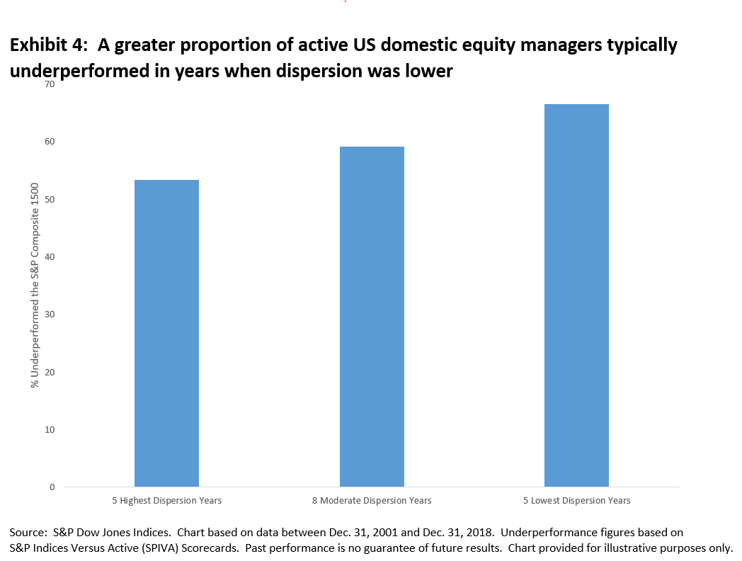
The SPIVA Latin America Mid-Year 2019 Scorecard showed that over the one-year period ending on June 30, 2019, 64% of actively managed funds in Mexico underperformed the S&P/BMV IRT, the total return version of the flagship S&P/BMV IPC. In addition, the percentage of active funds underperforming the benchmark increased over longer-term investment horizons; 82%, 90%, and 86% of active managers were not able to beat their benchmark over the 3-, 5-, and 10-year horizons, respectively. One should notice that active fund managers do not always lag the benchmarks, especially over the short-term horizons. A clear example was in the year-end 2018 report, when more than 58% of Mexican active funds outperformed the S&P/BMV IRT. The numbers suggest that active managers’ outperformance relative to the benchmark may exist, but rarely.

Furthermore, it is challenging for managers to consistently remain at the top of their categories, especially over longer horizons. The Latin America Persistence Scorecard demonstrates that top-performing active funds have little chance of repeating that success in subsequent years.

The SPIVA report does not intend to explain why underperformance exists, rather it is meant to act as a scorekeeper. That said, we could argue that many active managers do not have the skill to beat their benchmarks consistently that they may claim to have. It is difficult to time the market with consistent success, and the trading costs associated with excessive trading from active managers does not help fund performance. Furthermore, SPIVA uses net-of-fees returns of active funds, and numerous studies[1] show that the fee drag in fund returns can be substantial.

SPIVA can help investors make informed decisions about whether to use an active manager or invest in an index-based fund such as an ETF. It also reminds investors that using past performance as the main guidance in fund selection could be misleading due to the lack of performance persistence among actively managed equity funds.

This article was first published in Fortune Mexico Magazine December 2019.

[1] Sharpe, William F., “The Arithmetic of Active Management,” Financial Analysts Journal, January/February 1991, Volume 47 Issue 1. “Properly measured, the average actively managed dollar must underperform the average passively managed dollar, net of costs.”

The posts on this blog are opinions, not advice. Please read our Disclaimers.

The Uncommon Average

Contributor Image
Wes Crill

Vice President, Research

Dimensional Fund Advisors

The US stock market has delivered an average annual return of around 10% since 1926.[1] But short-term results may vary, and in any given period stock returns can be positive, negative, or flat. When setting expectations, it’s helpful for investors saving for retirement to see the range of outcomes experienced historically. For example, how often have the stock market’s annual returns aligned with its long-term average?

Exhibit 1 shows calendar year returns for the S&P 500 since 1926. The shaded band marks the historical average of 10%, plus or minus 2 percentage points. The S&P 500 had a return within this range in only six of the past 93 calendar years. In most years, the index’s return was outside of the range—often above or below by a wide margin—with no obvious pattern. For investors, the data highlight the importance of looking beyond average returns and being aware of the range of potential outcomes.

Tuning in to Different Frequencies

Despite the year-to-year volatility, investors can potentially increase their chances of having a positive outcome by maintaining a long-term focus. Exhibit 2 documents the historical frequency of positive returns over rolling periods of one, five, and 10 years in the US market. The data show that, while positive performance is never assured, investors’ odds improve over longer time horizons.

Conclusion

While some investors might find it easy to stay the course in years with above average returns, periods of disappointing results may test an investor’s faith in equity markets. Being aware of the range of potential outcomes can help investors remain disciplined, which in the long term can increase the odds of a successful investment experience. What can help investors endure the ups and downs? While there is no silver bullet, understanding how markets work and trusting market prices are good starting points. An asset allocation that aligns with personal risk tolerances and retirement-planning goals is also valuable. By thoughtfully considering these and other issues, investors may be better prepared to stay focused on their long-term goals during different market environments.

[1]. As measured by the S&P 500 from 1926–2018.

Source: Dimensional Fund Advisors LP.
There is no guarantee investment strategies will be successful. Investing involves risks, including possible loss of principal. Diversification does not eliminate the risk of market loss.
All expressions of opinion are subject to change. This article is distributed for informational purposes, and it is not to be construed as an offer, solicitation, recommendation, or endorsement of any particular security, products, or services.

The posts on this blog are opinions, not advice. Please read our Disclaimers.

S&P Composite 1500®: Measuring Market Trends

Contributor Image
Hamish Preston

Head of U.S. Equities

S&P Dow Jones Indices

The S&P Composite 1500 measures the U.S. equity market by combining three world-renowned benchmarks – the S&P 500®, S&P MidCap 400®, and S&P SmallCap 600® – which together encompass approximately 90% of U.S. equity market capitalization.  With 2019 in the rear-view mirror, it is obvious that last year was extremely positive for U.S. equities:  the S&P 1500 recorded its best calendar year total return since 2013, up 30.90%.  While this performance may not be surprising given the healthy gains posted by most size, sector, and style segments, it reflects a few broader market trends.

Large-cap stocks have outperformed their mid- and small-cap counterparts in every year since 2016 and this continued through 2019:  the S&P 500 (+31.49%) beat the S&P MidCap 400 (+26.20%) and the S&P SmallCap 600 (+22.78%) last year.   This continued outperformance meant that the collective weight of S&P 500 constituents in the S&P Composite 1500 – as measured at quarterly intervals between the end of 1994 and 2019 – hit an all-time high of 91% in December 2019.  This helps to explain why the S&P Composite 1500 outperformed the mid- and small-cap market segments last year.

At the sectoral level, Information Technology companies have played an increasingly important role in determining market performance.  For example, the S&P 1500 Information Technology sector gained an impressive 49.75% last year, 17.5% more than second-placed Communication Services.  Combined with it sizeable average weight in the S&P 1500 – over 20% in 2019 – Information Technology accounted for nearly a third of the market’s gains last year.

More broadly, and repackaging an infographic from our daily dashboard (I highly recommend subscribing to ensure you receive witty market commentary direct to your inbox) 2019 was positive for all the S&P 1500 sectors and industries.  Not bad when you consider many people’s market outlook at the start of the year!

Finally, some have argued that 2020 may be the year of the stock picker based on a recent decline in correlations.  However, as we have pointed out repeatedly, dispersion is a better measure of active management’s alpha opportunity: Exhibit 4 highlights that a greater proportion of active domestic U.S. equity managers typically underperformed the S&P 1500 when dispersion was lower.

Given the below-average dispersion in the S&P 1500 last year, most active managers may find it challenging to outperform the U.S. equity market benchmark.


The posts on this blog are opinions, not advice. Please read our Disclaimers.

From “Hard to Beat” to Nigh-On Impossible

Contributor Image
Chris Bennett

Former Director, Index Investment Strategy

S&P Dow Jones Indices

Our SPIVA® reports have shown, year after year, that market-cap weighted benchmarks are, to put it kindly, hard to beat.  However, in 2019 a range of circumstances made “hard to beat” become nigh-on impossible for the S&P 500®.

In general, there are three common ways by which an active portfolio can outperform its benchmark: over or under-weighting benchmark stocks, by tilting towards factors or sectors, or by venturing beyond the benchmark’s constituents to hold anything from cash to commodities.  Each of these options was uncommonly disadvantaged last year.

Based on the performance of a wide range of alternative markets, going outside the benchmark was not much help.  Smaller U.S. stocks, international equities, fixed income, and commodities all underperformed large-cap U.S. equities.

Stock selection within the benchmark was handicapped by the 51% average gain of the biggest five stocks in the S&P 500.  Since few active managers (and few factor indices) allocate as much to the largest companies as the benchmark does, when the very largest stocks outperform, stock selection becomes harder.

Relatedly, the larger sectors of the S&P 500 also outperformed their smaller peers.  The Information Technology sector – the largest in the S&P 500 – gained a whopping 50% on the year.

The performance of equal-weight indices provides an easy way to analyse the importance of size in stock and sector selection.  S&P 500 Equal Weight Index has the same constituents as the S&P 500, but weights each constituent equally, with the result that the sector allocations are also more balanced.  As illustrated in the latest S&P Equal Weight Sectors Dashboard, both underweighting the largest sectors and weighting equally within each sector helped to contribute to the 2.3% underperformance of the S&P 500 Equal Weight index in 2019.  In fact, sector allocations were responsible for the lion’s share of underperformance – with an underweight in the tech sector accounting for over 1% of the drag.

But …  some parts of the market must have outperformed?  If you didn’t overweight the largest sectors and stocks, the sting in the tail of the market’s performance this year was that, beyond portfolio construction, a degree of timing was also required to maintain outperformance.  As we highlighted in our year end S&P 500 Factor Dashboard , for several areas of the market, there were major reversals into the year end: the Health Care sector, for example, underperformed the S&P 500 by 15% in the first three quarters, and then outperformed by 5% in Q4.  In September, the S&P 500 Low Volatility Index looked certain to finish the year on top, but failed to keep pace with the fourth quarter’s rally.

What does this mean for active equity managers?  Early indications point to a rough year for stock pickers, with less than 1/3 of active U.S. equity managers estimated to have finished 2019 ahead of their benchmarks.   Whatever else may be true of the coming year, active managers might at least hope that the S&P 500 goes back to being just “hard” to beat.

The posts on this blog are opinions, not advice. Please read our Disclaimers.

Strongest Annual Performance for the S&P GSCI Since 2007

Contributor Image
Fiona Boal

Managing Director, Global Head of Equities

S&P Dow Jones Indices

The S&P GSCI ended 2019 up 17.6%. This was the S&P GSCI’s 10th-strongest performance since 1990 and its best annual return since the heights of the so-called commodity super cycle in 2007. Across the commodity markets, gains were driven by the petroleum complex and precious metals, while agriculture and livestock detracted from headline performance.

Petroleum prices climbed during the year due to sanctions on Iran and Venezuela, as well as continued OPEC+ production cut compliance. The S&P GSCI Crude Oil ended 2019 34.1% higher, but the bulk of the gains came in the first quarter after the U.S. introduced sanctions on Venezuela. As the new decade commences, the oil market will be forced to negotiate swelling supplies, particularly from the U.S., and some indications of weakening global demand. The U.S. is on track to be a net petroleum exporter on an annual basis for the first time in 2020. It was not all positive news for energy commodities this year. Natural gas ended the year with the poorest performance of all the single‑commodity S&P GSCI constituents. The S&P GSCI Natural Gas was down an eye-watering 32.3% for the year.

Gold proved one of the most popular assets for investors in 2019. The S&P GSCI Gold posted its best performance since 2010, gaining 18.0%, driven by safe-haven buying powered by escalating geopolitical tensions, a protracted trade war, and quantitative easing by major central banks. As more government bonds across the globe displayed negative yields throughout 2019, gold remains well positioned as a safe-haven alternative for investors going into the new year. The S&P GSCI Palladium ended the year 64.3% higher, continuing a multi-year price appreciation driven by its use in car exhaust to defuse emissions.

Among the industrial metals, nickel was the standout performer in 2019. While well off its late summer highs, the S&P GSCI Nickel ended 2019 up 32.8%. Supply constraints, in the form of an export ban from Indonesia, dictated price action in the nickel market for the bulk of the year. It would be folly not to mention the stellar performance of the S&P GSCI Iron Ore, which ended the year 83.1% higher, a function of several significant supply curtailments and persistent Chinese steel demand.

The agricultural markets struggled this year under the weight of the protracted U.S.-China trade war and plentiful global supplies. One of the main features of December’s “Phase One” trade deal between the U.S. and China was China’s commitment to purchase a large amount of U.S agricultural goods. There is skepticism that China will be both willing, and able, to purchase such volumes of U.S. commodities and, therefore, if these purchases will be enough to stimulate demand for agricultural commodities in 2020. Wheat was the outlier in the grain complex, with the S&P GSCI Wheat ending the year up 9.4%, a third straight year of gains, on tightening supplies, particularly from Australia, which is in its third year of drought.

Despite African swine fever ravaging the world’s largest pig herd, the S&P GSCI Lean Hogs fell 19.2% in 2019. On top of burgeoning U.S. hog supplies, the U.S.-China trade war greatly restricted the ability of U.S. pork producers to export their product to China.

The posts on this blog are opinions, not advice. Please read our Disclaimers.