Get Indexology® Blog updates via email.

In This List

Sustainability in South Africa: The Swing from SRI to ESG

Get to Know Mid-Cap U.S. Equities

Why Taking a Local Approach to Index Construction Matters in Canada

S&P Risk Parity Indices Surge on the Back of a Rally in Treasuries

Why the Volatility Spike is the Low Volatility Strategy’s Best Friend

Sustainability in South Africa: The Swing from SRI to ESG

Contributor Image
Mona Naqvi

Global Head of ESG Capital Markets Strategy

S&P Global Sustainable1


Socially responsible investing (SRI) has deep roots in the South African market. Indeed, some of the earliest records of this type of investing date back to the boycotts against South African companies during the era of Apartheid. The movement paved the way for a generation of socially conscious investors seeking to affect social change, giving renewed meaning to the adage of “putting one’s money where one’s mouth is.”

As an investment strategy, SRI removes “sin” stocks such as tobacco, alcohol, and weapons from portfolios with negative screens. Values aside, this is potentially risky due to a lack of portfolio diversification. SRI therefore got somewhat of a bad rep for being “values-based investing” in mainstream finance circles. But contrary to what mainstream investors might think, environmental, social, and governance (ESG) investing, on the other hand, is not some virtuous strategy relegated to those investors who are willing to put their beliefs before their returns. ESG can simply be a prudent approach to encompassing a broader information set that focuses on material issues with the potential to affect the long-term viability of company business models.

For example, the value of a company like Aspen Pharmacare is not only driven by its physical assets, but also by its innovation and access to patients. With rising healthcare costs and diminishing patient trust in providers, a holistic valuation might also consider its intangible assets like innovation management and business ethics. These are, to a large extent, informed by metrics such as R&D productivity, product recalls, and customer satisfaction—precisely the types of issues that would get captured by a diligent ESG research process. Though there are many sustainability topics to consider, they are not all relevant. ESG can, and often does, simply focus on the most financially material factors for a given industry.

The Myth of an ESG versus Performance Tradeoff

Since the early days of SRI, sustainability data has greatly improved. Companies increasingly disclose to qualify for exchanges like the JSE SRI Index that was launched in 2004. While initiatives such as the King Code on Corporate Governance (with various iterations from 1994-2017) have played a role. Investor demand for greater transparency has also risen with growing awareness of the materiality of ESG issues.[1] Revised Regulation 28 of the Pension Funds Act in 2011 calls for trustees to assess the materiality of ESG factors in their investments, on which FSCA released additional guidance in June 2019. Furthermore, the 2011 Code for Responsible Investing in South Africa encourages institutional investors to integrate ESG into their investment process as well. Investors are thus pushing for more information on the sustainability performance of the companies they own.

The data that has emerged offers the possibility of nuanced approaches to responsible investing—amplified by the launch of S&P DJI ESG Scores.[2] The scores unleash decades of sustainable investing insights and variation in sustainability characteristics among companies within even the same sector. With such datasets, inclusive approaches to tilt, reweight, or optimize a strategy rather than simply exclude sectors are now possible. Thus, with industry-neutral approaches, ESG investing need not imply a tradeoff with returns. For example, the S&P South Africa Domestic Shareholder Weighted (DSW) Capped ESG Index outperformed the benchmark over the past three-year period (see Exhibit 2). By targeting 75% of market cap by ESG rankings within industry groups, whose weights remain unchanged, the index offers a compelling rebuttal to the myth of an ESG versus performance tradeoff.

A Real (Economy) Problem

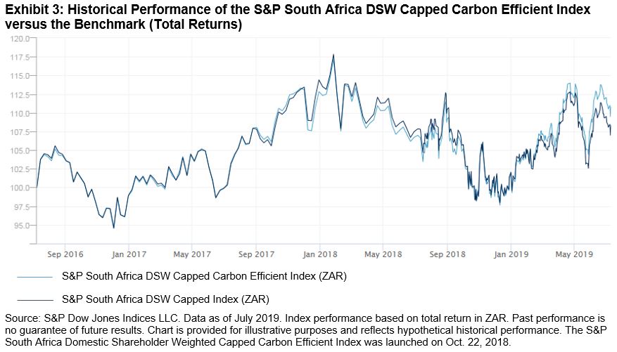
ESG can also help to address unprecedented trends unfolding in the global economy. Some of which, like global warming, invite policy responses that translate these real economy impacts into material concerns for investors. For instance, measures like the South African Carbon Tax Act No. 15 are, by design, transforming the underlying economics to favor carbon-efficient technologies across all industries. Investors looking to safeguard against the rising costs of a carbon-intensive portfolio might thus opt for low-carbon solutions, like the S&P South Africa DSW Capped Carbon Efficient Index (see Exhibit 3). The index closely tracked the benchmark over the past three years and achieved a 58% carbon reduction as of July 2019,[3] demonstrating that investors can make good on their values without compromising their returns.

A Primarily Pragmatic Approach

Not to be confused with SRI, which is deliberately principled, ESG offers a pragmatic approach to addressing financially material issues through a broader information set. ESG index solutions can facilitate similar—if not better—risk/return profiles to broad market benchmarks, upending the view that this type of investing necessarily implies a trade-off with returns. The added possibility of achieving some positive social impact might just be a bonus.

[1] A 2007 report led by UNEPFI found that 70% of South African investment professionals surveyed claimed that most ESG issues were at least somewhat material in “evaluating the likely performance of investments.”

[2] For more information about S&P DJI ESG Scores see here: https://spdji.com/documents/education/education-discover-material-insights-with-sp-dji-esg-data

[3] Calculated using Trucost carbon emissions data based on the aggregation of operational and first-tier supply chain carbon of index constituents per USD 1 million in revenue (tCO2e / USD million). For more information, visit www.spdji.com/esg-metrics.

The posts on this blog are opinions, not advice. Please read our Disclaimers.

Get to Know Mid-Cap U.S. Equities

Contributor Image
Louis Bellucci

Senior Director, Index Governance

S&P Dow Jones Indices

S&P Dow Jones Indices’ recent paper “The S&P MidCap 400®: Outperformance and Potential Applications” shows that mid-cap stocks have often been overlooked in favor of other size ranges in investment practice and in academic literature. This is despite the fact that the S&P MidCap 400 has outperformed the S&P 500® and the S&P SmallCap 600® at an annualized rate of 2.03% and 0.92%, respectively, since December 1994. While the mid-cap index was, on average, roughly 15% more volatile than its large-cap counterpart, its higher returns more than compensated over longer periods.

Market capitalization is the main determinant of size classifications, however there is no universally accepted way to define the mid-cap universe. Some index providers use a fixed-count, ranked approach to determine the mid-cap universe, while others target a proportion of free-float-adjusted market cap coverage instead.

The S&P MidCap 400 is designed to measure the performance of mid-sized U.S. equities, reflecting this market segment’s distinctive risk/return characteristics. S&P Dow Jones Indices defines mid-cap companies as those with total market capitalizations between USD 2.4 billion and USD 8.2 billion. This range is reviewed by the Index Committee from time to time to assure consistency with market conditions. The committee also considers other criteria—such as a financial viability screen and sector representation—when considering companies for addition to the S&P MidCap 400. Due to the upper bound on the market capitalization thresholds, the S&P MidCap 400 is less concentrated than the large-cap S&P 500. The top 10 companies account for 6.74% of the index weight, which is significantly less than the 22.79% weight held by the top 10 companies in the S&P 500.

Many mid-cap companies may possess a strategic advantage relative to firms of larger or smaller sizes, having successfully navigated the challenges specific to small companies, such as raising initial capital and managing early growth, and now offering stability with the potential of additional growth opportunities. Mid-cap companies have generally overcome the risks of small-cap companies, but they still have the potential to grow before exhibiting the growth deceleration often seen in large-caps. Mid-caps often have established infrastructure, access to capital, and developed distribution systems, but they are still nimble with motivated management teams to take advantage of opportunities quickly.

In the market-cap-weighted structure of indexing, the winners often graduate to the S&P 500, if they aren’t acquired first, and the losers decrease in weight and may even leave the index, making the overall index weighted more heavily with relative winners. Without knowing exactly which ones will be the big winners, allocating to the whole basket makes sense. From Jan. 1, 2014, to June 28, 2019, 77 S&P MidCap 400 components graduated to the S&P 500, 79 were demoted to the S&P SmallCap 600, and another 111 were acquired.

Additionally, the mid-cap segment has unique valuation characteristics. The S&P MidCap 400 maintains a similar trailing price-to-earnings ratio to the S&P 500, indicating similar valuations of mid-cap and large-cap companies. Meanwhile, the price-to-book value and price-to-sales ratios are much more similar to the small-cap segment, represented by the S&P SmallCap 600. These potential strategic advantages of the individual components and sector allocations may help to explain the mid-cap segment’s fundamentals relative to the large- and small-cap segments. On average, the S&P MidCap 400 has historically had higher exposures to Real Estate, Utilities, and Materials, and has been underweight Information Technology and Health Care.

With an overview of what makes the mid-cap segment distinct, take a closer look at the driving forces behind mid-caps’ outperformance (including stock versus sector selection and factor exposure), gauge how mid-cap active funds fare against their passive counterparts, and explore the potential benefits of dialing up exposures in core portfolios. Check out the latest research here to learn more.

The posts on this blog are opinions, not advice. Please read our Disclaimers.

Why Taking a Local Approach to Index Construction Matters in Canada

Contributor Image
Michael Orzano

Head of Global Exchanges Product Management

S&P Dow Jones Indices

While nearly everyone in the Canadian investment community has heard of the S&P/TSX Composite, few are aware of the key methodological intricacies that distinguish it from other broad market Canadian equity benchmarks.

The most notable distinction is that the S&P/TSX Composite is designed specifically for Canadians (as are all S&P/TSX Indices), while many other Canadian equity indices, such as the FTSE Canada All Cap Index, are simply country slices of global benchmarks and, therefore, take the perspective of foreign investors. Now, why does this matter you might ask? Well, Canada has foreign ownership limits that affect several industries, such as telecommunications, broadcasting, transportation, and real estate. So, whether or not these limits are accounted for in the index is significant.

As an example, Bell Canada (BCE)—the largest Canadian telecommunications company—was the 10th largest company in the S&P/TSX Composite, with a weight of 2.3%, as of June 28, 2019 (see Exhibit 1). However, foreign investors are restricted from owning more than one-third of BCE under Canada’s Telecommunications Act. As a result, BCE’s weight in the FTSE Canada All Cap Index is reduced by two-thirds from its natural market-cap weighting to roughly 0.75%.

Real estate investment trusts are also subject to a 49% ownership limit, which results in the weight of the Real Estate sector being reduced in the FTSE index relative to the S&P/TSX Composite. Ultimately, the differing treatments of foreign ownership limits is a key driver of the FTSE Canada All Cap Index’s higher concentration in Financials and lower exposure to other sectors such as Communication Services and Real Estate, as illustrated in Exhibit 2.

Differing definitions of what constitutes a Canadian company for index assignment purposes are also important to consider. For example, Shopify—the Canadian e-commerce company—was added to the S&P/TSX Composite in March 2017. However, FTSE Russell classified Shopify as a U.S. company until January 2019, which prevented it from being included in the FTSE Canada All Cap Index until earlier this year.

The S&P/TSX Indices also include companies structured as limited partnerships (LPs), whereas FTSE Russell’s global equity index methodology excludes them. Because of this, several Brookfield Partnerships that own and operate infrastructure, real estate, and renewable energy assets are excluded from the FTSE Canada All Cap Index. These companies represent a weight of about 1.5% in the S&P/TSX Composite.

Finally, the S&P/TSX Composite is a broader representation of the Canadian equity market relative to the FTSE Canada All Cap Index. As of June 28, 2019, the S&P/TSX Composite included 239 constituents, representing a total index market cap of nearly CAD 2.3 trillion, while the FTSE Canada All Cap Index included 205 components and a 6% smaller aggregate index market cap of CAD 2.15 trillion. This disparity is partially driven by the inclusion of LPs, but it is largely due to the relatively more inclusive size and liquidity requirements of the S&P/TSX Composite.

While the returns of the two indices have historically tracked fairly closely, the methodology differences discussed have contributed to meaningful performance differences over time. As depicted in Exhibit 4, the 3.87% total return of the S&P/TSX Composite was nearly 1% greater than the FTSE Canada All Cap Index over the trailing 12-month period. Over the past 10 years, the S&P/TSX Composite has outperformed by 42 bps per year with slightly lower volatility.

In summary, it is important to look under the hood and understand the design features of seemingly similar benchmarks. Because of its comprehensive nature and Canadian-centric design features, the S&P/TSX Composite may more fully and accurately reflect the investment opportunity set available to Canadian investors in comparison to other market indices.

As a final note, you may often see the S&P/TSX Capped Composite cited, given that it underlies several index-based products, and wonder how it differs from the headline S&P/TSX Composite. The term “capped” refers to the fact that the methodology includes a 10% cap—or limit—on the weight of any single stock. The capped version of the index was introduced back in 2000, when Nortel Networks grew to become so large that it represented nearly one-third of the weight of the S&P/TSX Composite. However, Nortel soon shrank and the S&P/TSX Composite and S&P/TSX Capped Composite have been identical since 2001, as no company has held a weight in excess of 10%.

To learn more about the S&P/TSX Indices and recent trends in Canadian equities, please watch our recently released video:  Finding Opportunity at Home with the S&P/TSX indices.

The posts on this blog are opinions, not advice. Please read our Disclaimers.

S&P Risk Parity Indices Surge on the Back of a Rally in Treasuries

Contributor Image
Rupert Watts

Head of Factors and Dividends

S&P Dow Jones Indices

Expectations have diverged in 2019, as equity markets welcomed a dovish Fed, while the bond market exhibited pessimism. In the second quarter, the S&P 500® finished up 4.3% despite ongoing trade tensions, while the yield on the 10-Year U.S. Treasury Bond fell 40 bps to 2.0% and the U.S. Treasury curve remained inverted.

The S&P Risk Parity Indices, which aim to spread risk equally across equities, fixed income, and commodities, have continued their strong start to 2019. New highs in the first quarter were followed by new highs in the second quarter, as equity and fixed income correlation remained positive.

Exhibit 3 shows the performance of the S&P 500, the hypothetical global 60/40 portfolio, and the S&P Risk Parity Indices across each of the past three quarters. The S&P Risk Parity Indices kept pace with the S&P 500 and outperformed the global 60/40 portfolio in the second quarter of 2019.

The significant outperformance the S&P Risk Parity Indices posted cumulatively over the past three quarters is noteworthy. While the S&P 500 came roaring back in 2019—recording its own highs—the net effect of its large drawdowns in the fourth quarter of 2018 led it to underperform across the entire period.

Next, by examining the performance attribution across the S&P Risk Parity Index – 10% Volatility Target in Exhibit 4, we can see that the second quarter gains came from equities and fixed income. Equities survived a mid-quarter wobble to finish the quarter strong on the back of easing trade tensions and growing dovishness among policymakers. Fixed income posted a strong second quarter, as yields fell markedly and prices rose.

Examining the performance attribution across the past three quarters in Exhibit 5, it is clear which asset class was responsible for driving the indices to new highs. The fixed income component posted three solid quarters on the back of the rally in U.S. Treasuries. Meanwhile, commodities and equities have yet to completely reverse losses from Q4 2018.

As we look ahead, it will be interesting to see how contrasting sentiments across equities and fixed income play out in the coming weeks and months. However, regardless of where markets end up in the short term, the S&P Risk Parity Indices’ objective to maximize diversification benefits across complementary asset classes could be a recipe for success in the long term.

The posts on this blog are opinions, not advice. Please read our Disclaimers.

Why the Volatility Spike is the Low Volatility Strategy’s Best Friend

Contributor Image
Berlinda Liu

Former Director, Multi-Asset Indices

S&P Dow Jones Indices

The first half of 2019 saw one of the biggest rallies in the domestic market; the S&P 500® rose 18.54% on a total return basis despite concerns of slow economic growth, a trade war, and a possible rate hike. During the same period, the S&P 500 Low Volatility Index surprised the market and rose even more. The index outperformed the broad market by 99 bps in the first six months, and 90 bps in the second quarter.

The S&P 500 Low Volatility Index generally tends to outperform in down markets and underperform in up markets. However, the first half of 2019 reminds us that, as its name would suggest, the S&P 500 Low Volatility Index’s outperformance partly comes from its ability to reduce volatility drag. As a result, it may even beat the market when it zigzags on its way up.

Before we discuss the relationship between market volatility and index performance, it is important to first define “volatility spike.” In particular, market participants should focus on what level of volatility is considered to be high and what kind of volatility movement is a “volatility spike”.

For our analysis, we will first compute market volatilities using a 21-trading-day rolling window and then use the one-year median to evaluate realized volatility. We will consider volatility above its one-year mean as a spike and deem this level as high.

When it comes to volatility distribution, either implied or realized, the sample median is usually more representative than the sample mean. The distribution of VIX® levels and the equity market’s 21-trading-day realized volatility in the past 10 years clearly shows that implied and realized volatilities were heavily skewed (see Exhibit 1). Although the majority of the data points clustered to the left of the distribution, the fat tail on the right significantly pulled the sample mean above its median. Exhibit 2 further confirms that average volatility was higher than median volatility. Note that the 2008 financial crisis data was not included in this sample set; otherwise, the gap between mean and median would be even larger.

Furthermore, using a relatively short lookback period can help us identify local volatility spikes that are relevant to market performance. We can see from Exhibit 2 that mean and median vary, depending on the length of lookback period, indicating volatility regime shifts in history. The realized volatility of the S&P 500 in May 2019 was 14.29%. It may look tame compared with the index’s long-term average volatility (17.5% since 1990), but it has more than doubled from one month ago (6.14%).

We plotted the monthly excess returns of the S&P 500 Low Volatility Index over the past 10 years against the broad market monthly volatility (see Exhibit 3). We also included the one-year moving average and the moving median of 21-trading-day market volatilities, both calculated daily.

We can make the following observations from the past 120 months.

  • The volatility spiked 51 times, 34 of which had positive excess returns. In other words, if volatility rose above its one-year median, the probability of the S&P 500 Low Volatility Index beating the market was 67%.
  • The S&P 500 Low Volatility Index outperformed in 56 months; 61% of those months also had volatility spikes.
  • We saw 17 months in which the S&P 500 Low Volatility Index had excess returns greater than 2%. Out of those 17 months, 14 of them (82%) were also months with volatility spikes.

Exhibit 2 also shows that the mean and median of market volatility in the past year exceeded those of the past five years, suggesting that the market might be gradually moving out of its low volatility regime of recent years. The widening spread between the one-year mean and one-year median also reminds us of the shocks in late 2018.

It would not be surprising for market participants if low volatility factor strategies continued to perform better than a rising equity market, as long as volatility remained above its median.

The posts on this blog are opinions, not advice. Please read our Disclaimers.