Get Indexology® Blog updates via email.

In This List

Why Taking a Local Approach to Index Construction Matters in Canada

S&P Risk Parity Indices Surge on the Back of a Rally in Treasuries

Why the Volatility Spike is the Low Volatility Strategy’s Best Friend

Do Active Funds in India Benefit from Higher Active Risk Exposure?

Implied Plunge Protection

Why Taking a Local Approach to Index Construction Matters in Canada

Contributor Image
Michael Orzano

Head of Global Exchanges Product Management

S&P Dow Jones Indices

While nearly everyone in the Canadian investment community has heard of the S&P/TSX Composite, few are aware of the key methodological intricacies that distinguish it from other broad market Canadian equity benchmarks.

The most notable distinction is that the S&P/TSX Composite is designed specifically for Canadians (as are all S&P/TSX Indices), while many other Canadian equity indices, such as the FTSE Canada All Cap Index, are simply country slices of global benchmarks and, therefore, take the perspective of foreign investors. Now, why does this matter you might ask? Well, Canada has foreign ownership limits that affect several industries, such as telecommunications, broadcasting, transportation, and real estate. So, whether or not these limits are accounted for in the index is significant.

As an example, Bell Canada (BCE)—the largest Canadian telecommunications company—was the 10th largest company in the S&P/TSX Composite, with a weight of 2.3%, as of June 28, 2019 (see Exhibit 1). However, foreign investors are restricted from owning more than one-third of BCE under Canada’s Telecommunications Act. As a result, BCE’s weight in the FTSE Canada All Cap Index is reduced by two-thirds from its natural market-cap weighting to roughly 0.75%.

Real estate investment trusts are also subject to a 49% ownership limit, which results in the weight of the Real Estate sector being reduced in the FTSE index relative to the S&P/TSX Composite. Ultimately, the differing treatments of foreign ownership limits is a key driver of the FTSE Canada All Cap Index’s higher concentration in Financials and lower exposure to other sectors such as Communication Services and Real Estate, as illustrated in Exhibit 2.

Differing definitions of what constitutes a Canadian company for index assignment purposes are also important to consider. For example, Shopify—the Canadian e-commerce company—was added to the S&P/TSX Composite in March 2017. However, FTSE Russell classified Shopify as a U.S. company until January 2019, which prevented it from being included in the FTSE Canada All Cap Index until earlier this year.

The S&P/TSX Indices also include companies structured as limited partnerships (LPs), whereas FTSE Russell’s global equity index methodology excludes them. Because of this, several Brookfield Partnerships that own and operate infrastructure, real estate, and renewable energy assets are excluded from the FTSE Canada All Cap Index. These companies represent a weight of about 1.5% in the S&P/TSX Composite.

Finally, the S&P/TSX Composite is a broader representation of the Canadian equity market relative to the FTSE Canada All Cap Index. As of June 28, 2019, the S&P/TSX Composite included 239 constituents, representing a total index market cap of nearly CAD 2.3 trillion, while the FTSE Canada All Cap Index included 205 components and a 6% smaller aggregate index market cap of CAD 2.15 trillion. This disparity is partially driven by the inclusion of LPs, but it is largely due to the relatively more inclusive size and liquidity requirements of the S&P/TSX Composite.

While the returns of the two indices have historically tracked fairly closely, the methodology differences discussed have contributed to meaningful performance differences over time. As depicted in Exhibit 4, the 3.87% total return of the S&P/TSX Composite was nearly 1% greater than the FTSE Canada All Cap Index over the trailing 12-month period. Over the past 10 years, the S&P/TSX Composite has outperformed by 42 bps per year with slightly lower volatility.

In summary, it is important to look under the hood and understand the design features of seemingly similar benchmarks. Because of its comprehensive nature and Canadian-centric design features, the S&P/TSX Composite may more fully and accurately reflect the investment opportunity set available to Canadian investors in comparison to other market indices.

As a final note, you may often see the S&P/TSX Capped Composite cited, given that it underlies several index-based products, and wonder how it differs from the headline S&P/TSX Composite. The term “capped” refers to the fact that the methodology includes a 10% cap—or limit—on the weight of any single stock. The capped version of the index was introduced back in 2000, when Nortel Networks grew to become so large that it represented nearly one-third of the weight of the S&P/TSX Composite. However, Nortel soon shrank and the S&P/TSX Composite and S&P/TSX Capped Composite have been identical since 2001, as no company has held a weight in excess of 10%.

To learn more about the S&P/TSX Indices and recent trends in Canadian equities, please watch our recently released video:  Finding Opportunity at Home with the S&P/TSX indices.

The posts on this blog are opinions, not advice. Please read our Disclaimers.

S&P Risk Parity Indices Surge on the Back of a Rally in Treasuries

Contributor Image
Rupert Watts

Head of Factors and Dividends

S&P Dow Jones Indices

Expectations have diverged in 2019, as equity markets welcomed a dovish Fed, while the bond market exhibited pessimism. In the second quarter, the S&P 500® finished up 4.3% despite ongoing trade tensions, while the yield on the 10-Year U.S. Treasury Bond fell 40 bps to 2.0% and the U.S. Treasury curve remained inverted.

The S&P Risk Parity Indices, which aim to spread risk equally across equities, fixed income, and commodities, have continued their strong start to 2019. New highs in the first quarter were followed by new highs in the second quarter, as equity and fixed income correlation remained positive.

Exhibit 3 shows the performance of the S&P 500, the hypothetical global 60/40 portfolio, and the S&P Risk Parity Indices across each of the past three quarters. The S&P Risk Parity Indices kept pace with the S&P 500 and outperformed the global 60/40 portfolio in the second quarter of 2019.

The significant outperformance the S&P Risk Parity Indices posted cumulatively over the past three quarters is noteworthy. While the S&P 500 came roaring back in 2019—recording its own highs—the net effect of its large drawdowns in the fourth quarter of 2018 led it to underperform across the entire period.

Next, by examining the performance attribution across the S&P Risk Parity Index – 10% Volatility Target in Exhibit 4, we can see that the second quarter gains came from equities and fixed income. Equities survived a mid-quarter wobble to finish the quarter strong on the back of easing trade tensions and growing dovishness among policymakers. Fixed income posted a strong second quarter, as yields fell markedly and prices rose.

Examining the performance attribution across the past three quarters in Exhibit 5, it is clear which asset class was responsible for driving the indices to new highs. The fixed income component posted three solid quarters on the back of the rally in U.S. Treasuries. Meanwhile, commodities and equities have yet to completely reverse losses from Q4 2018.

As we look ahead, it will be interesting to see how contrasting sentiments across equities and fixed income play out in the coming weeks and months. However, regardless of where markets end up in the short term, the S&P Risk Parity Indices’ objective to maximize diversification benefits across complementary asset classes could be a recipe for success in the long term.

The posts on this blog are opinions, not advice. Please read our Disclaimers.

Why the Volatility Spike is the Low Volatility Strategy’s Best Friend

Contributor Image
Berlinda Liu

Former Director, Multi-Asset Indices

S&P Dow Jones Indices

The first half of 2019 saw one of the biggest rallies in the domestic market; the S&P 500® rose 18.54% on a total return basis despite concerns of slow economic growth, a trade war, and a possible rate hike. During the same period, the S&P 500 Low Volatility Index surprised the market and rose even more. The index outperformed the broad market by 99 bps in the first six months, and 90 bps in the second quarter.

The S&P 500 Low Volatility Index generally tends to outperform in down markets and underperform in up markets. However, the first half of 2019 reminds us that, as its name would suggest, the S&P 500 Low Volatility Index’s outperformance partly comes from its ability to reduce volatility drag. As a result, it may even beat the market when it zigzags on its way up.

Before we discuss the relationship between market volatility and index performance, it is important to first define “volatility spike.” In particular, market participants should focus on what level of volatility is considered to be high and what kind of volatility movement is a “volatility spike”.

For our analysis, we will first compute market volatilities using a 21-trading-day rolling window and then use the one-year median to evaluate realized volatility. We will consider volatility above its one-year mean as a spike and deem this level as high.

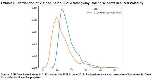
When it comes to volatility distribution, either implied or realized, the sample median is usually more representative than the sample mean. The distribution of VIX® levels and the equity market’s 21-trading-day realized volatility in the past 10 years clearly shows that implied and realized volatilities were heavily skewed (see Exhibit 1). Although the majority of the data points clustered to the left of the distribution, the fat tail on the right significantly pulled the sample mean above its median. Exhibit 2 further confirms that average volatility was higher than median volatility. Note that the 2008 financial crisis data was not included in this sample set; otherwise, the gap between mean and median would be even larger.

Furthermore, using a relatively short lookback period can help us identify local volatility spikes that are relevant to market performance. We can see from Exhibit 2 that mean and median vary, depending on the length of lookback period, indicating volatility regime shifts in history. The realized volatility of the S&P 500 in May 2019 was 14.29%. It may look tame compared with the index’s long-term average volatility (17.5% since 1990), but it has more than doubled from one month ago (6.14%).

We plotted the monthly excess returns of the S&P 500 Low Volatility Index over the past 10 years against the broad market monthly volatility (see Exhibit 3). We also included the one-year moving average and the moving median of 21-trading-day market volatilities, both calculated daily.

We can make the following observations from the past 120 months.

  • The volatility spiked 51 times, 34 of which had positive excess returns. In other words, if volatility rose above its one-year median, the probability of the S&P 500 Low Volatility Index beating the market was 67%.
  • The S&P 500 Low Volatility Index outperformed in 56 months; 61% of those months also had volatility spikes.
  • We saw 17 months in which the S&P 500 Low Volatility Index had excess returns greater than 2%. Out of those 17 months, 14 of them (82%) were also months with volatility spikes.

Exhibit 2 also shows that the mean and median of market volatility in the past year exceeded those of the past five years, suggesting that the market might be gradually moving out of its low volatility regime of recent years. The widening spread between the one-year mean and one-year median also reminds us of the shocks in late 2018.

It would not be surprising for market participants if low volatility factor strategies continued to perform better than a rising equity market, as long as volatility remained above its median.

The posts on this blog are opinions, not advice. Please read our Disclaimers.

Do Active Funds in India Benefit from Higher Active Risk Exposure?

Contributor Image
Akash Jain

Director, Global Research & Design

S&P BSE Indices

Fund managers typically follow a factor or a style of investing and aim to construct portfolios by balancing active sector exposures and stock-selection risks within a sector. Tracking error is one way to measure a fund’s deviation from its respective benchmark to determine how “active” it is.

As measured in the SPIVA® India Year-End 2018 Scorecard, in the Indian Equity Large-Cap category, fund managers undertaking higher active risk posted higher returns. The large-cap category is generally the most researched and most efficient segment in any market, and it is therefore extremely challenging to generate outperformance in the active space. As shown in Exhibits 1 and 2, in the large-cap category, fund managers who took higher risk (had a higher tracking error) delivered superior returns relative to their peers. In other words, funds taking higher active risk were compensated with higher excess return and thus, had higher information ratios. But looking at the category average, active funds had little to offer in terms of excess returns.

On the other hand, in the Indian Equity Mid-/Small-Cap category, funds with lower tracking error or funds that were more closely aligned to the benchmark outperformed their peers. Alternatively, Exhibits 1 and 2 imply that fund managers in this category who took on higher active risk in their portfolios found it challenging to get their active bets correct, thus witnessing lower information ratios. Having said that, we see that active fund managers in this category, on average, still generated excess returns over the benchmark.

In summary, in the Indian Equity Large-Cap category, active funds with higher active risk have historically offered positive excess returns and positive information ratios, but the overall category average shows that the category has underperformed the benchmark. Interestingly, in the Indian Equity Mid-/Small-Cap category, funds with lower tracking error have offered better excess returns and thus higher information ratios, with a mean excess return of 103 bps.

The posts on this blog are opinions, not advice. Please read our Disclaimers.

Implied Plunge Protection

Contributor Image
Tim Edwards

Managing Director, Index Investment Strategy

S&P Dow Jones Indices

Ever since its formation in response to the “Black Monday” crash of October 1987, the United States “Working Group on Financial Markets” has been accompanied by (persistently-denied) rumours that the group used government funding to make large equity purchases whenever the market fell – giving rise to its informal moniker of the “Plunge Protection Team”.  While few still believe that the original “PPT” are busy buying the dips, a modern version may have emerged in the current combination of U.S. political and fiscal priorities.  The effect is most visible in the collapsing cost of insuring against large downside moves in the S&P 500®.

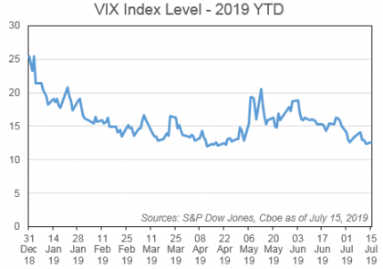
The Cboe Volatility Index (“VIX®”) provides a highly useful snapshot of short-term risk sentiment for the S&P 500 – it provides the “implied” annual volatility of the S&P 500 price index over the next month.  If volatility expectations are higher, the chance of a large down day increases.  After rising in December, VIX has been grinding down recently, closing on Monday at a paltry 12.68.

Exhibit 1: Cboe Volatility Index (VIX) year to date as of July 12th, 2019

If equity returns were normally distributed, then volatility would be all one needed to know to describe equity risk.  However, they aren’t, and so it isn’t.  Instead, equity returns are negatively skewed: declines three standard deviations below the mean have occurred much more frequently than gains three standard deviations above the mean.   In fact, if we take the prior day VIX as a prediction for the next day’s (annualized) volatility, declines that should be much more rare have occurred once or twice each decade.

Exhibit 2: “Impossible” daily moves in the S&P 500 (Jan 1990 – Jun 2019)

Note that although September 2008’s single-day decline of 8.79% is the largest in absolute terms, it was not the most “surprising” in our sample: the high reading of VIX on the previous day was already sounding the alarm of higher standard deviations.

Taking Skew into Account

If “tail” events are more likely than we would otherwise expect, we need to know how likely it is that a 3, 4 or 5-standard deviation move might occur (or at least, how much it costs to insure against one).  Conveniently, there’s an index for that!  The Cboe SKEW index uses the prices of S&P 500 options with different strikes to derive an implied “skew” of the distribution of future returns.  While skew has a formal mathematical definition, for practical purposes what we need to know is that its magnitude reflects the implied probability of a multiple-standard deviation loss.  Here is a chart of the implied 1-month skew in the S&P 500 for the past 15 years; we plot a 60-trading day average to illustrate the broader trend.  Notwithstanding a few bumps along the way, the series gains gradually from late 2008 through to a peak last September, but has fallen dramatically since then.

Exhibit 3: The 2019 Collapse in S&P 500 Skew

The perspectives of skew and volatility provide two dimensions in which the market can warn of a large decline.  VIX measures the cost of protection in general, whereas skew tells us if protection against larger moves is especially expensive relative to smaller moves.   Since surprises can occur even when we don’t expect them, skew has historically tended to reach its highest readings when VIX was low.  Exhibit 4 demonstrates this phenomenon based on daily closing levels over the past 15 years; the levels since the start of June 2019 are highlighted.

Exhibit 4: VIX and skew, historic and recent

What Exhibit 4 illustrates is that – at present – options linked to the S&P 500 imply that we’re set for low volatility, and unusually low skew compared to recent times.  That means that the market is charging considerably less than usual to insure against large down movements, and while market sentiment regarding risk can certainly be wrong, it does help explain what is going on at present.

Plunge Protection … but for how long?

Of course, it is one thing to note that the market doesn’t seem worried about a nasty shock, and quite another to speculate on the causes of such potential complacency: there is a very obvious candidate provided by the combined efforts of politicians and central bankers.

The U.S. Federal Reserve has committed to keep the economic expansion going, boosting market confidence that they will turn on the taps in response to equity weakness.  The Fed’s change in course in January after the equity market selloff was a major indicator here, as was the “good news is bad news” reaction that markets gave to a healthier-than-expected jobs figure on July 5th.

But the Fed is not going it alone; the Trump administration has made it clear that they view the equity market’s performance as a validation of their efforts to support the economy, and would appear to have a keen desire to keep the markets rising at least until the Presidential election.  The combined efforts of both fiscal and monetary powers seem aligned in an effort to prevent downside equity moves … at least in the near term.

The posts on this blog are opinions, not advice. Please read our Disclaimers.