Get Indexology® Blog updates via email.

In This List

A Look at Index History Part 1

Commodities Performance Highlights – May 2019

Mayday, Mayday!

S&P/TSX 60 2019 Gains Boosted by Exposure to the U.S.

Introducing the S&P/ASX 200® ESG Index: Mainstreaming ESG in the Australian Equities Market (Part 2)

A Look at Index History Part 1

Contributor Image
David Blitzer

Former Managing Director and Chairman of the Index Committee

S&P Dow Jones Indices

This is more an eyewitness account than an analytical review of the growth of indexing since I joined S&P in 1982.

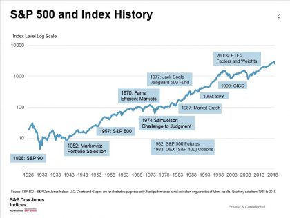
At the beginning of 1982, few people saw indices as a business. There were only two well-known US indices – the S&P 500® and the Dow™ – and one index fund. Interest rates and inflation were in double digits and the economy was in the second of two back-to-back recessions. No one wanted to buy stocks.

That January the Chicago Mercantile Exchange (CME) began trading futures on the S&P 500. In August the Fed backed away from tight money, T-bills fell under 10% and bull markets in stocks and bonds began. Stocks didn’t peak until 2000, after a nasty moment in October 1987. Bonds may not have peaked yet. By the end of 1982 Wall Street was using the S&P 500 futures to hedge positions and indices weren’t just for promoting newspapers. In 1983, the Chicago Board Options Exchange (CBOE) began trading options on the CBOE 100 stock index under the ticker OEX, later the index became the S&P 100.

Indices were a small part of S&P. In 1983, there were about 10 people in the index group when its name was changed to Index Services from Research. Today “the S&P” means the S&P 500. In 1983, the initials meant S&P Stock Reports – one page stock recommendations.  S&P had many more people supporting active managers and stock pickers than working on indices.

Black Monday was October 19, 1987, the day the market crashed. From January to late August 1987, the market rose 37%; from the high to October 16, it dropped 16%. On Monday, October 19, the S&P 500 lost 20%. The Dow lost 22%. Then it recovered: The S&P 500 closed 1987 unchanged for the year.  The one-day drop on October 19 was greater than the crash of 1929, which took two days.

In 1980s, trading stocks became an American pastime and part of daytime television with Financial News Network, acquired by CNBC in 1991. The S&P 500 became the benchmark and scorekeeper for the markets. Investment banks hired analysts to track indices and companies started asking how to become part of the S&P 500.

The 1990s started with a recession as the market that fell 23% from July to October 1990.  At the American Stock Exchange (later acquire by the NYSE) the new products team, looking for ways to increase trading volume, dug into the SEC’s report on the 1987 crash. Buried in the report was a comment that a mechanism to execute a single trade for a basket of stocks or an index would have helped. From that thought came the “Big SPDR” – the first US exchange traded fund (ETF) launched in 1993.  The ETF tracked the S&P 500; SPDR stood for Standard & Poor’s Depository Receipts.

The ETF brought several innovations to investors: It could be bought and sold through any broker and traded any time the market was open. ETF fees are typically lower than actively managed mutual funds.  ETFs are designed to track an index and the index gives investors transparency into strategy and securities.

The Tech bull market that began in 1995 put indices on the map. Most tales of the tech boom-bust chronicle the insanity of the boom exemplified by Pets.com (a real company). There were other, more substantial companies, pushing the market higher.  Two internet pioneers, which met the S&P 500 requirement for positive earnings, were added to the S&P 500: America Online (AOL) in December 1998 and Yahoo in December 1999.  Both are now part of Verizon.

The bull market paused in 1998 when Russia defaulted of its debt in August and Long Term Capital Management, an aggressive hedge fund, collapsed in September. Stocks dropped 19% before rebounding. The end of the Technology bull market came on March 24, 2000. From then until October 9, 2002 the market fell 50%.

The Tech bust had a lesson for investors. Weighting an index by companies’ market caps is a natural approach – the market itself is cap weighted so the index return and the market return should match. The Tech Boom-Bust proved that on the way up cap weighting can be a strong momentum performer. On the way down after the market turns, the index is often over-weighted in the stocks with the most to lose.  S&P began exploring other ways to weight indices.

In January 2003, S&P launched an equal weighted version of the S&P 500. Rather than weighting stocks by market value, the index weights each stock equally. Compared to the standard S&P 500, the equal weight version over weights the smaller stocks and under weights the larger ones. From January 2003 to May 2019, the equal weight S&P 500 returned 9.2% per year compared to 7.3% per year for the cap-weighted version.

The weighting in the standard S&P 500 shifted to float adjusted market capitalization in 2005. With the increasingly popularity of indices, investors recognized that excluding closely held shares which rarely trade would make tracking an index with an ETF easier. The average float among S&P 500 stocks was over 90% and the index had always excluded stocks with a float less than 50%, so there was not a major impact from float adjustment.

See Part 2 on the time since the Tech Bust.

The posts on this blog are opinions, not advice. Please read our Disclaimers.

Commodities Performance Highlights – May 2019

Contributor Image
Fiona Boal

Managing Director, Global Head of Equities

S&P Dow Jones Indices

There was a notable reversal of fortunes across the commodities complex in May. The S&P GSCI was down 8.2% for the month but remained up 8.5% YTD. The Dow Jones Commodity Index (DJCI) was down 3.6% in May and up 3.7% YTD, reflecting its lower energy weighting. A sharp correction in petroleum prices combined with ongoing weakness in industrial metal prices weighed on the broad commodities indices’ performance over the month. The U.S. Administration’s penchant for utilizing trade restrictions as a negotiation tool for everything from lowering illegal immigration, to penalizing the unauthorized use of intellectual property, to reestablishing dominance over its closest neighbors has undoubtedly muddied the fundamental supply and demand dynamics of the majority of commodities markets.

Oil prices fell abruptly in May, as trade wars fanned fears of a broad economic slowdown. The S&P GSCI Petroleum dropped 13.8% in May, when the supply issues that had preoccupied the energy markets for much of the year gave way to concerns regarding the resilience of demand and the long-term implications of the reinvigorated trade dispute between the world’s two largest economies, the U.S. and China. Oil market participants will now turn their attention to the upcoming OPEC meeting, scheduled for June 25, 2019, where it is becoming increasingly likely that there will be an agreement among the OPEC+ members to continue, or even deepen, production cuts with the lofty goal of maintaining global oil market stability.

The S&P GSCI Industrial Metals gave back all of its YTD gains in May, falling 5.5% for the month. The S&P GSCI Copper and S&P GSCI Zinc led the way down, falling 9.1% and 9.2%, respectively, in May. These two metals are highly correlated with trade war sentiment, which deteriorated markedly over the month. Zinc continued to fall from its highs in Q1 2019 after revised expectations for a supply surplus this year, with China’s zinc output forecast rebounding by 5.3%. Associated with the trade war, heightened risks of a global growth slowdown also weighed on industrial metals, with China’s manufacturing PMI reading below expectations at 49.4 in May.

With the present ambiguity across commodity and equity markets, it is somewhat surprising that gold only attracted lackluster interest from investors in May. The S&P GSCI Gold was up 1.7% over the month, leaving its YTD performance only marginally positive. The U.S. dollar slowed its year-long appreciation, moving sideways in May and adding to the list of reasons why the gold market has been relatively featureless.

The S&P GSCI Agriculture rallied 9.7% in May. Having severely lagged the energy and industrial metals markets during the first four months of the year, a spark was lit under the grain markets in May. Wet and rainy conditions have severely delayed the grain planting season in the U.S., and this encouraged a level of excitement in the markets that has not been witnessed for a number of years. The most recent USDA crop report showed that only 58% of the corn crop had been planted by May 26, 2019, down from 92% last year and from the 90% five-year average. Both the S&P GSCI Corn and S&P GSCI Wheat were up 18% for the month. In contrast, the S&P GSCI Cotton fell 11.1% in May, plagued by the trade conflict between China and the U.S. China is the largest importer and user of raw cotton and the U.S. is a top buyer of Chinese textile products.

The frenzy in the grains market spilt over into the livestock markets in May, but with the opposite effect, given that grain is a major component of livestock feed. The S&P GSCI Livestock was down 6.5% in May.

The posts on this blog are opinions, not advice. Please read our Disclaimers.

Mayday, Mayday!

Contributor Image
Chris Bennett

Former Director, Index Investment Strategy

S&P Dow Jones Indices

Coming into month-end, and as the street prepares its monthly summaries, (all figures are as of May 29th), the S&P 500 looks set to complete the month with a loss of around 5%.  So, what went wrong?  Global markets started the year very positively: the S&P 500 was up 18% by the end of April, while the S&P Global BMI had gained 16%.  Yet, the adage to “Sell in May and go away” looks to have been prescient advice this year.  Macro themes have returned, driving a wide spread in sector, factor, and country performances; volatility has also returned … although not as significantly as you might think.

Macro fears

The ongoing trade dispute between China and the United States provided the dominant theme in May, as both sides dug in their heels and prepared for a prolonged battle – creating uncertainty in both the investor and business communities.  Bond markets in particular demonstrated the flight to safety, as the 10-Year U.S. Treasury yield hit a twenty-month low, closing at 2.24%, and the 10-Year German Bund yield dropped to -0.18%.  Further, despite the U.S. economy growing 3.2% in Q1, the inversion in the U.S. yield curve continued to strengthen, stirring fears of recession.  While the current backdrop of economic strength seems like an unlikely environment for additional monetary stimulus, some believe there will be a rate cut from the U.S. Federal Reserve later this year – which added to the degree of inversion in the belly of the curve.

Divergence

While the broader market declined, sector, factor and single-country performances provided opportunities for selective investors.  Broadly speaking, defensive sectors outperformed, while trade-sensitive sectors struggled.  The S&P 500 Information Technology and Materials sectors declined 8% and 7%, respectively, while the Energy sector dropped 9% on oversupply concerns coupled with slowing global demand.

As was the case in sectors, defensive factors came back in vogue, with Low Volatility leading the way and High Beta bringing up the rear.  Momentum outperformed, which sounds counterintuitive but actually makes sense when you consider the timing of the mid-March rebalance for the index, when defensive constituents boasted market-beating one-year trailing returns.

In aggregate, markets included in the S&P Developed BMI outperformed those in the S&P Emerging BMI, but single-country performances were particularly dispersed.  Unsurprisingly, given the trade uncertainties, China struggled, with the S&P China BMI declining 12%.  Indian equities rebounded following the confirmation that Prime Minister Modi would get a second term, gaining 0.3% and outperforming all other Emerging Market country equity markets except for Russia and Greece, which gained 2% and 1%, respectively.  Frontier market Argentina beat them all, gaining 15% (all figures in USD terms).

Volatility … or a lack thereof

VIX® closed last night at 17.90, higher than it has been recently but not high by historical standards.  Given the perceived panic of trade concerns, it feels surprising that VIX isn’t higher.  One perspective is that the divergence in the performance among market segments has improved the level of diversification in the S&P 500; or it could be that – despite the cruelty of May – market participants think we’ll weather the storm and get back to growth in June.

Request to sign up for our daily market commentary by emailing chris.bennett@spglobal.com

The posts on this blog are opinions, not advice. Please read our Disclaimers.

S&P/TSX 60 2019 Gains Boosted by Exposure to the U.S.

Contributor Image
John Welling

Senior Director, Head of Global Equity Indices

S&P Dow Jones Indices

The S&P/TSX 60 gained 15.5% YTD[i] and many companies included in the index have benefitted from business prospects in the U.S. While nearly all stocks in the index are domiciled in Canada, 49%[ii] of combined revenues come from within Canada’s borders, while another 30% are sourced in the U.S. As shown in Exhibit 1, stocks with significant U.S. exposure have outperformed, contributing to gains of the S&P/TSX 60.

The S&P/TSX 60 U.S. Revenue Exposure Index, which is designed to measure companies from the S&P/TSX 60 with higher than average exposure to the U.S., outperformed the benchmark by 5.8 percentage points YTD. Meanwhile, the S&P/TSX 60 Canada Revenue Exposure Index, which is designed to measure companies from the S&P/TSX 60 with higher than average exposure to Canada, underperformed by 1.5 percentage points as of May 27, 2019.

Sector weight variations of each index, as shown in Exhibit 2, help explain the recent performance differences. Canadian Financials and Communication Services companies tend to gain a larger proportion of revenues from domestic sources. Energy and Information Technology companies, meanwhile, gain greater revenues outside of Canada.

Greater domestic focus of Communication Services and Financials sectors—shown in Exhibit 3—have been a hindrance to the S&P/TSX 60 Canada Revenue Exposure Index in 2019. Meanwhile, the outperformance of Energy and Information Technology companies have led to the improved returns of the S&P/TSX 60 U.S. Revenue Exposure Index.

While the S&P/TSX 60 comprises top companies in leading Canadian industries, over half of combined revenues are sourced from outside the country. Those companies earning significant revenues outside of Canada have boosted the YTD gains of the flagship index.

[i]   Source: S&P Dow Jones Indices LLC, total return data in CAD as of May 27, 2019.

[ii]   Source: Revenue exposure data from Factset, LLC, data as of May 27, 2019.

The posts on this blog are opinions, not advice. Please read our Disclaimers.

Introducing the S&P/ASX 200® ESG Index: Mainstreaming ESG in the Australian Equities Market (Part 2)

Contributor Image
Narottama Bowden

Director, Sustainability Indices Product Management

S&P Dow Jones Indices


Australian Listed Equities

The Australian listed equity market has two characteristics not to be overlooked when constructing a domestic index: its relatively small number of stocks and relatively large exposures to a few specific sectors. These factors alone often mean that the application of a specific indexing methodology can produce more pronounced effects compared with the equivalent approach being applied to a global universe.

  1. Number of Constituents

The S&P/ASX 200’s relatively low number of companies imply that each company has a larger-than-average weight in the index for a given size. Therefore, any exclusionary indexing approach could cause relatively larger levels of tracking error and index volatility compared with more diversified benchmarks.

This indeed turns out to be the case. The S&P 500 ESG Index—an index with more constituents of lower average index weights—had a marginally higher standard deviation than the benchmark over five years, at only 0.03%, compared with the S&P/ASX 200 ESG Index’s larger 0.23% margin (see Exhibit 1). The Australian benchmark also had a higher five-year tracking error than its U.S. counterpart.

Companies in the S&P ESG Indices are selected for inclusion, targeting 75% of the eligible universe’s weight, at the GICS® industry group level. However, by looking at the sector-level proportions of benchmark market caps covered in the ESG index compared with the 75% target, some sectors over- or undershoot the target by a significant margin.

These margins in all but two sectors are larger for the S&P/ASX 200 ESG Index than for the S&P 500 ESG Index, which may be expected given the relatively higher weights of the average stock in the Australian index. The marginal inclusion of comparatively smaller-weighted stocks, on average, would likely leave the final industry group market capitalization closer to the 75% target. The same result can also be expected when considering coverage at the sector level (see Exhibit 2).

  1. Sector Concentrations

Any index benchmarked to the S&P/ASX 200 would also be sensitive to how its methodology treats companies in the Financials (32.10%), Materials (18.12%), Health Care (8.40%), and Industrials (8.22%) sectors due to their significant weights.[1]

The S&P/ASX 200 ESG Index’s sector weights differ slightly from their weights in the benchmark due to the exclusions made when defining the index’s eligible universe. The two largest sector weight differences are found within the Health Care and Financials sectors.

  • In April 2019, Health Care had a 2.26% larger sector weight in the S&P/ASX 200 ESG Index compared with benchmark.
  • In contrast, Financials was underweight in the S&P/ASX 200 ESG Index by 2.81 (see Exhibit 3).

The S&P/ASX 200 ESG Index – Index Performance

Despite some of the nuances of the Australian listed equities market described above, the S&P/ASX 200 ESG Index achieves its objective. The index delivers a substantial index ESG score improvement, while providing a benchmark-like risk/return profile.

In fact, for the period studied, the S&P/ASX 200 ESG Index provided better relative returns and index ESG score improvement compared with its benchmark than its U.S. counterpart (see Exhibit 4). Overall, the S&P/ASX 200 ESG Index had an index ESG improvement of 28% compared with benchmark, while providing the same five-year annualized returns.

The ESG improvement at the sector level ranged from 14% to 66% (see Exhibit 5). The Real Estate and Consumer Discretionary sectors’ ESG score improvements were the largest. In the case of the Consumer Discretionary sector, this large improvement might have been expected considering that the ESG index’s coverage of the eligible benchmark sector market cap was the lowest (63%, see Exhibit 2). This implies that the average company included in this sector was among the higher ESG scoring samples in the top of the distribution of eligible companies. Similarly, the relatively low level of ESG score improvement experienced by the Utilities sector was correlated with its overshooting of the 75% benchmark market capitalization target.

CONCLUSION

The S&P/ASX 200 ESG Index is designed to present the Australian equities market with an alternative and investable ESG option to the widely adopted S&P/ASX 200. It can provide an increased exposure to the companies with better ESG characteristics in the S&P/ASX 200, with a similar risk/return profile. By bringing this ESG strategy to the flagship benchmark, investing through an ESG lens has never been easier.

For more information on the S&P/ASX 200 ESG Index, please visit https://spindices.com/indices/equity/sp-asx-200-esg-index-aud

Additional Resources on the S&P ESG Index Series

[1]   Weights denote these GICS sector weights in the S&P/ASX 200 as of the adjusted close on April 30, 2019.

The posts on this blog are opinions, not advice. Please read our Disclaimers.