Get Indexology® Blog updates via email.

In This List

Low Volatility Rate Response – Interest Rate Changes and Relative Performance

Women May Nurse This Old Stock Market Bull

The Next Frontier in Footprinting: Carbon Accounting for Sovereign Bonds

Introducing the U.S. S&P Select Industry Dashboard

Assessing the Potential of Value Factors in the Indian Market

Low Volatility Rate Response – Interest Rate Changes and Relative Performance

Contributor Image
Phillip Brzenk

Managing Director, Global Head of Multi-Asset Indices

S&P Dow Jones Indices

In a prior post, we saw that during sharp rising interest rate periods, the S&P 500® Low Volatility Rate Response fared better than the S&P 500 Low Volatility Index, even though both indices generally underperformed the S&P 500. In this post, we examine if there is a relationship between the magnitude of interest rate changes (positive and negative) and the relative performance between the two indices. We first plot the historical monthly excess returns of the rate response index over the low volatility index against monthly changes in interest rates (see Exhibit 1).

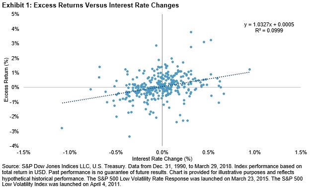
Exhibit 1 shows a clear trend in performance differential for 1) the direction and 2) the magnitude of interest rate changes. The linear regression trend line (the dotted line going across the chart) has a coefficient of 1.03 to interest rate changes. With a coefficient t-stat of 6.01, the results are statistically significant at the 99% confidence interval.

The coefficient approximates that for every 1% change in interest rates, the excess returns over the low volatility index is to change by roughly 1.03%. Given the positive slope coefficient, the rate response index generally outperformed the low volatility index when interest rates rose and underperformed when rates declined. Moreover, as shown by the upward-sloping regression line, the larger the increase in interest rates, the higher the excess return for the rate response index was compared with the low volatility index.

We also checked to see if the results held true for interest rate changes that were longer than one month. Exhibit 2 charts the rolling 12-month excess returns of the rate response index versus the low volatility index on the primary axis and the 12-month change in interest rates on the secondary axis.

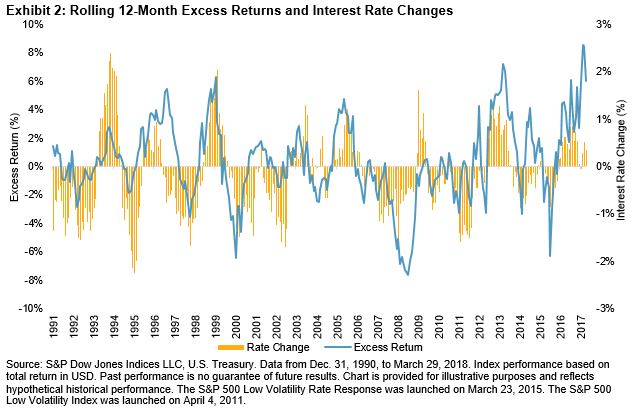
Exhibit 2 shows that the relationship between relative excess returns and changes in interest rates persisted for longer time horizons. As interest rates increased, the rate response index outperformed, and when rates declined, the low volatility index outperformed. Since the comparison goes back to 1991, the relationship can be observed throughout multiple market cycles. Exhibit 3 shows the hit rate and average excess returns for the rolling 12-month periods.

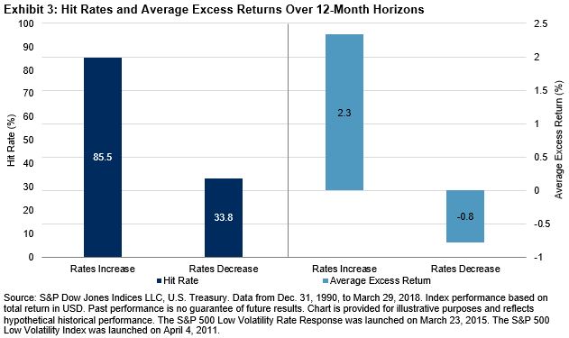
For the 12-month time horizons, when rates increased, the rate response index outperformed the low volatility index during nearly 86% of the periods, with an average outperformance of about 2.3%. When rates decreased, the low volatility index outperformed the majority of the time, with an average outperformance of 0.8%.

While the rate response index generally underperformed the S&P 500 in rising interest rate periods, it fared better than the low volatility index in the short-term (one month) and long-term (12 months). The results in this blog further confirm initial findings from the first blog that the rate response strategy reduces interest rate risk of a low volatility portfolio. In the final post of this series, we will investigate the performance of the two indices in down markets.

The posts on this blog are opinions, not advice. Please read our Disclaimers.

Women May Nurse This Old Stock Market Bull

Contributor Image
Jodie Gunzberg

Former Managing Director, Head of U.S. Equities

S&P Dow Jones Indices

“Not enough progress has been made in closing the gender gap, and in fact, in some countries, you have seen gender inequality increasing…” – Ángel Gurría, secretary-general of the Organization for Economic Cooperation and Development (OECD).

This was the opening of a recent speech at #WomenRule by Politico on a paper newly published by S&P Global.  Unfortunately, one of those countries is the United States as evidenced by  the decline of women’s participation to just 57%, from roughly 60% in 2000, according to the Bureau of Labor Statistics.  Also, as stated by the OECD, as recently as 1990, labor force participation rate (LFPR) among prime-age American women was near the top of advanced economies in the OECD. In 1990, LFPR for women of prime working age in the U.S. reached 74%. Since then, that rate has stayed roughly stable while increasing steadily elsewhere, pushing the U.S. down to 20th place among 22 advanced OECD economies by 2016.

In a prior paper by S&P Global, there was an economic scenario that showed the potential to add 5%-10% to nominal GDP.  If women entered, and stayed, in the workforce at a pace in line with, say, Norway, the U.S. economy would be $1.6 trillion larger than it is today.  However, the U.S. women’s LFPR has fallen from a key reason that the U.S. is the only country in the OECD that doesn’t provide income support during maternity or parental leave by law.  As one possible solution, S&P Global suggests a Congressional Budget Office (CBO)-like “score” could assess the impact legislation would have on the economic feasibility and accessibility to the workforce for women.

If the U.S. were to increase women’s LFPR to that of other advanced countries, S&P Global Ratings estimates an addition $455 billion output could be added to its baseline forecast for growth, or alternatively could add 0.2 percentage point per year on average for the next ten years.  That additional U.S. GDP growth could propel not just the U.S. stock market but the global markets as well, potentially adding an extra $2.87 trillion to the S&P 500 market value and $5.87 trillion to the S&P Global Broad Market Index over the next decade.

For every 1% of GDP growth, historically the S&P 500 has gained 3.4% on average, so based on that sensitivity, all else equal, the extra 0.2 percentage point may add another 0.7% of total return on average annually.  The information technology sector is the most sensitive with an average total return of 5.6% for every 1% of GDP growth historically.  If there were a higher female labor force participation rate, there could be an extra 1.1% total return annualized on average based on the historical sensitivity. 

U.S. GDP growth impacts not just the U.S. stock market, but markets globally since the U.S. economy is largely driven by consumer spending.  Generally, the more a country exports as a percentage of its output to the U.S., the greater the stock market sensitivity is to the U.S. growth. The mechanism for this is fairly simple: Because the U.S.’s “trade elasticity” is such that the country’s imports tend to increase at a faster pace than GDP growth during expansionary periods (while shrinking at closer to a 1-to-1 rate during times of economic contraction), manufacturers and other exporters to the U.S. enjoy outsized benefits when the American economy expands.

Since China exports almost four times as much to the U.S. as it imports in American goods and services in dollar terms, with exports to the U.S. accounting for 4.2% of the Chinese economy, its sensitivity to 1% of U.S. growth is 6.2% historically. For Japan, exports to the U.S. are roughly only twice its American imports, and exports to the U.S. account for just 2.8% of Japanese economic output, lowering its sensitivity to 1% of U.S. growth to just 2% total return on average.

Further evidence that this dynamic is at least partly responsible for the disparity includes the fact that South Korea—the U.S.’s sixth-biggest trade partner and No. 11 on the list of national economies—sends just about a third more to the U.S. than it receives, but those goods and services make up a substantial 4.6% of Korea’s GDP.  This has driven its stock market total return up 9.3% on average per 1% of U.S. GDP growth historically.

Most notably from its sensitivity to U.S. growth, Korea, which currently has the smallest market value of the major countries in the S&P Global Broad Market Index, could benefit so extraordinarily from U.S. GDP enhanced by increased female LFPR that it would jump to No. 3, just behind Japan and the U.S. in the 10 years examined, surpassing China.  

As this bull market, the second oldest one on record, continues to age, perhaps women are the key to unlocking the growth to give it a longer life.

The posts on this blog are opinions, not advice. Please read our Disclaimers.

The Next Frontier in Footprinting: Carbon Accounting for Sovereign Bonds

Contributor Image
Lauren Smart

Managing Director, Global Head Financial Institutions Business

Trucost, part of S&P Global

Sovereign bonds remain largely unanalyzed by investors from a carbon risk and reporting perspective. This is despite clear acknowledgement in the Paris Agreement that governments have a critical role in curtailing global warming,[1] and the Financial Stability Board’s warning that climate change could affect all asset classes and the stability of the broader financial system.[2]

A key obstacle has been defining the appropriate metrics. As sovereign bonds provide capital to national governments, it is a government’s carbon emissions that we are focused on, but opinions vary on the appropriate breadth of ownership and responsibility.

  • Are a government’s emissions just those produced directly through their expenditures, or should they also include those of the nation’s people and private companies?
  • What about the emissions embedded within goods produced domestically then shipped overseas or imported goods consumed in the country?
  • Is risk greater if a country consumes more emissions than it produces, if it has more emissions per capita, or if its level of debt is high relative to its emissions?

There is no right or wrong answer, but the choice of metric produces different insights.

Taking a Narrow View

A government’s emissions are those generated from its provision of public services. This limits double counting so it is neat from a carbon accounting perspective, but it is open to criticism for underrepresenting the emissions sovereign debt finances and the role of governments as regulators. The ability of a government to raise capital at competitive rates is based on the strength of the whole economy, not just the public sector. Similarly, the financial impacts of climate change will not be limited to the public sector, and the resilience of the economy will be affected by the influence a government exerts over private markets via regulation and taxation. Carbon taxes and renewable energy subsidies are good examples of the regulatory reach a government can exercise to influence production and consumption patterns of private firms and individuals. A broader approach counts all emissions produced within a country’s territorial boundary so the entire economy becomes the unit of analysis, but this method is exposed to double counting.

Accounting for Carbon in Imports and Exports

Governments generally report emissions produced within their borders, but this means that carbon can essentially be exported. Emissions tend to be exported from high-emitting industries in highly regulated countries to those with less stringent regulation. A carbon “balance of trade” approach helps address the demand side of the equation, and it is notable that net consumers are typically developed economies that typically outsource most production emissions to emerging economies.

To compare countries with economies of different size, we need to create a carbon intensity metric. Normalizing emissions by the level of government debt is one approach, but results are skewed by the different debt levels of countries that may disguise more environmentally relevant production and consumption patterns. An alternative is to express the carbon intensity relative to GDP. This is particularly appropriate if using a production-based approach to quantify a country’s carbon emissions because the territorial boundary mirrors the scope of GDP calculations. To take account of consumption, a per capita denominator provides a different perspective. However, the metrics can produce significantly different insights. As Exhibit 1 highlights, when using GDP-based intensities, OECD countries appear to be among the most carbon efficient in the world, but when using emissions per capita, they are the worst. The opposite is true for most BRIC countries. This illustrates the exportation of emissions from developed to emerging economies, which is not visible in the GDP-based metrics.

So we see that the choice of metric produces different insights and implied actions—the key is understanding when to apply which metric.

To explore in further detail, read Accounting for Carbon: Sovereign Bonds.

[1] https://unfccc.int/process/the-paris-agreement/status-of-ratification

[2] https://www.fsb-tcfd.org/about/

The posts on this blog are opinions, not advice. Please read our Disclaimers.

Introducing the U.S. S&P Select Industry Dashboard

Contributor Image
Anu Ganti

U.S. Head of Index Investment Strategy

S&P Dow Jones Indices

We recently launched the monthly U.S. S&P Select Industry Dashboard, which provides key metrics, analysis of correlation and dispersion, and historical risk/return data for 20 investable select industry indices.

The dashboard is a natural extension of our U.S. Select Sector Dashboard, which provides analysis for investable sectors across the large-, mid-, and small-cap ranges. For example, in May 2018, technology was the top-performing select sector. This outperformance was driven by strength in the S&P Semiconductors Select Industry Index and S&P Internet Select Industry Index.

One key feature of this new dashboard is that it illustrates each select industry’s distribution across the range of large, mid, and small caps. As seen in Exhibit 1, in May 2018, biotechnology had the most micro-cap exposure, as opposed to homebuilders, which had the highest large-cap exposure.

Another feature of this dashboard is a correlation matrix of the relative returns for all 20 S&P Select Industry indices. Banks and regional banks were highly correlated, as expected, as opposed to biotechnology and oil & gas equipment, which shared a lower correlation (see Exhibit 2).

Finally, as the S&P Select Industry indices are much more granular than their sector counterparts, we report on dispersion across industries (in contrast to our reporting within sectors). As of May 2018, the annualized dispersion among industry returns remained at moderate levels (see Exhibit 3); we shall continue to monitor the results in the coming months.

To sign up to receive the U.S. Select Sector and U.S. S&P Select Industry Dashboards, please refer to this link.

The posts on this blog are opinions, not advice. Please read our Disclaimers.

Assessing the Potential of Value Factors in the Indian Market

Contributor Image
Akash Jain

Director, Global Research & Design

S&P BSE Indices

The value factor looks to bucket stocks that have inexpensive valuation and trade at a discount to their fundamental value, with the hypothesis that inexpensive stocks should outperform overvalued stocks. Observations in empirical research suggested that the value factor performed best when the economy was in recovery and growth was accelerating from trough.[1]

We recently investigated the performance of different commonly used valuation parameters (see Exhibit 1) by market participants during the period from September 2005 to March 2018 in the Indian market. The analysis was based on hypothetical equal- and float-market-cap-weighted top quintile portfolios that were semiannually rebalanced in March and September.

Exhibit 1: Valuation Parameters Evaluated in the Analysis
BACK-TESTED UNIVERSE S&P BSE LARGEMIDCAP S&P BSE LARGEMIDCAP

(EX-FINANCIALS)

VALUATION PARAMETERS EVALUATED Sales-to-Price (S/P) EBITDA-to-EV (EBITDA/EV)
Book-to-Price (B/P) Free Cash Flow-to-EV (FCF/EV)
Trailing Earnings-to-Price (E/P)
12-Month Forward Earnings-to-Price (Fwd E/P)
Operating Cash Flow-to-Price (CFO/P)
Free Cash Flow-to-Price (FCF/P)
Dividend Yield (Div. Yield)

Source: S&P Dow Jones Indices LLC. Data from September 2005 to March 2018. All portfolios (except the S&P BSE LargeMidCap) are hypothetical portfolios. Hypothetical portfolios were rebalanced semiannually in March and September. The stock had to be covered by at least three analysts for it to be in the eligible universe for the forward earnings-to-price parameter. Table is provided for illustrative purposes.

Different cyclical characteristics were observed for various valuation parameters in the analysis (see Exhibit 2). For example, the top quintile portfolios for B/P, CFO/P, E/P, Fwd E/P, and S/P significantly outperformed the equal-weighted S&P BSE LargeMidCap portfolio in up markets, but they significantly underperformed in down markets, displaying strong cyclical behavior synonymous with the value factor. In contrast, the top quintile portfolios for Div. Yield, EBITDA/EV, and FCF/EV weren’t penalized in down markets.

Exhibit 2: Average Monthly Excess Return Versus the Benchmark (%, Based on Equal-Weighted Portfolios)
TREND NUMBER OF MONTHS B/P CFO/P DIV. YIELD E/P FWD E/P FCF/P S/P EBITDA/EV FCF/EV
Up 71 1.22* 0.95** 0.40 0.96* 1.31** 0.61* 1.40** 0.49 -0.67
Down 40 -2.13** -1.07** 0.14 -0.93* -1.52** -0.36 -1.89** 0.10 1.58**
Neutral 39 -1.12* -0.23 0.18 -0.25 -0.15 -0.15 -0.51 -0.01 0.90*
All 150 -0.28 0.10 0.27 0.14 0.17 0.16 0.02 0.26 0.34

Source: S&P Dow Jones Indices LLC. Data from September 2005 to March 2018. Excess return versus the equal-weighted S&P BSE LargeMidCap portfolio based on total return in INR. **Represents significance level at 1%. *Represents significance level at 5%. Up market trends refer to periods when the S&P BSE LargeMidCap monthly return was more than 1%. Down market trends refer to periods when the S&P BSE LargeMidCap monthly return was less than -1%. Past performance is no guarantee of future results. Table is provided for illustrative purposes and reflects hypothetical historical performance. The S&P BSE LargeMidCap was launched on April 15, 2015.

Exhibit 3 shows the correlation matrix of the top quintile excess return for all the back-tested value parameters. Due to the absence of finance stocks in the back-tested portfolios for EBITDA/EV and FCF/EV, these two parameters have low-to-negative correlations with other factors that were back-tested with the inclusion of all sectors. E/P and Fwd E/P had similar performance characteristics with a high excess return correlation of 91% (Exhibit 3). As the top quintile Fwd E/P portfolio had similar performance characteristics in comparison with the top quintile E/P portfolio over the long term (Exhibit 2) and the stock coverage of the Fwd E/P data was not as broad as of the E/P data, the trailing E/P seemed to be a more effective value parameter than the Fwd E/P.

Exhibit 3: Correlation Matrix of Equal-Weighted Value Parameters Based on Excess Return Over the Equal-Weighted S&P BSE LargeMidCap (%)
CORRELATION B/P CFO/P DIV. YIELD E/P FCF/P S/P EBTIDA/EV FCF/EV
B/P 78 68 84 87 61 89 -2 -53
CFO/P 78 58 77 79 80 80 16 -33
DIV. YIELD 68 58 74 67 51 65 -1 -41
E/P 84 77 74 91 66 78 3 -46
FWD E/P 87 79 67 91 64 82 0 -51
FCF/P 61 80 51 66 64 65 -9 -25
S/P 89 80 65 78 82 65 0 -54
EBTIDA/EV -2 16 -1 3 0 -9 0 37
FCF/EV -53 -33 -41 -46 -51 -25 -54 37

Source: S&P Dow Jones Indices LLC. Data from September 2005 to March 2018. Correlation calculated based on excess total return over the equal-weighted S&P BSE LargeMidCap concept benchmark index in INR. Past performance is no guarantee of future results. Table is provided for illustrative purposes and reflects hypothetical historical performance. The S&P BSE LargeMidCap was launched on April 15, 2015.

Additionally, the top quintile portfolios of a few valuation parameters had a large sector bias from the broad market universe (the S&P BSE LargeMidCap). Most notably, the basic materials sector was overweighted in the top quintile portfolios across all the valuation parameters, whereas the finance sector was most overweighted in the FCF/P top quintile portfolio (see Exhibit 4).

Exhibit 4: Average Sector Weight Deviation of the Top Quintile Portfolio Versus the S&P BSE LargeMidCap (%, Float Adjusted Market Cap Weighted)
SECTOR B/P CFO/P DIV. YIELD E/P FWD E/P FCF/P S/P EBTIDA/ EV FCF/EV
Energy -2 2 12 1 6 -6 8 9 -1
Utilities 5 1 4 2 0 -3 0 3 0
Information Technology -11 -12 -6 -9 -10 -8 -11 -9 8
Telecom 2 3 -2 -2 -2 1 -2 5 2
Fast Moving Consumer Goods -9 -9 -4 -9 -9 -9 -9 -9 -6
Finance 15 12 -1 12 14 39 1 -25 -25
Basic Materials 13 15 8 15 18 4 15 30 13
Healthcare -5 -5 -5 -5 -5 -4 -6 -5 2
Industrials -4 -1 -4 -1 -4 -8 6 3 0
Consumer Discretionary Goods & Services -3 -6 -2 -6 -7 -6 -3 -3 7

Source: S&P Dow Jones Indices LLC. Data from September 2005 to March 2018. The average sector weight deviation calculated versus the float-adjusted, market-cap weighted S&P BSE LargeMidCap portfolio. For the top quintile float-market-capitalization version of the indices, a 10% stock weight capping was implemented, which aligns with the S&P BSE LargeMidCap, where the largest stock had a weight of 11% in its constituent history. Back-tested portfolios for the EBITDA/EV and FCF/EV did not include finance stocks. Past performance is no guarantee of future results. Table is provided for illustrative purposes and reflects hypothetical historical performance. The S&P BSE LargeMidCap was launched on April 15, 2015.

Representation of Public Sector Undertaking (PSU) companies was also different across top quintile portfolios for various valuation parameters. While PSU companies represented almost 56% of the top quintile Div. Yield portfolio, they only accounted for 15% of the S&P BSE LargeMidCap. This indicates that PSU companies have been paying higher dividend yields than other companies in the Indian market.

Exhibit 5: Average Weight Representation of PSU Companies in Different Portfolios (Float-Weighted Portfolios)
VALUE PARAMETER PSU STOCK WEIGHTS (%)
Div. Yield 55.7
54.7
B/P 54.7
E/P 52.1
S/P 45.9
CFO/P 42.2
FCF/P 33.1
EBITDA/EV 32.9
FCF/EV 21.1
S&P BSE LargeMidCap 14.9
S&P BSE LargeMidCap (ex-Financials) 12.7

Source: S&P Dow Jones Indices LLC. Data from September 2005 to March 2018. All portfolios (except the S&P BSE LargeMidCap) are hypothetical portfolios. Average excess weight calculated over the float-market-cap-weighted S&P BSE LargeMidCap benchmark index in INR. For the float-market-capitalization version of the indices, a 10% stock cap was considered. This was in line with the S&P BSE LargeMidCap, where the largest stock had a weight of 11% in its constituent history. Past performance is no guarantee of future results. Table is provided for illustrative purposes and reflects hypothetical historical performance. The S&P BSE LargeMidCap was launched on April 15, 2015.

[1] Ang, Andrew. “The five Ws of style factors.” BlackRock (Dec. 5, 2017).

The posts on this blog are opinions, not advice. Please read our Disclaimers.