Get Indexology® Blog updates via email.

In This List

Big Things Come In Small Packages - Part 2

Prediction for 2018: There Will Be Many Predictions

Commodities: Winners and Losers of 2017

Big Things Come In Small Packages - Part 1

The Smartest Beta

Big Things Come In Small Packages - Part 2

Contributor Image
Jodie Gunzberg

Former Managing Director, Head of U.S. Equities

S&P Dow Jones Indices

Not all indices are created equally, especially those representing US small-cap equities.  Many investors are surprised to learn that the S&P SmallCap 600 has outperformed the Russell 2000 by 2% annualized since inception (Dec. 31, 1994.)  This outperformance is persistent through different time periods, bull and bear market cycles, and with less risk.  The performance results of the S&P SmallCap 600 should redefine and raise the bar for passive small-cap beta. 

This is the 2nd part of our blog series containing excerpts from our new paper where we discuss the outperformance of the S&P SmallCap 600 versus the Russell 2000, the performance of the indices compared with active managers, and the case supporting the performance.

THE S&P SMALLCAP 600 OUTPERFORMS THE RUSSELL 2000
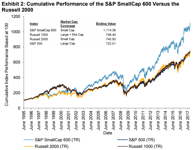
Let’s begin with a simple example to demonstrate the long-term outperformance of the S&P SmallCap 600 over the Russell 2000 by showing the cumulative growth of USD 100 from June 1, 1995 to September 29, 2017. The S&P SmallCap 600 would end with a hypothetical value of USD 1,114.38, while the Russell 2000 ends with a hypothetical value of just USD 740.93. Another way to view this is that a market participant would hypothetically return 373% more with the S&P SmallCap 600. Over the period studied, the Russell 1000 slightly outperformed the Russell 2000 and the S&P 500. Since the return of the Russell 1000 was similar to that of the S&P 500, the S&P 500 will be used as the large-cap market benchmark in the analysis. It is also worth noting  that the Russell 1000 includes both large- and mid-cap stocks, whereas the S&P 500 is purely a large-cap index.

Source: S&P Dow Jones Indices LLC. Data from June 1, 1995, to Sept. 29, 2017. Index performance based on total return in USD. Past performance is no guarantee of future results. Chart is provided for illustrative purposes.

Another way to measure S&P SmallCap 600 outperformance is by annualized return and risk, as measured by the standard deviation of returns. Since inception, the S&P SmallCap 600 had an annualized return of 11.6% and annualized risk of 18.3%, generating a Sharpe ratio of 0.50.
Over the same time period, the Russell 2000 had an annualized return of 9.6%, annualized risk of 19.2%, and a Sharpe ratio of 0.37. The S&P SmallCap 600’s returns were higher than the Russell 2000 over every time period analyzed, while its risk was lower in every period.

Source: S&P Dow Jones Indices LLC and eVestment Alliance. Data from Dec. 31, 1994, to Sept. 29, 2017. Index  performance based on total return in USD. Past performance is no guarantee of future results. Table is provided for illustrative purposes.

Since the S&P SmallCap 600 was launched in 1994, there are five bear and bull market cycles (as defined by peak to trough and trough to peak periods of the S&P 500) to analyze, and the S&P SmallCap 600 outperformed the Russell 2000 in four of those cycles. From the beginning of the data set on June 1, 1995, through Sept. 1, 2000, small caps underperformed large caps, but the S&P SmallCap 600 returned 129%, which was 15% more than the Russell 2000. In the following bear market, the S&P SmallCap 600 outperformed the Russell 2000 by 15% again.  Although the next two cycles returned similarly, the S&P SmallCap 600 has been significantly outperforming in the current bull run since the global financial crisis ended in March 2009, beating the Russell 2000 by 66% and the S&P 500 by 108%. These are compelling returns to argue for a strategic allocation to not just small-cap stocks, but to the S&P SmallCap 600 rather than the Russell 2000.

Source: S&P Dow Jones Indices LLC. Data from June 1, 1995, to Sept. 29, 2017. Index performance based on total return in USD. Past performance is no guarantee of future results. Chart is provided for illustrative purposes.

Lastly, the S&P SmallCap 600 had relatively strong monthly and annual returns compared to the Russell 2000. On a monthly average, the Russell 2000 gained 0.89%, slightly more than the 0.83% gain for the S&P 500, but noticeably less than the average monthly return of 1.03% for the S&P SmallCap 600. Perhaps more important is that the S&P SmallCap 600 also provided downside protection. The down market capture ratio for the S&P SmallCap 600 was just 104.8 versus 119.2 for the Russell 2000. This means for every 1% drop in the S&P 500, the Russell 2000 fell an extra 0.2%. Also, the Russell 2000 fell in 45% of months that the S&P 500 fell, which is slightly worse than the 43% rate for the S&P SmallCap 600.

Referring to Exhibit 5, in any given calendar year for the past 23 years, the S&P SmallCap 600 outperformed the Russell 2000 for at least four months. Only in five years did the S&P SmallCap 600 outperform in less than 6 of the 12 months. On average, the S&P SmallCap 600  outperformed by 1.9% per year. The greatest underperformance of 8.9% occurred in 1999 and
the greatest outperformance of 14.8% occurred in 2000.

Source: S&P Dow Jones Indices LLC, FactSet. Data from Dec. 31, 1993, to Dec, 31, 1996. Index
performance based on total return in USD. Past performance is no guarantee of future results. Table is provided for illustrative purposes.

The performance shown here should at least beg the question of why the S&P SmallCap 600 is not more commonly used as a benchmark. The performance measurement of managers may be held to a higher standard compared with the S&P SmallCap 600. It may bring more credibility to the managers who beat the benchmark, or it could bring to light the managers who might be charging for active management but generating negative alpha.

In the next post of this series, we will show the small cap index performance versus the active small-cap peer group.  The results will show the S&P SmallCap 600 could be considered not just as a benchmark replacement, but rather it could more widely serve as the underlying index for investable passive funds.


The posts on this blog are opinions, not advice. Please read our Disclaimers.

Prediction for 2018: There Will Be Many Predictions

Contributor Image
Fei Mei Chan

Former Director, Core Product Management

S&P Dow Jones Indices

A calendar that offers a forecast for every day of the coming year is not uncommon in Chinese households.  I don’t often hear references to the calendar on most days. But every now and again I would hear my mom marvel, “Oh that calendar was right on for today!” In investing, there is also particular penchant for prediction at the beginning of the year. The start of a new year means we have put the previous one behind us, and knowledge of what the coming year will bring will be helpful.

But rarely do people look back to see whether those forecasts actually panned out…except, of course, on the rare occasions when some did materialize. As an example, “Why 2017 could be the year stock pickers regain their edge,” was published in early 2017. Among the many predictions used to justify a “stock pickers’ market” were: inflation should rise, interest rates should rise, value stocks will do well, correlations will be low and dispersion will be high.

Many of these just did not happen in 2017; inflation remains tame, the 10-Year Treasury rate barely budged year over year, value did not make a comeback and dispersion was lower on average in 2017 compared to 2016.

One prediction, however, did happen. Correlations were lower on average in 2017 compared to 2016, and this is a commonly used justification for a better stock pickers’ market.  Unfortunately,  it is dispersion that defines the opportunities available for outperformance—and SPIVA data show that the lowest dispersion environments correspond with the worst manager performance).

More Managers Underperformed in Low-Dispersion Environments

In contrast, active managers are no more likely to outperform when correlation is low than when it is high.

Correlation Had No Significant Influence on the Outcome of Manager Performance

Undoubtedly, more predictions will be forthcoming for 2018 and likely, many will be the same ones that were made for 2017. But at least if we come across the one about low correlations we can check it off the list because it is irrelevant to the outcome of active performance.

The posts on this blog are opinions, not advice. Please read our Disclaimers.

Commodities: Winners and Losers of 2017

Contributor Image
Marya Alsati

Former Product Manager, Commodities, Home Prices, and Real Assets

S&P Dow Jones Indices

The Dow Jones Commodity Index (DJCI) was up 3.0% for the month and up 4.4% YTD, and the S&P GSCI was up 4.4% with a YTD return of 5.8%. In December, livestock was the worst-performing sector in the indices, while industrial metals was the best. Of the 24 commodities tracked by the indices, 16 posted positive YTD returns. Aluminum was the best-performing commodity for the year, while natural gas was the worst.

Of the S&P GSCI commodities, five industrial metals made up the top five YTD performers in 2017. Aluminum was up 30.7% for the year, which marks the third-largest annual gain for the commodity in the history of the S&P GSCI, after 1994 (up 72.9%) and 2009 (up 33.7%). Aluminum posted seven monthly gains in 2017. The gains were partly due to plans from China, the world’s largest producer and consumer of the base metal, to reduce excess aluminum production to address pollution, along with a Chinese fiscal stimulus targeting infrastructure, which bolstered demand for all base metal commodities.

Copper had its best year-end performance since 2010, as the Chinese government banned imports of scrap metal in a period of high demand. Lead, nickel, and zinc benefited from low inventories; both lead and zinc had their best years since 2009.

Coffee was down, recording its third consecutive negative year, due to a global production surplus. The wheat commodities reported their fifth negative annual decline due to increased global supply, as Russia increased production and competition with Australia, Canada, and the U.S. over the Middle Eastern import market due to its geographical proximity. Sugar was weighed down by increased output levels in 2017 plus reduced production in both Brazil and India that had failed to meet demand in 2016.

Natural gas was down 36.5%, reporting its worst year-end decline since 2014, due to two consecutive mild weather winter conditions in 2016 and 2017, as well as strong production. A report from the U.S. (Energy Information Administration (EIA) showed an increase in inventories to 36 billion cubic feet in December 2017.

The posts on this blog are opinions, not advice. Please read our Disclaimers.

Big Things Come In Small Packages - Part 1

Contributor Image
Jodie Gunzberg

Former Managing Director, Head of U.S. Equities

S&P Dow Jones Indices

Sometimes first isn’t better, and sometimes bigger isn’t better.  In this case, first and bigger are mostly worse.  Here’s some background behind the launch timing of the Russell 2000 versus the S&P SmallCap 600.  The timing and business around the Russell 2000 launch really helped the popularity of the index, but with an extra decade’s worth of research, the S&P SmallCap 600 has a higher quality design, resulting in higher performance and less risk.

This blog series will contain excerpts from our new paper where we discuss the outperformance of the S&P SmallCap 600 versus the Russell 2000, the performance of the indices compared with active managers, and the case supporting the performance.

A recent paper by FTSE Russell rightly pointed out the well-timed launch of the Russell 2000® in 1984, an index meant to measure the small-cap segment of the U.S. equity market. The launch was on the back of breakthrough research by Rolf Banz finding that “smaller firms have had
higher risk-adjusted returns, on average, than larger firms.”  At the time, the launch of this benchmark enabled Russell Investment’s consulting clients to gauge the success of small-cap managers.

However, it was not until the early 1990s when the “small-cap premium” concept was really solidified. Nobel Prize winner Eugene F. Fama and co-author Kenneth R. French introduced the three-factor model of market risk, value, and small-cap factors that now serves as the foundation for much of the current research on the topic.  Following this research, the S&P SmallCap 600 was launched in 1994.

Although the S&P SmallCap 600 took an extra decade’s worth of research into account in its construction as a benchmark, the Russell 2000 is far more widely used. According to eVestment Alliance, as of June 30, 2017, 93% of small-cap funds and 81% of assets in the space are benchmarked to the Russell 2000, compared with 3% of funds and 5% of assets benchmarked to the S&P SmallCap 600.

Source: eVestment Alliance, LLC. Data includes the eVestment US Small Cap Equity, US Passive Small Cap Equity, and US Enhanced Small Cap Equity Universes. The Russell 2000 and S&P SmallCap 600 rows include sub-indices such as Value and Growth. eVestment Alliance, LLC and its affiliated entities (collectively, “eVestment”) collect information directly from investment management firms and other sources believed to be reliable, however, eVestment does not guarantee or warrant the accuracy, timeliness, or completeness of the information provided and is not responsible for any errors or omissions. Performance results may be provided with additional disclosures available on
eVestment’s systems and other important considerations such as fees that may be applicable. Not for general distribution and limited distribution may only be made pursuant to client’s agreement terms. *All categories not necessarily included, totals may not equal 100%. Copyright 2012-2017 eVestment Alliance, LLC. All rights reserved. Table is provided for illustrative purposes.

Perhaps the longevity and prevalence of the Russell 2000 as a small-cap benchmark is why it has been widely used in research doubting whether the small-cap premium exists.  Even in FTSE Russell’s own research, they show the Russell 2000 had a lower Sharpe ratio than the large and mid-cap Russell 1000 (0.34 versus 0.41, respectively) from June 1996 through August 2015. According to eVestment Alliance, from June 1996 through September 2017 the Sharpe ratio of the Russell 2000 was 0.31 while that of the Russell 1000 was 0.42.

However, the S&P SmallCap 600 had a Sharpe ratio of 0.43 over the same period. Not only has the S&P SmallCap 600 had a higher Sharpe ratio than the Russell 2000 historically, but the S&P SmallCap 600 has outperformed the Russell 2000 over various time periods and market cycles. Furthermore, according to the S&P Dow Jones Indices SPIVA® U.S. Mid-Year 2017 Scorecard, the S&P SmallCap 600 outperformed 93.8% of all small-cap funds over a five-year period.

In the next post of this series, we will show the actual outperformance of the S&P SmallCap 600 versus the Russell 2000 over the long term, the higher returns and lower risk over different time periods, and through different bull and bear market cycles.

The posts on this blog are opinions, not advice. Please read our Disclaimers.

The Smartest Beta

Contributor Image
Tim Edwards

Managing Director, Index Investment Strategy

S&P Dow Jones Indices

In the last year, plain old beta performed remarkably well in comparison to the so-called “smart” alternatives tracking large-cap U.S. equities.  Of the 17 different strategies reported in our year-end factor dashboard, less than a third outperformed the S&P 500’s total return of 21.83% over the last 12 months.

When they are criticized as the basis of investment strategies (or at any rate when alternatives are promoted) cap-weighted equity benchmarks tend to be ascribed with certain “flaws” – in particular: an undue concentration in the largest stocks or sectors; a disregard for valuations; and a propensity to overweight recent outperformers.  Ironically, it was the supposed flaws of capitalization-weighted benchmarks that drove their relatively strong performance last year.

In 2017, size mattered.  The smallest quintile of S&P 500 constituents (based on prior year-end market capitalizations) averaged a total return of only 8.4%, while the largest stocks gained 22.3%.  In between, returns increased monotonically with size quintile.

Moreover, the U.S. market’s largest sector (Information Technology) had a banner year, soaring by 39% over the year and driving strong correlations between an index’s allocation to the sector, and its total return over the year. 

These size and sector perspectives are useful because nearly all smart beta strategies will – unless explicitly controlled for – underweight the largest stocks or sectors.   (Strategies based on momentum, growth or quality can provide occasional exceptions.)

As we’ve argued previously, the performance of an equal weight index is a useful tool to gauge whether capitalization weighting alone helped or hindered returns.  Last year, the S&P 500 Equal Weight underperformed its parent by around 3% – a material hurdle for smart beta to overcome through stock selection and additional weighting tweaks.  Those that did outperform largely did so through exposures to the factors said to weaken market benchmarks – owning larger stocks, or underweighting value, or simply following the trend.

The posts on this blog are opinions, not advice. Please read our Disclaimers.