Get Indexology® Blog updates via email.

In This List

S&P 500 Buy-Write Strategies: How Much Income Should You Expect?

Tracking the Effect of Demonetization on Capital Markets in India

Asian Fixed Income: From Implicit Guarantees to Bond Defaults

No News, and No Implications

Drawdown Analysis of Low Volatility Indices

S&P 500 Buy-Write Strategies: How Much Income Should You Expect?

Contributor Image
Berlinda Liu

Former Director, Multi-Asset Indices

S&P Dow Jones Indices

Buy-write strategies, also known as covered calls, are a staple offering for income-seeking market participants who sell, or “write,” call options against shares of assets they already own in order to generate income from the option premium.  However, the option seller forfeits the upside potential of the asset and is obligated to sell the asset to the buyer of the option if it is exercised.

Since 2002, CBOE has launched a suite of buy-write indices that covers all major U.S. equity benchmarks.  Exhibit 1 shows the buy-write indices based on the S&P 500.

The BXM is considered the benchmark index for buy-write strategies.  It writes standard monthly at-the-money (ATM) call options based on the S&P 500 and holds the options to maturity before they are cash settled.  All dividend and option premiums are fully reinvested in the index.

According to the roll data published by CBOE, between March 17, 2006, and Dec. 16, 2016, the short call position went in-the-money (ITM) and was exercised in 85 out of 130 months (65.38%).  This implies that any gain from the S&P 500 was offset by the short call cash settlement in almost two out of three months, and that in the other months, the S&P 500 decreased or was unchanged.  Based on this data, the growth in the BXM mainly came from the reinvestment of the stock dividend and the call option premium.

Taking the monthly roll data published by CBOE, we tested several distribution plans based on the BXM (see Exhibit 2).  Assuming we invested USD 100 in the BXM on March 17, 2006, on Dec. 16, 2016, we would end up with USD 165.57 if all dividends and premiums were reinvested, but only USD 11.47 if all dividends and premiums were immediately distributed every month.  With an annual distribution of 4.5%, we would end up with USD 102.13, almost at par with the initial portfolio value.  Although the option premium seemed high at 1.84% per month, distributing 1% monthly (or 12% annually) would have reduced the portfolio value by one-half in these 130 months.

The BXY is another popular buy-write index, which writes 2% out-of-the-money (OTM) call options based on the S&P 500 every month.  It allows the equity to grow up to 2% between monthly rolls but takes in a lower call premium as a tradeoff.

To illustrate the impact of the moneyness of options on distribution of cash flows, we ran a similar test on the BXY (see Exhibit 3).  For the same time period, USD 100 invested in the BXY grew into USD 197.86 and USD 44.86 if all dividends and premiums were distributed immediately.  The portfolio ended up almost at par (USD 103.93) if the index distributed 6% annually.

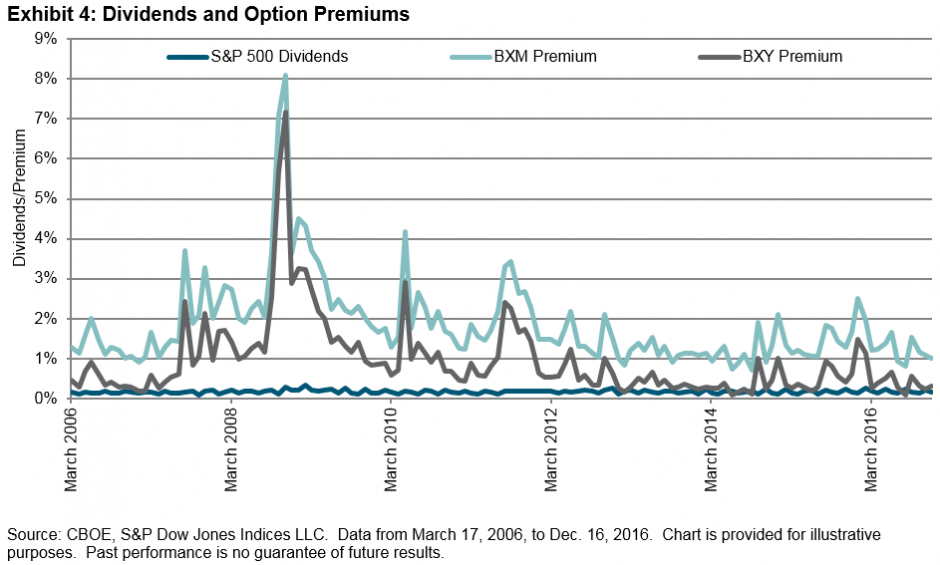
Exhibits 4 and 5 show that the option premiums collected from BXM were much higher than from BXY.

These tests illustrate the trade-off of a typical buy-write strategy: ATM option premiums are usually larger than the OTM option premiums, but selling ATM options forgoes all the upside of the stock market.  The equity position has no upside but the potential cost of options being exercised.  For income-seeking market participants, picking a proper buy-write portfolio to meet a specific distribution goal has to take both the equity growth and the call premium into consideration.

The posts on this blog are opinions, not advice. Please read our Disclaimers.

Tracking the Effect of Demonetization on Capital Markets in India

Contributor Image
Ved Malla

Associate Director, Client Coverage

S&P Dow Jones Indices

November 9, 2016, was the day when the world witnessed two big unexpected events—one was Mr. Donald Trump winning the U.S. presidential election, and the second was the Indian Prime Minister Mr. Narendra Modi announcing that 500 and 1,000 rupee notes would no longer be considered legal tenders.  Both of these events were expected to affect India in a big way.

On November 8, 2016, Mr. Narendra Modi came on national television and announced that at the stroke of midnight, 500 and 1,000 rupee notes would no longer be legal tenders.  These notes constituted 86% of the total currency in circulation.  This announcement was by far the boldest economic decision taken in recent years.  The rationale for this unexpected decision was to remove counterfeit currency notes from the system, end the parallel black market economy, and digitize the Indian economy.

The old notes were proposed to be replaced with new 500 and 2,000 rupee notes.  The deadline to deposit or change old notes was December 30, 2016 (50 days after the announcement).  There were restrictions imposed on withdrawal, as it would take some time to release the new currency notes into the system.  Millions of people rushed to banks and ATMs to deposit old notes and collect new ones, which were unfortunately in shortage.  The unregulated cash economy had suddenly come to a standstill.

Demonetization was the topic of discussion across the length and breadth of India.  While many supported this bold move, there were others who criticized it.  Many people felt that it was a landmark decision that would have enormous benefits in the long run, while some argued that it was a decision that only caused inconvenience to the people, especially the poor.

We will analyze the effect of demonetization on the four leading S&P BSE Indices, the S&P BSE SENSEX, S&P BSE LargeCap, S&P BSE MidCap, and S&P BSE SmallCap.

Exhibit 1: Index Total Returns
INDEX INDEX VALUE ON NOVEMBER 08, 2016 INDEX VALUE ON MARCH 14, 2017 PERCENTAGE INCREASE
S&P BSE SENSEX 38,829.29 41,516.06 6.92
S&P BSE LargeCap 3,874.84 4,141.88 6.89
S&P BSE MidCap 15,010.27 15,755.02 4.96
S&P BSE SmallCap 15,093.32 15,943.86 5.64

Source: S&P Dow Jones Indices LLC.  Data from November 8, 2016 to March 14, 2017.  Table is provided for illustrative purposes.  Past performance is no guarantee of future results.

In Exhibit 1, we can see that all four indices have given a positive return.  The returns of the S&P BSE SENSEX and S&P BSE LargeCap were higher than those of the S&P BSE MidCap and S&P BSE SmallCap post demonetization.

Exhibit 2: Index Total Returns

Source: S&P Dow Jones Indices LLC.  Data from November 8, 2016 to March 14, 2017.  Chart is provided for illustrative purposes.  Past performance is no guarantee of future results.

From Exhibit 2, we can see that after the demonetization announcement, all four indices fell for about two weeks due to uncertainty in the economy.  This was followed by a stable period of two weeks, during which markets even recovered.  Nearing the cut-off date for depositing old notes (December 30, 2016), the markets again fell as there was uncertainty about the future due to the shortage of new currency in circulation.  The S&P BSE MidCap and S&P BSE SmallCap fell more compared with the S&P BSE SENSEX and S&P BSE LargeCap, as the demonetization had a greater effect on smaller companies. Since January 1, 2017, the markets have been bullish and have continued the upward trend.

Considering the upward movement in all four indices post demonetization, as well as the recent state election results (especially that of Uttar Pradesh, where the Narendra Modi Government obtained majority), we can conclude that the demonetization decision has been backed by most people and it has generally had a positive impact on capital markets in India.

The posts on this blog are opinions, not advice. Please read our Disclaimers.

Asian Fixed Income: From Implicit Guarantees to Bond Defaults

Contributor Image
Michele Leung

Former Director, Fixed Income Indices

S&P Dow Jones Indices

Chinese authorities will allow market participants to buy onshore bonds through transactions carried out in Hong Kong, which will further broaden foreign access to China’s onshore bond market. While no additional details have been provided, a “bond connect” scheme that provides cross-border cash bond trading is anticipated by market participants.

Despite currency volatilities, China bonds offer better yields and diversification benefits. However, foreign investors are concerned with the potential credit risk.  Besides the non-parallel rating systems between local and the international standards, the implicit government guarantees prevented bond defaults, which had made it difficult to analyze the true underlying credit risk.

However, following the first bond default in 2014, the number of bond defaults has been accelerating, including those of state-owned enterprises. According to WIND data, over 60 bonds defaulted in 2016, with the affected sectors including land development, mining, steel-iron, and oil & gas.  The biggest default in 2016 was from China City Construction, a Chinese construction and development firm, with a collective defaulted amount of CNY 8.55 billion.  In the first two months of 2017, bond defaults amounted to CNY 4.1 billion from Dongbei Special Steel, Dalian Machine Tool, and Inner Mongolia Berun.

From 2014 to February 2017, China recorded a total of CNY 58 billion of bond defaults, which is equivalent to 0.11% of the current overall market value, as tracked by the S&P China Bond Index. The top two industries that had the highest default amounts were mining/diversified and landing development/real estate, reflecting the sharp slowdown in Chinese manufacturing and construction.

The defaults are perceived to be healthy for the long-term development of China’s onshore bond market. In the search for higher-quality corporate bonds, we adopted a two-tier screening approach in our index design and launched the S&P China High Quality Corporate Bond 3-7 Year Index. As per the index methodology, issuers must first be investment-grade rated by at least one of the international rating agencies, and then securities must be rated ‘AAA’ by at least one of the local Chinese rating agencies.

Exhibit 1: China Corporate Bond Defaults by Company Industry (Total Par Amount)


The posts on this blog are opinions, not advice. Please read our Disclaimers.

No News, and No Implications

Contributor Image
Craig Lazzara

Former Managing Director, Index Investment Strategy

S&P Dow Jones Indices

This morning’s Wall Street Journal reported, rather breathlessly, that “U.S. bond yields are topping a key measure of the dividends that large U.S. companies pay—a shift that has broad implications for investors….”  The headline was triggered by the observation that the 2.50% “yield on the 10-year U.S. Treasury note…exceeded the 1.91% dividend yield on the S&P 500.”

Does this fact have important implications? On the contrary, we’d argue that this isn’t news, and that it tells us nothing about the market’s future direction.  For historical context consider the chart below:

In September 1958, the yield on the 10-year Treasury note rose above that of the S&P 500, a condition which continued unabated for the next 50 years.  Stock yields rose above bond yields briefly at the end of 2008, but have remained below bond rates for most of the time since then.  In other words, for the vast majority of recent history, the yield on bonds has exceeded the yield on stocks.

Does the current upward move in interest rates pose “a threat” to the stock market, as the Journal suggests?  The historical evidence here is ambiguous; since 1991, the average return for the S&P 500 has been higher in months when interest rates rose than in months when rates fell.  There is clearly no concrete relationship between the direction of rates and the direction of the stock market, as the chart below makes clear:

It’s certainly possible that increased competition from higher bond rates will cause weakness in the equity market.  It’s equally possible that the economic strength which is producing higher bond yields will also sustain earnings and stock prices.  In either event, the news that bonds yield more than stocks hardly qualifies as news at all.

The posts on this blog are opinions, not advice. Please read our Disclaimers.

Drawdown Analysis of Low Volatility Indices

Contributor Image
Phillip Brzenk

Managing Director, Global Head of Multi-Asset Indices

S&P Dow Jones Indices

One of the objectives of low volatility strategies is to provide higher risk-adjusted returns than their respective benchmarks over the long run, primarily by reducing drawdowns during market downturns.  In the U.S. market, both the S&P 500® Low Volatility Index and the S&P 500 Minimum Volatility Index have shown outperformance over the S&P 500, not just on a risk-adjusted basis, but also in absolute terms (see Exhibit 4 of Inside Low Volatility Indices).  To understand how the volatility strategies performed in the most significant down markets, we look at the three largest drawdowns of the S&P 500 since 1990:

In all three drawdown periods, the low-risk strategies outperformed the benchmark.  In the financial crisis (2007-2009), the S&P 500 Low Volatility Index outperformed the S&P 500 by over 15% and the S&P 500 Minimum Volatility Index outperformed by more than 6%.  The return differential during the tech bust (2000-2002) was more extreme, with the minimum volatility outperforming by 30% and the low volatility index outperforming by 50%.  During the Russian currency crisis (1998), the S&P 500 dropped 19% in under two months, and the low-risk strategies were again able to limit losses.

Did the low-risk indices outperform during the market downturns for the same reasons, or did the methodology differences (as outlined in a previous post) lead to different sources of excess return?  A common approach to analyzing this is to run a sector-based performance attribution, which breaks down the total excess return of a portfolio versus a benchmark between an allocation effect and a selection (+ interaction) effect.  The allocation effect will show the effect of over- or underweighting a sector relative to a benchmark, while the selection effect will show the effect of over- or underweighting individual securities within a sector relative to the benchmark.  The sector-based attribution results for the low-risk strategies during each of the three largest drawdowns of the S&P 500 are shown in the following exhibits, with the sector that had the highest total effect highlighted for each index.

During the largest drawdown, the financials sector was the largest contributor to excess return for both volatility strategies, with a total effect of 3.91% in the S&P 500 Minimum Volatility Index and 7.04% in the S&P 500 Low Volatility Index.  While both outperformed, the allocation and selection effect figures show contrasting reasons for the outperformance.  In the minimum volatility index, the allocation effect for financials was negative (-1.50%), as the financials sector in the S&P 500 underperformed, and the minimum volatility index had an average sector weight higher than the benchmark.  However, it was successful in selecting or weighting securities within the sector (selection effect of 5.41).  In the low volatility index, the financials sector’s weight was significantly reduced during the period, with an average weight of 9.23% lower than the S&P 500.  The underweight led to an allocation effect of 4.86%, while the selection effect contributed 2.17%.

The second-largest drawdown (tech bust) highlights the methodological differences for sector diversification.  Both low volatility strategies allocated away from information technology, but the minimum volatility index sector constraints (±5% relative to the benchmark at rebalancing), whereas the low volatility index can move completely out of a sector.  This occurred for the information technology sector in the low volatility index, which lead to a total effect of 18.39%.

What is evident in examining the drawdown periods is that the majority of outperformance can come from different effects for the two low-risk indices.  The selection + interaction effects drove most of the outperformance for the minimum volatility index, while the allocation effect drove the majority of the outperformance for the low volatility index.

Our related research paper, Inside Low Volatility Indices, expands on the comparison between the two low-risk strategies.

The posts on this blog are opinions, not advice. Please read our Disclaimers.