Get Indexology® Blog updates via email.

In This List

Unnaturally Negative Interest Rates

How Did South African Active Managers Perform in 2015?

What Is Driving the Mexican Peso?

Who Fuelled the Oil Bonds Bubble?

Active Versus Passive Funds in Latin America

Unnaturally Negative Interest Rates

Contributor Image
David Blitzer

Former Managing Director and Chairman of the Index Committee

S&P Dow Jones Indices

Negative interest rates – you pay for the privilege of keeping your money in the bank – are current monetary policy in Japan and some European countries.  Negative interest rates pose questions: Are they here? Why would anyone pay the bank to keep money?  Do they make economic sense? Why would a central bank set negative interest rates? Most importantly, should a central bank make negative interest rates its policy?   In what follows, we try to answer some of these.

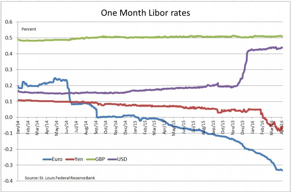
Are they here? Yes, in Japan and in various European countries some short term interest rates are negative. The chart shows one month Libor for the yen, euros, British pounds and US dollars.  In most cases only short term interest rates are negative, longer term rates remain positive. Moreover, in most countries the negative interest rates apply to funds that commercial banks keep on deposit at the central banks; in only a few cases do businesses or consumers face negative interest rates on bank deposits. As shown on the chart, typical figures are measured in basis points.

Why would someone pay negative rates?  There are convenience and security factors that outweigh the interest cost when rates are very low.  Transactions using credit or debit cards, electronic funds transfers or checks are cheaper and easier than using cash.  If a business decides that short term cash should really be cash, not bank deposits, they will need a large vault to hold the cash and lots of security to keep holding it. All this costs money so paying 10, 20 or 30 basis points annually to a bank for providing payment services and security is worthwhile.  At some point hoarding does become preferable to a bank account,

Do negative interest rates make economic sense? Somewhat. Start with the natural, not negative, rate of interest.  When the economy is in a sweet spot with inflation and unemployment are at desirable levels and are not being pushed up or down, the rate of interest is the natural or steady state interest rate. If inflation were close to 2% and unemployment were between 4% and 5% — both roughly the Fed’s targets — and both are stable, then the Fed funds rate would be close to the natural rate of interest. Were an economy is in a slump, businesses weren’t borrowing or investing, people were saving instead of spending then the natural rate would be low or possibly negative. Similarly with a booming economy, businesses and consumers are borrowing and investing or buying and the natural rate is high. When the Fed funds rate is less than the natural rate, monetary policy stimulates the economy, and vice-versa.

Why would a central bank set negative interest rates?  In a slumping economy, the central bank needs to push its policy rate below the natural rate of interest for stimulative monetary policy.  If the natural rate is below zero, the central bank must push rates into negative territory. The expected result is to encourage banks to lend, businesses and consumers to invest or spend while weakening the currency to boost exports.

Most importantly, should a central bank make negative interest rates its policy?  The economic arguments supporting the expected result of negative interest rates appear sensible, but the things don’t always work out.  First, FX rates don’t always follow the program – lately the yen and the euro have strengthened against the dollar eliminating one part of the hoped-for stimulus. Second, negative interest rates may be perceived as a panic move, a last chance as the central bank runs out of options.  If that happens, businesses and consumers will hoard what they have instead of spending. Third, in many cases the negative interest rates apply only to banks’ excess reserves on deposit at the central bank, so there is no stimulus directly applied to businesses and consumers. Further, this leaves banks with a difficult choice: be pressured to makes loans that may not meet their credit standards or have their earnings squeezed. Either way this may not be the best policy for a central bank.

Negative interest rate might be reasonable short term stimulus, but they are likely to wear out their welcome quickly.

The posts on this blog are opinions, not advice. Please read our Disclaimers.

How Did South African Active Managers Perform in 2015?

Contributor Image
Daniel Ung

Former Director

Global Research & Design

In 2015, equity markets in South Africa were turbulent amid falling commodity prices and the depreciation of the South African rand.  Political uncertainty surrounding the appointment of the country’s finance minister and the lowering of the country’s debt rating by leading rating agencies also contributed to the lackluster performance of equities.  This may partly explain why the S&P South Africa Domestic Shareholder Weighted (DSW) Index underperformed the S&P Global 1200 by 29% in rand terms.

Volatility in the markets would normally be favorable for active managers, who could make use of their stock-picking skills to benefit from the perceived discrepancies in the market.  However, the SPIVA South Africa Year-End 2015 Scorecard shows that over 50% of active funds underperformed the domestic benchmark over a one-year period.  The level of underperformance continued to deteriorate over the three- and five-year periods (see Exhibit 1).  As for global equity funds, the performance of active funds against their benchmark was even more underwhelming, as 75% of active funds underperformed the benchmark over a one-year period.  This rose to over 96% over the five-year period.

Capture

The posts on this blog are opinions, not advice. Please read our Disclaimers.

What Is Driving the Mexican Peso?

Contributor Image
Jaime Merino

Former Director, Asset Owners Channel

S&P Dow Jones Indices

A few weeks ago, Dennis Badlyans wrote about Mexico’s Fixed Income Markets and made a performance comparison of the different currencies of emerging markets, which illustrated how the Mexican peso has been the worst performer among its peers in 2016.  The question is, what is driving the depreciation of the currency?

The answer in the short term, or on a daily basis, could vary from announcements of monetary policy in the U.S. and in Mexico, announcements of relevant economic data in the U.S., such as non-farm payroll, GDP estimates, or any emerging market news that could make the U.S. dollar stronger against other currencies.

We could list a lot of examples trying to explain why the currency has fallen 14.1% over the past 12-month period ending March 31, 2016, or 32.1% in the previous two-year period, but Exhibit 1 shows how the price of oil has been one reason for this depreciation.  The graph shows the price of the next oil future to mature, WTI May 2016, and on the left axis shows the inverse of the U.S. dollar to Mexican peso currency (pesos per dollar).

Capture

Doing a linear regression analysis of the log value using 252 of these two variables, where the variable “y” is the currency, we can see how dependent the currency is on movements in oil prices, with a correlation of 0.939 and an equation of y=0.284x – 1.698 (see Exhibit 2).

Capture

Given that the currency is a component of the performance of the S&P/Valmer Mexico Government International 1+ Year UMS index, Exhibit 3 shows the monthly returns of the index, with the performance of the Mexican peso making a considerable contribution to its performance.

Capture

The posts on this blog are opinions, not advice. Please read our Disclaimers.

Who Fuelled the Oil Bonds Bubble?

Contributor Image
Tim Edwards

Managing Director, Index Investment Strategy

S&P Dow Jones Indices

It has become popular to blame passive investors and index funds for the recent rise (and fall) in prices for U.S. high yield bonds.  The thesis – placing passive investors as the culprit – goes as follows:

  • There have been material, positive flows into passive bond funds, at the expense of active funds.
  • Passive bond funds typically track indices that are market-cap weighted, that is, with a higher weight in issuers that have a greater value of outstanding debt.
  • Such trends have rewarded the most-indebted companies with an “irrational” demand for their bonds.
  • Energy companies in particular have been able to ramp-up a debt-fuelled binge, the eventual popping of which we experienced earlier this year.

We cannot fault anyone for nodding in agreement; the reasoning is certainly seductive. And its variants have found support.  Certainly, large flows of capital into (and out of) an asset class have the ability to create, and pop, bubbles within that market segment.  But the argument – assigning importance to the relative popularity of passive funds – is fatally flawed.

Imagine, for a moment, that we could split the U.S. high yield bond market into two categories: those securities owned by the passive investors, and everything else, which is owned by the active investors.  Each passive investor – new or existing – is required to hold bonds issued by energy companies in proportion to their overall market capitalization, while we suppose that each active investor may individually choose their preferred allocation.

Now, here’s the logical trick: since the sum-total of active and passive investments matches the market, the proportion allocated to any market segment by active managers must, in aggregate, equal the allocation made by passive investors.  This is just arithmetic, based on the fact of both passive investors and the overall market having the same weights in each segment. To emphasize: 

The proportion of capital allocated by active investors, in aggregate, to high yield energy bonds was, is and forever shall be precisely in proportion to market capitalization.

At the point when a new passive investor entered the market (or an existing passive investor increased their allocation), he or she bought high yield energy bonds in the same proportion as the active investors, and maintained their allocations similarly.

Given this fact, one might be wondering, at this point: what it is that active investors in aggregate do exactly? Here’s the rub:

Active investors set prices.

The weighting of each security in a market-cap bond index depends on both the issuance amount and the price of the security.  If an energy company is viewed as a poor prospect to repay their debt, active investors – if they are paying attention – will only buy their bonds at a lower price, and will sell them if the price is unduly high.  In this way, active investors determine the market capitalization of any individual company’s bonds.

This applies to the primary (issuance) market, just as much as the secondary market.  It also applies to investors deciding whether or how much to invest in the U.S. high yield market in the first place, which similarly occupies a proportion of the overall U.S. bond market that is determined by the activities of active investors.

Thus understood, the “bubble” in high yield energy debt was not created by the simple issuing of debt by oil companies.  Nor was it created by passive investors, or a shift from active to passive bond funds.  Instead, as was the case with every bubble before and since, it arose through ACTIVE decisions to purchase securities – or market segments – whose price in hindsight seems unjustified.

The posts on this blog are opinions, not advice. Please read our Disclaimers.

Active Versus Passive Funds in Latin America

Contributor Image
Phillip Brzenk

Managing Director, Global Head of Multi-Asset Indices

S&P Dow Jones Indices

The S&P Indices Versus Active (SPIVA®) Latin America Scorecard is a semi-annual report that compares the performance of active mutual funds in Latin America against passive benchmarks.  The SPIVA Latin America Year-End 2015 Scorecard covers the equity and fixed income markets in Brazil, as well as the equity markets in Chile and Mexico.

In 2015, outperformance by active managers was only seen in Brazil.  Over the long-term (five years), which gives a clearer picture of fund managers’ abilities to provide above-average returns on a consistent basis, all fund categories in the scorecard underperformed their respective category benchmarks.  As seen in our SPIVA: A Cross-Country Comparison report, the average expense ratios of active funds are significantly higher than those of passive products in both Chile and Mexico.[1]  Given the long-term underperformance, it calls into question why active funds charge such high fees relative to their passive fund counterparts.

Brazil
The Brazilian equity market declined sharply in the second half of 2015, leading to a -13.87% total return for the S&P Brazil BMI for the year.  Fixed income investors fared better in 2015, as the corporate bond market[2] returned 13.53%, and the government bond market[3] returned 9.32%.  The majority of managers outperformed their benchmarks in Brazil Equity, Brazil Large-Cap Equity, Brazil Corporate Bond, and Brazil Government Bond fund categories during 2015.  Brazil Mid-/Small-Cap was the only category where managers underperformed for the year, with 79% underperforming.

Chile

In Chile, the equity market struggled to show positive gains in both the short and long term, as the one-year total return was -3.04% for the S&P Chile BMI (CLP), as its five-year total return was off 4.43%.  Equity fund managers in Chile have consistently underperformed their benchmark in both the short and long term.  Over 90% of active equity fund managers underperformed the category benchmark in 2015, and over a five-year time horizon, all managers (44 funds) underperformed.

Mexico
Mexico is the only country to have positive equity market gains in the short- and long-term, with a one-year total return of 1.53% and five-year annualized total return of 4.68% in the S&P Mexico BMI (MXN).  Equity fund managers were unsuccessful in beating the benchmark in 2015, with close to 61% underperforming.  An even higher portion of managers failed to beat the benchmark over the long term.

Capture

[1]   Expense ratio data unavailable for Brazil.

[2]   Represented by the Anbima Debentures Index.

[3]   Represented by the Anbima Market Index.

The posts on this blog are opinions, not advice. Please read our Disclaimers.