Get Indexology® Blog updates via email.

In This List

Waiting for the Fed

November's Worst Commodity Nightmare

Accessing China’s Growth via Dividends

Impact of the Affordable Care Act (ACA) on Individual versus LG/ASO Trends

Dollar's Revival Adds New Life To These Commodities

Waiting for the Fed

Contributor Image
David Blitzer

Former Managing Director and Chairman of the Index Committee

S&P Dow Jones Indices

The Fed’s policy makers, the FOMC, meet on December 15th and 16th and are widely expected to raise the target Fed funds rate for the first time since 2006.  The odds of a 25 bp increase in the target range to 25-50 bp is about 77% based on Fed Funds futures.  There are two key economic reports still expected before the meeting: employment and inflation.

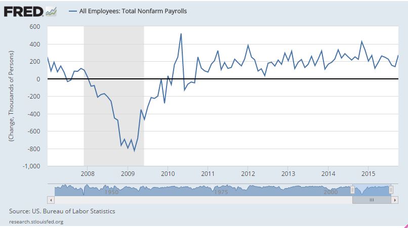
The first chart shows the monthly change in payroll employment since 2009.  The market expectation is for a 200,000 increase, in line with recent numbers and further confirmation that the weakness seen in August and September is behind us.

payrols M-M

The second chart shows the core rate for the CPI (CPI ex-food and energy). While the FOMC looks at a similar measure, the personal consumption expenditure deflator, the CPI is more widely followed and will be released on Tuesday, December 15th as the FOMC members gather for their meeting. It is expected to show inflation remains below the Fed’s 2% desired figure.

CPI Y-Y

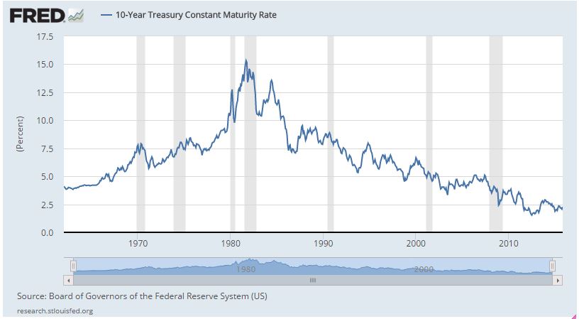
For those who wonder why there is so much interest in the Fed and a possible turn in interest rates, the last chart of the 10 year Treasury note yield is a capsule history of the bond market since the 1960s.  We are nearing the end of what used to be called the “Great Intergalactic Bond Rally.” Once the Fed begins the shift to rising rates, it will be a different financial world.

The posts on this blog are opinions, not advice. Please read our Disclaimers.

November's Worst Commodity Nightmare

Contributor Image
Jodie Gunzberg

Former Managing Director, Head of U.S. Equities

S&P Dow Jones Indices

Unfortunately for commodities, there’s no waking up from this nightmare. It’s real. Since 1970, the S&P GSCI has never seen a Nov. with as many as 21 negative commodities. After a glimmer of hope in Oct., only 3 commodities, sugar, cotton and cocoa are on track to be positive in Nov. In other words, for every one commodity that is positive, seven are negative in Nov., 2015.

Source: S&P Dow Jones Indices. Data ending Nov. 27, 2015.

Moreover, Nov. 2015 is the 5th worst Nov. on record since 1970, only behind 1997, 1998, 2008 and 2014. Year-to-date, the index is also on pace to be the 5th worst year with 1998, 2001, 2008 and 2014 losing more. Though YTD through Nov. 2014, the index was in better shape than the index is through this Nov.

Source: S&P Dow Jones Indices. Data ending Nov. 27, 2015.

While 2015 is not the worst year for any single commodity despite 2 down more than 40%, 7 down more than 30% and 13 down more than 20% (more than half in a bear market for the year), there are a number of commodities setting notably bad years. Aluminum, feeder cattle, Kansas wheat, nickel, and the industrial metals sector are all posting their worst years after 2008. Below is a table showing the rank of worst years since 1970 (for example, aluminum is having its second worst year in history and gold is having its sixth worst year in history):

Source: S&P Dow Jones Indices

Last, it is worth mentioning that 20 of the 24 commodities are in contango. Although this is the highest number since Nov. 2013, there have been 23 other months in history where 20 or more commodities have been in contango together. However, November is the worst month on average of any of the twelve months for having the most commodities in contango. It is the only month that has more than half on average (12.4) in contango, and of the 24 months in history having 20 or more commodities in contango, 7 have occurred in the month of November. Contango has had a significant cost, erasing almost an additional ten years of gains, for commodity investors rolling the first nearby most liquid contracts. Notice the spot index is only at the Feb. 2009 level, while the total return is at the Jun. 1999 level.

Source: S&P Dow Jones Indices


The posts on this blog are opinions, not advice. Please read our Disclaimers.

Accessing China’s Growth via Dividends

Contributor Image
Tianyin Cheng

Former Senior Director, ESG Indices

S&P Dow Jones Indices

In the current environment of short-term volatility amid a long-term positive outlook for the Chinese economy, a focus on growing, sustainable dividends in China’s equity markets could provide the opportunity to get a slice of the region’s structural growth and potential downside protection compared with a typical growth strategy, such as an earnings growth strategy.

In recent years, with the release and implementation of a series of dividend-encouraging policies issued by Chinese authorities, the amount of dividends issued by companies listed in China’s equity markets has gradually increased.  In 2014, the size of the total dividend pool for companies in the S&P China A BMI was USD 70 billion, nearly triple the size of the dividend pool in 2009.  In terms of the number of companies, 70% of the S&P China A BMI universe paid dividends in 2014, which is much higher than the 55% reported in 2009.

Capture

From a dividend growth perspective, Chinese companies may offer much faster dividend growth than companies in many other parts of the world.  From 2009 to 2014, Chinese equities provided a dividend growth rate of 17.0% per year, driven mainly by improved earnings—far higher than equities in Pan Asia, Europe, and the U.S.

Capture

One unique feature of Chinese companies is that they tend to have more concentrated company ownership, either in the form of a founding family or a government-affiliated entity.  The implications on dividends are three fold.  First, many of China’s IPOs are due to the privatization of large stakes in SOEs and family-run businesses.  These are typically mature companies that pay dividends from the beginning of their public listings.  This explains the fast growth of dividend pools in China.

Second, dividends may provide a sign of positive corporate governance in China.  Under the conditions of high concentration of ownership and weak legal protection for small- and medium-sized shareholders in China, the distribution of dividends can be used as a way to limit large shareholders’ ability to expropriate minority shareholders’ rights or improper government intervention in the listed companies.

Third, many of the largest dividend-paying Chinese companies are SOEs with a high degree of direct or indirect government ownership.  Therefore, the Chinese government influences companies’ earnings and dividends.  Given the government support to improve dividend policies, these companies tend to return a greater share of earnings to shareholders via dividends.

The S&P China A Share Dividend Opportunities Index seeks to offer a transparent, rules-based, diversified, and tradable strategy for investors looking for exposure to China’s growth via dividends.  The index seeks to measure high-yielding A share stocks traded on the Shanghai or Shenzhen Stock Exchanges.  The index was launched on Sept. 11, 2008, showing a seven-year live track record of consistent outperformance against the benchmark, the S&P China A BMI (see Exhibit 3).  The index may be attractive to investors for its total return, income generation, and potential for downside protection.  For more information, please refer to the following research paper by clicking here.

Capture

The posts on this blog are opinions, not advice. Please read our Disclaimers.

Impact of the Affordable Care Act (ACA) on Individual versus LG/ASO Trends

Contributor Image
John Cookson

Principal, Consulting Actuary

Milliman

When we initiated our forecast on the S&P Healthcare Claims Indices in 2014, we wanted to avoid the effects of the ACA on individual and Small Group claim costs, so we focused on Large Group and Administrative Services Only (ASO) trends.  The individual claim costs continued to show a sharp divergence in trends from the group business claim costs through 2014.  In the first quarter of 2015, the high cost trends for individual were still below 2014 levels, as predicted.  Also as predicted, the Small Group trends have begun to show an uptick (from virtually flat in December 2014 and January 2015 to nearly 7% by April 2015 on a three-month basis), but this increase was not nearly as strong as the increase for individual during the same period.

Capture

We expect that there could be a further increase in 2015 Small Group trends as a result of the ACA changes.  The capacity of hospitals, as measured by employment per capita, declined below long-term average levels, but since late 2014, employment has increased at a faster pace.  Medicare initiatives to cut readmissions and increase observation (emergency room) holds in order to avoid unnecessary admissions have been affecting Medicare and non-Medicare hospital patients by reducing admissions.[1] [2]  These may have run their course.

 Capture

[1] Due to the effects of deductible and copay leverage, large employers’ benefit plans that have not changed rates in the previous year could increase by as much as 2.5% or more on bronze-level plans and by 1% or more on gold-level plans.  Risk takers may need to take this into account.  In addition, the S&P Healthcare Claims Indices do not reflect the impact of benefit buydowns by employers (i.e., higher deductibles, etc.), since the indices are based on full allowed charges.  Actual trends experienced by employers and insurers in the absence of benefit buydowns can be expected to be higher than trends reported by the S&P Healthcare Claims Indices due to plan design issues such as deductibles, copays, out-of-pocket maximums, etc.  Benefit buydowns do not represent trend changes, since they are benefit reductions in exchange for premium concessions, but they can have a dampening effect on utilization due to higher member copayments.  This can have a dampening effect on trends measured by the S&P Healthcare Claims Indices compared with plans with no benefit changes, further pushing up experienced trends relative to those reported in the indices.  The long time lag between real personal income growth (highly correlated with real GDP) and the impact on healthcare trends defer the impact on healthcare costs for 30 to 36 months, and that is reflected in our forecasts.  The lag on inflation is much shorter, with a range of 12 to 18 months.
[2] Readmission rates are much higher for the Medicare population than commercial patients, and Medicare has seen significant admission rate reductions in recent years.  Medicare 30-day readmission rates have dropped from an average of 19.0%-19.5% four-to-seven years ago to under 18% in early 2014.
[3] Our operative theory is that healthcare is primarily a supply-driven system due to consumers being immunized from significant cost because of the effect of insurance.  This increases the demand above what it might otherwise have been in the absence of insurance.  Although ongoing market increases in deductibles and co-pays have a downward effect on demand, this would only have a marginal impact relative to the effect of having no coverage at all.  This was demonstrated in the Rand Health Insurance Experiment conducted from 1971 to 1986.

THE REPORT IS PROVIDED “AS-IS” AND, TO THE MAXIMUM EXTENT PERMITTED BY APPLICABLE LAW, MILLIMAN DISCLAIMS ALL GUARANTEES AND WARRANTIES, WHETHER EXPRESS, IMPLIED OR STATUTORY, REGARDING THE REPORT, INCLUDING ANY WARRANTY OF FITNESS FOR A PARTICULAR PURPOSE, TITLE, MERCHANTABILITY, AND NON-INFRINGEMENT.

The posts on this blog are opinions, not advice. Please read our Disclaimers.

Dollar's Revival Adds New Life To These Commodities

Contributor Image
Jodie Gunzberg

Former Managing Director, Head of U.S. Equities

S&P Dow Jones Indices

It makes sense that a strong US dollar is generally bad for commodities since as the U.S dollar strengthens, goods priced in dollars become more expensive for other currencies. However, historically the U.S. dollar has a negative correlation of only about -0.30 with the S&P GSCI as shown in the chart below using data since 1970:

Source: S&P Dow Jones Indices and Bloomberg.

This may be surprising since -0.30 correlation does not show a very strong negative relationship. It may be explained partially by the late additions of (WTI) crude oil that did not occur until 1987 and brent crude in 1999. Their combined weights have been up to roughly 50% of the S&P GSCI at times, so their impact on the overall composite relationship to the dollar is significant. In the past 10 years, crude oil and brent crude are two of the most sensitive and negatively correlated commodities in the index to the dollar. Brent crude and (WTI) crude oil are negatively correlated -0.67 and -0.66 with beta of -2.9 and -2.8, respectively. This has driven the S&P GSCI to have a negative correlation of -0.63 to the U.S. dollar. Simply put, brent and WTI have doubled the negative correlation of the index to the U.S. dollar.

However, there are other commodities that just aren’t so badly impactedFeeder cattle and sugar have up market capture ratios of 130 and 125, using the dollar as the market, that says those commodities outperformed the dollar by 30% and 25%, respectively, in the past 10 years. Further, gold, live cattle, zinc, lean hogs and coffee have all posted positive returns on average when the dollar was up.

While the strong U.S. dollar is bad for commodities overall, it hurts far less than how much a weak dollar helps commodities. In the past 10 years on average, the U.S. dollar was pretty symmetrical with 58 periods of a rising dollar and 62 periods of a falling dollar, and in terms of the magnitude of gains and losses on average of -6.14% and +6.18%. When the dollar was up, brent crude lost 3.67% and (WTI) crude oil lost 4.00% with the worst average loss in nickel of -12.02%, far more than the single commodity average loss of -1.97%. However, when the dollar lost, not one single commodity fell on average and the single commodity gained 24.64% on average. Below is the table that shows the performance:

Source: S&P Dow Jones Indices and Bloomberg.


The posts on this blog are opinions, not advice. Please read our Disclaimers.