Get Indexology® Blog updates via email.

In This List

Asia Fixed Income: Foreign Investor Access to Onshore Chinese Bond Markets Grows

The Essence of VIX: What You Really Need to Know

SPIVA® Europe Scorecard 2014: How did active funds perform versus their benchmarks?

Is GDP Growth Over?

It’s Not So Much the Current Weight, But the Weight That’s Put On

Asia Fixed Income: Foreign Investor Access to Onshore Chinese Bond Markets Grows

Contributor Image
Michele Leung

Former Director, Fixed Income Indices

S&P Dow Jones Indices

China continues to broaden foreign investor access to their onshore bond market. Luxembourg is the latest country being granted an RQFII quota by the People’s Bank of China, followed Canada, Germany, Qatar and Australia.  According to the data published by State Administration of Foreign Exchange (SAFE) on April 29, 2015, the approved RQFII investment quota reached CNY 363 billion, representing a 22% increase from December, 2014. The number of the qualified institutions also rose from 93 to 121.

Among the qualified participants, Hong Kong remains to be the biggest player, with an RQFII quota allocation of around 74%, see exhibit 1 for the country breakdown. Outside of Hong Kong, the most significant development observed was by South Korea, with its approved quota jumping 10 times to CNY 30 billion, while the number of the qualified institutions climbed from 1 to 14 since last December.

In sync with the opening up of its capital markets, the China onshore market has recorded substantial growth in recent years. Tracked by the S&P China Bond Index, the market value of the China onshore bond market reached CNY 28 trillion, as of April 30, 2015. This market has expanded 22% since last year and more than three times since the index first valued on December 29, 2006. The market value tracked by the S&P Japan Bond Index, representing the other giant market in Asia, gained 2.6% and 37% respectively.

In terms of total return performance, the S&P China Bond Index rose 2.14% year-to-date (YTD), after a 10% gain in 2014.  Global investors seem to continue to favor Chinese bonds as they offer relatively higher yields as compared to markets globally. The index’s yield-to-maturity currently stands at 3.91%, compared with 0.27% yield-to-maturity from the S&P Japan Bond Index. Please see exhibit 2 for indices comparison.

Exhibit 1: Country Breakdown of the Approved RQFII quota from State Administration of Foreign Exchange (SAFE)

Source: State Administration of Foreign Exchange. Data as of April 28, 2015

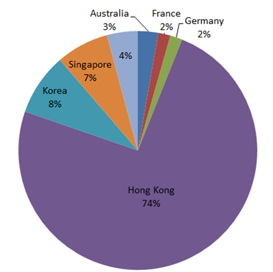
Exhibit 2: Indices Comparison

 S&P China Bond Index  S&P Japan Bond Index
 Calculated Currency  CNY  JPY
 Market Value  7,866,324,806,704  1,119,159,373,390,670
 Yield-to-Maturity  3.907%  0.273%
 1-Year Total Return  9.262%  2.475%

Source: S&P Dow Jones Indices. Data as of April 30, 2015

The posts on this blog are opinions, not advice. Please read our Disclaimers.

The Essence of VIX: What You Really Need to Know

Contributor Image
Reid Steadman

Former Managing Director, Global Head of ESG & Innovation

S&P Dow Jones Indices

What is the essence of VIX? This may seem like an abstract, philosophical question, but I can assure you it is not. It is a practical one, and if you can understand what makes VIX unique, you will know why this index matters so much.

Informed investors know that VIX:

  • Employs a wide range of options in its calculation, both calls and puts;
  • Maintains a constant 30-day maturity;
  • Is not based on an options pricing model such as Black-Scholes; and
  • Does not incorporate the S&P 500 price level in its calculation (VIX is negatively correlated to the S&P 500, but correlation does not translate to direct causation).

For most people, VIX is largely associated with the first two bullet points. But many indices use options prices and target certain maturities. The key attribute of VIX – the knowledge you need to take away from this post – comes from the final two bullet points. It has to do with how VIX measures implied volatility, and nothing else.

How is it that we can arrive at an implied volatility value without using an options pricing model like Black-Scholes? And how can it be that the VIX and the S&P 500 price levels are not directly related?

VIX and Variance Swaps

When institutional investors want to trade volatility, they often trade variance swaps. The magic of a variance swap is that by using a portfolio of options weighted in a certain way, the impact of other factors, such as the changing underlying index level, can be neutralized. The trader is left with exposure to volatility alone.

VIX uses the same processes employed in variance swaps to arrive at the same result: exposure to pure volatility. Though the math behind variance swaps is complicated, one simple technique, explained below, liberates VIX from the influence of other factors.

How Volatility is Isolated

A challenge in calculating a volatility index is that, as a general rule, options have higher sensitivities to changes in implied volatility (“vega values”) as their strike prices increase, as shown in Figure 1. The bell curves in this graphic represent the sensitivities of options to implied volatility at different strike prices.

Figure 1

Vega increasing

This upward sloping effect links the price of the underlying index with the volatility exposure of the full portfolio. If the underlying index price is high, then the sensitivity of the options to changes in implied volatility will be high as well.

To offset this effect, the options need to be reweighted. The result of this reweighting is illustrated in Figure 2. The options demonstrate the same relative sensitivity to implied volatility in the portfolio regardless of the underlying index price.

Figure 2

Vega even


This is achieved through weighting the options by the inverse of their strike prices, squared. So, options with lower strike prices are given a higher weight to make up for the fact that they naturally have less sensitivity to changes in implied volatility.

This is the essence of the VIX calculation: a reweighting of the options so that exposure to implied volatility rises and falls independently of the underlying index price level. This is what allows VIX to be VIX, a pure measure of volatility, uncontaminated by other effects and factors.

For a deeper dive into this concept – and better charts! – I recommend reading a renowned paper published by Goldman Sachs in 1999. The ideas in this piece served as the foundation for the modernization of the VIX methodology, which took place in 2003.


The posts on this blog are opinions, not advice. Please read our Disclaimers.

SPIVA® Europe Scorecard 2014: How did active funds perform versus their benchmarks?

Contributor Image
Daniel Ung

Former Director

Global Research & Design

Published every six months, the SPIVA Europe Scorecard aims to measure the performance of active funds against their corresponding benchmarks.  The results for the Year-End 2014 Scorecard are now in, and they reveal few surprises.

Euro-Denominated Funds
In spite of a slight improvement in the last quarter of the year, growth in Europe for the other quarters of 2014 was generally anemic.  At the start of the year, the markets had generally been optimistic that the European Central Bank (ECB) would start quantitative easing in the event of continued slow growth, but they were disappointed that the ECB did not announce any concrete measures.  This led to bouts of high volatility throughout the year and a generally lackluster performance in the equity markets.  Normally, these conditions would be ideal for active managers, but our report indicates that the majority of euro-denominated funds invested in European equities trailed their respective benchmarks over the one-, three-, and five-year periods.

This pattern of underperformance[1] was not only limited to European equities. We saw a similar pattern of underperformance in euro-denominated funds invested in other regions, such as emerging markets, the U.S., and international markets (see Report 1).

Sterling-Denominated Funds
In regards to sterling-denominated fund categories, some categories of active funds invested in U.K. equities performed well.  Across all time periods, the majority of U.K. large- and mid-cap funds posted higher returns than their benchmark, suggesting that active management opportunities may be present in the U.K. large- and mid-cap spaces.

However, sterling-denominated funds invested in emerging markets, the U.S., and international equities underperformed their corresponding benchmarks.  This is in line with the finding for euro-denominated funds invested in these markets.

Capture

[1] In order to be consistent with SPIVA reports in other regions, funds that have disappeared during the relevant reporting period are now considered to be underperforming the benchmark in the computation of the results in Report 1.

The posts on this blog are opinions, not advice. Please read our Disclaimers.

Is GDP Growth Over?

Contributor Image
Jodie Gunzberg

Former Managing Director, Head of U.S. Equities

S&P Dow Jones Indices

In April, the S&P GSCI gained 11.1%, posting its 19th best month in history with data back to January, 1970.  The last time the index had performance this strong was in May, 2009 but what is most interesting is that all commodities in energy and industrial metals were positive.

When the economy slows, people still consume agriculture and livestock, and many use the precious metals as a safe haven. However, demand for energy and industrial metals are more sensitive to the growth of the economy but still may perform differently based on the type of growth – for example, automobile demand may increase energy consumption while construction may drive industrial metals.

Using historical monthly returns back to February 1983, energy and industrial metals only have a correlation of 0.20 and only move up together less than 1/3 of the time.  Below is the chart of cumulative returns where you can see there is some relationship, though far from perfect.

Source: S&P Dow Jones Indices. Past performance is not a guarantee of future results.

Given this less than perfect positive correlation but notion of economic sensitivity, when the two sectors spike together, it may be indicative.  Since 1983, in only 12 months have energy and metals moved together on average in a month as much as in April 2015. The last time the sectors increased on average in a month as much as they did last month was in May 2009. The table below shows the months in history where the simple average of the two sectors was greater than in April 2015:

Source: S&P Dow Jones Indices. Past performance is not a guarantee of future results.

While the combined positive returns of at least today’s magnitude haven’t necessarily occurred in consecutive months, there are distinct general periods when the energy and industrial metals spiked, and with the exception of the 1999-2000 time that was clearly driven by energy, both sectors had relatively strong returns.

Given only four blocks of time where energy and industrial metals have moved this much, it seemed a comparison to real GDP growth might be interesting.  Below is a chart of yoy% change of GDP data by per capita terms of the Americas. Notice the dips that follow each block of energy and industrial metal performance.

Source:http://www.worldeconomics.com/papers/Global%20Growth%20Monitor_7c66ffca-ff86-4e4c-979d-7c5d7a22ef21.paper Real GDP data was taken from the World Economics Global GDP database Population data was obtained from the Maddison and the United Nations tables 2012/14 data was calculated from the year on year estimated % increase in real GDP from the IMF tables[1] (Gross domestic product, constant prices, % change)
Source: http://www.worldeconomics.com/papers/Global%20Growth%20Monitor_7c66ffca-ff86-4e4c-979d-7c5d7a22ef21.paper. Real GDP data was taken from the World Economics Global GDP database. Population data was obtained from the Maddison and the United Nations tables. 2012/14 data was calculated from the year on year estimated % increase in real GDP from the IMF tables[1] (Gross domestic product, constant prices, % change).
When the next dip will be is yet to be determined, but the first quarter of 2014 showed the first negative quarter-over-quarter growth rate since the last quarter of 2010 and the first quarter of 2015 only showed growth of 0.2% quarter-over quarter. This plus the strong combined energy and industrial metal performance of the S&P GSCI could be telling of the first annual contraction since the global financial crisis.

Source: http://www.tradingeconomics.com/united-states/gdp-growth


The posts on this blog are opinions, not advice. Please read our Disclaimers.

It’s Not So Much the Current Weight, But the Weight That’s Put On

Contributor Image
Kevin Horan

Former Director, Fixed Income Indices

S&P Dow Jones Indices

In addition to liquidity concerns in the credit markets, the rising amounts of debt have become a topic for discussion.

The S&P U.S. Issued Investment Grade Corporate Bond Index has seen its market value actually decline from the beginning of the year’s USD 4.126 trillion to  USD 4.077 trillion as of April 30, 2015.

  • Although the overall market value of the index has declined by 1.2%, certain issues within the index have increased their weight.
  • As of April 30, 2015, Medtronics and 21st Century Fox are both up by 0.4% in weight, while recent issuers of large deals such as Verizon (0.3%), Microsoft (0.26%), and Apple (0.15%) have also added to their weight within the index.
  • For April, the index returned -0.73% MTD and 1.36% YTD.

High-yield bonds, as measured by the S&P U.S. Issued High Yield Corporate Bond Index, have increased by 3.4%.  The index has gone from its Dec. 31, 2014 value of USd 1.169 trillion to  USD1.209 trillion as of April 30, 2015.

  • Issues that have been part of the index since the beginning of the year and have increased their weight include names such as Navient (0.41%), GM (0.33%), Scientific Games (0.26%), and Murray Energy (0.23%).
  • Household names like Heinz (0.18%), Rite Aid (0.15%), Netflix (0.13%), and Sprint (0.11%) have also increased their weight in the index.
  • The index returned 1.13% in April and is at 3.75% YTD.

The S&P/LSTA U.S. Leveraged Loan 100 Index continues to yield approximately 4.75%, as the index returned 0.73% MTD and is at 2.59% YTD.  Repricing activity has intensified.  PetSmart, which recently agreed to a large loan in March, has returned to the market with lower rates.  Additional issues are expected to create loans ahead of any long-term increase in interest rates.

The yield of the U.S. Treasury 10-year as measured by the S&P/BGCantor Current 10 Year U.S. Treasury Bond Index ended the week 20 bps wider, at 2.11%, as yields rose going into the end of April and May 1, 2015 added 7 bps to the total.  The index’s rise in yield over the month of April was 11 bps wider, and tightening in the first and third week helped offset some of the increase in month-end yield, which closed at 2.04% on April 30, 2015.  For April, the index returned -0.80% MTD, while the YTD is 2.24%.

Exhibit-1: Market Value
Market Value Chart


Source: S&P Dow Jones Indices LLC.  Data as of April 30, 2015.  Past performance is no guarantee of future results.  Chart is provided for illustrative purposes only.

The posts on this blog are opinions, not advice. Please read our Disclaimers.