Get Indexology® Blog updates via email.

In This List

A Tale of Two Energy Cities – Dallas and Denver

Sluggish GDP Growth

Greece

It's So Bad, It's Good

SPIVA® Interpretation and Misinterpretation

A Tale of Two Energy Cities – Dallas and Denver

Contributor Image
Marya Alsati

Former Product Manager, Commodities, Home Prices, and Real Assets

S&P Dow Jones Indices

This post examines the relationship between Dallas and Denver, utilizing the S&P/Case-Shiller Home Price Index for each city.  The pair was selected based on a correlation analysis that yielded a correlation coefficient of 0.84 between the two cities.  This analysis covered the 20 metropolitan indices in the S&P/Case-Shiller Home Price Index series, utilized log returns to account for the skewness in the home price data, and spanned a time period of 14 years.

Exhibit 1 depicts the levels of the home price indices for Dallas, Denver, and the entire U.S.  For both Dallas and Denver, a trough was felt in February 2009, and the indices are now up 27.7% and 31.8% since that time, respectively (as of Jan. 31, 2015).  Both Dallas and Denver have been recording new peaks since the first quarter of 2014.

Capture

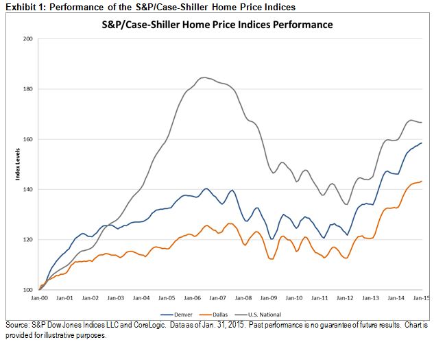
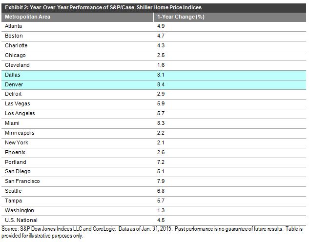
Exhibit 2 summarizes the results for January 2015, showing the year-over-year percent changes.  It can be seen that Dallas and Denver are two of the best performers, up 8.1 and 8.4%, respectively.

Capture

To attempt to identify drivers that could explain the correlation, we evaluated various housing factors, such as foreclosure rates, housing permits, population change and employment by industry.

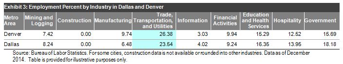
In terms of population change, Dallas and Denver grew at varying rates.1  Dallas lost 30% and Denver lost 29.1% in permit issuance for single-family homes between 2004 and 2013,2 and Denver had a slightly worse foreclosure rate (1.4%) than Dallas(0.4%).3  For employment by industry,4 “Trade, Transportation, and Utilities” was the highest employment industry for Dallas and Denver by a large margin.  It should be noted that this industry also had a large allocation from other, uncorrelated metro areas.

Capture

These findings led us to explore more theoretical analysis.  The energy industry is considered the cornerstone of Dallas and the North Texas economy.  Denver, long hailed the Houston of the Rockies, is the largest city in a 600-mile radius of energy companies that are investing in the oil and gas fields of Colorado, Wyoming, Montana, and North and South Dakota.5  Metro Denver and the Northern Colorado region ranked fourth for fossil fuel energy employment, and fifth among the nation’s 50 largest metros for cleantech employment concentration in 2014.6

The energy industry fuels jobs and activity across a range of fields, affecting population, income, and therefore, the housing market.  The industry is thus a strong candidate as a reason for what is driving Dallas and Denver’s intertwining performance.  It will be interesting to see what the impact of the plunging price of oil on the two cities will be, and if one (or both) will be affected, especially in comparison to the other metropolitan areas.

On a lighter note, and if you are still not convinced that there is a correlation between the two cities, here is a tidbit of information.  In 1981, ABC launched a Denver-based, oil tycoon soap opera to compete with the CBS primetime oil company-owning family series Dallas.

————————————————————————————————————————
1. Census.gov, Large Metropolitan Statistical Areas—Population: 1990 to 2010
2. Census.gov, New Privately Owned Housing Units Authorized Unadjusted Units by Metropolitan Area
3. Foreclosure.com
4. Bureau of Labor Statistics
5. Cathy Proctor, Denver Business Journal, “Denver posed for growth from energy sector – and millennials”.
6. http://www.metrodenver.org/industries/energy/

The posts on this blog are opinions, not advice. Please read our Disclaimers.

Sluggish GDP Growth

Contributor Image
David Blitzer

Former Managing Director and Chairman of the Index Committee

S&P Dow Jones Indices

First quarter U.S. GDP will be reported on Wednesday morning April 29th; the consensus is for only one percent real growth.  The last few years have been marked by poor GDP growth. The chart compares actual GDP to potential GDP and shows that six years after the Great Recession GDP remains well below its potential.   In the 22 quarters since when the recession ended in June 2009, GDP growth touched 5% only once; since 1980 GDP growth was 5% or higher in 16% of quarterly reports.  Growth is sluggish.


Among theories of why growth is slow, three stand out: too much debt, weak demand and slow labor force growth:

The amount of debt – government, household and corporate – in the economy surged before and during the financial crisis.  After the Great Recession, efforts to work down debt levels limited spending and investment and prevented a strong rebound.  Some analysts would describe the 2007-9 recession as a “balance sheet recession” meaning that high debt severely damaged balance sheets and companies and households were forced to devote any funds to debt service rather the spending.  Debt levels in the US economy have come way down. Households currently spend a record low percentage of income on debt service, corporate balance and earnings are much improved and the federal deficit is down to normal levels.  While there may be some remaining concerns about taking on debt – or extending credit – in the US, debt levels are not the only cause of sluggish growth.

In the depths of a recession, everyone hunkers down, stops spending and saves as much as possible, The paradox of saving – what makes sense for individuals, families or companies confronting hard times, can spell disaster for the economy.  The vanished spending makes the economy worse off.  With little or no spending or investing, a capitalist economy won’t grow.  In most recoveries, the pain of the recent recession is forgotten fairly quickly and growth resumes. This time the recession was far deeper and nastier and it is taking longer to put it behind us. Until a few months ago few believed that the unemployment rate would approach 6%; now it is 5.5%.  Lingering concerns from the Great Recession are still with us and may be deterring some spending and contributing to weak GDP growth.

Fewer people in the labor force and working means less production and slower GDP growth. The US labor force is growing less rapidly now than before the last recession. One factor is the aging of the baby boomers – people born between 1946 and 1964. The oldest among them are reaching retirement age.  A second factor is a drop in labor force participation – people of all ages seem less likely to hold jobs or look for work than was the case a decade or more ago.  While the aging of the population is easy to explain, the drop in labor force participation is a bit of a puzzle.  One possible factor is declining real wages – adjusted for inflation wages are flat to down and the returns to working, or working longer hours, may not be there for everyone.

The posts on this blog are opinions, not advice. Please read our Disclaimers.

Greece

Contributor Image
David Blitzer

Former Managing Director and Chairman of the Index Committee

S&P Dow Jones Indices

Forecasts of an imminent Greek default and possibly Grexit, (Greece exiting the euro) abound.  Following the first rule of successful forecasting, no one is willing to put the date and the event in the same sentence. Moreover, while both possibilities have been widely discussed, there is little agreement on what might happen.   If Greece defaults it would be the largest collapse since Lehman Brothers but, hopefully, smaller and less disruptive.

The Greek government owes a lot of money, much of which comes due in the next several weeks.  Based on reporting by the Guardian Newspaper the near term dates in May include a loan repayment of €760 million and an interest payment of €200 million to the IMF and two T-bills maturing for a total of €2.8 billion.  June is larger: €5.2 billion of T-bills and almost €1.6 billion due to the IMF.  There are still some government expenses, such as salaries, to pay. By most estimates Greece can probably gather about €2 billion.

Getting through May looks doubtful, but there have been other deadlines and dire warnings followed by temporary reprieves. No one know how long the money will last or who will blink first between Greece’s government and the troika of the European Central Bank, the European Commission and the IMF. All that can be said is that beginning now the risk that Greece defaults is getting larger and larger.

What will happen if Greece defaults? First, it will be the end of the beginning, not the beginning of the end; the morning after default the same problems will still be here. Some financial turmoil is inevitable.  Greek banks, and possibly others, will close for a few days as will various other businesses. Stock markets across Europe are likely to drop sharply while markets in the Americas and Asia will slide but by less. Investors who have enjoyed a strong run in European markets so far in 2015 – the S&P Europe 350 measured in euros is up 19% since the start of the year – may see many of those gains vanish.  But the real problem is not the immediate market turmoil; it is spreading failures, collapsing credit and contagion. Risks of bank and business failures or a credit freeze are greater inside Greece than elsewhere in the Eurozone. Outside of Europe financial damage will be less than inside.

Comparisons to Lehman Brothers are inevitable, but there are major differences.   First, the world remembers 2008 and Lehman Brothers and people have been warned. In contrast, when Lehman was close to the end, most people expected the Fed and the US Treasury to stage a last minute rescue as they did six months before with Bear Stearns. No one expects an instant fix for Greece. Some have taken precautions – money has been flowing out of Greece to the rest of Europe for several months.  Second, attention will shift to European countries which some investors worry about: Spain, Portugal, Ireland or Italy.  The good news is that these are in better shape than a few years ago and in much better shape than Greece.  Problems may spread, but a second Greece is unlikely to come from a default by the first. However, in one sense a Greek default would be like Lehman Brothers – there will be some big unexpected problems.  With Lehman, such surprises included a massive squeeze on short term credit and incompatible bankruptcy laws in the US and the UK. We will have to wait to see what a Greek default brings us, if the default happens.

Grexit is politics, not economics.  One motivation for the euro was assuring a stable and peaceful Europe where countries would trust one-another, where Germany’s faster growth and stronger economy would not splinter the continent or worse.  A purely economic design for a euro would have included unified fiscal and banking systems and would not have looked the other way when countries failed to meet their fiscal policy commitments for entry.  Leaving the euro would be extremely messy, for Greece or any member country. On day one after the euro the exiting nation would have no currency, no payments system and probably no credit.

Default and an exit from the euro are not absolutely linked.  Given the calendar and debts, a default would come before Grexit if both occur. A default probably increases the probability of Grexit, but definitely doesn’t guarantee it.  Neither default nor Grexit are inevitable. Greece has surprised before and avoided the inevitable. Grexit would be mired in politics and politics is even less forecastable than economics.

While most of the media and the blog sphere focuses on when default will happen, there is the Greek position explained by Yanis Varoufakis, the finance minister.

The posts on this blog are opinions, not advice. Please read our Disclaimers.

It's So Bad, It's Good

Contributor Image
Jodie Gunzberg

Former Managing Director, Head of U.S. Equities

S&P Dow Jones Indices

The highest weekly U.S. crude oil stockpiles going back to 1982 and the highest monthly inventories back to 1930 were announced by the U.S. Energy Information Administration (EIA) yesterday.  By now, the market is so oversupplied with oil in the near term that more or less supply shouldn’t matter on a daily basis. However, we are seeing the highest volatility since the global financial crisis, as shown in the chart below, but the volatility is still well below the volatility experienced in the demand-driven crises as opposed to this supply-driven oil drop.

Source: S&P Dow Jones Indices. Past performance is not a guarantee of future results.

Today, in spite of really high inventories that usually diminish supply shock impacts on price, some news came out that caused prices to spike. Reuters reported oil prices reached a new high this year from tension coming out of the middle east. Even though this isn’t the first time in 2015 oil prices rose from political tensions (Feb. supply disruptions in Libya and Iraq increased oil price,) this time is different from the bad news on the demand side.

Today, HSBC said its China Manufacturing Purchasing Managers’ Index, a gauge of nationwide manufacturing activity, fell to a one-year low of 49.2 in April, compared with a final reading of 49.6 in March.

Source: HSBC. HSBC Purchasing Managers’ Index™ Press Release


This data was so weak that it raised prospects of economic stimulus for China, which is potentially highly beneficial for oil (and other commodities) since China is the world’s second-largest oil consumer, and its oil demand is linked to economic growth.

Source: International Energy Agency Oil Market Report April 2015.

This may be just what the oil market needed, especially after a weak demand forecast from the International Energy Agency’s (IEA) Oil Market Report report last week. Despite supportive data from the China Association of Automobile Manufacturers that showed a 9% year-over-year gain in new vehicle sales in the first two months of 2015, the IEA reported heightened stock-builds likely from extra import flows but with an ailing industrial backdrop. That ailing backdrop seems to be weak enough now to possibly cause Chinese stimulus to be the catalyst of an oil rebound.


The posts on this blog are opinions, not advice. Please read our Disclaimers.

SPIVA® Interpretation and Misinterpretation

Contributor Image
Rick Ferri, CFA®

Author, Columnist and Managing Partner

Portfolio Solutions, LLC®

I’ve been a long-time SPIVA® fan. The first report was published about 13 years ago and it quickly became my go-to active management scorecard. No firm was comparing active manager performance to index benchmarks regularly. Advisers had to crunch data themselves to see the trends. SPIVA came to the rescue by doing the heaving lifting, and now does it globally.

The S&P Dow Jones SPIVA® U.S. Scorecard is published semi-annually. It’s some twenty pages of hard-hitting data on active manager performance versus comparable market benchmarks. The report is parsed into multiple tables covering different time periods and different asset classes, and is provided in both equal-weight and asset-weighted returns. There’s also information on survivorship bias and style consistency.

The SPIVA® U.S. Year-End 2014 report compares data going back 10 years. Actively managed mutual funds routinely underperformed the indexes they were trying to beat in every asset class and almost every style. There were only two areas in the global market where the average active manager outperformed over the previous 10 years, and they didn’t do it by much.

One possible takeaway from SPIVA is that it might make sense to use index funds in categories where managers have done poorly and use active management where they have done well. You may have heard something like this before: “Index the efficient asset classes and use active management in inefficient asset classes.” That may sound reasonable, but it’s wrong.

There are no inefficient asset classes; there are only messy active managers. Index constituents in a style are a pure play while actively managed portfolios look like a shotgun blast across a broad section of the market with most constituents falling in the style. This messiness causes active funds to outperform a style index when the style performs poorly relative to adjacent styles. It also causes active funds to underperform when a style significantly outperforms adjacent styles.

Investors would be wrong to assume managers have an advantage in styles that are underperforming without considering the purity phenomena. What goes around comes around. Styles that underperformed in the past will reverse at some point and active managers will underperform. It could take one year or several years before a regression to the mean occurs, but it will happen.

Active managers have such a difficult time beating their benchmarks long-term in every style. The reason is simple math; it’s a zero-sum game. There’s only a finite amount of money that can be earned in the markets each year. When one active investor extracts more than his or her fair share, another one earns less – and this is before costs. Since no one invests for free, investment cost ultimately causes the average active fund in every category and style to underperform.

The lesson behind the SPIVA® U.S. Scorecard and its sister publication, SPIVA® Persistence Scorecard is that it’s darn hard to beat the markets – every market. This makes low-cost index funds and exchange-traded funds (ETFs) a wise choice.

For more information on this topic, I will be speaking at S&P DJI’s upcoming webinar, “Putting SPIVA to Practical Use in Portfolio Management” on May 12.

The posts on this blog are opinions, not advice. Please read our Disclaimers.