Get Indexology® Blog updates via email.

In This List

Observations on January Release of S&P Claims Based Indices (Allowed Charge Trends): Part 3

Miss The Commodity Bottom? There Might Be Time.

Shelter from the Storm

Asia Fixed Income: China Onshore vs. Offshore

Freezing Temperatures, Hot Bonds

Observations on January Release of S&P Claims Based Indices (Allowed Charge Trends): Part 3

Contributor Image
John Cookson

Principal, Consulting Actuary

Milliman

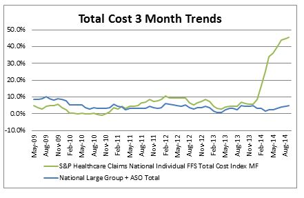
The overall medical trend rates covering all services have continued to be modest in the S&P data through the 3rd quarter of 2014—increasing up to 3.5% on a 12-month moving average basis as of September[1].

But in 2014 the Individual trends reported by S&P are now over 45% based on 3-month moving average trends as of September.  These can reflect the impact of adverse selection, higher demographics and higher minimum (essential) benefits required under the ACA.  To one degree or another, the industry tried to anticipate these effects in the initial rating for 2014.  It remains to be seen if we see a similar effect on Small Group in 2015.  We would not expect the impact to be as dramatic on Small Group as it was for Individual in 2014, however the results remain uncertain at this time.  The Small Group ACA coverage requirement and electronic enrollment had been deferred until 2015 and insureds in this category were only allowed to enroll electronically staring in late 2014 so no experience due to Small Group ACA enrollment is yet apparent, but there could be an increase in these measured trends, although probably not as dramatic as the Individual trends.

Capture

THE REPORT IS PROVIDED “AS-IS” AND, TO THE MAXIMUM EXTENT PERMITTED BY APPLICABLE LAW, MILLIMAN DISCLAIMS ALL GUARANTEES AND WARRANTIES, WHETHER EXPRESS, IMPLIED OR STATUTORY, REGARDING THE REPORT, INCLUDING ANY WARRANTY OF FITNESS FOR A PARTICULAR PURPOSE, TITLE, MERCHANTABILITY, AND NON-INFRINGEMENT.
[1] We track the LG/ASO trends as representative of underlying trends, since Individual and Small Group are impacted more significantly by the Affordable Care Act (ACA).  Keep in mind that actual trends experienced by plans are likely to be higher than as reported in S&P data.  Trends experienced by large employers on plans that have not changed in the previous year could be higher by as much as 2% or more on bronze level plans and higher by 1% or more on gold level plans due to the effects of deductible and copay leverage.  So risk takers need to take this into account.  In addition, the S&P Indices do not reflect the impact of benefit buy-downs by employers (i.e., higher deductibles, etc.), since the indices are based on full allowed charges.  As noted above, actual trends experienced by employers and insurers in the absence of benefit buy-downs can be expected to be higher than reported S&P trends due to plan design issues such as deductibles, copays, out-of-pocket maximums, etc.   Benefit buy-downs do not represent trend changes since they are benefit reductions in exchange for premium concessions, but they can have a dampening effect on utilization due to higher member copayments, and this can have a dampening effect on measured S&P trends compared to plans with no benefit changes, further pushing up experienced trends relative to those reported in the indices.

The posts on this blog are opinions, not advice. Please read our Disclaimers.

Miss The Commodity Bottom? There Might Be Time.

Contributor Image
Jodie Gunzberg

Former Managing Director, Head of U.S. Equities

S&P Dow Jones Indices

Worried that maybe you missed the possible bottom of commodities after the S&P GSCI Total Return lost 7.5% in January, posting its sixth worst January in history since 1970? It’s possible there is still time even after the S&P GSCI TR posted (on Feb. 3, 2015) not only the 35th best day, up 4.13%, in its history since Jan. 6, 1970 (11,370 days ago), but the index posted a 3-day gain of 10.03%.  This is only the 5th time in history the index has posted a 3-day gain over 10%.

August 3, 2009 ended the last 3-day period the index gained over 10%, up 10.64%. Also in 2009, January 5th ended the largest 3-day gain of 14.31%.  The chart below shows return following these spikes. Notice there was a 26.7% drop from Jan. 5 to Feb.18 of 2009 before a 41.7% gain through Aug. 3 of that year. The S&P GSCI TR continued to increase 30.8% until its peak on April 8, 2011.

Source: S&P Dow Jones Indices. Past performance is not an indication of future results.

The other two 3-day periods the index gained more than 10% ended on August 6th and 7th in 1990, posting returns of 13.65% and 10.83%, respectively. Notice after this period, the index peaked on Oct. 9, 1990 gaining an additional 25.2% after the historically big 3-day rise. Subsequently it fell 26.8% through Jan. 18, 1991 before rising 80.7% through Jan. 6, 1997.

Source: S&P Dow Jones Indices. Past performance is not an indication of future results.


The posts on this blog are opinions, not advice. Please read our Disclaimers.

Shelter from the Storm

Contributor Image
Chris Bennett

Former Director, Index Investment Strategy

S&P Dow Jones Indices

Like many in the northern hemisphere, the S&P 500® felt a bit blue in January.  With the traditional winter frost came winds of volatility, which, like many of our holiday guests, overstayed their welcome.  On a total return basis, the S&P 500 declined 3% in January, as market volatility from the fall of 2014 lingered into the new year.

All was not lost, however; certain factor-based strategies thrived in the volatility.  The conditions were ideal for defensive strategies, as the markets were both choppy and directionless (since September 2014, the S&P 500 (TR) is essentially flat).  Both high dividend and low volatility strategies have generally provided historical downside protection in volatile markets.

The S&P 500 Low Volatility Index comprises the 100 least-volatile constituents of the S&P 500, while the S&P 500 Dividend Aristocrats® contains the S&P 500 companies that have increased dividends every year for the past 25 consecutive years.  Finance 101 taught us that companies that issue consistent dividends are usually mature, low-growth (read: less volatile) companies.  Therefore, in periods when the S&P 500 performs poorly, we could typically expect both the S&P 500 Low Volatility Index and the S&P 500 Dividend Aristocrats to outperform, as both indices are made up of low volatility stocks.

Capture

The recent bout of market weakness provided an opportunity to test this hypothesis.  While the S&P 500 was flat from September 2014 through January 2015, the S&P 500 Low Volatility Index and the S&P 500 Dividend Aristocrats were up 7.83% and 5.57%, respectively.

Capture

Obviously, these strategies are not perfect downside hedges.  Over the long term, however, both the S&P 500 Dividend Aristocrats and the S&P 500 Low Volatility Index have tended to offer patient investors protection from declining markets, while providing some exposure to the upside.  Though both of these indices tend to underperform the S&P 500 during bull runs, they provide some shelter when the sky starts to fall.

The posts on this blog are opinions, not advice. Please read our Disclaimers.

Asia Fixed Income: China Onshore vs. Offshore

Contributor Image
Michele Leung

Former Director, Fixed Income Indices

S&P Dow Jones Indices

The China offshore renminbi (CNH) bond market has been serving some investors as a gateway to Chinese bonds until the Renminbi Qualified Foreign Institutional Investor (RQFII) program takes off.  The size of offshore renminbi market is approaching CNH 800 billion, yet it is relatively small when compared with the CNY 27 trillion onshore bond market, which is tracked by the S&P China Bond Index.

Fundamentally speaking, the CNH and CNY currencies are different; additionally, onshore and offshore Chinese bonds are subject to different interest rate systems.  While the spreads of the yield curves have converged over time, some spread differences continue—e.g., 3 bps for a 5-Year Chinese government bond and higher for shorter-maturity bonds.

While China’s onshore market is vast, it is predominately restricted to domestic issuers.  On the other hand, many international issuers have tapped into China’s offshore market.  For example, there are quasi names such as the IFC, KFW, and Asian Development Bank, and corporate names like Volkswagen, Total, and Caterpillar.

Perhaps a more significant distinction is that 53% of Chinese offshore corporate bonds (by par amount) are rated by international rating agencies, according to the S&P/DB ORBIT Credit Index.  Of these, a total of CNY 61 trillion in bonds are rated as investment grade by at least one international rating agency (see Exhibit 1 for the index’s rating profile).  Of note, most of China’s onshore bonds are not rated by the international rating agencies.

In terms of total return, the onshore market, tracked by the S&P China Composite Select Bond Index, rose 9.61% in 2014, outperforming the offshore market as represented by the S&P/DB ORBIT Index. Exhibit 2 shows a quick comparison of these two indices of investable bonds.  Last but not least, liquidity and accessibility are definitely the two key criteria to consider when differentiating China’s onshore and offshore bond markets.

Exhibit 1: The Rating Profile of the S&P/DB ORBIT Credit Index

Source: S&P Dow Jones Indices LLC. Data as of Feb. 2, 2015. Charts are provided for illustrative purposes. Calculation is based on the historical monthly returns from December 2009.

Exhibit 2: Comparison of Indices

Source: S&P Dow Jones Indices LLC. Charts and tables are provided for illustrative purposes.

Please click for more information on the S&P China Composite Select Bond Index and the S&P/DB ORBIT Index.


The posts on this blog are opinions, not advice. Please read our Disclaimers.

Freezing Temperatures, Hot Bonds

Contributor Image
Kevin Horan

Former Director, Fixed Income Indices

S&P Dow Jones Indices

The current cold snap that has descended upon the east coast of the U.S. has winter temperatures on par with its neighboring country to the north.  In addition to the weather, the Canadian bond market has seen its share of interest, as on Jan. 21, 2015, the Bank of Canada (BOC) cut rates by 25 bps to an overnight lending level of 0.75%.  The need for the BOC to act was created by sliding inflation, weaker crude prices (which threaten domestic sand oil production), and lagging employment growth.

After the news, Canadian sovereign bonds, as measured by the S&P Canada Sovereign Bond Index, rallied by 0.45%, and this continued into Jan. 23, 2015, with a 0.30% daily total return.  The index closed the month of January at 3.77%, and it has returned 3.86% YTD as of Feb. 2, 2015.  In comparison, the  S&P/BGCantor US Treasury Bond Index has returned 2.00% YTD as of Feb. 2, 2015.

Along with sovereigns, performance of additional segments of the Canadian fixed income market has been just as impressive.  Exhibit 1 shows that over the course of the last year, investment-grade corporates (as measured by the S&P Canada Investment Grade Corporate Bond Index) have tracked sovereigns tightly and recently began to underperform sovereigns.  As of Feb. 2, 2015, the S&P Canada Investment Grade Corporate Bond Index has returned 3.01% YTD.  Since the beginning of the year, the performance for all components of the S&P Canada Aggregate Bond Index has been strong.  The leader of the pack (including sovereigns, provincials and municipals, corporates, and collateralized bonds) has been the S&P Canada Provincial & Municipal Bond Index.  After returning 10.48% in 2014, this segment of the Canadian market has returned 5.83% YTD (as of Feb. 2, 2015).  The combination of yield and a government guarantee has led to significant 2015 performance for securities in this index, with issuers such as Canada Mortgage and Housing, the Province of Quebec, Saskatchewan, British Columbia, and Ontario being some of the top performers.

The laggard of the group is the S&P Canada Collateralized Bond Index, which has returned 1.54% YTD as of Feb. 2, 2015, but the index represents less than 1% of the S&P Canada Aggregate Bond Index.

Exhibit 1: Total Returns of Canadian Bond Indices
Total Returns of Canadian Bond Indices

Source: S&P Dow Jones Indices LLC.  Data as of Feb. 2, 2015.  Charts and tables are provided for illustrative purposes.  Past performance is no guarantee of future results.

The posts on this blog are opinions, not advice. Please read our Disclaimers.