Get Indexology® Blog updates via email.

In This List

Observations on January Release of S&P Claims Based Indices (Allowed Charge Trends): Part 2

Inside the S&P 500: How Sector Weights Adjust for Oil

Are TIPS Insurance on a Sunny Day?

Energy Related Municipal Bonds Help Push the S&P Municipal Bond Default Rate to a 3-Year High in 2014: 0.17%

2015 Resolution: Diversification

Observations on January Release of S&P Claims Based Indices (Allowed Charge Trends): Part 2

Contributor Image
John Cookson

Principal, Consulting Actuary

Milliman

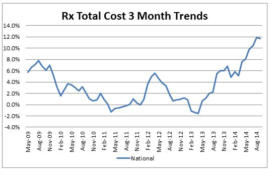
Although the overall medical trend rates covering all services have continued to be modest in the S&P data through the 3rd quarter of 2014[1],  the prescription drug trends have been more volatile but modest prior to mid-2013, but have continued to accelerate since then through September 2014.  On a 3-month basis they have climbed to 11.7% by September (before deductibles, copays, etc.).  Cost pressure on generics and brand drugs (perhaps generated by price concessions on Medicare by the pharma companies) have shown an uptick in the last year, however, the introduction of Sovaldi and other new and expensive drugs in early 2014 (which are now incorporated in our economic forecasts) are further pushing up drug costs.  Furthermore, the impact of deductible/fixed dollar copay leverage can be quite substantial on drug plans and have pushed drug trends to insurers even higher than shown in our forecast worksheet.  The impact of more new and expensive drugs for cancer, cardiovascular and cholesterol in 2015 can be expected to potentially push trends higher than the economic forecasts in our models until it gets completely factored into the data.  Recent anecdotal data seems to indicate that Sovaldi growth may have peaked in the short term, while patients are waiting for the new alternative product Harvoni.  In addition to the high cost of Sovaldi, there are issues about the required additional drugs, and the somewhat higher drug regimen termination rates than in initial trials of the drug that could be causing a slowdown in its prescription rate.  A number of combination drugs for Hepatitis C were expected to become available starting in 2015 that help reduce some of the negative effects mentioned, and some patients may be holding off for these new options.

Capture


THE REPORT IS PROVIDED “AS-IS” AND, TO THE MAXIMUM EXTENT PERMITTED BY APPLICABLE LAW, MILLIMAN DISCLAIMS ALL GUARANTEES AND WARRANTIES, WHETHER EXPRESS, IMPLIED OR STATUTORY, REGARDING THE REPORT, INCLUDING ANY WARRANTY OF FITNESS FOR A PARTICULAR PURPOSE, TITLE, MERCHANTABILITY, AND NON-INFRINGEMENT.
[1] We track the LG/ASO trends as representative of underlying trends, since Individual and Small Group are impacted more significantly by the Affordable Care Act (ACA).  Keep in mind that actual trends experienced by plans are likely to be higher than as reported in S&P data.  Trends experienced by large employers on plans that have not changed in the previous year could be higher by as much as 2% or more on bronze level plans and higher by 1% or more on gold level plans due to the effects of deductible and copay leverage.  So risk takers need to take this into account.  In addition, the S&P Indices do not reflect the impact of benefit buy-downs by employers (i.e., higher deductibles, etc.), since the indices are based on full allowed charges.  As noted above, actual trends experienced by employers and insurers in the absence of benefit buy-downs can be expected to be higher than reported S&P trends due to plan design issues such as deductibles, copays, out-of-pocket maximums, etc.   Benefit buy-downs do not represent trend changes since they are benefit reductions in exchange for premium concessions, but they can have a dampening effect on utilization due to higher member copayments, and this can have a dampening effect on measured S&P trends compared to plans with no benefit changes, further pushing up experienced trends relative to those reported in the indices.

The posts on this blog are opinions, not advice. Please read our Disclaimers.

Inside the S&P 500: How Sector Weights Adjust for Oil

Contributor Image
David Blitzer

Former Managing Director and Chairman of the Index Committee

S&P Dow Jones Indices

From May 30th 2014 to last Friday, January 9th, the energy sector in the S&P 500 was down 18.1% while the overall index was up 6.3%. As energy under-performs the overall index, its weight within the index is dropping, reducing the impact of further energy weakness on the index.  The energy sector weight is down by more than a fifth, from 10.8% at the end of May to 8.2% last week.

The nature of a market cap weighted index is to adjust to mitigate the damage, or take advantage of, a trend as long as the trend is maintained.  The weight of any stock, or sector, in the index is simply the ratio of its market value to the total market value of the index. If energy stocks drop by one percent today and the rest of the index rises (or falls by less than one percent), the energy sector weight will drop and the weight of the other sectors will rise.  If the energy sector steadily and consistently falls compared to the rest of the market, its weight falls. For an investor holding a portfolio tracking the S&P 500, a one percent loss in energy today is less damaging than a one percent energy loss was last summer. This may sound like almost magical risk management – the more energy under-performs, the smaller the exposure.  There is one caveat: when oil prices bottom out and begin to rise, the exposure to oil and energy will have been minimized. At the exact moment when an investor wishes to be over-weighted in energy, she would be under-weighted.

Those who remember the end of the tech stock boom in March 2000 saw the same process in the other direction. For two or three years, tech stocks led the market up and month by month the tech sector weighting in the S&P 500 climbed from about 15% to a third of the index.  But when techs crashed, the entire market was over-weighted in the wrong direction.

The chart shows the performance of the energy sector of the S&P 500 and the S&P 500 excluding energy as well as the energy sector weight (the shaded region).

The posts on this blog are opinions, not advice. Please read our Disclaimers.

Are TIPS Insurance on a Sunny Day?

Contributor Image
Kevin Horan

Former Director, Fixed Income Indices

S&P Dow Jones Indices

The current quote of NYMEX crude is lower by $2 today as the price action of crude oil has been on a downhill slide since the end of June 2014.  The news is loaded with stories of oil and its effects on consumers and the economy.  Min Zeng of the Wall Street Journal published “Closely Watched Inflation Gauge Falls to Lowest Level in 14 Years,” while his colleague Jason Zweig approached the issue from a differing angle.  In his article, “Here’s a Tip: Buy More TIPS,” Mr. Zweig makes a case for investors to keep an eye on the performance of TIPS (Treasury Inflation-Protected Securities) and to be opportunistic with investing.  The article states, “in recent months, as oil has fallen, TIPS ‘have taken a huge adjustment,’ says Gemma Wright-Casparius, portfolio manager of the Vanguard Inflation-Protected Securities Fund, with $24.8 billion in assets. ‘They look fairly priced to me now.’”  This asset class may be down, but don’t count it out, if I was to paraphrase the message.

The return of the S&P U.S. TIPS Index for 2014 was 3.10%, though the index did have a tough December, returning -1.1%, and an even tougher September, losing 2.38%.  As of Jan. 9, 2015, the index was returning 0.80% MTD.

The U.S. Fed seems determined to get inflation up to its target level of 2%, though the current, all-items CPI of 1.3% YOY is nowhere near the target.  Extreme as it may seem, the Fed does have the tools to print money in order to push the inflation level upward.  Current expectations are that inflation will stay low, but as we know, the idea of insurance is to protect against the unexpected.  As the saying goes, “the best time to buy insurance is when the sun is shining.”
S&P U.S. TIPS Indices-Total Rate of Return Performance

The posts on this blog are opinions, not advice. Please read our Disclaimers.

Energy Related Municipal Bonds Help Push the S&P Municipal Bond Default Rate to a 3-Year High in 2014: 0.17%

Contributor Image
Tyler Cling

Senior Manager, Fixed Income Indices

S&P Dow Jones Indices

In 2014, the default rate of the S&P Municipal Bond Index rose for the first time since 2011, finishing the year at 0.17%. In 2013, the overall default rate fell to 0.107% from 0.144% in 2012. The corporate bond sector of the municipal bond market has historically been one of the sectors where bonds have a higher propensity to default. That was the case in 2014. The Energy Future Holdings Corporation default (previously TXU) accounted for over 17% of the deals entering default in 2014.

Based on the index data, the high-yield municipal bond default rate also jumped from 0.807% to 1.264% in 2014.  In comparison, according to Standard & Poor’s Ratings Services Global Fixed Income Research estimates, the 2014 U.S. speculative-grade corporate bond default rate was 1.52%.  Combining this data reveals a definitive trend: Historically, municipal bonds have had a lower propensity to default.  Default data from 2014 suggest that this trend may be correcting itself in the high yield space.

The number of deals tracked in the index has declined in 2014 as the pace of new issues qualifying for the index did not outpace bonds maturing.

The S&P Municipal Bond Index has been a live benchmark since Dec. 31, 2000.  The index tracks over 79,000 bonds from over 22,000 different issuers, and it represents a market value of more than USD 1.5 trillion.  Some unique features of the index are that it is designed to measure bonds throughout their “lifetime,” meaning from issuance to maturity (as of the index rebalancing date, the bond must have a minimum term to maturity or complete call date greater than or equal to one calendar month), and it includes bonds that range in quality from “AAA” to “Default.”  By keeping bonds in the benchmark even when a default occurs, the index has become a living timeline, allowing us to track the municipal bond default rate.  The vast swath of the municipal bond market tracked by the S&P Municipal Bond Index makes this analysis possible.

Capture

The posts on this blog are opinions, not advice. Please read our Disclaimers.

2015 Resolution: Diversification

Contributor Image
Michele Leung

Former Director, Fixed Income Indices

S&P Dow Jones Indices

Most bond markets ended on a positive note in 2014. Some of the outperformers are the S&P Eurozone Developed Sovereign Bond Index (up 11.98%), the S&P U.S. Issued Investment Grade Corporate Bond Index (up 7.71%) and the S&P China Government Bond Index (up 10.35%). Yet the global yields remained low, i.e. the yield-to-worst of the S&P Eurozone Developed Sovereign Bond Index tightened by 92bps to 0.98%. Please see Exhibit 1 for the selective total return and yield comparisons.

Exhibit 1: Total Return and Yield-To-Worst Comparisons

Source: S&P Dow Jones Indices. Data as of December 31, 2014.  Charts are provided for illustrative purposes.  The S&P China Government Bond Index is calculated in CNY and the S&P Eurozone Developed Sovereign Bond Index is calculated in EUR, while the other two indices are calculated in USD.
Source: S&P Dow Jones Indices. Data as of December 31, 2014. Charts are provided for illustrative purposes. The S&P China Government Bond Index is calculated in CNY and the S&P Eurozone Developed Sovereign Bond Index is calculated in EUR, while the other two indices are calculated in USD.

With the global uncertainties in economic growth, inflation and monetary policy remain; portfolio diversification seems to be the key in 2015, which allows upside participation while minimizes the downside risk of over-concentration.

Looking into 8-year historical data, despite the differences in their economies and monetary policies, the S&P/BGCantor U.S. Treasury Bond Index has a correlation of 0.47 with the S&P Eurozone Developed Sovereign Bond Index.

On the other hand, the U.S. and European bond markets exhibited low correlations with the Pan Asia and Chinese local currency bond markets over the same period.

S&P/BGCantor U.S. Treasury Bond Index S&P Eurozone Developed Sovereign Bond Index
S&P Pan Asia Government Bond Index 0.179 0.173
S&P China Government Bond Index 0.169 0.140

Specifically, the S&P China Corporate Bond Index had a negative correlation with the U.S. issued high yield and investment grade bonds.

S&P U.S. Issued High Yield Corporate Bond Index S&P U.S. Issued Investment Grade Corporate Bond Index
S&P China Corporate Bond Index -0.224 -0.104

Hence, Pan Asian bonds offer portfolio diversification through the exposure to local rates, credits and currencies. For more information on the performance of the S&P Pan Asia Bond Index family, please visit here.

*Correlation data are as of December 31, 2014, computed from the monthly returns since December 29, 2006.


The posts on this blog are opinions, not advice. Please read our Disclaimers.