Get Indexology® Blog updates via email.

In This List

What Ails the Market?

Real Yield and a 14% Return … O Canada

Bemoaning Cheap Oil

The Disparity Of Risk Parity

Third Quarter Results: Expect Disappointment

What Ails the Market?

Contributor Image
David Blitzer

Former Managing Director and Chairman of the Index Committee

S&P Dow Jones Indices

Everyone wants an explanation. Cataloged below are popular explanations with each rated as plausible, contributing, possible, or unlikely.

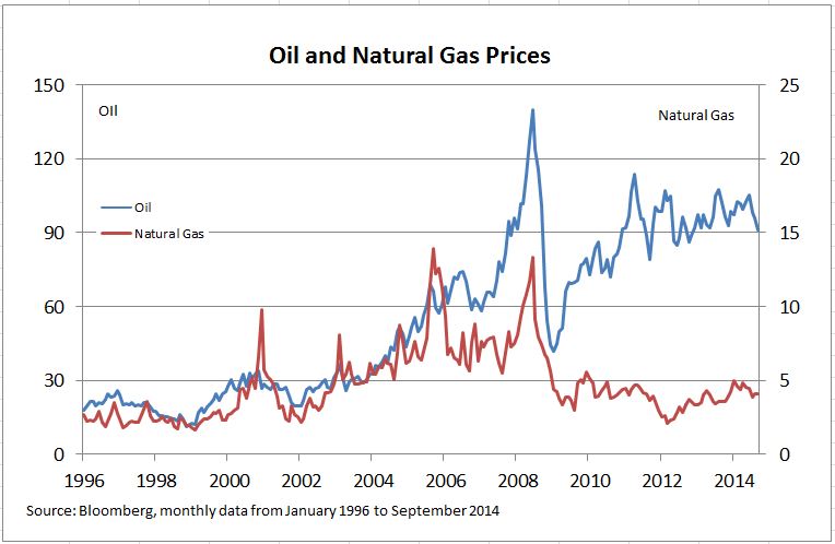
Falling oil prices – bad news for energy stocks but good news for the rest of the economy, especially for consumers.  A few years back everyone was wishing for cheaper gasoline and now that it is almost here we blame it for falling stock market. Contributing

Slow growth in Europe and recession risks in Germany – Europe’s economy is barely growing and near term prospects suggest further weakness. Everyone likes what the European Central Bank says, but no one believes it can provide enough monetary stimulus to make a real difference.  A German recession would hurt the rest of Europe, dampen some of the US economy’s strength and deter some pending tax inversion M&A deals. Plausible

China — In China 7.5% real growth is slow, and it is likely to get slower still. China faces both short term and long term economic challenges and sorting them out won’t happen overnight.  Exports are likely to continue and there will be new cell phone models in 2015, but China may no longer be the buyer of last resort for all natural resources.  The direct impact on the US markets is less than the risk of a European recession, but China is certainly a contributing factor

The end of QE – When the Fed began quantitative easing everyone said it was a mistake. Then everyone said it raised asset prices, including stocks. Now that it is ending, everyone is worried what happens when it goes away.  The announcement and the associated anxiety do more damage than QE itself.  We survived the “Taper Tantrum” last year and will survive the final end of QE, which, by the way, is almost gone. Unlikely

The Fed – Setting aside QE, some investors always blame the Fed, either for what they did, or didn’t do. Over the weekend Stanley Fischer, the Fed Vice-Chairman suggested that economic weakness in Europe and emerging markets might lead the Fed to delay any interest rate increases.  For the moment, the Fed is not the problem. Unlikely

Geopolitics, Ebola, and ISIS – All these worry people and those worries combine with the market worries to encourage selling.  If ISIS were routed, Ebola was only found in bad thriller novels and no one wanted to sanction someone, would a 5% market pullback make the six o’clock news? Plausible

The S&P 500 is falling – Can we blame that market’s decline on the market? One factor cited by market analysts is that the S&P 500 has fallen far enough to test its 200 day moving average.  In research done following the 1987 stock market crash, Robert Shiller asked investors what factors they cited for the market crash; their response was the sharp declines the week before the crash.  Crowd psychology plays a part. The title of one of first analyses of markets and manias was Extraordinary Popular Delusions and the Madness of Crowds.  Contributing


Do we know why the market is down? No. Maybe there isn’t an explanation.  The US economy is doing okay – unemployment is down, inflation is low, there are hints that wages may be rising and the economy is growing.  This is the fourth time this year the S&P 500 dropped about 100 points. The market has successfully forecasted about seven of the last two recessions.  Remember that the market will fluctuate and is virtually unpredictable.

The posts on this blog are opinions, not advice. Please read our Disclaimers.

Real Yield and a 14% Return … O Canada

Contributor Image
Kevin Horan

Former Director, Fixed Income Indices

S&P Dow Jones Indices

The S&P Canada Sovereign Inflation-Linked Bond Index has returned 1.8% month-to-date and an outstanding 14.87% year-to-date.  Investors of inflation-linked bonds are interested in the real yield which measures a bond’s yield adjusted for inflation.  Canadian inflation (2.1%) has recovered in recent months from the low end of the Bank of Canada’s 1% to 3% target range.

Inflation-linked bonds are not just a hold-to-maturity strategy. Inflation expectations vary with economic conditions and so by varying the weightings of nominal and inflation-linked bonds in a portfolio, investors can take views on movements in those expectations.

Currently in Europe, the ECB has been fighting deflationary pressure and looking to revive growth.  U.S. style asset purchases supported by ECB President Mario Draghi are the latest action to stimulating the feeble economy.  Though, strong demand for a new Spanish inflation-linked bond to settle Oct. 14th suggests the belief that the ECB policies will stave off deflation and increase consumer prices.  A modest recovery in inflation might be expected by some as the weak euro versus the dollar could lead to increased price pressures.   Year-to-date the S&P Eurozone Sovereign Inflation-Linked Bond Index has returned 7.06%.

O Canada
O Canada


The posts on this blog are opinions, not advice. Please read our Disclaimers.

Bemoaning Cheap Oil

Contributor Image
David Blitzer

Former Managing Director and Chairman of the Index Committee

S&P Dow Jones Indices

Investors – both stock investors and commodities traders – are having a bad week as oil prices fall lower and lower and the stock market follows close behind.  (see chart 1) In all markets there are buyers and sellers and in the energy market most people (and most equity investors) are buyers.  Cheap energy, especially cheap natural gas, is a boon to the US economy.  Why is oil plunging? Where are the benefits?

Short term factors are behind the current oil price slide: signs of a deeper economic slowdown in Europe and the possibility of a German recession. Added to this are rumors that Saudi Arabia may have lowered prices to maintain its market share plus black market oil sales from some fields in Iraq controlled by ISIS and similar groups.

Larger longer run developments matter more: increased oil and shale oil production in the US and the US natural gas boom.  US oil production has surged, oil imports are collapsing, and cheap natural gas is replacing both coal and oil in electric power generation. Cheap US coal is finding growing export markets in Europe, further lowering global energy prices.  Results cited by the IMF in their just-published World Economic Outlook include rising US manufacturing exports, a smaller US trade deficit and increasing US competitiveness versus Europe and Asia.  While oil price are sending stocks down today, the stage is being set for lower expenses and rising company profits in the near future.

One measure of the impact of increased gas production can be seen in the second chart which shows the prices of oil and natural gas.  Gas is priced per million BTU (a measure of energy) and oil is priced per barrel. A barrel of crude oil contains about six million BTU, so the price of oil should be six times the price of gas. The chart shows oil and gas prices with axes scaled 6:1.  If oil and gas were both traded freely the two lines on the chart would coincide.  However, exporting gas is very expensive, so rapidly growing US gas supplies tend to stay home, keeping gas prices low. On top of that, gas is generally cleaner and requires equipment to use.

To be fair, not all of the stock market gloom should be blamed on energy.  Weak demand in Europe, politics in the Middle East and a bull market that is overdue for some corrective angst are all part of the picture.

The posts on this blog are opinions, not advice. Please read our Disclaimers.

The Disparity Of Risk Parity

Contributor Image
Jodie Gunzberg

Former Managing Director, Head of U.S. Equities

S&P Dow Jones Indices

The simple concept of risk parity is that within a portfolio, each investment contributes equally to the overall portfolio risk.  For example, a portfolio with a capital allocation of 50% equities and 50% t-bills, has a risk profile where over 99% of risk comes from the equities.  In a risk parity portfolio, if 50% risk (contribution to variance) were allocated each to equities and t-bills, the capital allocation looks more like 5% in equities and 95% in t-bills.

As Blackrock published in a paper earlier this year, interest in risk based investing has grown steadily in the post-crisis years, as investors seek to overcome the limitations of traditional approaches to asset allocation. Some are now setting their strategic asset allocation by applying a risk factor framework across their entire portfolio and others are exploring risk parity strategies in specific asset classes.

Risk parity strategies fill the gap between active and index management to offer a chance at improving return and reducing risk in a classicly balanced portfolio. Though strategies vary in implementation, they share a basic goal: building a portfolio based on diversifying sources of return, in pursuit of strong, consistent returns and avoidance of drawdowns in recessions and periods of economic stress. This is illustrated in the chart below where the shaded bars are recessionary periods and the circles are large equity drawdowns. Notice the smoother returns of risk parity when compared with the S&P 500.

This exhibit shows how risk parity has performed in rolling five-year periods versus equities and cash plus 5% since 1930.  Pre-1970: The risk parity strategy is a 25%/75% allocation of the S&P 500 (and predecessor indexes) and the Ibbotson Intermediate-Term Treasury Index with notional exposure of 1.8X  capital invested. Post 1970: The risk parity strategy is a 22%/62%/16% allocation of the S&P 500, the Ibbotson Intermediate-Term Treasury Index and the GSCI Commodity Index with  notional exposure of 1.85X capital invested. Both pre- and post-1970 target a risk level of 10% and equal risk allocation among all three components, assuming zero correlations at  volatilities of 15%/5%/20%. Thirty percent of capital is invested in T-bills to meet margin calls. Notional exposure is greater than capital invested. We assume a 50-bps spread over T-bills  for derivatives financing. Index performance is for illustrative purposes only. You cannot invest directly in an index. Performance returns for strategies do not reflect any management fees,  transaction costs or non-financial expenses. Past performance is not indicative of future returns.
This exhibit shows how risk parity has performed in rolling five-year periods versus equities and cash plus 5% since 1930.
Pre-1970: The risk parity strategy is a 25%/75% allocation of the S&P 500 (and predecessor indexes) and the Ibbotson Intermediate-Term Treasury Index with notional exposure of 1.8X capital invested. Post 1970: The risk parity strategy is a 22%/62%/16% allocation of the S&P 500, the Ibbotson Intermediate-Term Treasury Index and the S&P GSCI with notional exposure of 1.85X capital invested. Both pre- and post-1970 target a risk level of 10% and equal risk allocation among all three components, assuming zero correlations at volatilities of 15%/5%/20%. Thirty percent of capital is invested in T-bills to meet margin calls. Notional exposure is greater than capital invested. A 50-bps spread over T-bills for derivatives financing is assumed. Index performance is for illustrative purposes only. You cannot invest directly in an index. Performance returns for strategies do not reflect any management fees, transaction costs or non-financial expenses. Past performance is not indicative of future returns.

Again, risk parity is being applied at both portfolio and strategy levels, which works for commodities and managed futures.

Below is a 10-year cumulative return chart that shows the power of risk parity in commodities and managed futures. The apples to apples annualized return comparison for isolating the risk parity impact in commodities can be seen by the S&P GSCI total return of -3.47% as compared with the total return of 2.28% from the S&P GSCI Risk Weight. For managed futures that include financial futures in addition to commodity futures, the appropriate comparison to evaluate the power of risk parity is the total return of 1.21% from the S&P DFI (that has a capital allocation of 50% commodities/50% financials with an S&P GSCI Light Energy weight inside the commodities and a GDP weight inside the financials) versus the total return of  3.07% from the S&P SFI (strategic futures index that is risk parity weighted).

Further, the value of adding financials to commodities can be evaluated by comparing the S&P GSCI Light Energy total returns of -1.05% versus the S&P DFI total returns of 1.21%. In a risk parity framework, futures added to the S&P SFI from the S&P GSCI Risk Weight earn an additional 79 basis points annually.

Source: S&P Dow Jones Indices

Source: S&P Dow Jones Indices

For only 79 basis points annually, is it worth adding the financials in a risk parity weighted index? If cutting your risk by more than half is attractive, then yes. Adding financials in a risk parity index more than tripled the Sharpe Ratio in 10 years, bringing it from 0.19 to 0.60. Further within the managed futures framework, changing the weight to risk parity from 50/50 capital allocations to commodities/financials increased the Sharpe Ratio from 0.18 to 0.60. Source: S&P Dow Jones Indices LLC.  All information presented prior to the index launch date is back-tested. Back-tested performance is not actual performance, but is hypothetical. The back-test calculations are based on the same methodology that was in effect when the index was officially launched. Past performance is not a guarantee of future results.  Please see the Performance Disclosure at http://www.spindices.com/regulatory-affairs-disclaimers/ for more information regarding the inherent limitations associated with back-tested performance.

Source: S&P Dow Jones Indices LLC. All information presented prior to the index launch date is back-tested. Back-tested performance is not actual performance, but is hypothetical. The back-test calculations are based on the same methodology that was in effect when the index was officially launched. Past performance is not a guarantee of future results. Please see the Performance Disclosure at http://www.spindices.com/regulatory-affairs-disclaimers/ for more information regarding the inherent limitations associated with back-tested performance.

The posts on this blog are opinions, not advice. Please read our Disclaimers.

Third Quarter Results: Expect Disappointment

Contributor Image
Craig Lazzara

Former Managing Director, Index Investment Strategy

S&P Dow Jones Indices

This week or next, millions of investors will be receiving statements reporting third quarter performance for their actively-managed mutual funds.  Comparing active results to passive benchmarks has been a frustrating exercise more often than not.  Two observations tell us that the third quarter is likely to be especially painful.

We first observe that dispersion is low.  Dispersion gives us a way to gauge the difference between the “best” performing and “worst” performing stocks in a given market.  When dispersion is relatively wide, the opportunities to profit from stock selection are relatively large; when dispersion is narrow, the opportunities diminish.  We can grasp this immediately by contrasting October 2001 with December 2013.

High and low dispersion

In both months, the return of the Dow Jones Industrial Average was 3%.  Yet it takes only a quick glance at the graph to understand that stock selection opportunities were much greater in October 2001, when dispersion was high, than in December 2013, when dispersion was at near-record lows.  This is not a function of manager skill.  The problem is that in a low dispersion environment, the value of skill goes down.

Our second observation is that in the third quarter of 2014, the average stock underperformed the market.  This sounds oxymoronic, but in fact turns on an important subtlety.  Capitalization-weighted indices like the S&P 500 tell us the return of the average dollar invested, not the return of the average stock.  An equal-weight index tells us the performance of the average stock.  The spread between equal- and cap-weighted performance tells us how much incremental return an investor could achieve by picking stocks at random.  The higher the spread between equal- and cap-weight, the stronger the tailwind at the active manager’s back.

In the recent past, the most successful year for active U.S. equity managers was 2009, when nearly half of U.S. large-cap managers outperformed the S&P 500.  More importantly for our purposes, the weighted average performance of those managers in 2009 was 28.9%, versus 26.5% for the S&P 500.  This performance occurred in an extremely favorable environment, as the S&P 500 Equal Weight Index rose by 46.3%.  Otherwise said, in 2009, the average stock in the S&P 500 outperformed the index by nearly 20% — an ideal environment for stock picking if ever there was one.  Not surprisingly, dispersion for that year averaged 8.7%, well above its historical average.

How does this compare with current conditions?  The table below shows a dramatic difference:

2009 and Q3 2014 summary

In contrast to the tailwind that the outperformance of the average stock often generates, in the third quarter, managers faced a headwind.  Moreover, dispersion is quite low by historical standards, meaning that even managers skillful enough to navigate through the headwind are unlikely to generate large rewards for doing so.

Active equity investors are likely to be disappointed by third quarter results.


The posts on this blog are opinions, not advice. Please read our Disclaimers.