Get Indexology® Blog updates via email.

In This List

The VIX Factor

Surprises Come With Attractive Yields

Shariah Indices Closely Track Conventional Benchmarks in 2013

COCOA Is The New Valentine

Obfuscation is Good, or How to Destroy an Economic Indicator

The VIX Factor

Contributor Image
Berlinda Liu

Former Director, Multi-Asset Indices

S&P Dow Jones Indices

After a strong 2013, the US equity market took a dive in January 2014 and dropped more than 3%. Is it a temporary market correction or something more substantial? Everyone has his own answer. Regardless of your outlook of the market, January has reminded us that market volatility is still one of the major risks that investors have to take care of.

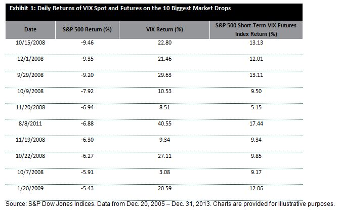
To directly hedge against equity market risk, investors traditionally buy put options to protect their downside. In recent years, more and more investors include VIX derivatives in their portfolio to manage their market risk, including VIX futures, options, exchange traded products and other OTC products. The main benefits of using VIX derivatives are: 1) VIX is negatively correlated (~ -77%) with the S&P 500 Index historically, and 2) this negative correlation is convex, meaning that VIX shows more reaction to large decrease in the equity market than to market increases. Exhibit 1 shows that rises of the S&P 500 VIX Short-Term Futures Index were usually higher than the losses of the equity market when the market was in stress.

Daily Returns of VIX Spot and Futures on the 10 Biggest Market Drops

Isn’t convexity a nice feature of VIX futures? Unfortunately it is no free; VIX futures can lose money even if VIX does not change. All futures have fixed expiration days; hence the S&P 500 VIX Short-Term Futures Index has to roll from the first month futures contract to the second month futures contract prior to the expiration on the first month contract. Since Dec. 2005, for the majority of the time (~ 83%), the longer term VIX futures were more expensive than the shorter term futures and a roll cost was incurred.

This roll cost of VIX futures is equivalent to the upfront premium for equity put options. It is the price of the downside protection. The only difference is that the roll cost is distributed throughout the month as the futures price converges towards the spot while the put option premium is paid up front.

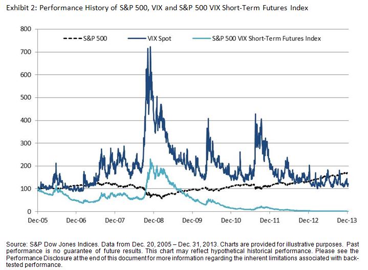
Exhibit 2 shows that the roll cost has led to significant performance drag in the S&P 500 VIX Short-Term Futures Index.

Exhibit 2: Performance History of S&P 500, VIX and S&P 500 VIX Short-Term Futures Index

Performance History of S&P 500, VIX and S&P 500 VIX Short-Term Futures Index

To avoid paying too much for downside protection, investors have to adjust their allocation to VIX futures wisely and implement “just-in-time hedging”. To help investors to dynamically allocate to VIX, S&P Dow Jones Indices launched the S&P 500 Dynamic VEQTOR Index (“VEQTOR”) as a prepackaged investment solution. The Index monitors two market signals, implied volatility trend and realized volatility, and allocates dynamically to equity and volatility. It also has a “stop-loss” feature that moves 100% to cash when the index has experienced more than 2% loss in the past five business days.

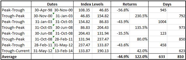
Compared to S&P 500, VEQTOR shows lower maximum drawdown and faster recovery. On 3/9/2009, the S&P 500 dropped 55% since its previous peak (2447.08 on 10/9/2007). It took 1120 calendar days to recover (2449.08 on 4/2/2012). VEQTOR saw its maximum drawdown on 9/15/2008 when it dropped 18% since its previous peak (137005.24. on 10/9/2007). It took only 31 calendar days to restore that level (140308.26 on 10/6/2008). See Exhibit 3.

Performance History of S&P 500 and S&P 500 Dynamic VEQTOR Index

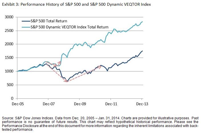
As all volatility reduction products, VEQTOR outperforms in bear market. It also participates in the growth but underperforms in strong bull market.

For more information, please join us during our webinar on Thursday.

The posts on this blog are opinions, not advice. Please read our Disclaimers.

Surprises Come With Attractive Yields

Contributor Image
Michele Leung

Former Director, Fixed Income Indices

S&P Dow Jones Indices

Despite the headline news on India’s high deficits and low economic growth, the Indian bonds remain very popular among investors who hunt for yields. Let’s be realistic, while a 10 year U.S. Treasury Bond pays 2.7%, a similar maturity of Indian sovereign Bond is offering a yield of 8.8%!

The S&P BSE India 10 Year Sovereign Bond Index measures the performance of the current India on-the-run sovereign bond, with fixed coupons and having remaining maturity close to 10 years.  The index is created as an independent benchmark to meet strong investor demand in India sovereign bonds.

As presented in Exhibit 1, the index’s yield-to-maturity demonstrates the sensitiveness to the interest rate decision by Reserve Bank of India (RBI). On Dec 18, 2013, as RBI unexpectedly left the repo rate at 7.75%, the 10 year benchmark yield fell from 8.91% to as low as 8.52%. Subsequently, on Jan 28, 2013, while it is largely anticipated there would be no change, RBI surprised the market again by hiking its repo rate by 25bps to 8%, as it raised the concern of the high inflation. The index yield-to-maturity currently stood at 8.81%, as of Feb 14, 2014.

While the inflation is a sensitive issue, another key concern may arise from the general election to be held in May 2014. Regardless of the surprises, or the volatilities, the risk appetite for the Asian local currency bonds continues to be very solid, which implies the investors are happy with the risk premium they are receiving.

Note the Standard & Poor’s Ratings Services affirmed the ‘BBB-‘ long-term and ‘A-3’ short-term unsolicited sovereign credit ratings on India as of November 7, 2013.

The Yield-to-Maturity of S&P BSE India 10 Year Sovereign Bond Index

The posts on this blog are opinions, not advice. Please read our Disclaimers.

Shariah Indices Closely Track Conventional Benchmarks in 2013

Contributor Image
Michael Orzano

Head of Global Exchanges Product Management

S&P Dow Jones Indices

S&P Dow Jones Shariah-compliant benchmarks covering the U.S., MENA and global equity markets performed in line with their conventional counterparts in 2013. In fact, the S&P 500 Shariah, S&P Pan Arab Composite Shariah, and the S&P Global BMI Shariah, each closed the year within 50 basis points of their non-Shariah counterparts – quite remarkable in a year with such high absolute returns. Likewise, the Dow Jones Islamic (DJIM) Market World Index trailed the Dow Jones Global Index by just 1.4% for the year.
Mikeblog1
For those unfamiliar with the construction of Shariah-compliant indices, the primary driver of performance differentials stems from the exclusion of most financial services firms from Shariah-compliant benchmarks. As a result, in times when the Financial sector significantly over- or underperforms the overall market, the performance of Shariah-compliant benchmarks tends to diverge from that of conventional indices. In 2013, the Financial sector in the U.S. and global equity markets was roughly in the middle of the pack leading to comparable standard and Shariah-compliant performance.
Mikeblog2
The DJIM World Index gained 19.2% in 2013, driven by strength in the U.S. and Europe, while DJIM Asia Pacific (4.1%) and DJIM Emerging Markets (-2.2%) significantly underperformed. The blue-chip DJIM Titans 100 performed comparably to its broad market counterpart posting a 21.9% price return for the year.
In the Middle-East, the S&P Pan Arab Composite Shariah gained 21.2% in 2013, driven by the 23.3% return of the S&P Saudi Arabia Shariah, which comprises approximately half of the index.
The U.A.E. was the star performer for the year in the GCC and globally, as the S&P U.A.E. Shariah Index more than doubled in 2013. The country’s stock market was buoyed by continued recovery in its real estate market and the announcement of an upgrade from frontier to emerging market status from several major index providers, including S&P Dow Jones Indices.

To find out more about our Shariah Indices Click Here

The posts on this blog are opinions, not advice. Please read our Disclaimers.

COCOA Is The New Valentine

Contributor Image
Jodie Gunzberg

Former Managing Director, Head of U.S. Equities

S&P Dow Jones Indices

Perception might be that lovers everywhere have always enjoyed the confection of affection, chocolate. However, it has taken some time for many Asian countries to adopt the taste, but it seems now they have fallen in love.  The Singapore-based Cocoa Association of Asia said that in the fourth quarter of 2013 demand rose 10% from Asia including Malaysia, Singapore and Indonesia. Further, for Valentine’s Day in India, gold jewelry demand has dropped between 5-10% while confectioners estimate chocolate demand is up about 20%.

Maybe Ghana got it right, when in 2007, the Ghana Tourism Authority and the Ministry of Tourism re-branded Valentine’s Day, which falls on February 14, as National Chocolate Day. As you can see in the chart below, the S&P GSCI Cocoa gained 83.4% since Feb 2007.

Source: S&P Dow Jones Indices and/or its affiliates. Data from Jan 1998 to Feb 2014. Past performance is not an indication of future results. This chart reflects hypothetical historical performance. Please see the Performance Disclosure at the end of this document for more information regarding the inherent limitations associated with backtested performance.

The growing demand has driven cocoa to be one of the best performing commodities in the S&P GSCI in 2014, despite abundant arrivals from West Africa. The S&P GSCI Cocoa has gained 8.4% YTD, only behind coffee and natural gas in the index.

Notice in the analysis below that it is possible cocoa could reach a new all-time high. The current gain from the bottom in May 2012 is 42.0% and has occurred over 623 days, which is 169 days short of the shortest historical gain in the table. It is also between 6-7 months shorter than the average historical gain. Also notice the average gain has been 122% or 80% more than the current gain. If the S&P GSCI Cocoa only gained in this bull run as much as the smallest trough to peak gain, it would still add another 38.0%, but if the gain were as big as the biggest gain in the 2000-2003 period, it has another 188.4% to go. However, if we look at the high that occurred in Feb 2011, it is only 24.9% greater than today’s level, which means it wouldn’t be surprising to see cocoa break a record high, especially given the supportive fundamentals.  

Source: S&P Dow Jones Indices and/or its affiliates. Data from Jan 1998 to Feb 2014. Past performance is not an indication of future results. This chart reflects hypothetical historical performance. Please see the Performance Disclosure at the end of this document for more information regarding the inherent limitations associated with backtested performance.


The posts on this blog are opinions, not advice. Please read our Disclaimers.

Obfuscation is Good, or How to Destroy an Economic Indicator

Contributor Image
David Blitzer

Former Managing Director and Chairman of the Index Committee

S&P Dow Jones Indices

In her testimony to the House Financial Services Committee on Tuesday, Fed Chairwoman Janet Yellen commented that with interest rates near zero the Fed must rely on such less traditional tools of monetary policy as forward guidance and asset purchases. Asset purchases are being phased out as tapering slowly ends quantitative easing. That leaves the Fed with forward guidance: telling the market and the world what it will do when a chosen economic indicator hits a particular number.  In December 2012, the Fed offered forward guidance when it said that the Fed funds rate would remain between zero and 25 basis points until the unemployment rate dropped below 6.5%, as long as inflation was projected to remain below 2.5% and long term inflation expectations remain well anchored.

Inflation is one percent and long term inflation expectations are well anchored in low numbers.  Now that the unemployment rate is 6.6% and trending down, the Fed is revising its forward guidance. Chairwoman Yellen, in the same testimony, noted that the FOMC said in December and January that its current expectation “is that it likely will be appropriate to maintain the current target range [0 to 25 bp]for the federal funds rate well past the time the unemployment rate declines below 6.5%.”  Meanwhile, analysts are  debating the accuracy and utility of the unemployment rate. These developments leave us with less trust in the monthly employment numbers and less comfort about what the central bank might do next.

For the Fed, the answer may be to be vague.  We should stop kidding ourselves that the Fed, or anyone else, can confidently and competently forecast the reaction of the unemployment rate to monetary policy, economic shifts and politics a year or more in advance.  For most of the history of the Fed, markets accepted that the Fed couldn’t offer precise schedules for future policy adjustments. Forecasting has improved, but not enough.  A comment attributed to John Maynard Keynes, “When the data change, I change my mind; what do you do?” summarizes the difficulties with forward guidance.

Given cold and snowy weather in large parts of the nation, the weather is a favorite reason to not believe the employment numbers.  Other arguments focus on why a person should be looking for a job as well as out of work to be counted as unemployed; if we counted full time students and retirees as unemployed, the number would be larger and meaningless.  Behind all these explanations there is a Murphy’s Law of economic indicators, and the unemployment rate may be the current corollary.   When the market focuses on a particular number as the key to understanding the future, that number loses reliability.   Past efforts at gauging monetary policy tried various definitions of money and each was abandoned as it lost meaning.

Whether we like it or not, the economy, the future and especially the future of the economy is uncertain.  A little obfuscation in pronouncements about future policy might acknowledge the uncertainty.

The posts on this blog are opinions, not advice. Please read our Disclaimers.