Get Indexology® Blog updates via email.

In This List

What's Shocking About Commodities In 2014?

Two Dimensions of Risk

Facebook Selling Into the S&P 500

Eighty-one years later...

The year in balance

What's Shocking About Commodities In 2014?

Contributor Image
Jodie Gunzberg

Former Managing Director, Head of U.S. Equities

S&P Dow Jones Indices

As 2013 is wrapping up and we look out to 2014, there are some key questions about the drivers and opportunities in commodities in the coming year, as discussed in this interview.

Below are some of the questions discussed PLUS a bonus question about metals.

Q1: Jodie, let’s talk about commodity performance in 2013.  It looks like the S&P GSCI is off about 1.9% (ytd through Dec 18, 2013)  and the Dow Jones UBS Commodity Index down 9.3%.  What market events pushed down the performance of these indices this year?  Given the commodities in each of the flagships is roughly the same, the most important factor for the performance difference between the indices is the weights.  Energy has been the only positively performing sector, up about 5%, which has really helped the S&P GSCI with about 70% of its weight in energy.  Agriculture, which has the second heaviest weighting in the S&P GSCI of about 15% lost 17% in 2013, led by corn and wheat, both in bear markets, down 29% and 27%, respectively, led by favorable weather and a stronger U.S. dollar.  However, from the different weighting scheme of the DJ-UBS, metals were the main culprit, led by gold. Gold lost 30% in 2013 on stronger sentiment about an economic recovery and has the biggest target weight in the index of over 10%. My last point about how much the constituents and weights matter is demonstrated by POSITIVE performance this year from the S&P World Commodity Index (WCI) that is ex-US. It has 22 commodities across eight international exchanges and is world production weighted, just like the S&P GSCI. While it was only up slightly, about 1%, it was the European commodities, led by Brent crude oil, that pushed the index into the black.

Q2: What type of head winds might the commodity market run into or continue to run into in 2014? Although commodity performance was largely negative in 2013, the severity was light for the risks that were and continue to be in the market.  The Chinese demand growth stayed on target, the U.S. did not default on its debt or fall off the fiscal cliff, and major crises were avoided in the Eurozone.  By now, it even seems that while the Fed tapering and Chinese demand growth are still hot topics for commodities as we enter 2014, the geopolitical environment like the Syrian tensions have overtaken the attention of the Eurozone crisis as a top driver of commodity performance.

Q3: What potential impact, if any, will the US oil production revolution have on the commodity markets and international oil prices? If the production grows more quickly than the technology and logistics can to transport it, then there may be inventory excess and price pressure like we’ve seen in WTI. What is more important to the indices about the U.S. energy revolution is how the weights are impacted.  From 2011-2014, the combined weight of WTI in the S&P GSCI and DJ-UBS has dropped by about 15% and has been mostly replaced by Brent.

Q4: Jodie, despite difficult returns this year, we’ve seen a mini-revival in commodity investing by pension funds and growing interest by individual investors.  What are some of the reasons for this and do we expect this trend to continue next year? The main reasons investors are turning to commodities are the same as throughout history, which are diversification and inflation protection with the potential of equity-like risk and returns. Although these reasons hold in the long run, many investors questioned the true diversification commodities provide since they fell in the financial crisis with each other and the other asset classes.  The risk-on/risk-off environment has proved difficult for commodities, especially as portfolio diversifiers to protect capital.  Today, there are new factors overtaking the risk-on/risk-off environment that are bringing down correlations to pre-crisis levels, which you can read more about here:precrisis correlations

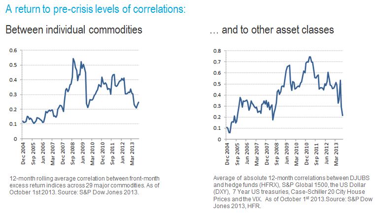
As suppliers have reduced production post-financial crisis and inventories have been reduced, finally the  supply shocks, are driving commodity returns again and cause them to be different from each other and from equities and fixed income. This is creating the most opportunity for spread plays and diversification since 2007.

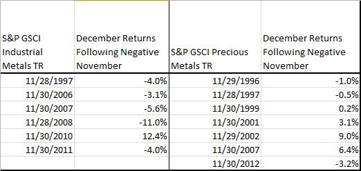
Bonus question: Will metals continue their downfall? The interesting thing about metals is the difference between the industrials and the precious metals.  Since 1995, there were 6 Novembers where industrial metals had negative returns and 5 out of those 6 times there was a negative December following.  This is not surprising given the sensitivity of industrial metals to the inventory situations.  Given the more difficult storage situations of some industrials like copper, it may be difficult for suppliers to meet the demand so the equilibrium is balanced by price, causing a persistent trend. [The possible reason for the persistence in realized roll yield may be, as discussed in Till and Eagleeye (2005), “if there are inadequate inventories for a commodity, only its price can respond to equilibrate supply and demand, given that in the short run, new supplies of physical commodities cannot be mined, grown, and/or drilled. When there is a supply/usage imbalance in a commodity market, its price trend may be persistent….“ ]

On the other hand, precious metals, which are well supplied and easy to store, have had 7 negative Novembers but only 3 of the following Decembers were down.

Source: S&P Dow Jones Indices. Data from Jan 1995 to Nov  2013. Past performance is not an indication of future results. This chart reflects hypothetical historical performance. Please see the Performance Disclosure at the end of this document for more information regarding the inherent limitations associated with backtested performance
Source: S&P Dow Jones Indices. Data from Jan 1995 to Nov 2013. Past performance is not an indication of future results. This chart reflects hypothetical historical performance. Please see the Performance Disclosure at the end of this document for more information regarding the inherent limitations associated with backtested performance

Different fundamentals that are more aligned with their “store of value” qualities like central bank buying and flight to safety, drive the precious metals. Since the precious metals are largely abundant, there is less trending from price as the calibrating factor to balance supply and demand.  Overall, it is not surprising that in all calendar months over the time span Jan 1995-Nov 2013, that industrial metals moved in the same direction as in the prior month 51% of the time, but precious metals only moved in the same direction as in the prior month 46% of the time.


The posts on this blog are opinions, not advice. Please read our Disclaimers.

Two Dimensions of Risk

Contributor Image
Craig Lazzara

Former Managing Director, Index Investment Strategy

S&P Dow Jones Indices

Investors have long regarded the market’s overall level of volatility as an indication of its riskiness.  The S&P 500 VIX Index, in particular, is often referred to as a “fear gauge” for U.S. equities since it tends to rise when investors are nervous and to fall when the markets are quiescent.

Although S&P 500 VIX has a strong claim to be primus inter pares in the volatility family, the family is large and growing.  Earlier this week we introduced a new volatility and dispersion dashboard designed to help investors analyze trends in VIX and to comment on their implications for market developments.  We were able to observe, e.g., that spot VIX was higher than the January VIX futures — an unusual alignment reflective of the market’s uncertainty about yesterday’s FOMC announcement.

Volatility gives us one way to measure risk, but vol itself is importantly influenced by a simpler but less well-known metric called dispersion.  Think of dispersion as the difference, over a given period of time, between the “best” and the “worst” performers in a market index.  If dispersion is low, the gap between “best” and “worst” shrinks.  When that happens, any strategy that deviates from cap-weighted indexing — from a disciplined factor index to the most aggressive fundamental stock picking — will have less opportunity to add value than it would have had in a period of high dispersion.  And when dispersion is low, other things equal, volatility will also tend to be low.

That’s the situation in which we find ourselves today.  Although VIX has risen in the last month, it’s still well below its typical levels.  Not surprisingly, stock market dispersion is also near its historical lows.  We’d expect that in such a low volatility, low dispersion environment, active alpha will be both scarce and small.

The posts on this blog are opinions, not advice. Please read our Disclaimers.

Facebook Selling Into the S&P 500

Contributor Image
David Blitzer

Former Managing Director and Chairman of the Index Committee

S&P Dow Jones Indices

Facebook (FB), the most-watched candidate for the S&P 500 all year, will join the index tomorrow night, December 20th , after the market closes. Once ETFs, index mutual funds and other index funds complete their buying – probably sometime next week – roughly 12% of FB’s shares will be held by indexers.  As many expected, the stock jumped up on our December 11th announcement that FB would join the index. Moreover, FB outperformed the S&P 500 from December 11th to yesterday (December 18th) by 9.5 percentage points.

Hedge fund and arbitrageurs sometimes trade index additions hoping to profit from the expected stock bounce.  Dating back to the tech boom of the 1990s, when index adds and drops first drew a lot of attention, the company joining the index often sells stock through a secondary offering to take advantage of the demand for shares created by the index addition. FB is following this pattern – it is offering 70 million shares of its class A common stock, about 3% of the current outstanding float. Included in the 70 million are about 41.4 million shares being sold by Mark Zuckerberg, FB’s founder.

The posts on this blog are opinions, not advice. Please read our Disclaimers.

Eighty-one years later...

Contributor Image
Tim Edwards

Managing Director, Index Investment Strategy

S&P Dow Jones Indices

Harbouring year-end reviews and final accounts, the last weeks of December are infused with nostalgia. In this seasonal spirit, I’d like to draw your attention to an under-celebrated piece of work, completed in the year that Katharine Hepburn, Cary Grant and Shirley Temple saw their debuts on the silver screen. In 1932, Fred had not yet met Ginger, ground had just been broken on the Golden Gate Bridge, and on New Year’s Eve, a joint meeting of the Econometric Society and the American Statistical Association considered the results of an inquiry that opened the debate between active and passive management.

The question “Can Stock Market Forecasters Forecast?” is a natural one to ask. The economist Alfred Cowles III was probably the first to investigate this question empirically. In July 1927, he began collecting information on the equity investments made by financial institutions of the time as well as on the recommendations made by various “oracles” in contemporary financial media, embarking on a multi-year project to record and evaluate their performance. It was a heroic effort: over 7,500 recommendations and transactions tracked and tabulated, against hundreds of stocks prices and dividends collected by hand over 4 ½ years.

Importantly, Cowles didn’t just measure absolute performance. He also compared the returns to what “the market averages” (in his case, the Dow Jones Industrial Average) would have achieved. Using fairly modern statistical techniques1 combined with meticulously hand-drawn charts, Cowles expertly diagnosed contemporary active management: poor on average; appearing skilful most probably through sheer luck.

Cowles

Source: Cowles ; “Can Stock Market Forecasters Forecast?” ; Econometrica, Volume 1 Issue 3 (1933)

Cowles presented his research on December 31st, rounding off a year in which he also established the Cowles Commission for Research in Economics, subsequently to become a veritable breeding ground for Nobel-prize winning ideas (Robert Shiller’s being the most recently recognised).

And his comparison of stock selection strategies to market averages and random portfolios is thoroughly modern.   With almost identical methods and conclusions2, the progeny of Cowles’ research continue to stimulate debate.

_______________________________________________

  1. Cowles’ ideas are considerably ahead of their time. His use of playing cards to simulate random portfolios is a more than a decade prior to Stanislaw Ulam’s & Von Neuman’s celebrated first use of the “Monte Carlo” method at Los Alamos in work relating to the development of the hydrogen bomb.
  2. Today a market-cap weighted benchmark is usually seen as the bogey, but it would be more than 30 years before William F. Sharpe explained why.

The posts on this blog are opinions, not advice. Please read our Disclaimers.

The year in balance

Contributor Image
David Blitzer

Former Managing Director and Chairman of the Index Committee

S&P Dow Jones Indices

The US stock market did very well in 2013, up 25% (before dividends) through December 16th, with better results than the overall economy and most other developed markets.  The one big exception is Japan where the market is up almost 47% in Yen terms, though within a percentage point of the S&P 500 when measured in US dollars.

Looking across the US market, growth and value, and all ten sectors, showed results broadly similar to one-another.  Unlike some past years, no single sector or style accounted for the lion’s share of the gain. 

Sector Rank Price ‘Return
Cons Discretionary 1 36.4%
Health Care 2 34.4%
Industrials 3 32.0%
Financials 4 29.1%
InfoTech 5 21.1%
Consumer Staples 6 20.0%
Energy 7 18.1%
Materials 8 16.8%
Utilities 9 7.1%
Telecomm 10 3.9%

Likewise, growth and value came in very close with growth up 25.9% and value up 24.5%.

Where did the balanced growth come from? Largely the Federal Reserve’s QE 1-2-3 policies which provided liquidity, kept interest rates low and boosted asset prices.  This is also the challenge for 2014: whether or not the Fed begins its tapering after tomorrow’s FOMC meeting, or waits until sometime in 2014, some of the underpinning of the market is going away in the new year.

The posts on this blog are opinions, not advice. Please read our Disclaimers.