Get Indexology® Blog updates via email.

In This List

Not ALL Weights are EQUAL: Why Brent isn't Heavier than WTI

3 Reasons Companies Issue Preferreds

Core / Satellite Investment Strategies: Don’t Forget The Beta!

Stocks and Houses

Stock Picker's Market?

Not ALL Weights are EQUAL: Why Brent isn't Heavier than WTI

Contributor Image
Jodie Gunzberg

Former Managing Director, Head of U.S. Equities

S&P Dow Jones Indices

2014 is just around the corner now and the new weights for both the DJ-UBS CI and S&P GSCI have been announced. While the index weightings follow the methodologies, there are questions around the weights of two particular commodities, Brent crude oil and WTI crude oil. The interest comes from the fact that they are the most heavily weighted commodities across the two indices and there has historically been a popular spread trade between the two, since theoretically they should trade similarly given their qualities.  However in the past few years, there has been a build-up of WTI from the recent surge in US production, causing the price differential to increase where Brent has been more expensive than WTI.

Source: S&P Dow Jones Indices. Data from Nov 2003 to Nov 7, 2013. Past performance is not an indication of future results. This chart reflects hypothetical historical performance. Please see the Performance Disclosure at the end of this document for more information regarding the inherent limitations associated with backtested performance

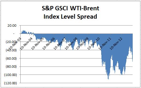
In 2013, the WTI- Brent spread narrowed from improving transportation and increased midstream infrastructure to enable crude to be transported to coastal refiners. Also, according to the EIA, refiners have been running at higher rates, driving up the demand for WTI.

EIA Refiner Capacity

The WTI-Brent spread has historically traded near par and reached near par at points earlier this year. However, given the structural change of significantly more oil being produced from the U.S. (with projections of continued future growth), many market participants expect Brent to be priced at a premium to WTI. For example, the EIA, noted in its monthly report titled “Short Term Energy Outlook” that it expects a spread of ~$6 per barrel in 2014. They also noted that the Brent-WTI price spread may be influenced by the balance between future growth in U.S. crude production and the capacity of crude oil infrastructure to move that crude to U.S. refiners.

So, the question is, why are the 2014 target weights in the DJ-UBS CI and S&P GSCI for WTI still heavier than for Brent?

Simply stated, the reason WTI is still heavier than Brent is because the data used to calculate the weights is based on historical five year averages. Both indices use world production and liquidity in the weighting calculations, though the factors are applied in a slightly different way for each index.

For example, in order to construct the weights of the commodities in the DJ-UBS, a ratio of 2:1 of liquidity: production is applied.  The liquidity is a based on annual volume data for the five years up to and including the year prior to the calculation period. For example, the target index weights in 2014, which are calculated in 2013, include years 2008-2012.

For each commodity, a relative liquidity is assigned by taking the ratio of the individual contract liquidity versus the total index liquidity. The production also uses a 5 year average of US dollar adjusted production based on the latest common date of production across all commodities. The 2014 index weights are calculated in 2013, so the data spans from 2006-2010.  The weighting process then adjusts the data into similar units as in the futures contracts (like barrels for oil). Finally the average settlement prices for the first day of every month are converted into US dollars and multiplied by production. The relative production, like relative liquidity is the result divided by the overall index production. Finally, limits are enforced so that no single commodity is over 15%, no derivative commodities (like Brent, WTI, Heating Oil and Unleaded Gasoline) are greater than 25% combined, and no group (Energy) is greater than 33%.

The S&P GSCI uses a similar methodology for data collection, though the application for weights is slightly different that results in dramatically different target index weights than for the DJ-UBS CI, especially since there are no weight limits for the S&P GSCI.  The S&P GSCI applies a relative world production weight to each component (a component may be more than one commodity: for example, petroleum includes Brent, WTI, Gasoil, Heating Oil and Unleaded Gasoline.) There are 18 components in the S&P GSCI that are constructed from 24 individual commodities. After the relative world production is calculated, a relative liquidity adjustment is applied that drives the weighting difference between commodities of the same component, like WTI and Brent.

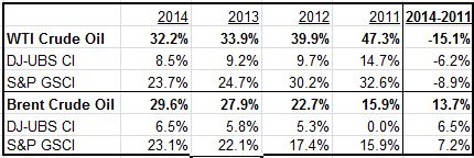
The resulting impact on the indices has been a weight that is shifting out of WTI and into Brent, though Brent has not taken over WTI yet. Please see the chart below for the historical weightings since Brent was added into the DJ-UBS CI.

Source: S&P Dow Jones Indices.

The next common question is what impact will this have on the market?

Fortunately or unfortunately, this question is not as predictable as the former question. By estimated assets tracking published for year end 2012, which were approximately $75 billion for the DJ-UBS CI family and approximately $80 billion for the S&P GSCI family, that implies (given all else constant) from the 2011 rebalance through the 2014 rebalance, a total of about $23.4 billion is removed from WTI and about $21.2 billion is placed into Brent, where roughly $2.6 billion is set to move during the 2014 rebalance. 

Finally, does this mean Brent will increase in price and WTI will drop?

If we look at the 2013 rebalance period (Jan 8-14, 2013 for the S&P GSCI, and Jan 9-15, 2013 for the DJ-UBS CI) for some guidance, we notice that approximately $9.3 billion flowed out of WTI and $8.1 billion into Brent based on estimated assets tracking the flagship indices, DJ-UBS CI and S&P GSCI. However, due to the expansion of the Seaway Pipeline in January 2013 to enable more WTI to flow from Cushing in Oklahoma to the Gulf Coast refiners, the S&P GSCI (WTI) Crude Oil increased 57 basis points over the rebalance period when assets tracking flowed out. At the same time the S&P GSCI Brent experienced a 1.39% loss despite the inflows.


The posts on this blog are opinions, not advice. Please read our Disclaimers.

3 Reasons Companies Issue Preferreds

Contributor Image
Aye Soe

Former Managing Director, Global Head of Core and Multi-Asset Product Management

S&P Dow Jones Indices

Companies may issue preferred stocks for a variety of reasons.  The three reasons below are the most common.

  1. Preferred stock issuances give companies a relatively cheap way to acquire additional capital.  The preferred market is dominated by banks and related financial institutions, which are required by regulators to have adequate Tier 1 capital to support their liabilities.  Tier 1 capital includes common equity, preferred equity and retained earnings.  (Note that as per the recently passed Dodd-Frank Act, cumulative preferred and trust preferred securities will eventually be phased out of their Tier 1 capital status.[1])  Since issuing preferred shares is normally cheaper than issuing common shares and avoids common ownership dilution, banks issue preferred shares to meet the required capital ratio set by regulators.
  2. Preferred shares can be used in balance sheet management.  Investors often prefer low debt-to-equity ratios, and issuing preferreds can better help to lower the debt-to-equity ratio than issuing debt.  A company in need of additional financing may also be required to issue preferred shares instead of debt to avoid a technical default, which could trigger an immediate call on previously issued bonds or an increase in interest rates on those bonds.  A technical default may occur when the debt-to-equity ratio breaches a limit set in a currently issued bond covenant.
  3. Preferreds give companies flexibility in making dividend payments.  If a company is running into cash issues, it can suspend preferred dividend payments without risk of default.  Depending on whether the preferred share class is cumulative or non-cumulative, a company may have to pay previously skipped dividend payments before restarting dividend payments in the future.

[1] Source: United States. Office of the Comptroller of the Currency, Treasury; and the Board of Governors of the Federal Reserve System. 2013.  “Regulatory Capital Rules: Regulatory Capital, Implementation of Basel III, Capital Adequacy, Transition Provisions, Prompt Corrective Action, Standardized Approach for Risk-weighted Assets, Market Discipline and Disclosure Requirements, Advanced Approaches Risk-Based Capital Rule, and Market Risk Capital Rule”.

Contributors:
Phillip Brzenk, CFA
Associate Director, Index Research & Design

Aye Soe, CFA
Director, Index Research & Design

For more on preferreds, read our recent paper, “Digging Deeper Into the U.S. Preferred Market.”

The posts on this blog are opinions, not advice. Please read our Disclaimers.

Core / Satellite Investment Strategies: Don’t Forget The Beta!

Contributor Image
Larry Whistler, CFA

President and Chief Investment Officer

Nottingham Advisors, Inc.

Traditional Core/Satellite investment strategies typically combine a diversified asset allocation framework with a smaller alpha-seeking segment of the portfolio.  With an increased emphasis being placed by many investment advisors on so-called “tactical” managers, as well as other “alpha-generating” trades, it’s not surprising, though somewhat disappointing, that simple beta often gets ignored.  In a year when the S&P 500 gains over 25%, the S&P 400 nearly 28% and the S&P 600 surges 33%, S&P’s SPIVA scorecard can be a useful reminder as to the perils of chasing expensive alpha with too much of a portfolio’s assets.

By maintaining a solid investment core of diversified low-cost index funds, investors can be more selective in terms of paying up for riskier alpha-oriented exposures without wholly sacrificing the market return.  Besides the cost-effectiveness of index-based beta exposure, a core and satellite strategy can help investors avoid costly market-timing mistakes.  Absent some change in investor condition, core holdings remain fully invested throughout market triumph and market turmoil.  On the other hand, tactical or alpha-oriented trades may be implemented or unwound as circumstances dictate.  The buy-and-hold element of the core strategy reduces the probability of getting whipsawed during periods of rising volatility when investor sentiment tends to dominate rational thought.

Consistent alpha is very hard to come by, can be quite expensive and often requires investors to take on exposures at exactly the time their brains are telling them to get out of the market.  Frequently, alpha trades demand investors remain steadfast through periods of high uncertainty or extreme market volatility in order to realize outperformance versus the broader market.  Unlike the beta trade, however, investors should feel free to convert the alpha to cash when the underlying investment thesis changes or the client’s risk tolerance becomes maxed-out.

The main driver of portfolio return in Core / Satellite investment strategies tends to be the beta allocation.  It’s also typically the cheapest when index-based ETF’s or mutual funds are employed.  Academic studies and other market data continually point out the high cost and inconsistency of returns over time from alpha-oriented tactical strategies.  Used correctly, and this typically involves a high degree of due diligence, the satellite trades can either reduce volatility or enhance portfolio return.  If the core is misaligned, however, it may all be for naught.

To hear more on this topic, register for the upcoming S&P Dow Jones Indices webinar on Thursday November 14th.

 
S&P Dow Jones Indices is an independent third party provider of investable indices.  We do not sponsor, endorse, sell or promote any investment fund or other vehicle that is offered by third parties. The views and opinions of any third party contributor are his/her own and may not necessarily represent the views or opinions of S&P Dow Jones Indices or any of its affiliates.

The posts on this blog are opinions, not advice. Please read our Disclaimers.

Stocks and Houses

Contributor Image
David Blitzer

Former Managing Director and Chairman of the Index Committee

S&P Dow Jones Indices

When tech stocks collapsed in 2000 and the market fell 50%, investors put their faith in houses:  maybe too much faith.  Then house prices collapsed from mid-2006 as mortgage excesses took down the economy. Stocks fell 50% again.  The subsequent recovery in the economy, houses and stocks disappointed at least two of the three: the economy is lackluster and housing is coming back but remains about 20% below the peaks set seven years ago.  Stocks have done better, reaching new highs as the S&P 500 recovered some 140% from the bottom.  But even stocks are a scant 12% to 13% above their 2007 highs in six years or an annual return of two percent.   Are houses a better bet because they suffered only one collapse since the turn of the century or are stocks preferred because the rebound is more dramatic?  And what happened to diversification by spreading one’s wealth across houses and stocks?

The chart gives a quick comparison, but some numbers might help.  All the data on the chart are monthly which means that some of the peaks and troughs of the market may be obscured compared to daily data.  The housing series are monthly.  As the picture suggests, stocks are more volatile.   Both the S&P 500 and the Dow have standard deviations of monthly returns of about 15% annualized.  The figures for the house price series (the S&P/Case-Shiller 10-City and 20-City Composites) are 3.3% and 4.0%.  Stock investors would probably worry more often since stock prices will move farther and faster than house prices.  Another aspect of the risk comparison is the depth of the collapse or draw down. Stocks dropped about 50% in both the tech bust and the housing bust; houses fell a comparatively modest 35%.   The surprise in the numbers may be diversification and correlation.  While the financial crisis sent everything but treasury bills into a free fall, the correlation between the S&P 500 and the S&P/Case-Shiller 10-City Composite is about 3.5%.  Indeed another look at the chart shows that peaks and troughs of houses and stocks do not line up.   The numbers don’t, and can’t, answer the question of which is the better choice between houses and stocks; it depends on the investor, his or her situation and taste for houses, stocks or risk.

stock-house

The posts on this blog are opinions, not advice. Please read our Disclaimers.

Stock Picker's Market?

Contributor Image
Craig Lazzara

Former Managing Director, Index Investment Strategy

S&P Dow Jones Indices

This morning’s Wall Street Journal cites an adviser who opines that “the current stock market environment favors…active fund managers, who pick individual stocks in an attempt to beat broad market indices.”  This immediately raises the question of how to define a stock picker’s market, and how to determine whether today’s conditions are more auspicious for stock picking than they were, say, a year ago?

We recently introduced a metric called dispersion, one application of which is to answer precisely this sort of question.  Dispersion is a cross-sectional measure — that is, it tells us at any point in time whether the constituents of a particular index are behaving largely alike or largely differently.  Times of high dispersion represent great opportunities for stock pickers; low dispersion, not so much.  We plot dispersion for the S&P 500 Index here:

Source: S&P Dow Jones Indices. Max S&P 500 = 1630.74. Data from Dec. 1996 to Sept. 2013. Graphs are provided for illustrative purposes.

As the graph shows, the S&P 500’s dispersion is very near the low end of its historical range — in other words, the variation in performance among the 500 members of the index is much lower than it has typically been.  If variation in performance is low, it means that the benefit of picking the “best” stocks versus the “worst” stocks is correspondingly low.

None of this means that stock selection is more or less difficult than it usually is.  What it does mean is that the rewards to successful stock picking are likely to be small by historical standards.  We are by no means in a stock picker’s market.

The posts on this blog are opinions, not advice. Please read our Disclaimers.