Get Indexology® Blog updates via email.

In This List

Core / Satellite Investment Strategies: Don’t Forget The Beta!

Stocks and Houses

Stock Picker's Market?

No Tricks, Just Treats From The Fed This Halloween

Where's my free lunch?

Core / Satellite Investment Strategies: Don’t Forget The Beta!

Contributor Image
Larry Whistler, CFA

President and Chief Investment Officer

Nottingham Advisors, Inc.

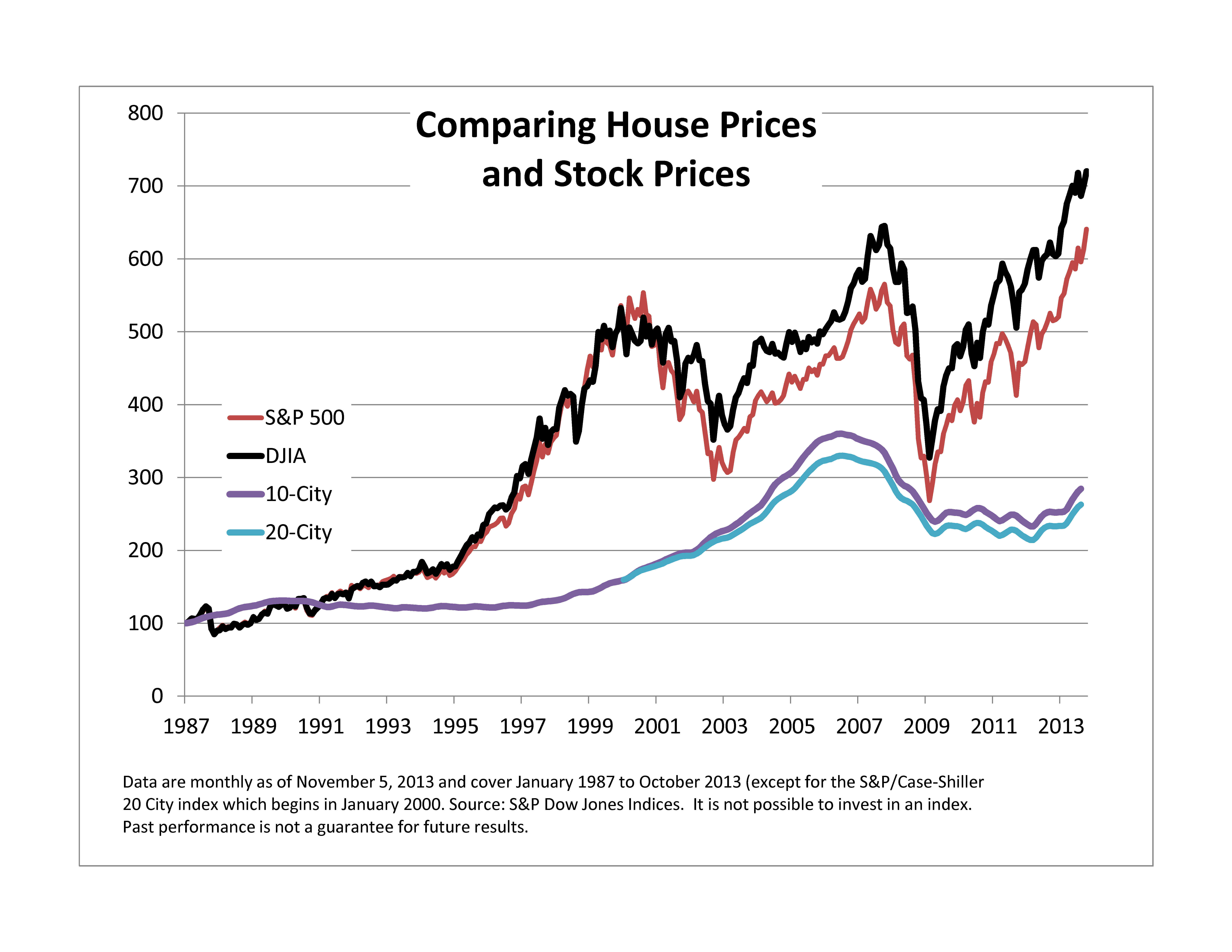
Traditional Core/Satellite investment strategies typically combine a diversified asset allocation framework with a smaller alpha-seeking segment of the portfolio.  With an increased emphasis being placed by many investment advisors on so-called “tactical” managers, as well as other “alpha-generating” trades, it’s not surprising, though somewhat disappointing, that simple beta often gets ignored.  In a year when the S&P 500 gains over 25%, the S&P 400 nearly 28% and the S&P 600 surges 33%, S&P’s SPIVA scorecard can be a useful reminder as to the perils of chasing expensive alpha with too much of a portfolio’s assets.

By maintaining a solid investment core of diversified low-cost index funds, investors can be more selective in terms of paying up for riskier alpha-oriented exposures without wholly sacrificing the market return.  Besides the cost-effectiveness of index-based beta exposure, a core and satellite strategy can help investors avoid costly market-timing mistakes.  Absent some change in investor condition, core holdings remain fully invested throughout market triumph and market turmoil.  On the other hand, tactical or alpha-oriented trades may be implemented or unwound as circumstances dictate.  The buy-and-hold element of the core strategy reduces the probability of getting whipsawed during periods of rising volatility when investor sentiment tends to dominate rational thought.

Consistent alpha is very hard to come by, can be quite expensive and often requires investors to take on exposures at exactly the time their brains are telling them to get out of the market.  Frequently, alpha trades demand investors remain steadfast through periods of high uncertainty or extreme market volatility in order to realize outperformance versus the broader market.  Unlike the beta trade, however, investors should feel free to convert the alpha to cash when the underlying investment thesis changes or the client’s risk tolerance becomes maxed-out.

The main driver of portfolio return in Core / Satellite investment strategies tends to be the beta allocation.  It’s also typically the cheapest when index-based ETF’s or mutual funds are employed.  Academic studies and other market data continually point out the high cost and inconsistency of returns over time from alpha-oriented tactical strategies.  Used correctly, and this typically involves a high degree of due diligence, the satellite trades can either reduce volatility or enhance portfolio return.  If the core is misaligned, however, it may all be for naught.

To hear more on this topic, register for the upcoming S&P Dow Jones Indices webinar on Thursday November 14th.

 
S&P Dow Jones Indices is an independent third party provider of investable indices.  We do not sponsor, endorse, sell or promote any investment fund or other vehicle that is offered by third parties. The views and opinions of any third party contributor are his/her own and may not necessarily represent the views or opinions of S&P Dow Jones Indices or any of its affiliates.

The posts on this blog are opinions, not advice. Please read our Disclaimers.

Stocks and Houses

Contributor Image
David Blitzer

Former Managing Director and Chairman of the Index Committee

S&P Dow Jones Indices

When tech stocks collapsed in 2000 and the market fell 50%, investors put their faith in houses:  maybe too much faith.  Then house prices collapsed from mid-2006 as mortgage excesses took down the economy. Stocks fell 50% again.  The subsequent recovery in the economy, houses and stocks disappointed at least two of the three: the economy is lackluster and housing is coming back but remains about 20% below the peaks set seven years ago.  Stocks have done better, reaching new highs as the S&P 500 recovered some 140% from the bottom.  But even stocks are a scant 12% to 13% above their 2007 highs in six years or an annual return of two percent.   Are houses a better bet because they suffered only one collapse since the turn of the century or are stocks preferred because the rebound is more dramatic?  And what happened to diversification by spreading one’s wealth across houses and stocks?

The chart gives a quick comparison, but some numbers might help.  All the data on the chart are monthly which means that some of the peaks and troughs of the market may be obscured compared to daily data.  The housing series are monthly.  As the picture suggests, stocks are more volatile.   Both the S&P 500 and the Dow have standard deviations of monthly returns of about 15% annualized.  The figures for the house price series (the S&P/Case-Shiller 10-City and 20-City Composites) are 3.3% and 4.0%.  Stock investors would probably worry more often since stock prices will move farther and faster than house prices.  Another aspect of the risk comparison is the depth of the collapse or draw down. Stocks dropped about 50% in both the tech bust and the housing bust; houses fell a comparatively modest 35%.   The surprise in the numbers may be diversification and correlation.  While the financial crisis sent everything but treasury bills into a free fall, the correlation between the S&P 500 and the S&P/Case-Shiller 10-City Composite is about 3.5%.  Indeed another look at the chart shows that peaks and troughs of houses and stocks do not line up.   The numbers don’t, and can’t, answer the question of which is the better choice between houses and stocks; it depends on the investor, his or her situation and taste for houses, stocks or risk.

stock-house

The posts on this blog are opinions, not advice. Please read our Disclaimers.

Stock Picker's Market?

Contributor Image
Craig Lazzara

Former Managing Director, Index Investment Strategy

S&P Dow Jones Indices

This morning’s Wall Street Journal cites an adviser who opines that “the current stock market environment favors…active fund managers, who pick individual stocks in an attempt to beat broad market indices.”  This immediately raises the question of how to define a stock picker’s market, and how to determine whether today’s conditions are more auspicious for stock picking than they were, say, a year ago?

We recently introduced a metric called dispersion, one application of which is to answer precisely this sort of question.  Dispersion is a cross-sectional measure — that is, it tells us at any point in time whether the constituents of a particular index are behaving largely alike or largely differently.  Times of high dispersion represent great opportunities for stock pickers; low dispersion, not so much.  We plot dispersion for the S&P 500 Index here:

Source: S&P Dow Jones Indices. Max S&P 500 = 1630.74. Data from Dec. 1996 to Sept. 2013. Graphs are provided for illustrative purposes.

As the graph shows, the S&P 500’s dispersion is very near the low end of its historical range — in other words, the variation in performance among the 500 members of the index is much lower than it has typically been.  If variation in performance is low, it means that the benefit of picking the “best” stocks versus the “worst” stocks is correspondingly low.

None of this means that stock selection is more or less difficult than it usually is.  What it does mean is that the rewards to successful stock picking are likely to be small by historical standards.  We are by no means in a stock picker’s market.

The posts on this blog are opinions, not advice. Please read our Disclaimers.

No Tricks, Just Treats From The Fed This Halloween

Contributor Image
Kevin Horan

Former Director, Fixed Income Indices

S&P Dow Jones Indices

It recently struck me that the announcement day for the Federal Reserve’s policy meeting would coincide with what is known locally as “Mischief Night”. Mischief Night is the night before Halloween when kids play trick on neighbors by hanging toilet paper in the trees or soaping car windows. If anyone was positioned to play a dirty trick it was the Fed, whose announcement, if it wasn’t a consistent message, could have put a scare into the markets greater than any Halloween costume.

True to form the Fed stuck to its message and reaffirmed that its stimulus purchases of Treasuries and mortgage-backed securities would continue. It was a smart move, as investors have been concerned with the party politics that lead to the U.S. debt ceiling impasse, and how the issue has been kicked further down the road into 2014. The speed of the economic recovery has not yet reached a pace which would give investors much confidence that the possibility of a backwards slide has passed. The yield-to-worst (YTW) on the S&P/BGCantor Current 10 Year U.S. Treasury Index is 8 basis points tighter on the month at 2.53%. This yield was as low as 1.63% at the beginning of May, increasing to a high of 2.99% before the FOMC’s September meeting when the markets thought the Fed might begin tapering its asset purchases. The steady Fed message of continued stimulus has helped to settle rates back down.

In mid-November, newly nominated Chairwoman Janet Yellen will appear before the Banking Committee for her confirmation hearing, which could add some insight into how she plans to manage the stimulus program. For now, the markets are looking past the December Fed policy meeting for any changes, and have pushed their expectations to March or beyond for the start of any possible tapering.

One point of note is in the U.S. TIPS market. Month-to-date the S&P U.S. TIPS Index is up 1.11%, as the U.S. Treasury auctioned off $7 billion of 30-year notes last week. The auction was 2.76 times bid with an increase to 19.1% in the number of direct bidders which includes domestic money managers. Though inflation remains low, the thinking is that the longer the Fed continues its stimulus, the greater the chances are that inflation will eventually begin to rise.

Away from the Treasury market, municipal bonds look to be cheap as a result of  news about Puerto Rico and arbitration results for States that have issued tobacco settlement bonds. The S&P National AMT-Free Municipal Bond Index, with a duration of 5.3 years, is yielding 2.93% (YTW). In comparison with the S&P U.S. Issued Investment Grade Corporate Bond Index, it is yielding 2.97% (YTW), but with a longer modified duration of 6.38 years and more assumed credit risk. Both the S&P Municipal Bond Puerto Rico Index and the S&P Municipal Bond Tobacco Index have returns that are positive for the month. The indices are returning 1.67% and 0.45% respectively, though the year-to-date returns are still deeply in the red at -15.03% and -7.61%.


Source: S&P Dow Jones Indices as of Oct. 31, 2013. Past performance is not a guarantee of future results.


The posts on this blog are opinions, not advice. Please read our Disclaimers.

Where's my free lunch?

Contributor Image
Tim Edwards

Managing Director, Index Investment Strategy

S&P Dow Jones Indices

Ever since Harry Markowitz published his June 1953 paper on portfolio selection, investors both institutional and retail have subscribed to the theory that diversification – and its use in combination with mean-variance optimized allocations – universally widens and almost always improves the possibilities of risk and return.

At its core, the theory states that an investor should consider including assets with a) positive return expectations and b) low correlations to existing investments.  Faithfull acolytes of Markowitz as many of us have now become, the years subsequent to the financial crisis have challenged if not the theory, then at least the practice of expecting diversification to provide a “free lunch”: macro-economics dominated performance as condition b) above remained persistently obstinate in its absence.

Average strength of multi-asset correlations, based on 12-months returns*.

Multi-asset Corr

Sources: S&P Dow Jones, Barclays, JP Morgan, HFRI. Charts and graphs are provided for illustrative purposes. Past performance is no guarantee of future results.

And in due course, the great minds of investment and allocation have bent their efforts into ever-more esoteric assets.

But it’s not just about correlation, which measures the strength of linear relationships. It’s also about differing market betas, and about conditional relationships between financial assets. It’s about how disperse the returns are, this month and next. In an environment of high dispersion, not only does it matter more which allocations you make, it also – at least in theory – implies a greater benefit from diversification. If you’re wondering whether it’s worth expanding your investment footprint beyond a core set of exposures, or even how much difference your decisions really make, that’s a particularly useful concept to keep in mind.

We recently offered some thoughts to define, examine and to some extent publicize dispersion. Not only because we think it’s an under-celebrated and remarkably useful measure of market opportunity, but also because it has much to say about the current diversification of existing portfolios (like the S&P 500®) and – in tandem – can provide a useful guide to the factors that are most important in understanding Index returns.

* Average of absolute values of 12-month correlations between the S&P GSCI Commodities, S&P 500®, S&P Europe 350®, S&P Emerging Market BMI, JP Morgan Core EMBI, Barclays Aggregate U.S. Corporate High Yield, S&P 7-10 year U.S. Treasuries and HFR Global Investable Indices. Note that negative correlations are counted as positive – it is the strength not the sign of the relationship that we wish to emphasize.

The posts on this blog are opinions, not advice. Please read our Disclaimers.