Get Indexology® Blog updates via email.

In This List

Less [Information] May be More…

Commodities Fall at the Start of Autumn

Jekyll & Hyde: The U.S. Preferred Stock Market

Real Data on Healthcare

US Energy Revolution’s Impact on Trade Flows

Less [Information] May be More…

Contributor Image
David Blitzer

Former Managing Director and Chairman of the Index Committee

S&P Dow Jones Indices

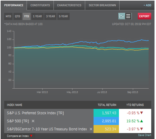
For most investors and many economists the first Friday of the month means the Employment Report at 8:30 AM eastern time.   The much-watched first official bit of economic data for the month just ended sets the tone for the markets and for the weekend investment advice columns.   This weekend the economic-investing blogosphere had little to debate beyond what to watch instead of the unemployment rate.  Those hoping that all will be revealed in the next Employment Report once the government is back to work could be disappointed.  On the usual schedule the Bureau of Labor Statistics would be doing their survey this coming week.  If the government is still shut down next weekend, we might have to wait even longer to argue over the accuracy of the unemployment rate.

Don’t despair.  Investors may be better off with fewer economic statistics and a little less debate.   Some years ago an academic paper title “Trading is Hazardous to Your Wealth” showed that for many individual investors, the more often they traded, the worst their results were.  Portfolio turnover averaged 75% for the investors studied and their returns lagged the market by a substantial margin.  The authors of the study suggest that investor over-confidence drove the excessive trading. (The paper can be found here.)

Other research that shows index investing outperforms some 60%-70% of active fund managers is based on buy-and-hold investing.  In the analyses the index fund is assumed to be held for one, three or five years with index level minimal turnover while the active fund manager trades, often surpassing the 75% turnover noted in the Trading is Hazardous study.  All that churning drives up costs. If the trading is successful, the churning also drives up tax liabilities.  Those costs are a key factor in the studies results.  (Index vs. active research is here.)

Most of us would like to see the government get back to work – after all we’re still paying our taxes so they should be doing something for our money – and most would not want to go without ever seeing another economic statistic or unemployment rate report.   But for the moment maybe we can enjoy worrying about something else this weekend.

The posts on this blog are opinions, not advice. Please read our Disclaimers.

Commodities Fall at the Start of Autumn

Contributor Image
Jodie Gunzberg

Former Managing Director, Head of U.S. Equities

S&P Dow Jones Indices

Hear the impact of the Syrian tension on oil and why the effect on copper might be different than in historical wars.

The S&P GSCI® and Dow Jones UBS Commodity Index both fell in September, returning -3.4% and -2.6%, respectively.

Some highlights from the S&P GSCI® include:

  • Energy: Despite losing 4.5% on the month, S&P GSCI Energy is up 3.8% for the year.
  • Precious Metals: The S&P GSCI Precious Metals was the weakest sector in September, returning -5.3%.
  • Agriculture: Grains were down 2.9% in September mainly due to corn’s 8.4% loss.

Read on for more S&P GSCI trends.

Explore our S&P GSCI offerings:

www.spdji.com/index-family/commodities/all

Some highlights from the DJ-UBS Commodity Index include:

  • Industrial Metals: Industrial metals were up 1.6% for the month, with copper carrying the sector.
  • Energy: Among subindices in the energy sector, unleaded gasoline declined the furthest, down 7.9%.
  • Softs: With the exception of coffee, down 2.2%, all the commodities in the softs sector were positive in September.

Read on for more DJ-UBS Commodity Index trends.

Explore the DJ-UBS Commodity Index offerings: 
www.djindexes.com/commodity/

The posts on this blog are opinions, not advice. Please read our Disclaimers.

Jekyll & Hyde: The U.S. Preferred Stock Market

Contributor Image
J.R. Rieger

Former Head of Fixed Income Indices

S&P Dow Jones Indices

Preferred stocks have a split personality, part equity and part bond. The bond characteristics of preferred stock has, at least for the time being, become the ‘Mr. Hyde’ of the asset class.  The high dividends that preferred stock owners enjoy can be compared to future interest payments of bonds. Like bonds, the prospect of the Fed tapering and causing rising interest rates has helped bring the 2013 YTD returns for the S&P U.S. Preferred Stock Index to -1%.  Meanwhile, the S&P 500 has seen over 19.6% total return.

Source: S&P Dow Jones Indices LLC and/or its affiliates. Data as of October 3, 2013. Charts and graphs are provided for illustrative purposes. Past performance is no guarantee of future results.

The dividend cash flow ends up being an important characteristic of the preferred asset class. With a yield over 7%, the S&P U.S. Preferred Stock Index reflects a yield of over 120bps higher than U.S. high yield bonds as tracked by the S&P U.S. Issued High Yield Corporate Bond Index.

Asset Class Yields September 30, 2013


Over the long haul, those higher dividends have helped create a total return advantage over the S&P 500.  A five year look back tells the story as the S&P U.S. Preferred Stock Index has returned over 16%, while the S&P 500 returned over 11%.

Source: S&P Dow Jones Indices LLC and/or its affiliates. Data as of October 3, 2013. Charts and graphs are provided for illustrative purposes. Past performance is no guarantee of future results.

Which future will it be for U.S. Preferred Stock, Dr. Jekyll or Mr. Hyde?


The posts on this blog are opinions, not advice. Please read our Disclaimers.

Real Data on Healthcare

Contributor Image
David Blitzer

Former Managing Director and Chairman of the Index Committee

S&P Dow Jones Indices

One of the biggest things missing from the never ending healthcare debate is hard data.  “Man-on-the-street” interviews reveal that some people don’t realize that Obamacare, the Patient Protection and Affordable Care Act and the ACA are all one and the same.  The absence of factual data is most crucial when examining the cost of healthcare.  One reason is that healthcare is a huge industry spread across the country and accounting for between a fifth and a sixth of GDP.  A second issue is that detailed data dealing with individual is protected by law and unavailable.

The new S&P Healthcare Claims Indices launched today are a big step toward relieving the lack of data.  These indices cover costs and utilization of inpatient and outpatient healthcare services and prescription drugs.  They are based on actual health insurance claims with data provided by over 30 large national insurance plans. These indices will provide hard numbers to answer questions about how the cost of healthcare is rising or falling across the U.S. and for selected regions, states and cities. More information and the press release can be found here.

Branded prescription drugs are usually sold by only one company which developed the drug and owns a patent on the drug giving it a monopoly position in the market for that drug. Generic drugs are often sold by a number of companies, the patent may have expired and the market is more competitive.  Since the S&P Healthcare Claims Indices collect data on both kinds of drugs separately, we can track the difference.  The chart shows the unit costs for branded and generic. Generic unit costs vary widely, occasionally falling and never rising faster than 5% annually.  Branded drug costs rise at 10% or more annual and appear to be accelerating.

healthcare drugs(3)

Many people see hospitals with their increasingly complex technology and large staffs as the big factor in rising healthcare expenditures.  Inpatient hospitalization costs are rising, but costs for outpatient care are actually rising faster, as seen in the second chart.  One cause may be efforts to move tests, examinations and routine surgery to outpatient centers from hospitals.  Whatever the underlying cause is, concentrating only on hospitals won’t control some rapidly rising health care costs.

healthcare drugs(2)

The posts on this blog are opinions, not advice. Please read our Disclaimers.

US Energy Revolution’s Impact on Trade Flows

Contributor Image
Bluford Putnam

Managing Director and Chief Economist

CME Group

The substantial increase in the supply of energy from the United States is dramatically affecting US trade flows.  US crude oil production has increased about 29% and natural gas production has grown 33% since 2005.  To analyze the impact on trade flows, we must first examine what has happened to US energy consumption.

Energy consumption trends have been quite interesting.  US oil consumption has actually been declining during the last five or six years just as oil production has increased.   The opposite pattern has occurred with natural gas, with consumption rising more or less in tandem with increased production.  The reasons have to do with relative prices and environmental issues.  Compared to crude oil, natural gas is now much cheaper in terms of a BTU of energy.  Natural gas is also a cleaner burning fuel than coal.  Because of the relative price difference in favor of natural gas, there has been a tendency to consume the additional natural gas domestically, at the expense of crude oil where possible.  In the electrical power generation industry, cleaner burning natural gas has been aggressively substituted for coal.

blu

As might be expected, the primary initial impact of rising US energy production has been on crude oil trade flows.  With simultaneous downward pattern in US crude oil consumption along with increased production, the decline in US Crude oil imports has been quite dramatic.  Also, due to geographic and transport cost efficiencies, we are seeing US crude oil imports rise from their low base levels prior to 2005.  Combining the three trends of higher domestic oil production, lower consumption, and more exports, the net crude oil import bill has shrunk dramatically.  Indeed, China is now a larger net importer of crude oil than the US.

blu2

Interestingly, the increased natural gas production has had its impact on trade flows through coal.  That is, the additional natural gas production has largely been consumed domestically, partly at the expense of coal consumption for electrical power generation, so exports of coal also have increased rather sharply.  Indeed, coal exports were up over 100% in 2012 compared to 2007.

All of these trends in US energy production and consumption have brought the US a little bit closer to energy independence, although energy independence is still not close at hand.   Since it will be much more efficient to continue to import certain energy supplies, what is at stake is the US energy import/export gap, which certainly has narrowed considerably.   Moreover, for geo-politics, it is the crude oil import-export balance that matters most.  In terms of oil, the US is nowhere near the point where exports would equal imports.  Domestic production would have to nearly double to achieve net import/export neutrality for crude oil, and that assumes continued declines in domestic oil consumption.

All examples in this report are hypothetical interpretations of situations and are used for explanation purposes only.  The views in this report reflect solely those of the authors and not necessarily those of CME Group or its affiliated institutions.  This report and the information herein should not be considered investment advice or the results of actual market experience.

S&P Dow Jones Indices is an independent third party provider of investable indices.  We do not sponsor, endorse, sell or promote any investment fund or other vehicle that is offered by third parties. The views and opinions of any third party contributor are his/her own and may not necessarily represent the views or opinions of S&P Dow Jones Indices or any of its affiliates.

The posts on this blog are opinions, not advice. Please read our Disclaimers.