Get Indexology® Blog updates via email.

In This List

Some Bite-Sized Highlights from our Sectors Webinar

The Growth of Emerging ASEAN

Growth in Use of S&P 500 Options at Cboe Over 35 Years

Yield Curve Anxiety

The Impact of Human Capital on Retirement Savings

Some Bite-Sized Highlights from our Sectors Webinar

Contributor Image
Hamish Preston

Head of U.S. Equities

S&P Dow Jones Indices

We recently hosted a webinar examining the potential value in a sector-based approach to portfolio construction, their application in navigating different market environments, and some key considerations for those adopting sector-based strategies.  You can view a replay of the event here; a few highlights might whet the appetite…

The Global Importance of U.S Equity Sectors

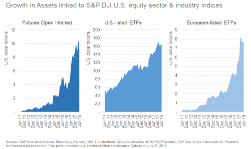
In recent years, products such as futures and ETFs linked to U.S. sectors and industries have become increasingly popular.  The sheer size of the U.S. equity market means that investors hoping to gain exposure to certain market segments – either to offset the inherent sectoral biases present in their local market, or as part of a tactical allocation – will necessarily require exposure to the U.S.  For example, the U.S. accounted for the majority of market capitalization in 31 of 68 S&P Global BMI industries at the end of 2017.

Exhibit 1: Growth in popularity of S&P 500® sectors

The Outperformance Potential From Sectors

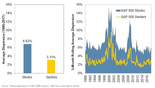
For investors adopting a sector rotation strategy, the potential benefit of favouring one sector over another is dependent on the differences in the returns to various sectors; the greater the difference, the greater the value of insight.  This is where dispersion is useful – it provides a gauge of the expected difference in returns across sectors.  Historically, the average monthly dispersion among S&P 500 sectors has been 3.11%, which compares to 6.82% for S&P 500 stocks.  It might therefore be said that roughly half of the value of stock picking could have been accessed through successful sector-selection.

Exhibit 2: S&P 500 Stock Dispersion vs Sector Dispersion

Rotate Don’t Retreat!   

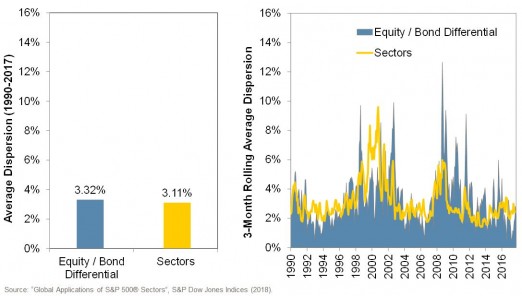
Trade tensions, a flattening yield curve, and political uncertainty in several markets have induced some market participants to cut positions, waiting for the risks to “blow over”.  But leaving the equity market altogether can mean missing out on returns.  A potential alternative is to use sector rotation strategies to manage risk.  While remaining fully invested in equities, changing the sectoral mix of an equity portfolio can have an impact on performance that is comparable to swapping out equities for Treasury bonds.  

Exhibit 3: Sector changes within an existing equity allocation can be comparable to switching between equities and bonds.

Consider the Macroeconomic Environment

Companies with shared sensitivities to particular economic factors are often found in the same sector.  For example, the Financials sector tends to outperform in periods of rising inflation, while the Utilities sector tends to falter.  Macro-economic considerations may help to inform which market segments might benefit from identified trends, or diversify risks within a pre-existing portfolio.

Exhibit 4: Sectors and Macroeconomic Factors

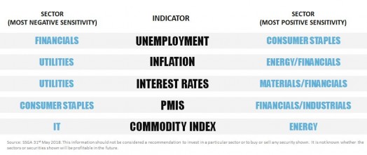
This last chart was provided by Rebecca Chesworth from SSGA, who joined our webinar along with Sam Stovall from CFRA.  The full replay of the event – and a discussion of all of these charts (and others) – may be found at this link.

The posts on this blog are opinions, not advice. Please read our Disclaimers.

The Growth of Emerging ASEAN

Contributor Image
Utkarsh Agrawal

Associate Director, Global Research & Design

S&P Dow Jones Indices

The Association of Southeast Asian Nations (ASEAN) region is well known for its growth potential among market participants who seek to diversify their exposure within emerging markets. ASEAN originally consisted of Indonesia, Malaysia, Philippines, Singapore, and Thailand. It then expanded to include Brunei, Cambodia, Laos, Myanmar, and Vietnam. Within ASEAN, the World Bank classifies Singapore and Brunei in the high-income category, while the others fall under the middle-income group. For emerging markets exposure, middle-income markets with relatively higher growth and a sizable GDP generally have an attractive diversification benefit. Within the middle-income ASEAN markets, the GDPs of Indonesia, Malaysia, Philippines, Thailand, and Vietnam were well over USD 100 billion in 2009 and have been growing steadily (see Exhibit 1). Let’s take a closer look at the characteristics of these five markets.

The global competitiveness index (which determines the level of productivity, the state of public institutions, and the technical conditions) of these five markets has either remained stable or improved since 2008-2009 (see Exhibit 2). An improvement in rank points to a favorable business and political environment in relation to other markets.

The market capitalization of the listed domestic companies as a percentage of GDP has been growing steadily and was more than 50% for all the markets in 2017 (see Exhibit 3). The growth of the stock markets kept pace with the growth in the GDPs of these markets, indicating a balanced development of the public market in relation to the overall capital market.

Brazil, Russia, India, China, and South Africa (BRICS) make up another standard group of emerging markets that may provide diversification benefits. The emerging ASEAN markets had no more than 70% correlation with individual BRICS markets (see Exhibit 4), demonstrating the possible diversification benefit from treating it as a separate asset class.

Based on these observations, it’s no surprise that market participants looking for growth potential and diversification have shown increased interest in emerging ASEAN markets.

The posts on this blog are opinions, not advice. Please read our Disclaimers.

Growth in Use of S&P 500 Options at Cboe Over 35 Years

Contributor Image
Matt Moran

Head of Index Insights

Cboe Global Markets

Thirty-five years ago, on July 1, 1983, Cboe® launched SEC-regulated S&P 500® (SPX) index options with posted volume of 350 contracts. Since 1983 there has been tremendous growth in SPX options volume, as many individual and institutional investors now use the contracts for purposes such as portfolio management, hedging, and income generation.

Below are five charts that related to the growth in use of and interest in S&P 500 options.

CHART #1 – GROWTH IN AVERAGE DAILY VOLUME SINCE 1983
Average daily volume for the SPX options grew from 111 contracts in its launch year of 1983 to 1.44 million contracts in the first half of 2018, as more fund managers now use SPX options for portfolio management.

CHART #2 – CAPACITY AND GROWTH IN NOTIONAL VALUE OF DAILY VOLUME
When institutional investors are considering risk management tools, a key issue often raised concerns market capacity – does the market have the capacity to handle large-sized trades? One metric that can be helpful in answering this question is the notional value of average daily volume. As shown in chart #2 below, estimates for the notional value of daily volume for Cboe’s S&P 500 options have grown from $12 billion in 2002 to $390 billion in the first half of 2018. A number of developments facilitated the growth in chart #2, including the introduction of Cboe’s BXM, BXMD, and PUT benchmark indexes, papers by Ibbotson Associates, Wilshire, Callan, Blackrock, and Keith Black and Professor Ed Szado, and the launches of SPXW weekly options with expirations on Mondays, Wednesdays and Fridays.

CHART #3 – TEN BIGGEST DAYS FOR S&P 500 OPTIONS VOLUME
Chart #6 shows the ten dates with the biggest volume for the S&P 500 options. Five of the dates occurred in the first half of 2018. On many of the dates, there was anxiety or volatility in worldwide financial markets, and portfolio managers worked to adjust their equity exposures.

 CHART #4 – GROWTH IN ASSETS FOR ’40 ACT FUNDS THAT USE OPTIONS
A 2018 study by Keith Black and Professor Ed Szado found that the number of ’40 Act funds (including mutual funds, closed-end funds and ETFs) that focused on use of options grew from ten funds in 2000 to 157 funds in 2017. Key findings of the study include:

  • Less volatility for options-based funds: As a group, the options-based funds had less volatility and less severe drawdowns than the stock and commodity indexes studied.
  • Better risk-adjusted returns: Cboe’s BXM, PUT and BXMD Indexes all had higher risk-adjusted returns (as measured by the Sharpe Ratio and Sortino Ratio) than the S&P 500 and S&P GSCI Indexes.

CHART #5 – GROWTH IN BXMD BENCHMARK INDEX THAT WRITES SPX OPTIONS
Since 2002 Cboe has been a pioneer and leader on the topic of benchmark indexes for options-related strategies, and Cboe offers ten benchmark indexes that now have more than 32 years of price data history. Four of those Cboe indexes – the Cboe S&P 500 30-Delta BuyWrite Index (BXMD), Cboe S&P 500 BuyWrite Index (BXM), Cboe S&P 500 PutWrite Index (PUT) and the Cboe S&P 500 5% Put Protection Index (PPUT) – all  had lower volatility than the S&P 500 and S&P GSCI Indexes over the past 32 years.

The posts on this blog are opinions, not advice. Please read our Disclaimers.

Yield Curve Anxiety

Contributor Image
David Blitzer

Former Managing Director and Chairman of the Index Committee

S&P Dow Jones Indices

The slope of the yield curve is a good recession predictor. When the curve is inverted – when the yield on three month T-bills is greater than the yield on the ten year T-Note – a recession is imminent. Similar signals can be seen if the T-bill is replaced by a two- or three-year T-Note or the Fed funds rate. The same result is found if one uses 20- or 30-year treasuries instead of the ten-year, although there is less data available for the longer maturities. The chart shows the spreads based on the ten-year note and either three-month bills or three-year notes. The vertical bars mark recession.

Currently the Fed is pushing the Fed funds rate upward and it is dragging other short term interest rates higher while the yield on the ten year note remains a touch below 3%. The yield curve isn’t inverted yet, but is headed that way.  Market expectations shown by trading in Fed funds futures point to two more increases in the Fed Funds rate this year, reaching a range of 2.25%-2.5% at year-end.  In his testimony today, Fed Chairman Powell said that gradual rate increases will continue.

Market commentary is focused on the yield curve trying to resolve the conflict between today’s strong economy and the yield curve’s warning.

For economic and monetary policy, the level of the real or inflation adjusted Fed funds rate matters as well as the relative positions of short and long interest rates. Normally the real Fed funds rate is positive. Over the last seven decades, it averaged 1.27%. When the real Fed funds rate is below zero, as it has been recently, monetary policy provides unusually large accommodation and support to the economy. That is why the Fed pushed the real funds rate into negative territory after the financial crisis. It is also a factor in the currently strong labor.  The second chart shows the yield curve based on the 10 year T-Note and 3 month T-bill and the real Fed funds rate.

Before almost every recession, as the yield curve inverted the real Fed funds rate climbed sharply higher. The exception was the short recession in 1980 followed by a failed recovery and a second recession within 12 months. As long as the real funds rate remains in negative territory, analysts can temper their anxiety over the yield curve.  Today the real Fed funds rate is -1.0% while the Fed’s current range for the nominal rate is 1.75%-2%. The recent Monetary Policy Report from the Fed suggests that the nominal Fed funds rate range will top 3% in 2019, pushing the real rate into positive territory as long as the inflation goal holds. There will always be another recession. The next one may not be as soon as the yield curve hints.

The posts on this blog are opinions, not advice. Please read our Disclaimers.

The Impact of Human Capital on Retirement Savings

Contributor Image
Zvi Bodie

President

Bodie Associates

This week I am participating in a retirement panel at the University of Chicago Booth School of Business with key thought leaders from the Plan Sponsor Council of America, the Employee Benefits Research Institute and S&P Dow Jones Indices.  The panel, moderated by my good friend Jody Strakosch, creator of one of the first DC retirement income products, will focus on applying goals-based investing to default investments in DC plans.

In this blog, I discuss my thoughts on the impact of one’s human capital—the present value of lifetime earnings—on retirement plan design. Bob Merton, Bill Samuelson, and I were the first theorists to rigorously model this factor in our 1992 paper entitled Labor Supply Flexibility and Portfolio Choice in a Life-Cycle Model, (Journal of Economic Dynamics and Control, 1992). That paper influenced all subsequent theoretical and practical discussions on the topic.

The key insights were the following:  First, the ultimate objective is to save enough during one’s working years to maintain a standard of living in old age after human capital is exhausted.  Second, the optimal fraction of one’s retirement portfolio allocated to equities depends on the amount of remaining human capital (age) and equity exposure through one’s job.  For example, the human capital for a tenured professor is less risky than that of a worker in a cyclical industry.  The ability to adjust one’s age of retirement is a key factor in the optimal allocation to equities during the working years. In general, the greater the market-risk exposure of one’s job, the lower the fraction to invest in equities.

Since default investments tend to be designed for all workers during all phases of retirement planning we must seek to accumulate enough retirement assets and manage market risk exposure to achieve a target level of income in retirement.  When we are young, say right out of college, most of us have a small amount of financial capital (potentially negative if we still have education debt), however over time we gain financial capital by saving as we enter our peak earning years.  Therefore, based on this assumption, lifecycle asset allocation should evolve over time, potentially from a high allocation to equities to a portfolio that produces a reliable stream of inflation-proof income.

For more on this subject, I recommend other blogs addressing retirement income, such as the recent post by my fellow panelist, Jodie Gunzberg of S&P Dow Jones Indices: https://www.indexologyblog.com/2018/04/19/standard-benchmarks-extend-standard-of-living-through-retirement/.  If we adopt the mantra that income is the outcome, goals-based investing is the investment approach that helps our industry design the right default solutions for all workers, at all times.

The posts on this blog are opinions, not advice. Please read our Disclaimers.