Get Indexology® Blog updates via email.

In This List

S&P 500 Posts Best January Since 1997

2017 Retirement Funding Update for DC Account Holders

Carbon Emissions History of the S&P 500® and its Sectors

Capturing Global Market Gains Using U.S. Sectors

Investing in a World of Unknown Future Outcomes: The Benefits of Equal Weighting

S&P 500 Posts Best January Since 1997

Contributor Image
Jodie Gunzberg

Former Managing Director, Head of U.S. Equities

S&P Dow Jones Indices

If the glass can be more than half full, this stock market glass is so full, it’s time to wonder when it may spill over.  Large-caps continue to lead the U.S. equity market with the S&P 500 (TR)  delivering its 15th consecutively positive month, its best month since March 2016, its best January since 1997 and its eighth best January on record, gaining 5.7% (since 1971.)

Source: S&P Dow Jones Indices

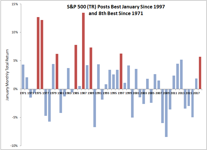
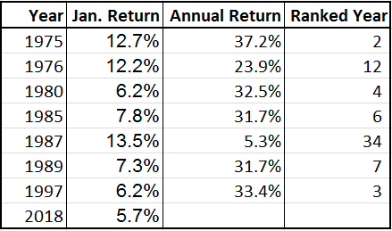
In prior years with January gains this big, all the years ended highly positive with the exception of 1987, which arguably had a structurally different market than today.  While 1995 was the best year on record with a gain of 37.6%, its January that gained 2.6% was not quite as strong as in 2018.  However, the 2nd, 3rd and 4th best years are all on the list with other very high ranking years too.

Source: S&P Dow Jones Indices

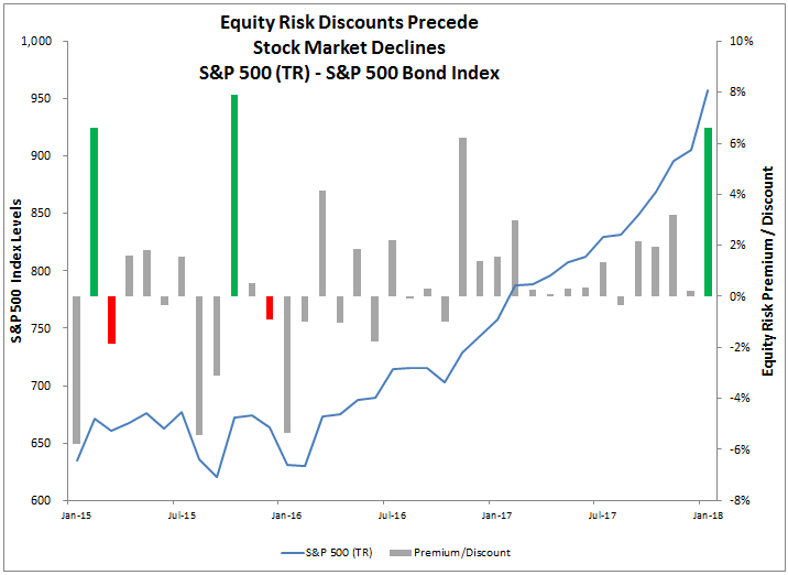
The market is excited to say the least.  In a measure of optimism by the outperformance of the S&P 500 versus the S&P 500 Bond Index, the stocks are outperforming by the most, 6.6%, since October 2015, when the outperformance was 7.9%. Also, the consumer discretionary sector showed its greatest optimism with a premium of 10.1%, the 7th most in history, and the most since Sep. 2010, when its premium was 10.5%.  This is supported by the tax cuts and the increased consumer confidence of 125.4 (1985=100), up from 123.1 in December, as reported by the Conference Board.  Though the glass looked more than half full for the health care sector in January that posted its biggest premium since January 2013, that glass may be starting to empty from the push to cut health care costs.  It may not be the only sector starting to look half empty as real estate and utilities are both measuring discounts for the second consecutive month.  Though a few of these glasses are looking half empty most seem still very full. If the S&P 500 Bond Index starts outperforming its more famous stock counterpart, the S&P 500, it could be a warning sign.  Immediately following that high premium in October 2015, the stock market topped on Nov. 3, 2015, and by December investors saw the glass as half empty. The exuberant premium turned into a discount, and in the following period through Feb. 11, 2016, the market dropped 12.7%. 

Source: S&P Dow Jones Indices

In other segments of the U.S. equity market, the performance continued to be strong in January.  The S&P SmallCap 600 (TR) returned 2.5% and the S&P MidCap 400 (TR) gained 2.9%. While consumer discretionary led large caps, gaining 9.3%, its best month since Oct. 2011, health care led small-caps, gaining 11.1%, the most since Sep. 2010, and mid-caps, gaining 8.5%, its best month since Jan. 2012.  The large cap consumer discretionary sector may not be only benefiting from the tax cuts and high consumer confidence but from the international business boost from the weaker dollar.  In the health care sector, where so much business is domestic for smaller and mid cap companies the tax cuts may mean more for them, helping them outperform the larger part of their sectors.  Together with health care and consumer discretionary, financials, industrials, information technology and materials gained regardless of size.  Smaller consumer staple companies have been challenged with changing consumer tastes for food with higher demand for whole and raw ingredients. Mid-cap energy companies also underperformed the big and small parts of the sector as they may not have been able to benefit as much from international business as the large caps but may have also been more hedged and less nimble than small caps as oil rebounded and the dollar fell. Real estate and utilities are suffering from falling bond prices and rising yields from more inflation fears after the passage of the tax cuts.  Large-caps are outperforming mid-caps by 2.9%, the most since Sep. 2014 and are outperforming small caps by 3.2%, the most since May 2017.

Source: S&P Dow Jones Indices

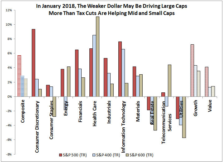
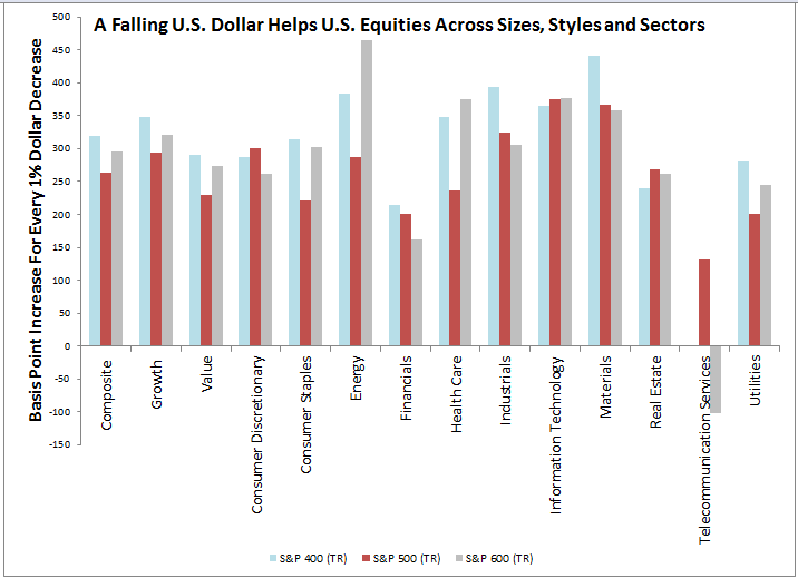
The weaker dollar seems to be winning over the tax cuts in lifting large caps beyond the mid and small size companies, though on average the falling dollar helps mid-caps most. Energy and materials gain most from a falling dollar since the natural resources are priced in dollars.  Although large-caps do most international business, the falling dollar may present growth opportunities for mid-caps that otherwise might not do as much international business.  If the dollar continues to fall, energy, materials, information technology, industrials and consumer discretionary may be where to overweight, as well as in mid-caps and growth.

Source: S&P Dow Jones Indices and Bloomberg DXY


The posts on this blog are opinions, not advice. Please read our Disclaimers.

2017 Retirement Funding Update for DC Account Holders

Contributor Image
Philip Murphy

Former Managing Director, Global Head of Index Governance

S&P Dow Jones Indices

2017 was generally kind to U.S. shareholders of domestic and international equities, but long-term U.S. Treasury Inflation-Protected Securities (TIPS) rates drifted downward, increasing the present value of future inflation-adjusted cash flows discounted to the TIPS curve. An important question for retirement savers may be whether investment returns outpaced the increased cost of securing future in-retirement income.

Exhibit 1 shows the change in present value in 2017 of 25-year inflation-adjusted cash flows, commencing in each of the respective years on the horizontal axis. Discount rates used to calculate pricing are derived from the TIPS yield curve. As expected, the chart illustrates that for a given change in rates, the longer duration cash flows experience more of a price change. Retirement savers planning to retire around 2030, for example, saw the cost of providing themselves 25 years of inflation-adjusted income increase by 7.5%. Other income sources, such as insurance company annuities, would generally move in the same direction but by varying magnitudes, depending on a number of external factors, like the insurance company profit margin and various features of specific annuity contracts. Nevertheless, tracking income cost by this straightforward method is a reasonable proxy for the cost of future income, and S&P DJI provides this metric monthly as part of its S&P STRIDE Index Series offering.

Exhibit 2 shows the 2017 total returns of U.S. stocks and bonds, as measured by the S&P 500®, the S&P U.S. Aggregate Bond Index, and a hypothetical 60/40 mix of the two.

For each of the benchmarks in Exhibit 2, Exhibit 3 shows the excess total return of the respective benchmark over the increase of the cost of income for each respective year (from 2020 to 2060). A couple of observations stand out in Exhibit 3. For all of the target years from 2020 to 2060, U.S. equities outpaced the rise in cost of future income. Of course, the volatility of equities means that from year to year this will not always be the case, but 2017 was kind to shareholders.

On the other hand, the broad U.S. bond market, as measured by the S&P U.S. Aggregate Bond Index, while returning a respectable 3.3%, failed to keep pace with the rise in cost of future income for any respective target years. Those only a few years from retirement with a higher exposure to bonds, and particularly short-term bonds, would find that their portfolio did not keep pace with the cost of income.

Lastly, the 60/40 stock/bond mix held up fairly well for most of the target years, but particularly well for those cohorts approaching retirement first. The years 2020 to 2035 all saw excess returns from a 60/40 mix of at least 5%. However for 2055 and 2060, there was not enough equity risk in the 60/40 mix to keep pace with the significant rise in cost of income commencing in those respective years.

Finally, Exhibit 4 is similar to Exhibit 3, but it shows the excess total return of specific S&P STRIDE Indices over the rise in cost of future income.

Like the S&P 500, the S&P STRIDE Indices outpaced the rise in cost of future income for all target years from 2020 to 2060. However, unlike the S&P 500, excess returns for all target years (including 2060) were greater than 5%. In addition, the range of excess returns across target years was significantly tighter than it was for the S&P 500, the S&P U.S. Aggregate Bond Index, or a 60/40 mix of the two.

As a result of the S&P STRIDE Index Series methodology, the index weight of near-dated S&P STRIDE Indices are heavily allocated to a mix of U.S. TIPS matching the duration of retirement income for the respective target year. For example, as of December 2016, the weight allocated to U.S.TIPS in the S&P STRIDE Glide Path 2020 Index Total Return was 65.7%. In spite of having significant fixed income within the index, excess return over change in cost of income was substantially positive (unlike the comparison using the S&P U.S. Aggregate Bond Index). 2017 showed that the strategy underlying the S&P STRIDE Indices met its design objective of generally offsetting changes in the cost of future income. Retirement savers should take note that managing portfolios to mitigate future income risk may make the transition from work to retirement a lot smoother.

The posts on this blog are opinions, not advice. Please read our Disclaimers.

Carbon Emissions History of the S&P 500® and its Sectors

Contributor Image
Kelly Tang

Former Director

Global Research & Design

Every year, Trucost and GreenBiz Group release their annual State of Green Business report, which gives an overview on the state of the sustainability movement and reviews 30 key indicators assessing corporate sustainability performance. As noted by Richard Mattison, CEO of Trucost, in a blog from earlier this month, the carbon emissions of the largest global companies have decreased in absolute terms and are at the lowest level in the past five years due to increased use of cleaner fuels. In this blog, we analyze the carbon emissions for the S&P 500 companies to gain insight about the index’s carbon emission history and understand which sectors are driving this downward shift.

Emissions are typically measured by mass of carbon dioxide equivalent (CO2e), whereby the “equivalent” is a proxy applied to greenhouse gases other than carbon dioxide and reflects their relative environmental impact. The units of reference are in kilotons of CO2e.[1] Exhibit 1 shows the total direct emissions (operational and first-tier supply chain greenhouse gas emissions) for the S&P 500 on an annual basis from December 2009 through December 2017, and 2017 (in yellow) comes in as the lowest absolute emissions figure in the nine-year period for which historical data is available.

In terms of sectoral contributions, the utilities and energy sectors have consistently represented the top two sectors generating the largest amount of greenhouse gas emissions, with utilities contributing 50% and energy approximately 20%, totaling to 70% for 2017. This amount represents an improvement from 2009 when these two sectors combined represented 83% of carbon emissions (see Exhibits 2 and 3).

Exhibit 4 compares the percent change from 2009 to 2017 for the S&P 500 and its GICS sectors for direct carbon emissions. Carbon emissions fell 11% for the overall index in the past eight years, with the highest emitting sector (utilities) decreasing its total direct emissions by 29%. The energy sector has also shown an emissions drop of 13% in the same time frame.

Analyzing the carbon emissions change data highlights sectors that show the greatest improvement and interestingly enough, the greatest reductions stem from the highest emitting sectors. As we mentioned in the previous “Evolution of Carbon Awareness Investing” blog, previous iterations for index construction had incorporated exclusionary screening, whereby the highest carbon emission offenders, whether on an absolute basis or a sector-neutral method, are excluded. However, as shown by the carbon momentum data in Exhibit 4, if the intent is to motivate carbon reductions, then the exclusionary option may not be the best choice and employing carbon momentum data may be more viable as it rewards companies that are working to reduce emissions.

The shift to renewables and cleaner technology is taking place, albeit at a slower pace than what is needed to meet the 2 degree targets as stipulated in the Paris Agreement. For institutional asset owners who can meaningfully influence a corporation’s behavior, one way to speed up carbon emissions improvement and percent change may be to consider redirecting capital to those companies that exhibit positive carbon momentum.

[1]   Emissions data is sourced from Trucost, which provides data on both direct and first-tier indirect emissions on a company-by-company basis; if companies do not report or otherwise make such figures available, Trucost estimates the emissions of each company using a proprietary model. Direct emissions, as the name suggests, encompasses emissions of CO2e produced directly by the entity, whereas indirect emissions are those that arise from the entity’s suppliers of materials and equipment, utilities such as electricity and business travel. The inclusion of indirect emissions is not always preferable, especially in an index, as this may result in double counting. For example, if a utility company as well as one of its customers is included in the same index, the emissions of the latter would be counted twice.

If you enjoyed this content, join us for our Seminar Discover the ESG Advantage in
London on May 17, 2018.

The posts on this blog are opinions, not advice. Please read our Disclaimers.

Capturing Global Market Gains Using U.S. Sectors

Contributor Image
Jodie Gunzberg

Former Managing Director, Head of U.S. Equities

S&P Dow Jones Indices

Almost a decade after the global financial crisis, the S&P Global BMI (Broad Market Index), a measure of the global stock market has gained 234.4% from its bottom on March 9, 2009.  As of January 26, 2018, the index level was 33.7% above its pre-crisis high that happened on October 31, 2007.  Interestingly, the current return over the pre-crisis high matches almost exactly the gain of 34.2% since President Trump’s inauguration.

Source: S&P Dow Jones Indices

Coincidence or not, the booming stock market seems to be supported by several data points, especially from the U.S. including the $1.5 trillion tax cut, higher consumer confidence, higher consumer spending, low savings and increased government spending.  What happens in the U.S. and to its stock market is vital to the rest of the world, since U.S. growth requires imports of parts and components from foreign manufacturers, and the U.S. makes up over half the world’s market capitalization of $58.6 trillion.

Source: S&P Dow Jones Indices

Not only is the U.S. the biggest market in the world but it has led the major countries in performance of the recovery since the global financial crisis and in surpassing the pre-crisis top. However, China, South Korea, Germany, France and emerging markets in general are outpacing the U.S. since President Trump’s inauguration.

Source: S&P Dow Jones Indices

This may be since the U.S. GDP growth drives up every major stock market in the world, but helps stock market performance in some countries more than others, and even more than in the U.S. itself.  South Korea, China, Switzerland, Germany and emerging markets overall benefit most from U.S. GDP growth, while Japan, the U.K. and other developed international markets are less sensitive.  For example, while the U.S. stock market rises on average 3.8 percent for every one percent of U.S. GDP growth, the Korean stocks rise 9.4 percent on average and Japan’s stock market rises just 2 percent.

Source: S&P Dow Jones Indices

The disparity gives opportunity to market participants investing around the world to select countries or regions based on U.S. growth expectations.  However, not all investors participate in global stock markets or choose exposure by country, and may fully or partially rely on U.S. equities for their “global” stock market exposure.

Examining the sector weights of the S&P 500 by global revenue rather than only of the market capitalization can help quantify where exposure is in the world despite a U.S. listing.  When weighted by foreign revenues or U.S. revenues rather than market capitalization, the sector makeup of the U.S. stock market represented by the S&P 500 changes significantly.  Information technology has far more foreign revenue exposure than financials but financials have much higher U.S. revenue exposure.  The information technology weight increases from 24 percent of the S&P 500 to 41 percent of the foreign revenue exposure index, but drops to just 3 percent of weight in the U.S. revenues exposure index.  On the other hand, the financial sector drops 8.5 percent of weight in the foreign revenue universe but is the biggest sector of the U.S. revenue exposure index at 27 percent. Other sectors with notably more foreign revenue exposures are materials and energy, while consumer discretionary, real estate, telecommunications and utilities make up proportionally more of U.S. revenue exposures.

Source: S&P Dow Jones Indices

The sector weights by global revenue exposure combined with the S&P 500 up market capture ratios can give a better understanding of how return is generated from U.S. GDP growth.  For example, the real estate sector has returned on average 6 percent for every one percent of GDP growth but has very little foreign revenue exposure, so may be a strong sector to overweight for both diversification to international equity exposure and for upside potential with U.S. economic growth.  On the other hand, the materials sector has comparatively low upside capture, gaining about 3 percent on average for every one percent of U.S. GDP growth, combined with relatively high correlation to most international markets, making it a possibly less desirable choice for growth and diversification internationally, but can give strong international exposure.  The industrials sector has a higher upside market capture ratio to U.S. GDP growth and more correlation to international markets, so might be a better choice for growth and international exposure.

Source: S&P Dow Jones Indices

If applying U.S. equities to get international exposure is a main goal, large-cap companies do the most global business.  However, if the main goal is to get the most upside from U.S. GDP growth, and rotation between market capitalization sizes is a possibility, small-caps may be the best bet.  Large-caps outperformed small-caps by the most in 2017 since 1999, but large-cap performance that big typically doesn’t last, especially when quality is a factor in a small-cap index like the S&P 600 indexThe upside market capture ratio of the S&P 600 to U.S. GDP growth is near 515 versus just 400 for the S&P 500, giving an extra 115 basis points of return on average for every one percent of U.S. GDP growth.  Within the small-cap space the sectors that benefit more are financials, health care and energy, but of course need to be reviewed with other factors like interest rates, inflation, the dollar and oil prices taken into consideration.

The posts on this blog are opinions, not advice. Please read our Disclaimers.

Investing in a World of Unknown Future Outcomes: The Benefits of Equal Weighting

Contributor Image
Anu Ganti

U.S. Head of Index Investment Strategy

S&P Dow Jones Indices

Consider this thought experiment: You “know” that 499 of the companies in the S&P 500® will return exactly 5% next year. One will return 100%. You have no way to determine which stock will be the big winner, or to know or infer anything about its characteristics. You can invest in either a cap-weighted S&P 500 index fund, or an equal-weighted S&P 500 index fund. What should you do?

We can begin by noticing that 120 of the 500 issuers in the S&P 500 are weighted at more than 0.20%—i.e., they have a higher weight in the cap-weighted index than in its equal-weighted counterpart. 380 issuers are weighted more heavily in equal-weight. We face a binomial choice—either equal-weight or cap-weight—and the “success” of that choice will be determined entirely by which index has a relatively higher weight in the one stock that’s up 100%. Since we are completely agnostic about the stock in question, choosing the equal-weighted index gives us a 76% probability of success.

Our example, of course, is artificial for any number of reasons, but it does illustrate an important truth: positively skewed returns favor equal-weight indices. Anyone who’s read a prospectus knows that past performance is no guarantee of future results. But past performance has indeed taught us two key lessons:

  • Historical gains in equity markets have been driven by a relatively small number of stocks.
  • The identity of these stocks is unknown—and generally unknowable—in advance.

The first point—the skewness of market returns—is clear in historical data. In 23 out of the past 27 years, the median stock in the S&P 500 has underperformed the return of the average stock. We see similar results in other markets. And if the second point were not true, we would not observe consistent underperformance from active managers.

These two points help us to understand a third:

To be sure, equal weighting does not always lead to success. For example, 2017 was an outlier, as the S&P 500, driven by a handful of large technology stocks, outperformed the S&P 500 Equal Weight. But the equal-weighted index has outperformed in 16 of the past 28 years, by an average margin of 1.5% annually. One reason for this record is the ability of equal-weight indices to take advantage of the positive skew in stock market returns.

The posts on this blog are opinions, not advice. Please read our Disclaimers.