Get Indexology® Blog updates via email.

In This List

Rieger Report: Munis Show Their Power in Low Rate Environment

A Quick Performance Check on U.S. Preferreds

Viewing the History of China A-Shares Through the Lens of the Dow Jones China 88 Index

Pockets of Active Achievement

Q4 2017: Crude Oil Is Black Gold, With Some Nuances

Rieger Report: Munis Show Their Power in Low Rate Environment

Contributor Image
J.R. Rieger

Former Head of Fixed Income Indices

S&P Dow Jones Indices

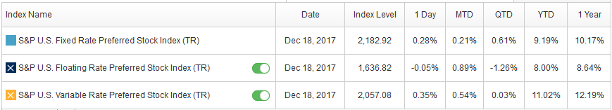
The 2017 low interest rate environment has created a wonderful example of the power of tax-exempt bonds. On a nominal return basis, investment grade corporate bonds tracked in the S&P 500 Investment Grade Corporate Bond Index have outperformed tax-exempt bonds tracked in the S&P National AMT-Free Municipal Bond Index. By considering the tax implications, using tax rate assumptions, the power of tax-exempt municipal bonds becomes evident. After all keeping more of the return is more important than the nominal return!

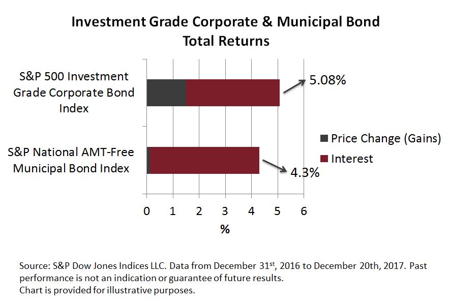
Chart 1 shows the returns broken down in price return (gains) and interest return. No attempt was made to address Original Issue Discount (OID) bonds which also have tax advantages regarding price appreciation.

Chart 1: Year-to-Date Returns of Select Investment Grade Bond Indices:

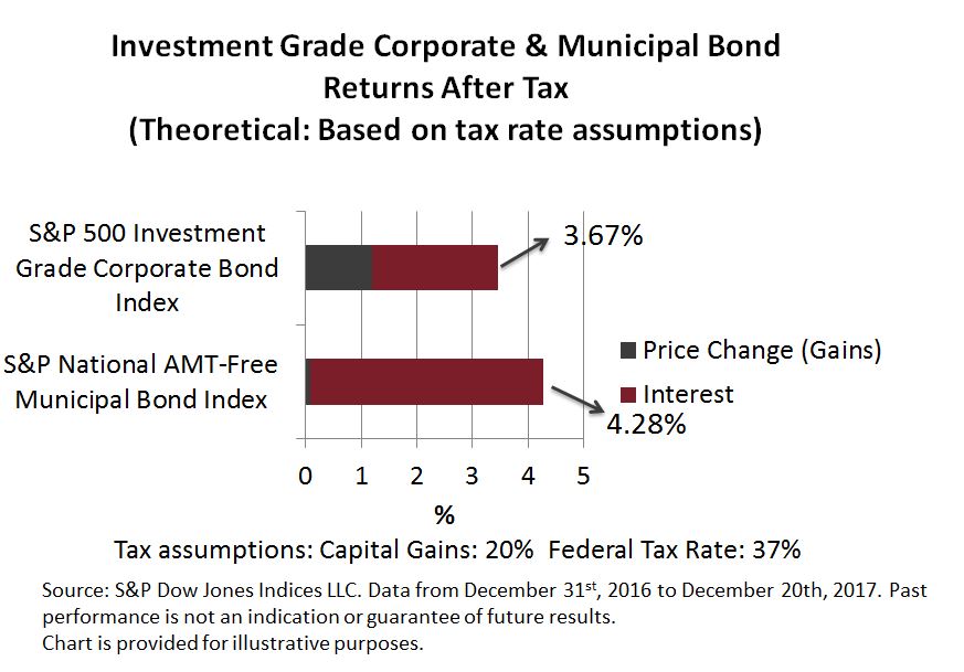
Viewing the returns of both asset classes, corporate and municipal bonds, from the perspective of returns after taxes reverses the trend. It is important to note that this analysis is just illustrative and is based on tax rate assumptions.

Chart 2: Year-to-Date Returns of Select Investment Grade Bond Indices After Federal Tax Rate Assumptions are Applied:

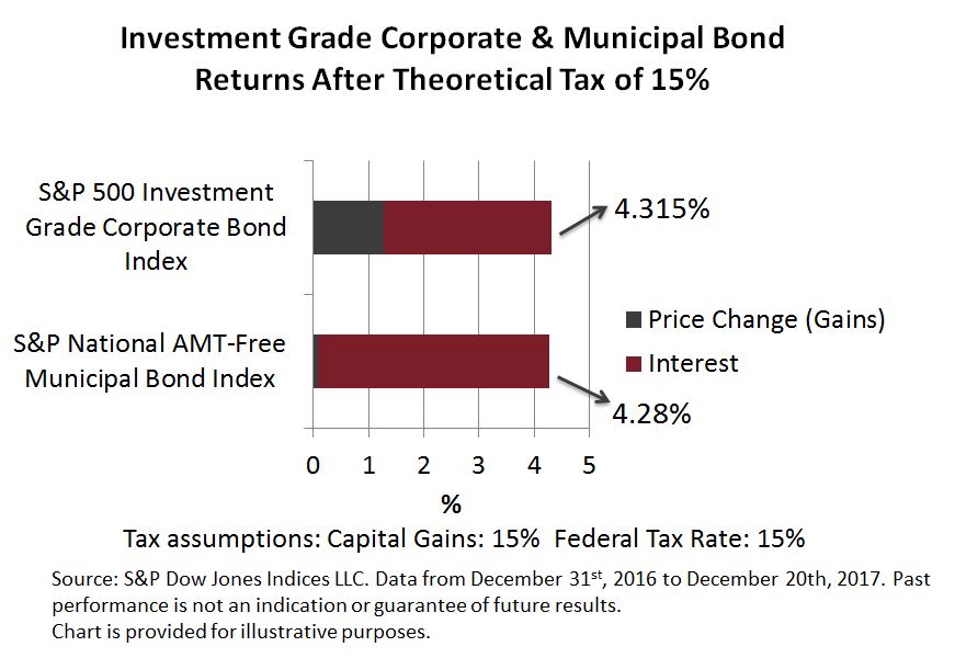
Taking the assumptions one step further, I looked to find what federal tax rate assumption on capital gains and interest income would be required for investment grade corporate bonds to return approximately the same return as tax-exempt municipal bonds from an after tax basis. Chart 3 illustrates the result: 15%. To me that means tax-exempt municipal bonds may have value for a wider investor base beyond the highest tax brackets.

Chart 3: Year-to-Date Returns of Select Investment Grade Bond Indices After Applying a 15% Federal Tax Rate Assumption:

The posts on this blog are opinions, not advice. Please read our Disclaimers.

A Quick Performance Check on U.S. Preferreds

Contributor Image
Kevin Horan

Former Director, Fixed Income Indices

S&P Dow Jones Indices

There are only a couple weeks to go until the end of the year, and for a while now, the investing public has seen plenty of material supporting the benefits or risks of diversifying a portfolio through the use of preferred securities. This hybrid type product touts the benefits of high yields, steady income, and a more senior status in the capital structure when compared with common stock.

When comparing the asset classes that the preferred hybrid securities sit between, it is noticeable that the preferred class (as measured by the S&P U.S. Preferred Stock Index) has had a higher total return than bonds (as measured by the S&P 500® Bond Index), but not nearly as much as equity (as measured by the S&P 500). What needs to be kept in mind about this is that the volatility of returns as measured by standard deviation is much lower for bonds (0.19) and preferreds (0.21) than it is for equity (0.43). Thus, preferreds tend to be a reliable stream of income that yields more than bonds, but it can also be used as a diversifier since the correlation of returns between bonds and preferreds is low.

Exhibit 1: Preferreds Versus 500 Stocks and 500 Bonds

Source: S&P Dow Jones Indices LLC. Data as of Dec. 18, 2017. Past performance is no guarantee of future results. Table is provided for illustrative purposes.

Dissecting the S&P U.S. Preferred Stock Index through the use of subindices can provide exposure to the differing components that make up the parent index. A quick comparison shows that investment-grade preferreds have outperformed high-yield and non-rated preferreds, as well as the parent index.

Exhibit 2: Preferred Ratings Indices Comparison

Source: S&P Dow Jones Indices LLC. Data as of Dec. 18, 2017. Past performance is no guarantee of future results. Chart and table are provided for illustrative purposes.

Coupon type can also provide differing exposure, as the S&P U.S. Variable Rate Preferred Stock Index (TR) returned twice the amount of the S&P 500 Bond Index, at 11.02% YTD, as of Dec. 18, 2017. It also helps to know that the S&P U.S. Variable Rate Preferred Stock Index (TR) is made up of 59% high-yield, 28% investment-grade and 12% non-rated securities.

Exhibit 3: Preferred Coupon Indices Comparison

Source: S&P Dow Jones Indices LLC. Data as of Dec. 18, 2017. Past performance is no guarantee of future results. Table is provided for illustrative purposes.


The posts on this blog are opinions, not advice. Please read our Disclaimers.

Viewing the History of China A-Shares Through the Lens of the Dow Jones China 88 Index

Contributor Image
John Welling

Senior Director, Head of Global Equity Indices

S&P Dow Jones Indices

The Dow Jones China 88 Index has recorded the ups and downs of the large-cap mainland China market for more than 20 years. Launched in 1996, the index was one of the first large-cap A-share benchmarks available in the market and therefore is unique in the length of its live, consistent track record. Let’s revisit some of the recent history of the China A-shares market through the lens of the Dow Jones China 88 Index.

Volatile History

After returning an average 6% each year (through ups and downs) for the first 10 years of existence, the Dow Jones China 88 Index subsequently experienced its most precipitous surge to date, increasing over 500% in the 15 months from June 2006 to October 2007. The unprecedented highs were soon followed by a 72% decline over the next year. A subsequent 120% appreciation soon changed the index’s course, leading to a relatively drawn-out period of general underperformance, falling 50% over slightly more than 3.5 years. From the beginning of its current rally starting in January 2016, the index has returned nearly 45% as of Dec. 15, 2017.

Perhaps the overall growth in market cap is more telling than the volatility in returns, however. In just over 21 years, the index market cap has grown significantly from approximately USD 60 billion to USD 7.3 trillion, earning China’s stock market the rank of second largest in the world—behind only the U.S.

The Dow Jones China 88 Index – Basics

The Dow Jones China 88 Index is a blue-chip index designed for use as the basis of financial products, representing the largest and most liquid stocks traded on the Shanghai and Shenzhen stock exchanges. The selection universe consists of all companies whose Class A shares have been included in the Dow Jones China BMI, which covers approximately 95% of the float-adjusted market capitalization listed on the Shanghai and Shenzhen stock exchanges. The largest 88 stocks are included in the index, which is float adjusted and weighted by market cap. The early inception date and continuous live history make it unique among China’s A-share blue-chip indices.

Similar comparison indices include the FTSE China A50 (launched in December 2003), which comprises a slightly narrower set of 50 A-shares, and the CSI 300 (launched in April 2005), which comprises a much broader set of 300 China A-shares. These well-known indices are similar in terms of correlation and returns. The 10-year correlation of the Dow Jones China 88 Index is 99% compared to the FTSE China A50 and 98% correlated to the CSI 300. Though limited by the data history of these peer indices, Exhibit 2 displays the similarities and differences in risk/return characteristics over the relevant periods. The Dow Jones China 88 Index offers similar risk/return profiles compared to these peers, while offering a much longer data history.

China’s stock market is often regarded for its past growth and opportunity for future appreciation. The Dow Jones China 88 Index is a prominent, long-standing, representative, and liquid China A-share index, allowing market participants to measure the growth prospects of this important market.

The posts on this blog are opinions, not advice. Please read our Disclaimers.

Pockets of Active Achievement

Contributor Image
Fei Mei Chan

Former Director, Core Product Management

S&P Dow Jones Indices

The last 16 years have not been kind to active management. But that shouldn’t come as a surprise. Unless the laws of basic arithmetic change, the theoretical argument on the perils of active management is ironclad. SPIVA data offer solid evidence to back up theory. As the chart below shows, most active managers underperform most of the time.

While SPIVA tells us that it is difficult for active managers to outperform, we thought it might be helpful to ask whether there are circumstances in which active performance has historically had an edge. We acknowledge that 16 years of data are not extensive. But that limited data set gave us some insight into a number of environments under which active performance was relatively less challenged.

In particular, we observed that low dispersion environments were especially unfavorable for active performance. On average 68% of managers underperformed in low-dispersion environments, a 5% increase over higher dispersion environments. These results were consistent with our expectations. Compared with passive, active managers begin with an encumbrance; they must make up fees before value gets passed on to clients. In low dispersion environments, the opportunity for adding value beyond costs is limited.

More Managers Underperformed in Low-Dispersion Environments

Similarly, it could be argued that high dispersion environments allow more opportunity for those managers with true skill (or luck) to stand out. Results were consistent with this theory. The SPIVA results point to a bigger gap between those from the bottom of the pack and the top as dispersion widened and this increase was monotonic.

Gap Between the Top and Bottom Performance Quartiles Broadened as Dispersion Increased

Unfortunately, dispersion tends to spike during tumultuous times like the inflation and bursting of the technology bubble and around the 2008 financial crisis but generally hovers within a limited band and, most recently, has been near historical lows.

A few other factors (e.g. performance of momentum and value stocks) also seemed to correlate with better manager outcomes.  We have summarized results in our latest paper.


The posts on this blog are opinions, not advice. Please read our Disclaimers.

Q4 2017: Crude Oil Is Black Gold, With Some Nuances

Contributor Image
Marya Alsati

Former Product Manager, Commodities, Home Prices, and Real Assets

S&P Dow Jones Indices

As of Dec. 18, 2017, the S&P GSCI is up 4.6% for the quarter, driven by petroleum, which is up 9.9% and makes up more than 59% of the index.

So far in the quarter, the S&P GSCI Crude Oil is up 9.8% and the S&P GSCI Brent Crude is up 12.7%. The difference in return is an indication of the level of availability of the commodity in the market. WTI crude, the benchmark for North America, is relatively underperforming Brent crude because of record-high levels in U.S. production. Meanwhile, Brent crude, the benchmark for crude oil production in Europe, Africa, and the Middle East, is being supported by OPEC’s rebalancing efforts and the shutdown forced by repairs of the UK’s most important pipelines.

While the spread between the two crudes has been widening since September 2017, it is important to note that it is not as wide as the spread reported at the end of 2016, when the S&P GSCI Crude Oil closed the year up 8.0% and the S&P GSCI Brent Crude closed up 28.5%.

In addition to the difference in returns, the two crudes are exhibiting different levels of backwardation and contango. Brent crude is in a state where its futures curve is sloping downward, generating a positive roll yield and an expectation that prices will rise, while WTI crude is in contango, with an upward sloping futures curve resulting in negative roll yield, along with an expectation that prices will fall.

The posts on this blog are opinions, not advice. Please read our Disclaimers.