Get Indexology® Blog updates via email.

In This List

Accessing China’s Growth via Dividends

Impact of the Affordable Care Act (ACA) on Individual versus LG/ASO Trends

Dollar's Revival Adds New Life To These Commodities

Listed Infrastructure: Bridging the Inflation Hedging Gap

The MENA Sukuk Market Expanded 14% YTD

Accessing China’s Growth via Dividends

Contributor Image
Tianyin Cheng

Former Senior Director, ESG Indices

S&P Dow Jones Indices

In the current environment of short-term volatility amid a long-term positive outlook for the Chinese economy, a focus on growing, sustainable dividends in China’s equity markets could provide the opportunity to get a slice of the region’s structural growth and potential downside protection compared with a typical growth strategy, such as an earnings growth strategy.

In recent years, with the release and implementation of a series of dividend-encouraging policies issued by Chinese authorities, the amount of dividends issued by companies listed in China’s equity markets has gradually increased.  In 2014, the size of the total dividend pool for companies in the S&P China A BMI was USD 70 billion, nearly triple the size of the dividend pool in 2009.  In terms of the number of companies, 70% of the S&P China A BMI universe paid dividends in 2014, which is much higher than the 55% reported in 2009.

Capture

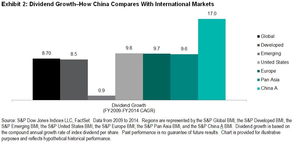
From a dividend growth perspective, Chinese companies may offer much faster dividend growth than companies in many other parts of the world.  From 2009 to 2014, Chinese equities provided a dividend growth rate of 17.0% per year, driven mainly by improved earnings—far higher than equities in Pan Asia, Europe, and the U.S.

Capture

One unique feature of Chinese companies is that they tend to have more concentrated company ownership, either in the form of a founding family or a government-affiliated entity.  The implications on dividends are three fold.  First, many of China’s IPOs are due to the privatization of large stakes in SOEs and family-run businesses.  These are typically mature companies that pay dividends from the beginning of their public listings.  This explains the fast growth of dividend pools in China.

Second, dividends may provide a sign of positive corporate governance in China.  Under the conditions of high concentration of ownership and weak legal protection for small- and medium-sized shareholders in China, the distribution of dividends can be used as a way to limit large shareholders’ ability to expropriate minority shareholders’ rights or improper government intervention in the listed companies.

Third, many of the largest dividend-paying Chinese companies are SOEs with a high degree of direct or indirect government ownership.  Therefore, the Chinese government influences companies’ earnings and dividends.  Given the government support to improve dividend policies, these companies tend to return a greater share of earnings to shareholders via dividends.

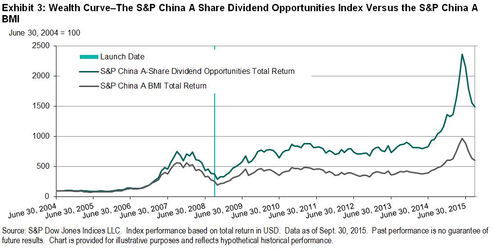
The S&P China A Share Dividend Opportunities Index seeks to offer a transparent, rules-based, diversified, and tradable strategy for investors looking for exposure to China’s growth via dividends.  The index seeks to measure high-yielding A share stocks traded on the Shanghai or Shenzhen Stock Exchanges.  The index was launched on Sept. 11, 2008, showing a seven-year live track record of consistent outperformance against the benchmark, the S&P China A BMI (see Exhibit 3).  The index may be attractive to investors for its total return, income generation, and potential for downside protection.  For more information, please refer to the following research paper by clicking here.

Capture

The posts on this blog are opinions, not advice. Please read our Disclaimers.

Impact of the Affordable Care Act (ACA) on Individual versus LG/ASO Trends

Contributor Image
John Cookson

Principal, Consulting Actuary

Milliman

When we initiated our forecast on the S&P Healthcare Claims Indices in 2014, we wanted to avoid the effects of the ACA on individual and Small Group claim costs, so we focused on Large Group and Administrative Services Only (ASO) trends.  The individual claim costs continued to show a sharp divergence in trends from the group business claim costs through 2014.  In the first quarter of 2015, the high cost trends for individual were still below 2014 levels, as predicted.  Also as predicted, the Small Group trends have begun to show an uptick (from virtually flat in December 2014 and January 2015 to nearly 7% by April 2015 on a three-month basis), but this increase was not nearly as strong as the increase for individual during the same period.

Capture

We expect that there could be a further increase in 2015 Small Group trends as a result of the ACA changes.  The capacity of hospitals, as measured by employment per capita, declined below long-term average levels, but since late 2014, employment has increased at a faster pace.  Medicare initiatives to cut readmissions and increase observation (emergency room) holds in order to avoid unnecessary admissions have been affecting Medicare and non-Medicare hospital patients by reducing admissions.[1] [2]  These may have run their course.

 Capture

[1] Due to the effects of deductible and copay leverage, large employers’ benefit plans that have not changed rates in the previous year could increase by as much as 2.5% or more on bronze-level plans and by 1% or more on gold-level plans.  Risk takers may need to take this into account.  In addition, the S&P Healthcare Claims Indices do not reflect the impact of benefit buydowns by employers (i.e., higher deductibles, etc.), since the indices are based on full allowed charges.  Actual trends experienced by employers and insurers in the absence of benefit buydowns can be expected to be higher than trends reported by the S&P Healthcare Claims Indices due to plan design issues such as deductibles, copays, out-of-pocket maximums, etc.  Benefit buydowns do not represent trend changes, since they are benefit reductions in exchange for premium concessions, but they can have a dampening effect on utilization due to higher member copayments.  This can have a dampening effect on trends measured by the S&P Healthcare Claims Indices compared with plans with no benefit changes, further pushing up experienced trends relative to those reported in the indices.  The long time lag between real personal income growth (highly correlated with real GDP) and the impact on healthcare trends defer the impact on healthcare costs for 30 to 36 months, and that is reflected in our forecasts.  The lag on inflation is much shorter, with a range of 12 to 18 months.
[2] Readmission rates are much higher for the Medicare population than commercial patients, and Medicare has seen significant admission rate reductions in recent years.  Medicare 30-day readmission rates have dropped from an average of 19.0%-19.5% four-to-seven years ago to under 18% in early 2014.
[3] Our operative theory is that healthcare is primarily a supply-driven system due to consumers being immunized from significant cost because of the effect of insurance.  This increases the demand above what it might otherwise have been in the absence of insurance.  Although ongoing market increases in deductibles and co-pays have a downward effect on demand, this would only have a marginal impact relative to the effect of having no coverage at all.  This was demonstrated in the Rand Health Insurance Experiment conducted from 1971 to 1986.

THE REPORT IS PROVIDED “AS-IS” AND, TO THE MAXIMUM EXTENT PERMITTED BY APPLICABLE LAW, MILLIMAN DISCLAIMS ALL GUARANTEES AND WARRANTIES, WHETHER EXPRESS, IMPLIED OR STATUTORY, REGARDING THE REPORT, INCLUDING ANY WARRANTY OF FITNESS FOR A PARTICULAR PURPOSE, TITLE, MERCHANTABILITY, AND NON-INFRINGEMENT.

The posts on this blog are opinions, not advice. Please read our Disclaimers.

Dollar's Revival Adds New Life To These Commodities

Contributor Image
Jodie Gunzberg

Former Managing Director, Head of U.S. Equities

S&P Dow Jones Indices

It makes sense that a strong US dollar is generally bad for commodities since as the U.S dollar strengthens, goods priced in dollars become more expensive for other currencies. However, historically the U.S. dollar has a negative correlation of only about -0.30 with the S&P GSCI as shown in the chart below using data since 1970:

Source: S&P Dow Jones Indices and Bloomberg.

This may be surprising since -0.30 correlation does not show a very strong negative relationship. It may be explained partially by the late additions of (WTI) crude oil that did not occur until 1987 and brent crude in 1999. Their combined weights have been up to roughly 50% of the S&P GSCI at times, so their impact on the overall composite relationship to the dollar is significant. In the past 10 years, crude oil and brent crude are two of the most sensitive and negatively correlated commodities in the index to the dollar. Brent crude and (WTI) crude oil are negatively correlated -0.67 and -0.66 with beta of -2.9 and -2.8, respectively. This has driven the S&P GSCI to have a negative correlation of -0.63 to the U.S. dollar. Simply put, brent and WTI have doubled the negative correlation of the index to the U.S. dollar.

However, there are other commodities that just aren’t so badly impactedFeeder cattle and sugar have up market capture ratios of 130 and 125, using the dollar as the market, that says those commodities outperformed the dollar by 30% and 25%, respectively, in the past 10 years. Further, gold, live cattle, zinc, lean hogs and coffee have all posted positive returns on average when the dollar was up.

While the strong U.S. dollar is bad for commodities overall, it hurts far less than how much a weak dollar helps commodities. In the past 10 years on average, the U.S. dollar was pretty symmetrical with 58 periods of a rising dollar and 62 periods of a falling dollar, and in terms of the magnitude of gains and losses on average of -6.14% and +6.18%. When the dollar was up, brent crude lost 3.67% and (WTI) crude oil lost 4.00% with the worst average loss in nickel of -12.02%, far more than the single commodity average loss of -1.97%. However, when the dollar lost, not one single commodity fell on average and the single commodity gained 24.64% on average. Below is the table that shows the performance:

Source: S&P Dow Jones Indices and Bloomberg.


The posts on this blog are opinions, not advice. Please read our Disclaimers.

Listed Infrastructure: Bridging the Inflation Hedging Gap

Contributor Image
Jon Winslade

Senior Director, Wealth Management Channel

S&P Dow Jones Indices

Roger McNamee, the American businessman and sometime musician said “We need to stop thinking about infrastructure as an economic stimulant… [since] economic stimulants produce Bridges to Nowhere. Strategic investment in infrastructure produces a foundation for long-term growth.” In 2013, Transportation for America identified that one in nine U.S. bridges—a jaw-dropping 66,000 of them—are deficient, and they are a striking example of the USD 1 trillion per year global infrastructure spending gap identified by the World Economic Forum last year.

If—as McNamee trumpets—infrastructure investment promotes growth, owners of large pools of capital should, by design, be interested. Global pension assets are one such reservoir, totaling around USD 40 trillion and predicted to increase to USD 65 trillion1 by 2020, yet less than 1% of aggregate pension assets are invested in infrastructure, and those funds that are sold on the investment benefits are finding a persistent gap between actual investment (2.9%) and their target allocations (3%-5%).2 The asset class is attractive to institutional investors looking for growth and inflation hedging, with investment return expectations for “Core” and “Core Plus”—investments in societal staples such as bridges, rail, roads, and airports—near 7%-13% per year.3

So why is the channel between spending requirements and return seekers seemingly unbridged? Three possibilities exist. First, the availability of suitable investment opportunities seems limited, as characterized by unallocated investment capital, which is at a record level of USD 100 billion.4 Second, the median pension fund infrastructure investor size is USD 6 billion,5 pointing to expertise and governance requirements many funds consider beyond their scope. Third, in a pensions management world where there is persistent and relentless focus on cost, specialized infrastructure manager fees of 2% and 10% of excess return over 8%6 are out of kilter. Infrastructure returns—in this context—seeming to have high barriers to entry.

But do they? A growing globally listed equity market now capitalized at approximately USD 3.5 trillion, with daily average trading volumes of USD 15 billion,7 affords funds the liquidity many desire, as well as a “governance advantage” due to the stringent regulatory demands and reporting requirements of listing. So far so good then—but what do the returns look like when holding liquid investments for the long term?

Two interesting outcomes can be observed. First, 10-year annualized returns—as represented by the Dow Jones Brookfield Global Infrastructure Index—compare favorably to the top end of the “Core Plus” range of return expectations (10%-13%).

Capture

Second, discernible inflation-hedging characteristics—one of the most desirable characteristics of infrastructure investing5—are present for historical infrastructure equity buy and hold approaches, with a 47 bps monthly excess return in high inflation scenarios seen over broad equity from 2004-2014.

Capture

Of course, equity exposure comes with equity risk, although the average 10-year annualized volatility of 13.8% for infrastructure equity versus 17% for global broad equity, along with the notably reduced maximum drawdowns for infrastructure, is observed.

Capture

In recent times, such notable names as AP4 and NZ Super have invested in infrastructure through listed securities.8 With exposure to desirable characteristics of return and inflation protection also possible in the cost efficient, indexed manner so many pension funds now embrace, listed markets could bridge the perceived governance and expertise gap bringing the asset class in closer reach to even the smallest funds without the (toll) fees that have historically been the norm.

1 PwC: Asset Management 2020 A Brave New World
2 2015 Preqin Global Infrastructure Report
3 Towers Watson, CBRE Clarion Securities, Caledon Capital Management
4 Infrared Asset Management via Real Assets Advisor Vol.2 No. 12 Nov 2015
5 Institutional Investing in Infrastructure I3 Investor Survey Summary Report
6 CFA Institute: Benchmarks for Unlisted Infrastructure by Singh, Orr and Settel
7 Brookfield Investment Management
8 OECD: Trends in Large Pension Fund Investment in Infrastructure Nov 2012

The posts on this blog are opinions, not advice. Please read our Disclaimers.

The MENA Sukuk Market Expanded 14% YTD

Contributor Image
Michele Leung

Former Director, Fixed Income Indices

S&P Dow Jones Indices

The Middle East and North Africa (MENA) region recorded strong growth in the sukuk market in the first 10 months of 2015.  The market value, as tracked by the S&P MENA Sukuk Index, rose 14% YTD to 37 billion, compared with the mere 1% growth in the conventional bond market in the region.  The sukuk market has expanded 37% since the S&P MENA Sukuk Index’s inception in July 2013.  United Arab Emirates is the most active issuing country in the region, and it remains dominant in terms of country exposure at 52%, followed by Saudi Arabia at 17%.

Overall, governments have continued to diversify their funding platforms, and the global sukuk market has witnessed solid support from the lack of primary supply.

Looking at the indices’ total return performance, there has been a 1.1%-1.3% decline in both sukuk and bond markets month-to-date. As of Nov 18, 2015, the S&P MENA Sukuk Index rose 1.05% YTD, while the S&P MENA Bond Index outperformed and gained 1.90% in the same period.

Exhibit 1: Total Return Performance

Source: S&P Dow Jones Indices LLC.  Data from Dec. 31, 2014, through Nov. 18, 2015.  Past performance is no guarantee of future results.  Chart is provided for illustrative purposes.
Source: S&P Dow Jones Indices LLC. Data from Dec. 31, 2014, through Nov. 18, 2015. Past performance is no guarantee of future results. Chart is provided for illustrative purposes.

The posts on this blog are opinions, not advice. Please read our Disclaimers.