Get Indexology® Blog updates via email.

In This List

Uncertainty In Greece Causing Real Concern In European Government Bond Markets

Tax-Aware Shift in Superannuation

The Greece Crisis is Not Our Concern, Say US Options Investors

The Small Respect it Deserves

Asia Fixed Income: A Closer Look at Indian Bonds

Uncertainty In Greece Causing Real Concern In European Government Bond Markets

Contributor Image
Heather Mcardle

Director, Fixed Income Indices

S&P Dow Jones Indices

Uncertainty is a four letter word in bond markets and can lead to significant volatility.  The Greek debt dilemma is becoming more and more dire each day.  European government bond markets are reacting with some significant swings.  Germany and the IMF offered Greece a deal last week that would require strict adherence to austerity reforms, only to be harshly criticized by Greek PM Tsipras on Tuesday.  Last Wednesday, Standard & Poor’s Ratings Agency cut Greece’s credit rating one notch to CCC, and indicated a default could happen in the next year if they cannot come to an agreement with their creditors.

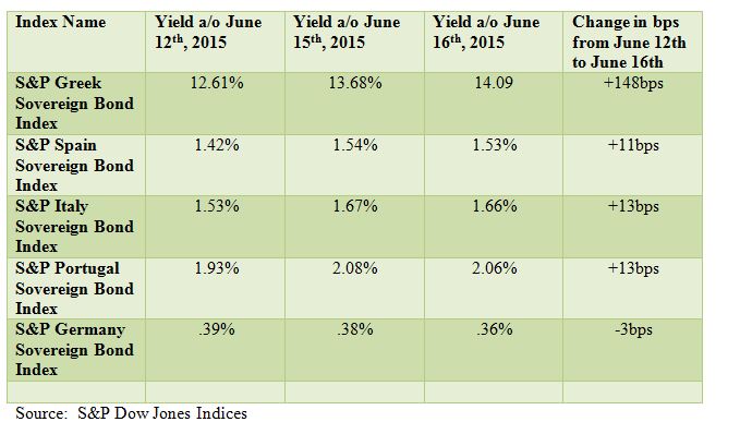
The European government bond markets are reacting to the possibility that an agreement may not be made and are choosing to play it safe.   The riskier countries like Spain, Italy and Portugal took a hit on Monday. While the impact of a Greek exit from the Eurozone may be less than it would have been back in 2012, the fear of contagion is still very real. The S&P Spain Sovereign Bond Index yield saw an 11 bps move upward from last week’s close, the S&P Portugal Sovereign Bond Index yield rose 13 bps, and the S&P Italy Sovereign Bond Index yield increased by 13bps.  In contrary, the S&P Germany Sovereign Bond Index tightened 3bps during this time period, along with the flight to safety.  (See table below.)

Greek sovereign debt took the biggest hit and the S&P Greek Sovereign Bond Index widened 148 bps as of Tuesday’s close.  While June 30th is a deadline for Greece’s ultimate fate, European finance ministers are meeting this Thursday to try to resolve the crisis.  For now, the only thing that remains constant in this crisis is that four letter word.

Capture

The posts on this blog are opinions, not advice. Please read our Disclaimers.

Tax-Aware Shift in Superannuation

Contributor Image
Harry Chemay

Co-Founder & CEO

Clover.com.au

This is the fourth blog in a series on the evolution of Australia’s tax-aware investment management (TAIM) landscape.

The Super System Review of the superannuation industry was completed in mid-2010, a year after the industry crossed the AUD 1.1 trillion asset mark. The Review included an observation that although taxes are often the single biggest expense for most super funds, the Australian fund management industry, unlike its US counterpart, had no obligation to calculate or report after-tax returns for its funds. In addition, the Review noted that there was a near-universal use, by super trustees, of pre-tax market indices as benchmarks against which fund managers were assessed and remunerated. For example, the most commonly used benchmark in large-cap Australian equities is the S&P/ASX 300, a pre-tax benchmark incorporating the 300 largest companies listed on the ASX by float-adjusted market capitalization.  But what of taxes?  As a ‘cost’ of investing shouldn’t they too be incorporated into the evaluation of manager performance?  And if they were, would it change pre-tax performance outcomes when viewed through a post-tax lens?

In accordance with its views, the Review made a recommendation to include an obligation on each super trustee to explicitly consider the tax consequences of its investment strategy, a change adopted into super legislation with effect from 1 July 2013. Due consideration must now be given to the overall investment strategy not just in respect of risk/return, adequate diversification, liquidity and costs, but also the expected tax consequences of investments held by each fund.

One of the more intriguing insights into the effect of taxes on active management was provided by Tad Jeffery and Rob Arnott (co-founder of Research Affiliates) in 1993 in a paper entitled ‘Is Your Alpha Big Enough to Cover Its Taxes?’  To answer this strikingly simple question, Jeffery and Arnott reviewed the historical pre-tax returns of a range of U.S. equity mutual funds, calculating their post-tax equivalent returns.  Their conclusion was that on average, the answer was a resounding ‘no’.  The study, together with a number of subsequent papers, suggested that taxes have a significant negative impact on returns, in the range of 1% to 3% p.a., for the typical active equity manager.  For most managers this tax-related return drag often exceeded the value added by active stock selection and timing.

To learn more about how to weigh your after-tax benefits, visit www.spdji.com/tax-aware.

The posts on this blog are opinions, not advice. Please read our Disclaimers.

The Greece Crisis is Not Our Concern, Say US Options Investors

Contributor Image
Reid Steadman

Former Managing Director, Global Head of ESG & Innovation

S&P Dow Jones Indices

English speakers have grown to love the German word schadenfreude. But what’s the single word for indifference to the suffering of others? We need to figure this out to describe what’s happening in the US options markets.

For the past decade, European and US options investors have been sympathetic to each other’s pains. When we chart the EURO STOXX 50 Volatility Index (VSTOXX) against the CBOE Volatility Index (VIX), we can see that the VSTOXX has typically been a little higher than VIX, but that these two indices have moved largely in sync.

Something strange has happened, though, in the past year. VSTOXX and VIX have diverged. As VSTOXX has gone up, VIX has stayed near its floor in the low teens.

Capture

This is easier to see when we subtract the daily values of VIX from the daily values of VSTOXX and chart the difference. For only the third time in the past decade, the gap between these two measures has hit 15 volatility points.

Capture2

The chart below shows the same measure, but just over the past 18 months. The trend is unmistakable.

Capture3

Why this decoupling? One explanation I have heard is that investors see the troubles in Greece more as a political crisis than a financial one. Financial crises, such as the one that rocked the world in 2008, tend to more directly affect financial institutions that span multiple regions. Political crises, on the other hand, are less likely to spill over borders. Or so the theory says. Personally, I have difficulty seeing the difference between the two types of crises in this case.

The posts on this blog are opinions, not advice. Please read our Disclaimers.

The Small Respect it Deserves

Contributor Image
Shaun Wurzbach

Managing Director, Head of Commercial Group (North America)

S&P Dow Jones Indices

Some indices are favorites of mine.  It might be better for me to be agnostic and dispassionate.  But I can’t help myself when it comes to the S&P SmallCap 600.  As far as indices go, size does matter, and in the case of this index, being small comes with quite a bit of swagger.

I recently moderated a webinar for financial advisors where our objective was to discuss how the S&P SmallCap 600 compares to the Russell 2000.  Larry Whistler, CFA, and President and Chief Investment Officer of Nottingham Advisors, was our guest on that one to help us understand how a wealth manager and asset manager uses small cap US Equities in a portfolio.  Those who watched this webinar learned that these two indices are very different, even though on the surface, they measure the same asset class.  In fact, the S&P SmallCap 600 outperformed the Russell 2000 by 1.72% per annum since 1994.  And that outperformance by the S&P 600 came with less measured risk than in the Russell 2000.  Just to share one stat, through December 2014, the S&P 600 Sharpe Ratio was 0.47 with the Russell 2000 Sharpe Ratio at 0.34 for that same period.

Phil Brzenk, CFA, and part of our Global Research and Design team at S&P DJI, shared more during our webinar about the construction differences which exist between these two indices:

  • The S&P SmallCap and the Russell 2000 include some of the same companies, but the Russell 2000 reaches down into what we describe as MicroCap (companies with a market capitalization below $400 million).
  • Phil shared data and analysis from a recently published whitepaper, A Tale of Two Benchmarks: Five Years Later, indicating that the Russell 2000 annual reconstitution has also historically led to a performance drag.
  • The S&P SmallCap 600 has a rule that companies in that index must demonstrate financial viability. This earnings screening is not a feature that the Russell 2000 shares.  Phil showed us through factor decomposition that this index construction difference led to a higher value factor for the S&P 600 which was a significant factor in explaining the returns difference.

Through year-end 2014, the S&P 600 had higher returns in 1-year, 3- year, 5-year, and 10-year measures.  Now, to be fair, there were 7 years out of 21 years since the inception of the S&P 600 index in 1994 that the Russell 2000 outperformed.   And that .333 batting average by the Russell 2000 (compared to .667 by the S&P 600) had some financial advisors on the webinar asking questions about whether our performance analysis is sensitive to the time period of measurement.  A financial advisor who likes using the Russell 2000 stated that to make our case in performance, we would have to show him rolling returns.  So, if that’s what it takes to persuade him (and those advisors with similar questions on the webinar), then here they are:

Capture

Larry Whistler was our concluding presenter for our webinar.  He stated that an Exchange Traded Fund (ETF) tracking the S&P SmallCap 600 meets his needs for small cap exposure because the index is effective, the ETF he chose for S&P 600 exposure is low cost, and the modularity, or building-block nature, of the three headline S&P indices are precise tools to help him allocate to his size views.

The posts on this blog are opinions, not advice. Please read our Disclaimers.

Asia Fixed Income: A Closer Look at Indian Bonds

Contributor Image
Michele Leung

Former Director, Fixed Income Indices

S&P Dow Jones Indices

The CPI inflation rate in India rose as expected to 5.0% year-over-year in May 2015(from 4.9% in April), led by a higher crude oil price.  The market is now expecting the Reserve Bank of India to remain on hold, in contrary to their expectation that most other emerging market policy rate decisions will have a more hawkish stance.  This may contribute to the fact that Indian bond funds have recorded moderate inflows in the last couple weeks, as opposed to the outflows seen in most other emerging countries.

In fact, Indian bonds have remained resilient on the back of rising rates and the FOMC announcement. The total return of the S&P BSE India Sovereign Bond Index rose 2.70% YTD, compared with the 0.10% gain of the S&P BGCantor U.S. Treasury Bond Index (see Exhibit 1).

Also, the Indian sovereign bond index performance had a low correlation with the U.S. treasury market historically.  The YTM of the S&P BSE India Sovereign Bond Index currently stands at 8.08%, which has widened seven bps YTD, (see exhibit 2).  The rich sovereign bond yield may provide a cushion if global rates continue to edge up.

Exhibit 1: The Total Return of the S&P BSE India Sovereign Bond Index and the S&P/BGCantor U.S. Treasury Bond Index

Source: S&P Dow Jones Indices LLC. Data as of June 15, 2015. Past performance is no guarantee of future results. Chart is provided for illustrative purposes.

Exhibit 2: The Yield-to-Maturity of the S&P BSE India Sovereign Bond Index

Source: S&P Dow Jones Indices LLC. Data as of June 15, 2015. Past performance is no guarantee of future results. Chart is provided for illustrative purposes.

The posts on this blog are opinions, not advice. Please read our Disclaimers.