Get Indexology® Blog updates via email.

In This List

The Hottest El Niño Yet

One Year of NaMo and India’s capital market

Hope Over Experience

Harvesting the Size Factor Premium

PMIs vs. Pan Asia Bond Markets

The Hottest El Niño Yet

Contributor Image
Jodie Gunzberg

Former Managing Director, Head of U.S. Equities

S&P Dow Jones Indices

Catastrophic weather events are happening now as we are experiencing deadly heat in India, floods in Houston, Oklahoma and Mexico, and the drought in California.  The ENSO (El Niño Southern Oscillation): Recent Evolution, Current Status and Predictions report prepared by the Climate Prediction Center / NCEP of NOAA (National Oceanic and Atmospheric Administration) stated on May 26, 2015 that El Niño conditions are present and there is an approximately 90% chance that El Niño conditions will continue through Northern Hemisphere summer 2015, and a greater than 80% chance it will last through 2015.

In some cases as in California where the El Niño may bring much wanted rain, the elevated ocean temperatures are welcome. However, the consistency in temperature increases hasn’t been enough to shift growing seasons, so is more destructive to crops in general than helpful and may disrupt the global food market.

In a post last year, spikes in agriculture following El Niño periods were shown to be significant. Now the study has been expanded to measure all of the five sectors 12 months performance post the El Niño periods. The result is that the global food market is not the only market that may get disrupted. Notice on average that all sectors have positive returns in the 12 months following the El Niño periods.

Source: S&P Dow Jones Indices and http://ggweather.com/enso/oni.htm

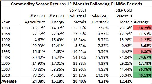
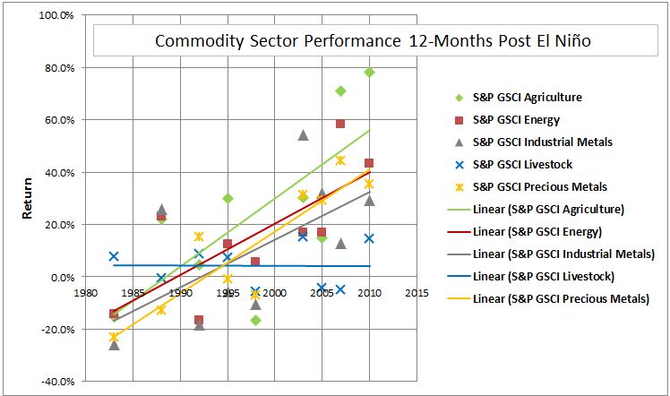
What is most interesting is commodity sector returns have increased through time in each of the 12 months following the temperature rise since the El Niño of 1982-1983. This is true for every sector except livestock. On average the annual increase using El Niño periods for agriculture is 2.6%, energy 2.0%, industrial metals 1.8% and precious metals 2.4%.

Source: S&P Dow Jones Indices and http://ggweather.com/enso/oni.htm

This El Niño may be just another potential boost with a little more octane than in history that can act as a catalyst for commodities.


The posts on this blog are opinions, not advice. Please read our Disclaimers.

One Year of NaMo and India’s capital market

Contributor Image
Mahavir Kaswa

Former Associate Director, Product Management

S&P BSE Indices

One year ago (in May 2014), the majority of the citizens of India voted for NaMo (Mr. Narendra Modi, Prime Minister of India), with hopes for “Aache Din” (days of prosperity) for the common man of India through the eradication of corruption, increased transparency, faster growth, recuperation of black money stashed abroad, and improved infrastructure, among other things. Modi also had the daunting task of putting in place things that were left a mess, inherited from the prior government.

Modi started his duty as Prime Minister even before taking oath by inviting the SAARC (South Asian Association for Regional Cooperation) leaders for his oath taking ceremony.  This sent a strong message to the world that he meant business.  As soon as he took office, Modi initiated a slew of measures to change the image of India, such as starting the “Swacch Bharat Abhiyan” (Clean India Mission) and the “Make in India” campaigns, improving the ease of doing business in India, improving relations with foreign countries, implementing measures to revamp Indian railways, and passing insurance bills and GST bills (passed in a lower house).  Modi has also ensured that top-level corruption will practically disappear.

There are few factors that acted in favor of the NaMo government. One of those was the decrease in oil prices, which helped keep a tab on the country’s current account deficit, therefore helping to decrease inflation. The Reserve Bank of India complemented this by reducing interest rates by 25 bps on two separate occasions.

Amid these occurrences, there are indications that India’s economy is reviving, and experts are saying that soon India’s GDP growth rate will overtake that of China.

For more than a decade, foreign portfolio investors and foreign institutional investors (FPIs and FIIs) have been pouring money into the Indian capital markets, except during the financial crises of 2008 (–FPIs and FIIs were net sellers, selling a total of INR 41,200 crores of equities and debt). Now, India is one of the most preferred destinations for FPIs and FIIs. During the past year, the net investments of FPIs and FIIs added up to more than INR 100,000 crores in equities and INR 170,000 crores in debt. [1]

[1] Source: https://www.cdslindia.com/publications/FIIreports.html

Capital Market Performances over the Past One-Year Period Ending May 15, 2015

The past month (April 15, 2015, to May 15, 2015) has been a bear market; out of 22 trading sessions, 15 ended in the red, eroding investor wealth by more than 5%. India’s bellwether index, the S&P BSE SENSEX, is hovering around a six-month low and closed at 27,324 on May 15, 2015.  The index increased by 16% (including dividends) during the trailing 12-month period before that close.

As of May 15, 2015, the S&P BSE AllCap, a broad benchmark index in India, has outperformed the S&P BSE SENSEX by a margin of 8% (the S&P BSE AllCap yielded 24% during the past one-year period. Among the other size indices, the S&P BSE MidCap and the S&P BSE SmallCap both returned 41%, while the S&P BSE LargeCap returned 18%.

On the sector front, the S&P BSE Healthcare was the best-performing index, returning 59%. Meanwhile, the S&P BSE Energy was the only index with a negative return, down 7% during the same period, primarily due to the fall in oil prices.

allcap

Source: www.asiaindex.co.in Data from May 15, 2014, to May 15, 2015. Index performance based on total return. Past performance is no guarantee of future results. Table is provided for illustrative purposes only.

During last couple of months the T20 cricket fever was at its peak, thanks to the Indian Premier League, with AB de Villiers and Chris Gale being the players that stand out most due to its flamboyant batting.  Modi’s “inning” is certainly not a T20 or a one-day cricket match, but rather it is a test that will play out over five years. Modi started his maiden inning well by unveiling his vision for India during his first year; however he needs to build a strong foundation for India’s development before dreaming of reelection in 2019.

Note: The S&P BSE AllCap Series (see Exhibit 1), which includes five size and ten sector indices, was launched on April 16, 2015. Historical index values prior to the launch date are back-tested. 

The posts on this blog are opinions, not advice. Please read our Disclaimers.

Hope Over Experience

Contributor Image
Craig Lazzara

Former Managing Director, Index Investment Strategy

S&P Dow Jones Indices

Second marriages, Dr. Johnson reminds us, sometimes represent the triumph of hope over experience. The same applies to many arguments for active investment management.

Last week, e.g., The Wall Street Journal announced, with a note of triumph, that “So far this year, actively managed U.S. stock mutual funds have outperformed funds trying to clone the market’s overall performance.”  As of April 30, the Journal reported, the average active fund was up by 2.25%, against the 1.92% return of the S&P 500.  Leaving aside methodological issues like how the 2.25% is computed (simple average or asset-weighted average?) and the statistical significance of a 33 basis point difference, there’s a more important difficulty with this comparison.

Despite my personal affection for the S&P 500, it is not the appropriate benchmark for all U.S. equity portfolios, let alone for an arbitrary average of mutual funds.  In the four months ended April 30, e.g., the S&P 400 MidCap Index rose by 3.74%, and the S&P 500 Growth Index was up 2.96%.  So if the Journal’s average fund tilted toward midcap or growth stocks, it would automatically gain an advantage in this period.  In fact, almost the entirety of the 33 basis point gap might be due to the tendency of equal-weighted indices to outperform their cap-weighted counterparts.  (In the first four months of 2014, the S&P 500 Equal Weight Index was up by 2.21%.)

The proper way to benchmark active managers is one by one.  For some strategies, the cap-weighted S&P 500 will be perfectly appropriate; for others, different benchmarks will provide the asset owner with more insight.  The point of benchmarking, after all, is to understand to what degree a manager’s results come from factor tilts which can readily be indicized.   If fund owners do not calculate their manager’s outperformance, or “alpha,” against the correct benchmark, they are at great risk of paying active fees for performance that could have been obtained passively.

And here, of course, lies the problem for all active investors: there is no natural source of alpha.  If I’m to be above average, someone else must be below average, and the weighted sum of the winners’ outperformance must be exactly equal (before costs) to the weighted sum of the losers’ underperformance.   Passive investors avoid becoming the source of someone else’s alpha.  It’s a strategy firmly founded on experience, rather than hope.

The posts on this blog are opinions, not advice. Please read our Disclaimers.

Harvesting the Size Factor Premium

Contributor Image
Justin Sibears

Managing Director, Portfolio Manager

Newfound Research

Factor investing is a well-documented method of generating excess returns, but some of the practical aspects of it are often overlooked in academic research, which tends to focus on “pure” premiums. Investors wanting to access these factors – size, value, volatility, momentum, etc. – are presented with a number of investment alternatives that aim to harvest the factor premium in different ways, and deciding which to utilize can be difficult.

For the size premium, one obvious choice is an ETF tracking the S&P SmallCap 600 index. However, other options may look surprisingly similar. The chart below shows the S&P SmallCap 600 index along with the S&P 500 index and the S&P 500 Equal Weight index.

Capture

Performance statistics of the three indices over the period from January 1995 to February 2015 are shown below.

Capture

From this we can see that the equal weight version of the S&P 500 behaved a lot like the S&P SmallCap 600 with slightly better risk-adjusted returns.

If we look at the alpha of these two indices over rolling two year periods, we see that they exhibit very similar trends. The average alpha for the S&P SmallCap 600 index was 2.5% compared to 2.4% for the S&P 500 Equal Weight index, but the S&P SmallCap 600 index’s alpha was over 50% more volatile.

Capture

While this analysis does not guarantee that these out/under-performance trends have been directly attributable to the “size” factor in both indices, it does hint that there is at least some overlap in risk factors underpinning the two.

One important consideration when dealing with factors is how they will be used within a strategy. Within our U.S. Factor Defensive Equity strategy, we consider five factors: momentum, value, dividend growth, low volatility and size. These are weighted in proportion to their inverse volatilities. Therefore, we care more about the risk-adjusted return of the factor rather than simply the factor premium. Because the risk-adjusted return of the S&P SmallCap 600 index is right in line with the S&P 500 index, accessing size in this manner would not have benefited the strategy; there was not really any risk-premium.

This is just a specific example of a well-documented phenomenon.

The size premium is arguably one of the weakest of the factor premiums, especially in recent history. In their paper “Quality Minus Junk”, Assness, Frazzini, and Pedersen of AQR examined different market cap stocks sorted based on their quality and found that the size premium is most pronounced in high quality stocks. Many small-cap indices are skewed toward lower quality stocks, and while the S&P SmallCap 600 index screens companies for profitability, we would expect a higher proportion of large-cap stocks to be classified as “quality stocks”, in general.

We chose the S&P 500 Equal Weight index ETF as our size factor not because it is the purest exposure to the size premium, but because its methodology complements our other factor exposures. If we had chosen the S&P SmallCap 600 or any other of a number of market-cap weighted small-cap indices, we would likely have less exposure to the beneficial quality factor.  Equally weighting the index also pairs with our value factor by avoiding many of the glamour stocks, and rebalancing back to equal weight captures benefits of mean reversion.

Ultimately, having a pure factor exposure may be ideal in an academic setting with a 70+ year investment horizon, but on the practical level where we operate, the best outcome is likely realized by utilizing more robust indices and combining them in an intelligent way.

————————————————————————————————————————————————————–The views and opinions of any contributor not an employee of S&P Dow Jones Indices are his/her own and do not necessarily represent the views or opinions of S&P Dow Jones Indices or any of its affiliates.  Information from third party contributors is presented as provided and has not been edited.  S&P Dow Jones Indices LLC and its affiliates make no representations or warranties of any kind, express or implied, regarding the completeness, accuracy, reliability, suitability or availability of such information, including any products and services described herein, for any purpose. 

The posts on this blog are opinions, not advice. Please read our Disclaimers.

PMIs vs. Pan Asia Bond Markets

Contributor Image
Michele Leung

Former Director, Fixed Income Indices

S&P Dow Jones Indices

The China PMI continued to show deterioration while the headline PMIs for other countries like South Korea, Taiwan and Indonesia also ticked down.  The market is expecting more easing to come in order to support the growth.

As of May 15, 2015, the S&P Pan Asia Bond Index rose 0.10% this month, bringing the year-to-date (YTD) total return to 2.40%, yet the individual market showed mixed performance. The S&P Indonesia Bond Index continued the slide and fell another 0.79% in May. Please see exhibit 1 for YTD and 1-Year total return performance.

On the other hand, China is the best performer of the month. The S&P China Bond Index rose 0.70% MTD and 2.85% YTD, led by the gains in the corporate bonds. On the back of the strong Chinese equities rally, the S&P China Convertible Bond Index jumped 11.4% YTD. The Chinese offshore RMB bond market, represented by the S&P/DB ORBIT Index also went up 1.94% YTD. Though the index’s yield tightened by 33bps to 4.37%, it offers yield pick-up over the onshore bond market.

Exhibit 1: Total Return Performance of the S&P Pan Asia Bond Index

20150520

The posts on this blog are opinions, not advice. Please read our Disclaimers.