Get Indexology® Blog updates via email.

In This List

Picking Factors Beats Picking Winners

Benchmarking target date funds (TDFs) with market-driven indices ≠ performance chasing.

Market Myopia

SPIVA U.S Scorecard: Measuring the Effectiveness of Passive Equity Investing in the US

Five-Year Itch in the Condo Market?

Picking Factors Beats Picking Winners

Contributor Image
Jodie Gunzberg

Former Managing Director, Head of U.S. Equities

S&P Dow Jones Indices

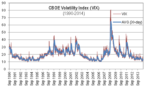
If you were to ask a few commodity experts what is going on with precious metals (like an attendee did at our 8th annual commodities conference), the answer is long-winded since the story is different for each commodity.  A few years back, the answer was far more simple where it depended on the RORO environment that overpowered supply and demand models of individual commodities and spiked correlations. The quantitative easing caused all the commodities to move together, and the excess inventories with destroyed demand caused them to fall (except gold – the safe haven that acts like currency.)

Fast forward to today and that has all changed. As inventories have depleted, supply shocks have become prevalent so correlations dropped. Sounds like an active manager’s dream, right? Maybe not. While this environment hovers near equilibrium causing swings across the zero line, there are abundant opportunities, winners and losers.  So what’s the problem? Picking the winners.  At our conference, we asked about the best calls for the year and got a mixed bag of answers. For single commodity plays, we heard long sugar, copper, nickel and short natural gas. For spreads, we took a poll of the registrants to uncover their beliefs about the best trade that resulted in about 40% corn-wheat, followed by about 33% WTI-Brent and 27% copper-aluminum. There are no clear answers and at this time when commodities seem to be mean reverting, the risk of being wrong and getting whipsawed is high.  That is why diversification is important.

The points of majority agreement at the conference according to the polls, were that 53% felt investors will move money from active to passive, and 77% felt over the next three years that money will flow into commodities. Why? Diversification.  Current correlations and roll yields indicate commodities are still an effective asset class in a portfolio, but not just via plain beta.

The return opportunity likely sits with assuming identified risks; therefore, risk premium strategies applied in a systematic way to capture variable contract expirations, less typical roll windows and different weighting schemes may be how to get the value from beta.  In other words, using a diversified set of factors may be the way to capture commodity risk premiums.

The newly launched Dow Jones – RAFI Commodity Index (DJ-RAFI CI) is designed to be a fundamental factor-weighted, broad-market commodity index with a modified roll. Notice although the DJ-RAFI CI has high correlations (3 yr) with the DJCI and S&P GSCI of 0.97 and 0.90, the current returns are better. This is the reflection of the power of factor investing in this environment. 

Source: S&P Dow Jones Indices. Data from Jan 2, 2014 to Sep 11, 2014. Past performance is not an indication of future results.


The posts on this blog are opinions, not advice. Please read our Disclaimers.

Benchmarking target date funds (TDFs) with market-driven indices ≠ performance chasing.

Contributor Image
Philip Murphy

Former Managing Director, Global Head of Index Governance

S&P Dow Jones Indices

At their core, TDFs are professionally managed asset allocation policies. Questions therefore naturally arise around how (or even whether) they should be benchmarked with market indices. The investor(s) on whose behalf a particular policy is undertaken may have highly subjective criteria for success that have very little to do with outperforming market benchmarks. For example, if I have a specific goal toward which I earmark some assets, in any given year I probably care more about making progress toward my goal than I do about outperforming the stock market.

However, we should not be led astray by false choices. We do not have to choose between market-based or goals-based benchmarks – we need to intelligently use both. If my large-cap fund manager consistently underperforms the S&P 500, there may be a very good reason for it. Maybe she is taking a lot less risk. Or maybe not. In either case, I ought to know about it, and having the S&P 500 as a proxy helps me to understand the opportunity, and risks, available in large-cap stocks. The market benchmark helps me make an informed decision about who should manage my hard-earned capital, as well as the overall portion of my resources that I should devote to the large-cap category.

Many stakeholders get hung up on how to benchmark TDFs because they include multiple asset classes and provide more holistic investment programs than single-asset class funds. Investors should be aware that benchmarking with market-based proxies enables better informed choices. For example, some TDF managers generally underperform market-based benchmarks because their policy is to invest more in fixed income than competitors. There is nothing wrong with that and many investors seek such exposure. To understand why managers perform in certain ways, referencing market-based benchmarks of the TDF universe provides valuable information. Benchmarking custom TD strategies is no different. Whether a plan selects a custom solution to create a more diverse asset allocation, have more control over underlying managers, or build a glide path that addresses unique plan demographics, the only way to fully gauge the impact of the decision to go custom is to compare results, and asset allocation, with a market-based proxy. In some instances, it may be eye opening for retirement plan sponsors to see that their custom glide path is not very different from the market consensus. In others, comparing the custom glide path with the market consensus may validate the decision to go custom. Either way, it’s better to be mindful of overall opportunities and risks within the TDF category, and to be conscious about deviating from the consensus where appropriate, via reference to a market benchmark.

If you are interested in a comparison of TDF performance with a market-based consensus glide path, as represented by the S&P Target Date Index family, please see our latest Target Date Scorecard.

The posts on this blog are opinions, not advice. Please read our Disclaimers.

Market Myopia

Contributor Image
Tim Edwards

Managing Director, Index Investment Strategy

S&P Dow Jones Indices

As investors, we necessarily rely on history.  How we analyse that history is particular to each investor – some will look for technical patterns, some at fundamental data, still others will build quantitative models.  But all of us need data, and history is our only source.

We may have to rely on history; we don’t have to fall prey to what the behavioural economists would call “recency bias.”  Indeed, taking a longer-term view can provide invaluable perspective.  Two popular views of the current environment provide a specific example:

  • Unprecedented levels of low volatility driven by central bank stimulus in the past two years have caused the market to become complacent; valuations are proof positive of a stock market bubble.
  • Moreover, when the bubble “pops”, the modern market of leveraged derivatives, high frequency trading and globalized capital has engendered a greater risk of systemic volatility and, when things get interesting they are going to get very interesting, very fast.

A running thread in both theories is the “risk on/risk off” dynamic.  We are now either in utter turmoil or dulcet calm, each exaggerated by the rapid and capricious response of a highly mobile and sophisticated investment community.

An examination of recent history would appear to support these claims.  It certainly looks like a new, more volatile dynamic since the beginning of the financial crisis.  And as we all know, volatility has registered remarkably low levels more recently.  Are we set to continue in a bar-belled digital age of all volatility, or none?

Pic1

Now, there is a good reason why the chart above begins in 1990.  The VIX data begin then; we don’t know what the VIX would have been during the “black Monday” crash of 1987 (although there are clues, they suggest the answer is higher than at any point subsequently).  Nor do we have any idea of the appropriate level of implied volatility during the “Knickerbocker Crisis” of 1907.

However, what we do have – in the Dow Jones Industrial Average – is a market bellwether with a remarkably comprehensive history.  Here is 118 years of realized monthly volatility in the DJIA:

Pic 2

Clearly, long periods of low volatility are not unusual.  Whatever else may have been occurring in the 1960’s – and despite a war and an assassinated president – there wasn’t much turmoil in U.S. blue chips.  Extended periods of both high and low volatility have been a part of the market since it was invented.

Moreover, viewed in this longer perspective, the past decade appears thoroughly ordinary.  A bit less volatile than average recently, a bit more volatile than average during the 2000s.  But, in the grand scheme of things, it is business as usual. 

Pic 3

The phrase “it’s different this time”, uttered by a financial professional, typically provides grounds for mockery.  Sometimes it’s true.  But if you don’t take the long view, it’s hard to see whether this time is actually different at all. 

The posts on this blog are opinions, not advice. Please read our Disclaimers.

SPIVA U.S Scorecard: Measuring the Effectiveness of Passive Equity Investing in the US

Contributor Image
Aye Soe

Former Managing Director, Global Head of Core and Multi-Asset Product Management

S&P Dow Jones Indices

The SPIVA U.S Scorecard, published twice a year, is a de facto scorekeeper of the active versus passive debate. It measures the performance of the actively managed domestic equity funds across the various market capitalizations and styles. The results for the 2014 mid-year Scorecard are in and reveal very few surprises. Here are some of the key findings:

  1. The past 12 months have been quite a bullish ride for the domestic equity markets. The S&P 500®, S&P MidCap 400® and S&P SmallCap 600® returned 24.61%, 25.24% and 25.54%, respectively. During the same period, 59.78% of large-cap managers, 57.84% of mid-cap managers and 72.79% of small-cap managers underperformed the above-mentioned benchmarks.
  2. The past five years have been marked by the rare combination of a remarkable rebound in domestic equity markets and a low-volatility equity environment. Against that backdrop, over 75% of them across all capitalization and style categories failed to deliver returns higher than their respective benchmarks.
  3. On the international front, approximately 70% of global equity funds, 75% of international equity funds, 81% of international small-cap funds and 65% of emerging market funds underperformed their benchmarks over the past one year.
  4. For the first time since adding the International Equity category to the Scorecard, the report witnessed the majority of the international small cap managers underperforming the benchmark. The outcome was slightly more favorable when viewed over three- and five-year horizons, as over 50% of managers outperformed the benchmark.

The results unequivocally show the effectiveness of indexing in the U.S equity market. Together with the Persistence Scorecard, the results highlight that not only it is extremely difficult for active funds to outperform the benchmarks, it is near impossible to find that skillful manager who can effectively do so consistently year after year.

The posts on this blog are opinions, not advice. Please read our Disclaimers.

Five-Year Itch in the Condo Market?

Contributor Image
Marya Alsati

Former Product Manager, Commodities, Home Prices, and Real Assets

S&P Dow Jones Indices

In a prior post, we analyzed the holding period of single-family homes using the S&P/Case-Shiller Home Price Index Series. We quantified the holding period with the rolling return for each period in question—10-, 7-, 5- and 3-year holding periods. In this post, we use the same holding period concept to look into whether the condo market behaves differently than the single-family homes market and assess whether the same pattern holds across the different cities. The cities investigated are Boston, Chicago, Los Angeles, New York and San Francisco. We found that the five-year holding period was the worst-performing holding period across the five cities.

In the single family market, the longer 10-year holding period fared better than the shorter duration periods, and we found that of the shorter duration periods, the three-year period performed better than the five-year period. In the condo market in all five cities, the five-year period experienced the largest decline. To rule out that the cause of the five-year decline was the trough in 2012, we looked at the holding period’s behavior prior to 2012, and we found that the time period that experienced the largest decline was indeed the five-year period.

So what is the cause of this five-year itch? On average, American home owners sell and move every five-to-seven years according to the Census, for reasons ranging from the house being too small to a job transfer. Many variables that drive single-family homes drive the condo market: upgrade, change in demographic, the need to move to a single family home, neighborhood changes, cash in equity, etc. Property owners are less likely to base their decision to buy or sell on the state of the market, and they are more likely to make the decision for personal reasons, because it’s where they live and the place most likely to affect their quality of life.

We did find that while the five-year period was the one that fared the worst, the range of returns—gains and losses—varied across the five cities. The following charts show the different holding periods for Chicago and Los Angeles.

Capture

Capture

In the 10-year holding period, Chicago faired worst having the smallest gain of 93% and the largest decline of 20%. Los Angeles had the maximum gain of 300%. New York didn’t enter into negative territory in the ten year holding period with the smallest gain being 37%. Overall, home owners could benefit from longer holding periods in the condo market, albeit differently depending on their geographic location, but they may need to watch out for that five-year itch.

The posts on this blog are opinions, not advice. Please read our Disclaimers.