Get Indexology® Blog updates via email.

In This List

High Quality Munis Held Back by Puerto Rico Storm

Less [Information] May be More…

Commodities Fall at the Start of Autumn

Jekyll & Hyde: The U.S. Preferred Stock Market

Real Data on Healthcare

High Quality Munis Held Back by Puerto Rico Storm

Contributor Image
J.R. Rieger

Former Head of Fixed Income Indices

S&P Dow Jones Indices

The S&P Municipal Bond Puerto Rico Index is down over 16% since mid-year and over 20% for the last 12 months.  The ‘storm’ has continued into October as the index is down 2% month to date.

The Puerto Rico bond market debacle weighs on the rest of the municipal bond market despite its relative high quality. For the year to date, tax-free investment grade municipal bonds tracked in the S&P National AMT-Free Municipal Bond Index are down over 3.5% as yields have risen by about 100bps. (As a comparison, investment grade corporate bonds tracked in the S&P U.S. Issued Investment Grade Corporate Bond Index are down just about 2.5% as yields have risen by about 50bps).

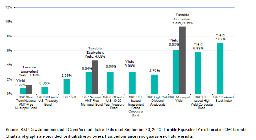
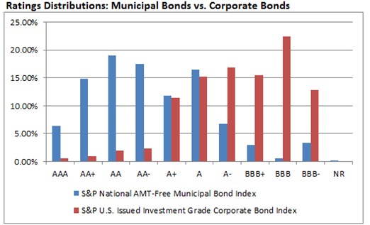
A quick look at the quality of investment grade municipal bonds compared to the corporate bond market can be seen in the graph below.

Source: S&P Dow Jones Indices LLC and/or its affiliates. Data as of September 16, 2013. Charts and graphs are provided for illustrative purposes. Past performance is no guarantee of future results.  Moody’s, S&P  and Fitch Ratings are used.  Ratings categories based on index methodology: if rated by only one ratings agency, that rating is used. If rated by more than one rating agency, the lowest rating is used.
Source: S&P Dow Jones Indices LLC and/or its affiliates. Data as of September 16, 2013. Charts and graphs are provided for illustrative purposes. Past performance is no guarantee of future results. Moody’s, S&P and Fitch Ratings are used. Ratings categories based on index methodology: if rated by only one ratings agency, that rating is used. If rated by more than one rating agency, the lowest rating is used.

Join S&P Dow Jones Indices for a Municipal Bond Event in New York, NY on October 17th

Attend this half-day seminar and hear financial industry leaders discuss the challenges facing the municipal bond market in a rising interest rate environment. Keynote speaker, Jim Lebenthal, co-founder of Lebenthal Asset Management, will examine the overall health of the market and explore current opportunities in U.S. infrastructure and municipal bonds. Our panel moderators include Tom Keene, anchor of Bloomberg Surveillance and Frederick Gabriel, Editor of InvestmentNews. CFA®, CIMA®, CFP® Credit Available.

Register Now: http://now.eloqua.com/es.asp?s=795&e=746099&elq=d8d00fceb16d47be87cb548953325adf

The posts on this blog are opinions, not advice. Please read our Disclaimers.

Less [Information] May be More…

Contributor Image
David Blitzer

Former Managing Director and Chairman of the Index Committee

S&P Dow Jones Indices

For most investors and many economists the first Friday of the month means the Employment Report at 8:30 AM eastern time.   The much-watched first official bit of economic data for the month just ended sets the tone for the markets and for the weekend investment advice columns.   This weekend the economic-investing blogosphere had little to debate beyond what to watch instead of the unemployment rate.  Those hoping that all will be revealed in the next Employment Report once the government is back to work could be disappointed.  On the usual schedule the Bureau of Labor Statistics would be doing their survey this coming week.  If the government is still shut down next weekend, we might have to wait even longer to argue over the accuracy of the unemployment rate.

Don’t despair.  Investors may be better off with fewer economic statistics and a little less debate.   Some years ago an academic paper title “Trading is Hazardous to Your Wealth” showed that for many individual investors, the more often they traded, the worst their results were.  Portfolio turnover averaged 75% for the investors studied and their returns lagged the market by a substantial margin.  The authors of the study suggest that investor over-confidence drove the excessive trading. (The paper can be found here.)

Other research that shows index investing outperforms some 60%-70% of active fund managers is based on buy-and-hold investing.  In the analyses the index fund is assumed to be held for one, three or five years with index level minimal turnover while the active fund manager trades, often surpassing the 75% turnover noted in the Trading is Hazardous study.  All that churning drives up costs. If the trading is successful, the churning also drives up tax liabilities.  Those costs are a key factor in the studies results.  (Index vs. active research is here.)

Most of us would like to see the government get back to work – after all we’re still paying our taxes so they should be doing something for our money – and most would not want to go without ever seeing another economic statistic or unemployment rate report.   But for the moment maybe we can enjoy worrying about something else this weekend.

The posts on this blog are opinions, not advice. Please read our Disclaimers.

Commodities Fall at the Start of Autumn

Contributor Image
Jodie Gunzberg

Former Managing Director, Head of U.S. Equities

S&P Dow Jones Indices

Hear the impact of the Syrian tension on oil and why the effect on copper might be different than in historical wars.

The S&P GSCI® and Dow Jones UBS Commodity Index both fell in September, returning -3.4% and -2.6%, respectively.

Some highlights from the S&P GSCI® include:

  • Energy: Despite losing 4.5% on the month, S&P GSCI Energy is up 3.8% for the year.
  • Precious Metals: The S&P GSCI Precious Metals was the weakest sector in September, returning -5.3%.
  • Agriculture: Grains were down 2.9% in September mainly due to corn’s 8.4% loss.

Read on for more S&P GSCI trends.

Explore our S&P GSCI offerings:

www.spdji.com/index-family/commodities/all

Some highlights from the DJ-UBS Commodity Index include:

  • Industrial Metals: Industrial metals were up 1.6% for the month, with copper carrying the sector.
  • Energy: Among subindices in the energy sector, unleaded gasoline declined the furthest, down 7.9%.
  • Softs: With the exception of coffee, down 2.2%, all the commodities in the softs sector were positive in September.

Read on for more DJ-UBS Commodity Index trends.

Explore the DJ-UBS Commodity Index offerings: 
www.djindexes.com/commodity/

The posts on this blog are opinions, not advice. Please read our Disclaimers.

Jekyll & Hyde: The U.S. Preferred Stock Market

Contributor Image
J.R. Rieger

Former Head of Fixed Income Indices

S&P Dow Jones Indices

Preferred stocks have a split personality, part equity and part bond. The bond characteristics of preferred stock has, at least for the time being, become the ‘Mr. Hyde’ of the asset class.  The high dividends that preferred stock owners enjoy can be compared to future interest payments of bonds. Like bonds, the prospect of the Fed tapering and causing rising interest rates has helped bring the 2013 YTD returns for the S&P U.S. Preferred Stock Index to -1%.  Meanwhile, the S&P 500 has seen over 19.6% total return.

Source: S&P Dow Jones Indices LLC and/or its affiliates. Data as of October 3, 2013. Charts and graphs are provided for illustrative purposes. Past performance is no guarantee of future results.

The dividend cash flow ends up being an important characteristic of the preferred asset class. With a yield over 7%, the S&P U.S. Preferred Stock Index reflects a yield of over 120bps higher than U.S. high yield bonds as tracked by the S&P U.S. Issued High Yield Corporate Bond Index.

Asset Class Yields September 30, 2013


Over the long haul, those higher dividends have helped create a total return advantage over the S&P 500.  A five year look back tells the story as the S&P U.S. Preferred Stock Index has returned over 16%, while the S&P 500 returned over 11%.

Source: S&P Dow Jones Indices LLC and/or its affiliates. Data as of October 3, 2013. Charts and graphs are provided for illustrative purposes. Past performance is no guarantee of future results.

Which future will it be for U.S. Preferred Stock, Dr. Jekyll or Mr. Hyde?


The posts on this blog are opinions, not advice. Please read our Disclaimers.

Real Data on Healthcare

Contributor Image
David Blitzer

Former Managing Director and Chairman of the Index Committee

S&P Dow Jones Indices

One of the biggest things missing from the never ending healthcare debate is hard data.  “Man-on-the-street” interviews reveal that some people don’t realize that Obamacare, the Patient Protection and Affordable Care Act and the ACA are all one and the same.  The absence of factual data is most crucial when examining the cost of healthcare.  One reason is that healthcare is a huge industry spread across the country and accounting for between a fifth and a sixth of GDP.  A second issue is that detailed data dealing with individual is protected by law and unavailable.

The new S&P Healthcare Claims Indices launched today are a big step toward relieving the lack of data.  These indices cover costs and utilization of inpatient and outpatient healthcare services and prescription drugs.  They are based on actual health insurance claims with data provided by over 30 large national insurance plans. These indices will provide hard numbers to answer questions about how the cost of healthcare is rising or falling across the U.S. and for selected regions, states and cities. More information and the press release can be found here.

Branded prescription drugs are usually sold by only one company which developed the drug and owns a patent on the drug giving it a monopoly position in the market for that drug. Generic drugs are often sold by a number of companies, the patent may have expired and the market is more competitive.  Since the S&P Healthcare Claims Indices collect data on both kinds of drugs separately, we can track the difference.  The chart shows the unit costs for branded and generic. Generic unit costs vary widely, occasionally falling and never rising faster than 5% annually.  Branded drug costs rise at 10% or more annual and appear to be accelerating.

healthcare drugs(3)

Many people see hospitals with their increasingly complex technology and large staffs as the big factor in rising healthcare expenditures.  Inpatient hospitalization costs are rising, but costs for outpatient care are actually rising faster, as seen in the second chart.  One cause may be efforts to move tests, examinations and routine surgery to outpatient centers from hospitals.  Whatever the underlying cause is, concentrating only on hospitals won’t control some rapidly rising health care costs.

healthcare drugs(2)

The posts on this blog are opinions, not advice. Please read our Disclaimers.