Get Indexology® Blog updates via email.

In This List

Stocks and Fed Fears

A safer bet?

Low Volatility: Success or Failure?

The Other Shoe?

Thinking About P/E Ratios

Stocks and Fed Fears

Contributor Image
David Blitzer

Former Managing Director and Chairman of the Index Committee

S&P Dow Jones Indices

Only a month ago the market was in love with the Fed and Ben Bernanke was a hero for helping the market move from 1350 in November to about 1670 in May.  Now the central bank is a villain as the yield on 10 year treasuries tops 2%.

Interest rates have risen in the last couple of weeks, but it is too soon to tell if this is the beginning of the long expected return to higher yields or if it’s random noise and over-reaction.  The fear is that a real change is upon us.  Why would interest rates rise? Four possibilities: inflation, stronger economic growth, a shift in Fed policy or just random noise in markets.  We can set inflation aside – it hasn’t changed in many months except for gasoline prices which appear to be slightly lower.  There is little evidence that people are worried about inflation – no news or comments, no buying in advance, and no excitement about gold.

Second: stronger economic growth.  For every five people worried about inflation, maybe there is one who expects stronger economic growth.  A pickup in the economy would push interest rates higher, but it would also boost profits and the market.  The evidence for a stronger economy is mixed – housing looks better, confidence is up but the job market is still worrisome.  Were interest rates being pushed up by the economy we would be seeing something in the economic numbers.

Next reason: the Fed.  In the last couple of weeks the Fed has said little and done nothing to even hint at a change in policy. Bernanke’s last speech was at the Princeton University commencement on June 2nd – and he said it was not about interest rates. The Beige Book, the FOMC’s report on the economy, didn’t see much change and the fed funds rate hasn’t moved.

Noise and worries:  Markets move on rumors, worries, hopes and fears and little else all the time.  Lately, complaints that the European Central Bank didn’t lower rates at its last meeting, worries that Japan won’t really try to restructure of its economy while the yen rebounds,  and stories about the 1994 bonds collapse. For those who don’t remember, in 1994 the Fed did tighten, interest rates rose, investors in mortgage backed securities lost  money. The following year the stock market started one of the best five year runs in history.

Wait until next week when the Fed’s policy unit, the FOMC, meets on June 18th and 19th.

The posts on this blog are opinions, not advice. Please read our Disclaimers.

A safer bet?

Contributor Image
Jodie Gunzberg

Former Managing Director, Head of U.S. Equities

S&P Dow Jones Indices

http://www.pensionsage.com/pa/a-safer-bet.php

Read the article in PensionsAge by Peter Carvill, looking at the shifting commodities landscape.

In recent decades, investment by pension funds into commodities has been seen as something approaching what may be described as a way to counter-balance the risks from traditional stocks and bonds. As The Role of Commodities in an Institutional Portfolio states: “The case for commodities is based largely on their historical tendency to offer returns that exhibit a low correlation with those of stock and bond market indices. Although commodities may be volatile, their low correlation with traditional investments can result in a significant diversification benefit.” …

… “The real benefit of commodities, says S&P Dow Jones Indices head of commodities indices Jodie Gunzberg, is that…” A safer bet?

The posts on this blog are opinions, not advice. Please read our Disclaimers.

Low Volatility: Success or Failure?

Contributor Image
Craig Lazzara

Former Managing Director, Index Investment Strategy

S&P Dow Jones Indices

One of the consequences of May’s shift in leadership of the U.S. equity market from defensive to cyclical sectors has been the underperformance of most (if not all) low volatility strategies. Does this mean, as some commentators have suggested (e.g. see http://www.indexuniverse.com/hot-topics/18860-when-low-volatilitty-bites-back.html?showall=&fullart=1&start=4), that low volatility strategies “failed?”

Making a judgment of success or failure, about low vol or any other investment strategy, requires us to identify the goal against which the strategy is to be evaluated. Otherwise said, she who would design strategy indices must decide, before she starts, how she’ll know she’s finished.

Click the following link to learn more:
http://us.spindices.com/documents/research/research-the-limits-of-history.pdf

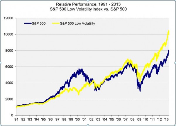
In the case of low volatility indices, the objective is to deliver a pattern of returns similar to that of the parent index, attenuating both increases and decreases. Like this:
Low Vol and S&P 500

Over long periods of time, most low vol indices have outperformed their parents, as the graph above illustrates for the S&P 500. But their goal is not outperformance per se — their goal is, well, lower volatility. As long as they deliver against that objective, low volatility indices will be doing what they were designed to do.

The posts on this blog are opinions, not advice. Please read our Disclaimers.

The Other Shoe?

Contributor Image
Craig Lazzara

Former Managing Director, Index Investment Strategy

S&P Dow Jones Indices

One of the striking things about May’s U.S. equity performance was that although the market continued the strength it had shown between January through April, it was strong in a different way. http://us.spindices.com/documents/commentary/dashboard-us-20130531.pdf

For example, the best-performing sector in the first four months of the year was Utilities (up 19.74%); in May the Utilities sector declined -9.06%. At the other end of the spectrum, one of the worst-performing sectors earlier in the year was Technology (up only 5.54% while the S&P 500 was rising 12.74%). In May, Technology was among the best performers (up 4.55% versus 2.34% for to market as a whole). Not surprisingly, this shift away from more defensive sectors caused strategies like low volatility and high dividends, which had been stellar performers between January and April, to lag considerably in May.

One obvious contributor to the rotation in equity sector performance was an equally notable shift in the bond market. At the long end of the curve, yields rose by more than 40 basis points in May. The S&P/BGCantor 20+ Year US Treasury Index, which had risen modestly in the first four months of the year, declined -6.71% in May (its worst decline since April 2009).

It’s not hard to make the case (e.g., see http://online.wsj.com/article/SB10001424127887324423904578520970034006496.html) that as bond yields rose in May, higher-yielding equity sectors such as Utilities became less attractive to income seekers, leading to their underperformance. But what happens now? If bond rates continue to rise, how likely is it that the equity market will continue its recent strength? And if equities weaken, is it possible that the lead might shift to defensive sectors once again?

The posts on this blog are opinions, not advice. Please read our Disclaimers.

Thinking About P/E Ratios

Contributor Image
David Blitzer

Former Managing Director and Chairman of the Index Committee

S&P Dow Jones Indices

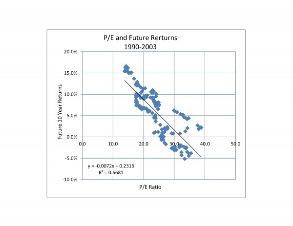
The chart below is  a scatter diagram comparing the P/E ratio to the price return on the S&P 500 over the next ten years.  P/E is defined as each month’s level of the S&P 500 divided by the earnings per share on the 500 over the trailing 12 months. Both the P/E and the index level are data, not forecasts.  The return over the next ten year is the index level ten years into the future divided by the index level used in the P/E calculation and stated as an annual return.  Since we want to look ten years into the future, the most recent data is April, 2003.

Source: S&P Dow Jones Indices

Before trying to forecast the market with the chart, remember that past performance is no guarantee of future returns. Further, the chart is based on the period from 1990 to 2003 so it doesn’t include such notable bits of history as the 2008 bear market or the 1987 market crash. Further, the statistics indicate that the P/E ratio only explains about two-thirds of the changes in market returns — not enough for a reliable guess about the future.


The posts on this blog are opinions, not advice. Please read our Disclaimers.