Get Indexology® Blog updates via email.

In This List

India's ETF Market: Examining Passive Investing's Continued Growth

Rising Rates' Repercussions

Commodities React to Conflict

Kensho Correlations

The S&P 500 in the Years of Rate Hikes

India's ETF Market: Examining Passive Investing's Continued Growth

Contributor Image
Koel Ghosh

Former Head of South Asia

S&P Dow Jones Indices

Market Resilience

The financial markets have been witness to numerous market cycles, trends, and crises, from the technology bubble in 2000 to the subprime housing crisis around 2007-08 and the collapse of Wall Street in 2009. 2020 brought the unexpected disruptor, coronavirus, and the ongoing pandemic changed the way markets and economies reacted. As with many disruptions, the first reaction was detrimental, with negative market reactions, as businesses were scrambling to adapt to the new environment. In March 2020, the S&P 500® dropped significantly, including its steepest one-day fall since 1987.1 It recovered from the low of 2,237.40 on March 23, 2020, to a high of 4,796.562 on Jan 3, 2022, a rise of 114%. The S&P BSE Sensex reacted similarly, with index levels falling to 25,981.24 on March 23, 2020, and a quicker recovery on Oct. 18, 2021, with a new high of 61,765.59; a rise of 138%, which has not been surpassed as of Feb. 8, 2022. Many other market indices such as the S&P Europe 350®, S&P/KRX Asia 100, S&P Japan 500, S&P/ASX 200, and S&P China 500 mimicked the recovery trend in other regions, showing the resilience of global financial markets and their ability to recover while adapting to new conditions.

The Shift to Passive

Investing styles and strategies are adapting to the new market, economic, and political dynamics that are compelling portfolio managers to review their objectives and goals. The growth in passive adoption is evident, with global assets under management having surpassed USD10 trillion and over 9,800 products as of December 2021.3 India also experienced a significant shift from being almost a purely active market, with minimal concentrated passive interest, to a boom in passive assets and number of passive products. With assets exceeding USD 50 billion and over 100 products,4 India’s growth in passive investment has ushered in new investor interest for diverse offerings.

The Active versus Passive Debate – Tilting the Scales

The debate of active versus passive has been ongoing. The recurring feature of benchmark outperformance is contributing to the adoption and growth of the passive investment space.

The S&P Indices Versus Active (SPIVA®) scorecard, which reflects on the trends of active fund management vis à vis benchmarks, has been a testament to the argument favoring indexing, as the statistics seem to tilt the balance in its favor. According to our SPIVA India Mid-Year 2021 Scorecard, over 86% of active Indian equity large-cap managers were beaten by the S&P BSE 100 over the previous 12-month period, and the numbers were similar for a three- or five-year horizon, with underperformance rates of 87% and 83%, respectively (see Exhibits 1 and 2). The index outperformance in large caps has been a recurring feature over the past few years. A new trend for the mid-/small-cap segment was a surprise for the market. Over the one-year period, 57% of active fund managers underperformed the S&P BSE 400 MidSmallCap Index, and the number was as high as 69% over the five-year horizon. This marks the beginning of opportunities for passive funds in this segment for India.

In a market that has had participants and product providers showcasing alpha in active portfolios for a long time, there is beginning to be an increased awareness on the merits of including indexing in investment strategies.

These SPIVA results are not unique to India, as similar results have been reflected over the one-year period across the SPIVA scorecards. Besides India, SPIVA is also published across another 10 markets, namely the U.S., Canada, Mexico, Brazil, Chile, Europe, MENA, South Africa, Japan, and Australia.

1 https://www.statista.com/statistics/1104270/weekly-sandp-500-indexperformance/#:~:text=On%20March%2012%2C%202020%2C%20the,one%2Dday%20fall%20since%201987.

2 Its highest level as of Feb. 8, 2022.

3 https://etfgi.com/news/press-releases/2022/01/etfgi-reports-global-etfs-industry-ended-2021-record-us1027-trillion

4 ETFGI report as of September 2021.

The posts on this blog are opinions, not advice. Please read our Disclaimers.

Rising Rates' Repercussions

Contributor Image
Fei Mei Chan

Former Director, Core Product Management

S&P Dow Jones Indices

Which of the figures in Exhibit 1 belong together?

Even if puzzles aren’t your strong suit, it’s not hard to observe that A and C are similar, as are B and D. A and C are not like B and D.

Exhibit 1’s puzzle is rooted in recent economic news, specifically in the consensus view that high inflation will lead to a sustained rise in interest rates. Whenever the prospect of rising rates looms, there is understandable concern over the reaction of the equity market. Conventional wisdom has been that rising interest rates should be bad for the stock market. But recent history has shown that that’s not necessarily the case. From 1991 through 2021, there have been 156 months when the 10-Year U.S. Treasury Yield rose. Of these, the S&P 500® gained in 115 (74%) of the months and declined in 41—i.e., in a rising rate environment, the market was more than twice as likely to do well as badly. The common belief that there is an inverse relationship between interest rates and equity market performance is no longer a sure thing.

By extension, the question of rising rates’ impact on factor indices also arises. Circling back to Exhibit 1, here’s the same graph, this time with some labels.

Consider the first grouping of three bars. These data tell us that in months when interest rates fell and the equity market also fell, the S&P 500 declined by an average of 3.8%%. The average outperformance of the S&P 500 Low Volatility Index was 2.3% in those months, while the average underperformance of the S&P 500 High Beta Index was 4.0%.

For strategies that are explicitly risk attenuators (like Low Volatility) or risk amplifiers (like High Beta), the condition of the equity market is much more important than the state of the bond market. For example, Low Volatility tends to outperform in bad markets while lagging in good markets, and High Beta tends to exhibit the opposite pattern of returns, regardless of whether interest rates are rising or falling.

As Exhibit 2 shows, the average return spreads of Low Volatility were positive in the months when the S&P 500 was down and negative in the months when the S&P 500 was up—and vice versa for High Beta. This dependency on the broader equity market was consistent regardless of the direction of the bond market.

The posts on this blog are opinions, not advice. Please read our Disclaimers.

Commodities React to Conflict

Contributor Image
Fiona Boal

Managing Director, Global Head of Equities

S&P Dow Jones Indices

Military and economic warfare rocked the financial markets in late February. Beyond the unthinkable human impact, the Russia-Ukraine conflict has had sizeable short- and long-term implications for commodities markets.

The S&P GSCI ended the month up 8.8%, driven higher by fears over the continuity of energy supplies in Europe, the dominance of Russia as a supplier of key industrial metals, the shutdown of international transport routes, and the importance of the region in global grain markets.

The raft of new economic sanctions, as well as announcements by major oil and gas multinationals that they will exit Russian operations and joint ventures, were sufficient to push Brent Crude Oil past the USD 100 per barrel level for the first time in seven years by the end of the month. Plans for a coordinated global crude stocks release did little to temper market sentiment. The S&P GSCI Energy rose 9.7% over the month. Longer term, the conflict has laid bare Europe’s dependence on Russian energy supplies and could hasten the shift to alternative supplies, both conventional and renewable. The energy complex may remain volatile, as the risk of losing access to Russian supplies hangs over the global economy.

In addition to energy, Russia is a major player in several energy transition metals. The S&P GSCI Industrial Metals jumped 7.3% in February, with aluminium touching a record high. Many of the metals markets have continued to be characterized by lingering COVID-19-related supply chain challenges, along with strong demand, and the restrictions on Russian raw materials have already had a cumulative impact on availability. The S&P GSCI Nickel rose 9.0% over the month. While the electric vehicle (EV) sector is a smaller user of nickel than stainless steel, the exponential rise in EV adoption has had a notable pull on nickel stocks.

Gold has been the laggard in the commodities complex for much of the past year, but it saw a resurgence in demand as a safe haven asset during the final days of February. The S&P GSCI Gold gained 5.8% over the month. Gold has historically performed strongly during periods of crisis but in the current ongoing tailwinds from central bank purchases, inflation expectations, and its role as the asset of last resort may be tempered by tightening monetary policy and competition from alternatives such as cryptocurrencies.

For the second month running, the S&P GSCI Palladium was one of the best performers across the commodity complex, taking the YTD return to up 30.9%. Russia is the world’s largest producer of palladium, which is an essential component in catalytic converters.

The S&P GSCI Agriculture ended the month 10.8% higher. Often referred to as the breadbasket of Europe, Ukraine accounts for 16% and 12% of global corn and wheat exports, respectively, while top wheat supplier Russia is responsible for 17% of global trade. With ports closed, the movement of commercial vessels restricted, and a raft of economic sanctions imposed on Russia, the disruption and dislocation of global grain markets has already been significant.

The posts on this blog are opinions, not advice. Please read our Disclaimers.

Kensho Correlations

Contributor Image
Anu Ganti

U.S. Head of Index Investment Strategy

S&P Dow Jones Indices

The Wall Street Journal reported that many active managers struggled to outperform the market in 2021. This underperformance is not surprising, as we observed less than ideal prospects last year for active management both in the U.S. and globally.

Dispersion and correlation provide convenient lenses through which to analyze stock selection conditions. All else equal, active managers should prefer above-average dispersion because stock selection skill is worth more when dispersion is high. The role of correlation is more complex. Active managers, almost by definition, run less diversified, more volatile portfolios than their index counterparts. When correlations are high, the benefit of diversification—i.e., the volatility reduction attendant upon a more diversified portfolio—is less than when correlations are low.

While counterintuitive, active managers should prefer above-average correlation, because it reduces the opportunity cost of a concentrated portfolio. We define the cost of concentration as the ratio of the average volatility of the component assets to the volatility of a portfolio. A higher cost of concentration is an opportunity cost and implies a higher hurdle for active managers to overcome.

The S&P Kensho New Economies are a unique universe to examine, as they tend to have much higher dispersion levels and much lower correlations compared to their S&P 500® counterparts. This is unsurprising given the more idiosyncratic nature of Kensho constituents compared to those within the GICS® framework.

Exhibit 1 shows that in 2021, dispersion as well as correlations decreased for the S&P Kensho New Economies Composite Index.

Applying the above logic to the S&P Kensho New Economies, how much higher do returns have to be to justify the additional volatility active managers take on? By multiplying the cost of concentration by a rate of return consistent with the market’s historical performance (e.g., 21% using the five-year annualized return as of December 2021 for the S&P Kensho New Economies Composite Index), we arrive at the required incremental return shown in Exhibit 2. Driven by the lower correlations seen in Exhibit 1, this measure increased in 2021 to 19%, indicating that thematic active managers gave up a larger diversification benefit last year. Interestingly, correlations were even lower in 2019, hence the diversification benefit foregone was even higher then.

Finally, to understand how challenging it is to earn this incremental return, we divide the required incremental return by dispersion to convert the measure into dispersion units. We can interpret a higher number of dispersion units to mean more difficult conditions for active management. We observe in Exhibit 3 that the required dispersion units rose in 2021, as a result of the decline in dispersion within the S&P Kensho New Economies. Consistent with what we observed in Exhibit 2, conditions were even more demanding in 2019 as dispersion was much lower than current levels.

As a result of the volatility headwinds outlined above, stock selection within the S&P Kensho New Economies universe was relatively more challenging in 2021. If this decline in dispersion and correlations persists, we can anticipate continued challenges for active managers.

The posts on this blog are opinions, not advice. Please read our Disclaimers.

The S&P 500 in the Years of Rate Hikes

Contributor Image
Benedek Vörös

Director, Index Investment Strategy

S&P Dow Jones Indices

Overnight rates in the U.S. are one of two major levers that the Federal Open Market Committee (FOMC) can pull to change the course of inflation and employment, the other being quantitative easing. At present, the market expects the Fed to move both levers in the near future: hiking rates and starting to wind down their gargantuan bond portfolio.1

The market’s expectations for the future path of short-term interest rates is encoded into the prices of listed futures and options traded at the Chicago Mercantile Exchange and, conveniently, the exchange provides a handy tool that allows us to gauge the implied likelihood of various future interest rate levels. In recent weeks, interest rate futures have moved sharply to reflect a much steeper liftoff in rates than previously expected—and as of mid-February are suggesting a roughly 80% probability of overnight rates at or above 1.25% by the final FOMC meeting of 2022.

In theory, all else being equal, higher interest rates make equity investments less appealing, as they reduce the present value of corporate cash flows, and higher rates result in higher borrowing costs that eat into corporate earnings. Consistent with such theories, the prospect of monetary tightening has triggered declines in U.S. equities, with the S&P 500® starting the year with its worst January since 2009. But history offers caution against assuming a rate hike would necessarily imply the end of the bull run.

Before we dig into the details, a few qualifications are appropriate: the FOMC monetary policy framework has seen significant changes in the past 50 years, and, until relatively recently, the target overnight rate was not as central an instrument in the Fed’s toolkit as it is today. In fact, the Fed didn’t even officially disclose its target overnight interest rate until October 1979, and even when it started doing so, the money supply remained the primary tool of conducting monetary policy. The primacy of the federal funds rate was established only in 1982, and the current framework (including the issuance of a statement following each FOMC meeting and the release of meeting minutes a few weeks later) has only been in place since 1994.2 Historically, the benchmark overnight rate was a lot more volatile on a day-to-day basis, as is evident in Exhibit 2.

As Exhibit 2 demonstrates, there were eight distinct interest rate hiking cycles in the U.S. since the collapse of the Bretton Woods system in mid-1971. For reference, the first year in which rates rose in each cycle was, in chronological order: 1973, 1977, 1985, 1988, 1994, 1999, 2004, and 2015.

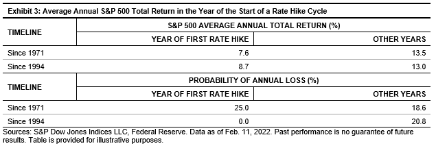
During those years, as Exhibit 3 shows, the S&P 500 underperformed, on average, compared to years that did not contain a first hike in rates. However, the average return remained positive and, more intriguingly, the performance differential narrowed after the current framework of monetary policy was adapted in 1994. Digging in a little further, the S&P 500 declined only in one-quarter of years in which a hike cycle began, with the benchmark finishing higher in each one since 1994.

Unfortunately, we only have a few such historical occasions to examine (and this time, as they say, may be different). But while it may be foolish to draw conclusions from this small a sample, such are the limits of history. We may be even more foolish to ignore what our small sample tells us; the experiences of the past half century do not back the popular narrative that the start of a rate hike cycle necessarily goes hand in hand with broad-based losses for U.S. large caps. While we may be left with considerable uncertainty, whatever else happens, our sample size looks set to expand this year.

1 Federal Reserve, “Summary of Economic Projections – Dec. 15, 2021.”

2 For an overview of how the Fed’s monetary policy evolved, see: Pakko, M. R., The FOMC in 1993 and 1994: Monetary Policy in Transition.

The posts on this blog are opinions, not advice. Please read our Disclaimers.