Get Indexology® Blog updates via email.

In This List

Special Purpose Acquisition Companies (SPACs) – Part III

Capturing the Past, Present, and Future of Commodities with the S&P GSCI

Renewable Diesel Feedstock - An Alternative Clean Energy Investment Part 1

Study the Performance of Global Size Benchmarks

Happy Birthday to Low Vol and High Beta!

Special Purpose Acquisition Companies (SPACs) – Part III

Contributor Image
Jason Ye

Director, Factors and Thematics Indices

S&P Dow Jones Indices

In our previous blog (part II), we introduced SPACs’ lifecycles, as well as the potential benefits and risks of investing in SPACs. In this blog, we will focus on SPACs’ liquidity. In general SPACs’ liquidity is poor when seeking the target, surges on the deal announcement date, and remains low relative to the S&P SmallCap 600® after de-SPAC.

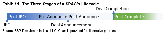
As of March 26, 2021, the median market capitalization of all listed SPACs was USD 284 million, much lower than the median market capitalization of USD 1.5 billion of S&P SmallCap 600 constituents. Since most SPACs are small- or micro-cap companies, we compared their liquidity against the S&P SmallCap 600. Based on the lifecycle of a SPAC, we analyzed its liquidity in three stages: post-IPO, deal announcement, and post-deal completion (see Exhibit 1).

We analyzed the 767 SPAC IPOs listed on the NYSE, NASDAQ, and NYSE American since 2008. As discussed in part I of our blog series, the majority of SPAC IPOs occurred in 2020 and 2021. We tracked the history of each SPAC through its lifecycle. Of the 767 SPAC IPOs, 27 were liquidated, while 23 SPACs finished the merger but were further acquired by another company, privatized, or became bankrupt. We excluded these 50 SPACs from our analysis in order to focus on the de-SPAC companies before any further corporate actions. Only common stock is included in our analysis.

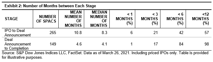
Exhibit 2 shows that the average number of months from IPO to deal announcement was 10.8 months, and the average number of months between deal announcement and deal completion was 4.6 months. 57% of SPACs announced a target within 12 months, and 98% of SPACs completed the merger within 12 months.  For our analysis we use 1, 3, and 6 months for post-IPO, and 3, 6, and 12 months for post-completion.

Liquidity

Exhibit 3 shows that the median of the S&P SmallCap 600 constituents’ past three-month median daily value traded (MDVT) was around USD 7 million at each quarter-end during the past five years, and the mean was around USD 11 million.

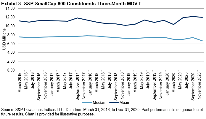
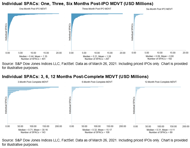
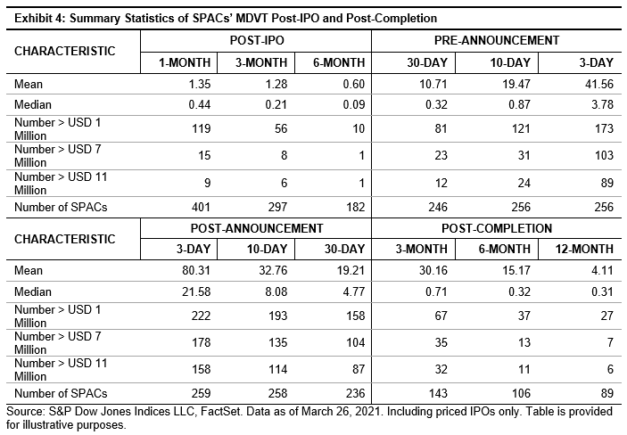
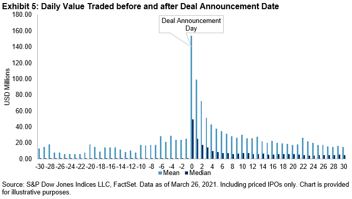
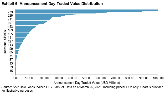
Exhibit 4 summarizes the SPACs’ MDVT and how that compares to the USD 7 million and USD 11 million benchmark liquidity post-IPO and post-completion, respectively. Exhibit 5 shows how the daily value traded changed 30 days before and 30 days after deal announcement, and Exhibit 6 highlights the distribution of value traded on the announcement day. The data shows the following:

  1. Most of the SPACs’ liquidity was lower than the median liquidity of the S&P SmallCap 600 constituents (see Exhibit 4).
  2. During their lifecycle, SPACs’ liquidity was the worst when searching for a target (see Exhibit 4). On the day of deal announcement, SPACs’ liquidity tended to improve significantly (see Exhibit 5 and Exhibit 6). Once a SPAC completed the deal, it traded with lower liquidity than the median of the S&P SmallCap 600 constituents (see Exhibit 4).
  3. At each stage, SPACs’ liquidity decayed rapidly after the corporate action (see Exhibit 4).
  4. The median liquidity was much lower than the mean liquidity, which shows that the distribution is heavily skewed in each stage (see Exhibit 4 and Appendix).

In our next blog in this series, we will follow the same framework to analyze SPACs’ performance.

Appendix

The posts on this blog are opinions, not advice. Please read our Disclaimers.

Capturing the Past, Present, and Future of Commodities with the S&P GSCI

After three decades of helping investors make more informed decisions and providing index-based access to diversification, liquidity, and inflation protection –  what’s next for this index icon?

The posts on this blog are opinions, not advice. Please read our Disclaimers.

Renewable Diesel Feedstock - An Alternative Clean Energy Investment Part 1

Contributor Image
Fiona Boal

Managing Director, Global Head of Equities

S&P Dow Jones Indices

Renewable diesel1 is one of the newer clean energy fuels on the market. It has become popular because it reduces emissions and has up to 85% less sulfur than ultra-low sulfur diesel. As clean air regulations and sustainability goals become more common, renewable diesel could continue growing in popularity. Renewable diesel can power conventional auto engines without being blended with diesel derived from crude oil, making it attractive for refiners aiming to produce low-pollution options.

According to the U.S. Department of Energy, the U.S. Energy Information Administration does not report renewable diesel production, but data from the U.S. Environmental Protection Agency indicates that the U.S. consumed over 900 million gallons in 2019. Nearly all domestically produced and imported renewable diesel is used in California due to economic benefits under the Low Carbon Fuel Standard. S&P Global Platts forecasts that the global renewable diesel supply will exceed 3 billion gallons by 2023 and 5 billion gallons by 2025.

Refiners can produce renewable diesel from animal fats and plant oils, in addition to used cooking oil. Several plant oils are widely traded via commodities derivatives, and for those market participants seeking exposure to green fuels, these commodities may offer an alternative avenue of investment.

The proportion of oil produced by crushing these so-called feedstocks varies, but apart from soybeans, they are all crushed for their oil, i.e., oil is the most valuable product from the crushing process and is the primary driver of demand (see Exhibit 1).

The performance of renewable diesel feedstocks was strong over the past 12-month period (see Exhibit 2), reflecting robust restocking demand from existing refiners, as well as expectations that production capacity would expand significantly over the coming years. The Biden Administration’s promise of a clean energy revolution may prove instrumental in cementing this new demand driver for plant and animal oils. However, more traditional food demand has also been strong for edible oil and meal. The U.S. Agriculture Department has forecasted record-high soybean demand from domestic processors and exporters in 2021, largely because of expanding global demand for livestock and poultry feed.

Over the long term, the adoption of electric passenger vehicles may limit the increased use of edible oil for renewable diesel, but it will still be required for heavy transport, such as trucks and trains.

For more information on S&P DJI’s renewable diesel feedstock indices, please visit https://www.spglobal.com/spdji/ and be sure to check back as we celebrate the 30th anniversary of the S&P GSCI.

1 In Europe, renewable diesel is known as hydrotreated vegetable oil

The posts on this blog are opinions, not advice. Please read our Disclaimers.

Study the Performance of Global Size Benchmarks

Contributor Image
Rachel Du

Senior Analyst, Global Research & Design

S&P Dow Jones Indices

The S&P Global BMI serves as a benchmark that measures global stock market performance. The index consists of three mutually exclusive and exhaustive size benchmarks: The S&P Global LargeCap, the S&P Global MidCap, and the S&P Global SmallCap. These indices are float market capitalization weighted and reconstituted annually in September, following the same weighting scheme and rebalancing schedule as their benchmark index.

We compared risk/return profiles for the three size benchmarks, using monthly data from Dec. 30, 1994, to March 31, 2021. The S&P Global SmallCap and S&P Global MidCap outperformed the S&P Global LargeCap more than half of the time, with the S&P Global SmallCap defeating the S&P Global LargeCap 166 out of 315 months (a 52.7% outperformance hit rate) and the S&P Global MidCap beating the S&P Global LargeCap 162 out of 315 months (a 51.6% outperformance hit rate).

Exhibit 1 shows that over the long term, especially in periods longer than 15 years, the S&P Global SmallCap and S&P Global MidCap delivered higher returns than the S&P Global LargeCap. After showing underperformance for the 5- and 10-year periods, both smaller-cap indices carried on strongly during the volatile markets triggered by the COVID-19 pandemic. The S&P Global SmallCap consistently showed the highest rate of volatility, while the S&P Global LargeCap displayed the lowest volatility across the same periods.

Exhibit 2 shows the rank of performance by calendar year with 1 indicating the best performer and 3 representing the worst performer. Over the past 27 years, the S&P Global SmallCap and the S&P Global LargeCap took turns in the winning position, each taking the lead for 12 years, while the MidCap was positioned as second place for 22 years.

The historical average sector weights shown in Exhibit 3 indicate that there has been no significant difference in sector allocation among the three size indices overall. However, the S&P Global SmallCap and S&P Global MidCap have been overweighted in Industrials, Materials, and Consumer Discretionary sectors, while the S&P Global LargeCap has been overweighted in the Communication Services, Consumer Staples, and Energy. The Financials sector has had the highest weight in all three size indices throughout the history, with an average weight of more than 20%. The Communication Services sector (reclassified from Telecommunication Services in 2018) shows the lowest weight in all three indices.

While the S&P Global LargeCap led the markets over the 5- and 10-year periods, the S&P Global SmallCap had the best performance over the longer term, since the end of 1994. The S&P Global LargeCap displayed consistently lower volatility compared with the other two size indices across various time periods. On the other hand, the S&P Global SmallCap demonstrated relatively higher volatility, but kept a winning momentum over the past year.

The S&P Global LargeCap, MidCap, and SmallCap indices performed differently over different time horizons. Because of their return/risk patterns over these different time horizons, an investment in a particular size category that had higher returns during one period could potentially help to offset losses in another. Understanding the risk/return patterns of the size indices can potentially help achieve return/risk targets for certain investment portfolios.

The posts on this blog are opinions, not advice. Please read our Disclaimers.

Happy Birthday to Low Vol and High Beta!

Contributor Image
Fei Mei Chan

Former Director, Core Product Management

S&P Dow Jones Indices

On April 4, 2011, S&P DJI launched two strategy indices, the S&P 500® Low Volatility Index and the S&P 500 High Beta Index. Ten years of live history let us compare how the two indices actually performed versus their pre-launch back-tests.

Many investors take back-tested history with an understandable grain of salt. But even live history can be deceptive if it doesn’t encompass market environments that reflect the full spectrum of reality. All strategies should be tested through different market environments, particularly strategies like low volatility and high beta that explicitly seek to provide a particular pattern of relative returns. Low volatility strategies seek to attenuate, and high beta strategies to amplify, the performance of the overall market. The behavior of both is therefore highly dependent on the market’s returns.

In the back-tested period from 1991 through March 2011, Low Volatility outperformed the benchmark S&P 500 with lower risk, while High Beta underperformed with higher risk. In the live period, Low Volatility underperformed while maintaining its goal of lowering volatility. High Beta’s live relative performance and risk were both comparable to those of the back-tested period.

Does Low Vol’s live underperformance mean that the index is somehow “broken” or that the back-test was not trustworthy? It’s important to remember that Low Vol’s out-or underperformance is highly dependent on the return of the benchmark S&P 500. The back-tested period included two bear markets: the bursting of the technology bubble and the financial crisis of 2008. With the exception of some small hiccups, the years in the live period, even including a pandemic, were mostly good (if not great) years.

In good markets, a low volatility strategy should not be expected to outperform. Low Vol’s major outperformance comes in years like 2000-2002 and 2008, which, thankfully for us, have not recurred since 2011.

So, did the two indices do what they were designed to do? For that, we look to their performance relative to the market. Exhibit 2 shows the monthly performance differentials of Low Vol and High Beta based on the performance of the S&P 500. Their behaviors have exhibited the same pattern both in the back-tested and the live period. We sometimes compare our indices to children; these two, at least, have been well behaved. Happy birthday.

The posts on this blog are opinions, not advice. Please read our Disclaimers.