Get Indexology® Blog updates via email.

In This List

S&P and Dow Jones Islamic Indices Outperform Conventional Benchmarks in Q1 2019

Using GARP Strategies for Indices Part IV – Factor Exposures, Sector Composition, and Performance Attribution

This Little Piggy Isn't Going to Market

Do Indian Equity Mutual Funds Generate Alpha When Adjusted for Risk?

Synchronized Gains Push the S&P Risk Parity Indices to New Highs

S&P and Dow Jones Islamic Indices Outperform Conventional Benchmarks in Q1 2019

Contributor Image
John Welling

Director, Global Equity Indices

S&P Dow Jones Indices

Information Technology and Financial Sectors Biggest Contributors

Global S&P and Dow Jones Shariah-compliant benchmarks outperformed their conventional counterparts in Q1 2019 as Information Technology—which tends to be overweight in Islamic indices—finished the quarter at the top of the sector leaderboard while Financials—which is underrepresented in Islamic indices—underperformed the broader market. The S&P Global BMI Shariah and Dow Jones Islamic Market (DJIM) World each gained 14.3% and 14.1%, respectively, outperforming the conventional S&P Global BMI by approximately 200 bps.

The outperformance trend played out across all major regions as Shariah-compliant benchmarks measuring U.S., Europe, Asia Pacific, and emerging markets each finished the quarter ahead of conventional equity benchmarks by meaningful margins.

U.S. Equities Led the Rest of World in Q1

The S&P 500® Shariah marked its best quarterly return since the inception of the index in 2006, with a gain of 15.0%. A more dovish stance from the U.S. Federal Reserve and hopes for a U.S.-China trade breakthrough helped push U.S. equities higher in the quarter following a more tumultuous close of Q4 2018. Europe and Asia Pacific equities followed in performance, as each enjoyed double-digit percentage gains.

MENA Equities Underperformed – Country Results Varied

After MENA equity outperformance in 2018, the S&P Pan Arab Composite lagged high-performing emerging and global markets during Q1 2019 with a gain of 9.4%. The S&P Egypt BMI led the way in the region in Q1, gaining a solid 19.3%, followed by the S&P Bahrain BMI, which added 15.0%. The Saudi Arabia BMI, which was promoted to emerging market status in March, gained a favorable 14.1%. The S&P Oman BMI and S&P Qatar BMI lagged the most, falling 1.6% and 1.1%, respectively.

For more information on how Shariah-compliant benchmarks performed in Q1 2019, read our latest Shariah Scorecard.

A version of this article was first published in Islamic Finance News Volume 16 Issue 14 dated April 10, 2019.

The posts on this blog are opinions, not advice. Please read our Disclaimers.

Using GARP Strategies for Indices Part IV – Factor Exposures, Sector Composition, and Performance Attribution

Contributor Image
Wenli Bill Hao

Director, Factors and Dividends Indices, Product Management and Development

S&P Dow Jones Indices

In this blog, the fourth in our introduction to Growth at a Reasonable Price (GARP) strategies, we cover factor exposures, sector composition, and performance attribution.

Targeted Factor Exposures

Exhibit 1 shows the active exposures (in percentages) of the S&P 500® GARP Index to the five factors used in GARP strategies: three-year sales per share (SPS) growth (SGROW), three-year earnings per share (EPS) growth (EGROW), earnings-to-price ratio (EP), return on equity (ROE), and financial leverage ratio (LEV). Active exposure is defined as the portfolio factor exposure minus the benchmark factor exposure. Factor percentage exposure is defined as the active exposure of one factor divided by the sum of all five factors. The monthly average of all periods is taken to represent the average active exposure. In Exhibit 1, we see that SPS growth and EPS growth had exposure levels that dominated the factor exposures, with 31% and 27%, respectively. EP, ROE, and LEV had exposures of 14%, 11%, and 16%, respectively. The factor exposure levels in the first layer of filters doubled that of the second layer of filters. The exposure results show that the multi-factor sequential filtering approach achieved its design goal.

Sector Composition and Performance Attribution

GARP strategies use bottom-up stock selection. The only constraint on sector composition is that each sector is capped at a maximum of 40%. As shown in Exhibit 2, the active weight of the S&P 500 GARP Index didn’t exceed 7%. The active weight is defined as the portfolio sector weight minus the benchmark sector weight. The two-factor Brinson attribution analysis shows that strategy outperformance mainly comes from stock selection rather than sector allocation. These findings are in line with our bottom-up strategy design process.

In conclusion, the multi-factor sequential filtering approach has achieved its designed goal for GARP strategies. Moreover, sector composition and performance attribution analysis show that the strategy has limited active sector exposure, and its outperformance is mainly due to stock selection.

The posts on this blog are opinions, not advice. Please read our Disclaimers.

This Little Piggy Isn't Going to Market

Contributor Image
Fiona Boal

Managing Director, Global Head of Equities

S&P Dow Jones Indices

Even eagle-eyed commodities investors might be surprised to learn that lean hogs have been one of the best-performing individual commodities so far in 2019. As of April 5, 2019, the S&P GSCI Lean Hogs was up an impressive 19.5% since the beginning of the year, outperforming the broad S&P GSCI (up 18.4%), and up 46% since Feb. 20, 2019. While lean hogs might seem like a trivial asset to cover in this medium, even in the relatively idiosyncratic world of commodities, it illustrates an important characteristic of individual commodity markets, namely their usefulness in expressing investment theses that are dependent on unique geopolitical, demographic, structural, weather, and health or disease factors. It also provides a timely reminder of the impact that significant price adjustments in real assets, such as commodities, have on underlying levels of economic activity, inflation, and fiscal and monetary policies.

The driving force behind the rally in lean hog prices has been a disease outbreak and its expected impact on supply. Lean hogs spent the first two months of the year in the doldrums, fixated on higher-than-expected levels of U.S. pork production and ongoing market access restrictions for U.S. pork in key export markets. By March, these factors were dwarfed by the realization that the scope, severity, and impact of the African swine flu (ASF) outbreak in China had been greatly misunderstood. ASF doesn’t affect humans but has a very high mortality rate in pigs and has no vaccine or cure. According to the FAO, China announced its first ASF outbreak on Aug. 3, 2018, and has since confirmed 118 outbreaks.[i]

To put the Chinese market in perspective, China is both the largest producer and consumer of pork in the world and has a hog herd conservatively estimated to be in excess of 430 million, almost three times the size of the next largest herd (in the European Union). Colleagues at S&P Global Platts have recounted that news reports from China suggest that only 20 of the 100 breeding herds in China are disease-free: the supply impact of ASF could be sizeable and long-lasting (sows have a gestation period of “three months, three weeks and three days” and pigs do not reach slaughter weight until they are at least six months old). The USDA’s attaché in Beijing has forecast Chinese pork production at 51.4 million metric ton this year, down 5% from 2018, with imports forecast to hit 2 million metric tons, up 33% year over year.[ii]

The spread of ASF risks creating a big hole in global pork supply, and the U.S. is likely best suited to fill this hole, as U.S. supplies are expected to increase, while supplies in other markets are steady or even declining. However, it is worth noting that at this time, U.S. pork producers continue to contend with a retaliatory 50% tariff in China (on top of the regular tariffs faced by all other importing countries). The tariff in China continues to make products from other countries more competitive versus the U.S., at least in the short term. Filling the disease-induced supply hole will not be straightforward.

The broader implications of ASF and higher pork prices, particularly in China, are noteworthy. Pork is believed to be the single largest item in the Chinese CPI basket (official components and weights are not disclosed), and while domestic Chinese pork prices are notoriously volatile, policy makers are undoubtedly already worried about more than just the rising cost of their red-fried pork lunch.

There have been no reported outbreaks of ASF in commercial hog herds in the U.S. or Western Europe, but the potential impact of an outbreak on lean hog prices in either region could prove to be momentous.


[i]   http://www.fao.org/ag/againfo/programmes/en/empres/ASF/situation_update.html

[ii]   https://www.fas.usda.gov/data/china-livestock-and-products-semi-annual-4

The posts on this blog are opinions, not advice. Please read our Disclaimers.

Do Indian Equity Mutual Funds Generate Alpha When Adjusted for Risk?

Contributor Image
Akash Jain

Director, Global Research & Design

S&P BSE Indices

Risk-adjusted returns showcase the return accrued for every unit of risk held in a portfolio. If two portfolios have the same returns over a given time period, the one that has the lowest risk will have the better risk-adjusted return. Modern portfolio theory (MPT) assumes that an investment with higher risk should compensate the investor, on average, with higher returns.[1]

In addition to observing the performance of funds purely on a return basis (as seen in the SPIVA® India Year-End 2018 Scorecard), it may also be useful to determine whether funds, adjusting for risk, are able to beat their respective category benchmarks. This analysis seeks to establish whether actively managed funds are able to generate higher risk-adjusted returns than their corresponding benchmarks over long-term investment horizons.

The standard deviation of monthly returns was used as a measure of risk (volatility) for this analysis. We used the return/risk ratio to evaluate managers’ risk-adjusted performance. To make our comparison relevant, we also adjusted the returns of the benchmarks by their volatility.

The analysis resonates the same message that we saw in the SPIVA India Year-End 2018 scorecard (see Exhibits 1a and 1b)—on a risk-adjusted basis, a large proportion of actively managed equity funds underperformed their benchmarks over long-term horizons.

Exhibit 1b shows that adjusting for risk does not necessarily portray a stronger case for active fund managers. For example, in large-cap and Equity-Linked Savings Scheme (ELSS) categories, we can still see that more than 45% of the active fund managers underperformed their respective category benchmarks on a risk-adjusted return basis across different time horizons. However, in the case of the mid-/small-cap segment, active funds fared relatively better; a little more than 50% of funds outperformed the S&P BSE 400 MidSmallCap Index across the 3-, 5-, and 10-year horizons.

Exhibit 1a: Percentage of Funds Outperformed by the Index (by Returns)
FUND CATEGORY COMPARISON INDEX 3-YEAR (%) 5-YEAR (%) 10-YEAR (%)
Indian Equity Large Cap S&P BSE 100 90.59 57.55 64.23
Indian ELSS S&P BSE 200 88.10 40.54 51.52
Indian Equity Mid-/Small-Cap S&P BSE 400 MidSmallCap Index 56.52 39.68 55.26

Source: S&P Dow Jones Indices LLC, Morningstar, and Association of Mutual Funds in India. Data as of Dec. 31, 2018. Past performance is no guarantee of future results. Table is provided for illustrative purposes.

Exhibit 1b: Percentage of Funds Outperformed by the Index (by Risk-Adjusted Returns)
FUND CATEGORY COMPARISON INDEX 3-YEAR (%) 5-YEAR (%) 10-YEAR (%)
Indian Equity Large Cap S&P BSE 100 92.94 60.43 55.28
Indian ELSS S&P BSE 200 88.10 51.35 45.45
Indian Equity Mid-/Small-Cap S&P BSE 400 MidSmallCap Index 50.00 33.33 44.74

Source: S&P Dow Jones Indices LLC, Morningstar, and Association of Mutual Funds in India. Data as of Dec. 31, 2018. Past performance is no guarantee of future results. Table is provided for illustrative purposes.

At an aggregate level, the asset-weighted basket of mid-/small-cap active funds witnessed better risk-adjusted returns than the S&P BSE 400 MidSmallCap Index with a notably lower return volatility (see Exhibit 2). On the contrary, large-cap and ELSS active funds noted worse or similar risk-adjusted returns to the S&P BSE 100 and S&P BSE 200 benchmarks, respectively, across different investment horizons. Therefore, one may notice that it is becoming increasingly difficult for fund managers to beat their respective benchmarks both on an absolute return basis and risk-adjusted returns basis.

Exhibit 2: Risk/Return Characteristics of Asset-Weighted Active Funds versus Category Benchmarks
INDEX/PEER GROUP 3-YEAR 5-YEAR 10-YEAR
ANNUALIZED RETURN (%)
S&P BSE 100 12.8 13.6 16.1
Indian Equity Large Cap 10.8 14.2 15.8
S&P BSE 200 12.8 14.5 16.6
Indian ELSS 9.5 14.9 16.9
S&P BSE 400 MidSmallCap Index 10.5 18.8 18.4
Indian Equity Mid-/Small-Cap 9.2 18.7 19.3
ANNUALIZED VOLATILITY (%)
S&P BSE 100 14.7 14.1 19.6
Indian Equity Large Cap 14.8 14.5 18.2
S&P BSE 200 14.8 14.2 19.7
Indian ELSS 15.5 15.0 18.7
S&P BSE 400 MidSmallCap Index 19.3 17.9 23.6
Indian Equity Mid-/Small-Cap 17.1 16.3 20.7
RISK-ADJUSTED RETURN
S&P BSE 100 0.88 0.96 0.82
Indian Equity Large Cap 0.73 0.98 0.87
S&P BSE 200 0.86 1.02 0.84
Indian ELSS 0.62 0.99 0.90
S&P BSE 400 MidSmallCap Index 0.54 1.05 0.78
Indian Equity Mid-/Small-Cap 0.54 1.15 0.93

Source: S&P Dow Jones Indices LLC, Morningstar, and Association of Mutual Funds in India. Data as of Dec. 31, 2018. Past performance is no guarantee of future results. Table is provided for illustrative purposes.

Experience the active vs. passive debate on INDEXOLOGY®.

[1]   https://spindices.com/documents/research/research-risk-adjusted-spiva-scorecard.pdf

The posts on this blog are opinions, not advice. Please read our Disclaimers.

Synchronized Gains Push the S&P Risk Parity Indices to New Highs

Contributor Image
Rupert Watts

Head of Factors and Dividends

S&P Dow Jones Indices

The first quarter of 2019 was one of synchronized gains across stocks, bonds, and commodities. Stocks soared, with the S&P 500® up 13.6%, recording its largest first quarter gain since 1998. Amid a dovish tone from the Fed, U.S. Treasury yields declined, with the yield on the 10-year U.S. Treasury Bond falling to its lowest level since 2017. Commodities rebounded strongly, with the S&P GSCI finishing the quarter up 15.0%.

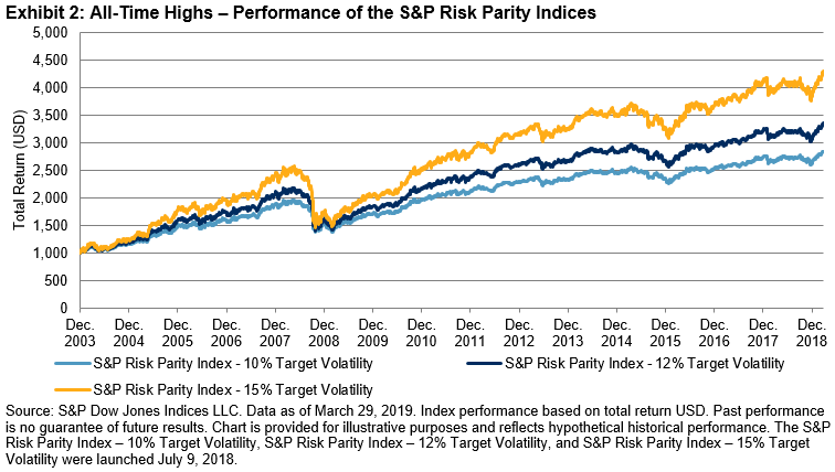
While their positive correlation is unlikely to continue long term, these three asset classes helped the S&P Risk Parity Indices to record attractive first quarter returns. In fact, the indices—which aim to spread risk equally across equities, fixed income, and commodities—have been propelled to new all-time highs.

Exhibit 3 shows the performance of the S&P 500, the hypothetical global 60/40 portfolio, and the S&P Risk Parity Indices from Q4 2018 and Q1 2019, as well as the cumulative return across both quarters. While the S&P 500 posted strong performance in Q1 2019, the impact of declines in Q4 2018 meant it ended about 1.7% off its closing level in September 2018. Furthermore, the “equity-concentrated” global 60/40 portfolio only managed to break even across the two quarters, despite strong performance from fixed income.

In contrast, the S&P Risk Parity Indices shrugged off their Q4 2018 weakness, as Q1 2019 helped to more than make up for those losses. This is largely due to their allocation methodology that aims to equalize the risk contribution of each asset class and hence is not “equity-concentrated.”

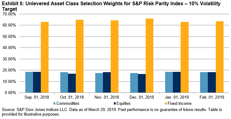
By examining the performance attribution and asset class weights across the S&P Risk Parity Index – 10% Volatility Target in Exhibits 4 and 5, it is clear where this outperformance comes from. It is the fixed income component, with back-to-back quarter gains and a higher proportion of weight, which has primarily driven the index to new highs. The 4.8% gain posted by fixed income since the end of September 2018 has more than offset the losses in the other two asset classes.

While inappropriate to judge the S&P Risk Parity Index – 10% Volatility Target based on two quarters worth of performance, this can be seen as an endorsement of its allocation methodology over the 60/40 portfolio. By equalizing the risk contribution of each asset class, the S&P Risk Parity Indices tend to exhibit a smoother return profile that is less exposed to equity market drawdowns. It is this mechanism that has brought active and passive risk parity products to investors’ attention.

The posts on this blog are opinions, not advice. Please read our Disclaimers.