Get Indexology® Blog updates via email.

In This List

Communicating Income: Lessons From Behavioral Finance

Interest Rate Risk of Low Volatility Indices

Do Dividends Really Pay? (Part 2)

A Closer Look at Indices Country Classifications

Exploring the G in ESG: E & S and Performance – Part 3

Communicating Income: Lessons From Behavioral Finance

Contributor Image
Warren Cormier

Executive Director

DCIIA Retirement Research Center

In my recent book, The Behavioral Economics Approach to Winning New Clients (and Keeping the Ones You Have!), I offer a dozen recommendations to financial advisors charged with stewarding their clients’ assets to ultimately improve the relationship between client and advisor.  Several lessons are devoted to communication, specifically ways to employ trust, loss aversion and regret aversion when helping clients save for future goals, and most often, those goals are retirement goals.

The heart of any retirement discussion must include the role of today’s defined contribution (DC) plan.  DC plans today are not like yesterday’s supplemental, savings-oriented plans and the more we rely on these plans to provide a true retirement, the more we may also change our focus from wealth accumulation to a different goal such as an income-oriented goal.  Income-oriented goals are those targeting a specific standard of living, withdrawal rate, or income replacement ratio in retirement.  This shift in focus would require plan sponsors, practitioners and plan sponsors alike to change the way they communicate to and with each other; moving from a mere savings discussion to a discussion encompassing both saving and spending over one’s lifecycle.

When we communicate with clients (and/or DC plan participants), we must communicate in terms familiar and relevant to them.  Historically, the retirement industry has communicated from the wealth accumulation lens, focusing on growing an account balance or what stocks or funds to pick.  The problem with this communication approach is two-fold.  First, participants generally do not know how much money is enough for retirement.  Lump sum account balances are confusing – it may be more natural for participants to make decisions based on periodic amounts such as an annual salary or monthly bills.  Secondly, when participants do retire, their nest egg is probably the biggest amount of money they have ever seen, let alone have to manage.  This conundrum causes participants to exhibit either the illusion of wealth (spending too much too quick) or alternatively spending too little because they haven’t fully graduated from the savings mindset.

The retirement industry (financial advisors, plan sponsors, asset manager and index providers) can help participants by creating products and services that focus on retirement income rather than just wealth accumulation.  I am pleased to see a resurgence in new products, white papers, retirement income topics at conferences and regulatory proposals such as the Retirement Enhancement and Savings Act of 2018.  What’s needed now are innovative solutions designed to provide clarity in savings outcomes to help participants understand the risks they face as they progress to and in retirement.  I am confident that our industry will create these solutions and help turn America’s defined contribution system into America’s retirement system!

Video Link: https://www.assettv.ca/video/communicating-income-lessons-behavioral-finance

The posts on this blog are opinions, not advice. Please read our Disclaimers.

Interest Rate Risk of Low Volatility Indices

Contributor Image
Phillip Brzenk

Managing Director, Global Head of Multi-Asset Indices

S&P Dow Jones Indices

A topic commonly brought up when interest rates rise is the impact that rates have on the performance of low volatility indices. Several studies[1][2] have shown that low volatility portfolios have exposure to rising interest rate risk. One of the main drivers of this exposure stems from the bond-like characteristics of sectors usually favored by low volatility strategies, such as utilities and consumer staples. Thus, rising interest rates can negatively affect the performance of indices, such as the S&P 500® Low Volatility Index. In this blog, we review the historical performance of the S&P 500 Low Volatility Index to the S&P 500 in rising interest rate periods to confirm whether or not this is the case.

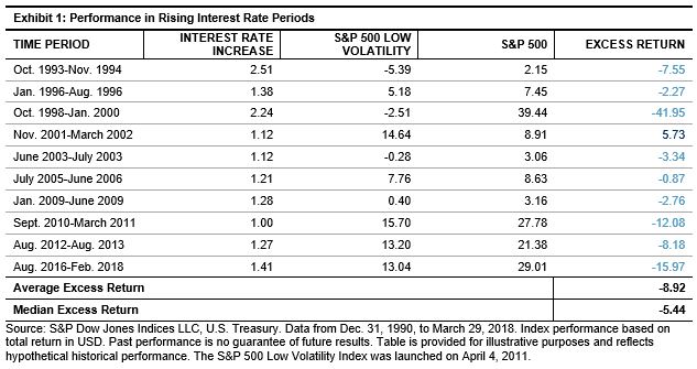
The S&P 500 Low Volatility Index outperformed the S&P 500 in the long term on an absolute and risk-adjusted basis, but in periods of rising interest rates, the index has underperformed.  Using the 10-year U.S. Treasury Bond yield as the proxy for interest rates, Exhibit 1 shows the historical performance of the S&P 500 Low Volatility and S&P 500 indices in periods of significantly increased interest rates. For the purpose of this study, rising interest rate periods are classified as significant when rates rose by 1% or more on a month-end basis.

Going back to 1991, there have been 10 non-overlapping periods of rising interest rates. This includes the most recent environment through the end of February 2018, as interest rates have been trending upwards since the summer of 2016. The S&P 500 Low Volatility Index underperformed the S&P 500 in 9 of the 10 periods, with an average excess return of -8.92% and median excess return of -5.44%.

The largest underperformance was seen during the technology boom in the late 90s as interest rates rose by over 2%. In this period, the S&P 500 Low Volatility Index underperformed by nearly 42% from October 1998 through January 2000. One of the main drivers of underperformance stemmed from the S&P 500 Low Volatility Index having no exposure to the information technology sector, which unsurprisingly was the best performing sector during the technology boom. The information technology sector is cyclical and generally has performed well in increased interest rate periods, while the utilities sector has significantly underperformed.[3]

To further isolate the impact of interest rate movements, monthly hit rates and average excess returns were calculated. Exhibit 2 shows these two statistics for the S&P 500 Low Volatility Index relative to the S&P 500 going back to 1991. The time period was broken out between months when interest rates rose and when rates fell. No minimum change threshold was incorporated; thus, all months were included in the analysis.

It is evident that there is a difference in relative performance based on the direction of interest rate changes. The S&P 500 Low Volatility Index underperformed the benchmark 60% of the time when interest rates rose and underperformed by an average of -0.60%. Conversely, the S&P 500 Low Volatility Index performed better than the benchmark when interest rates declined.

In a forthcoming blog, we will use regression analysis to further examine the robustness of the results found in this blog. In particular, we will test if there is a relationship between the magnitude of interest rate changes and resulting excess returns.

[1]   Blitz, D., B. van der Grient, and P. van Vliet. “Interest rate risk in low-volatility strategies.” 2014.

[2]   Driessen, J., I. Kuiper, and R. Beilo. “Does Interest Rate Exposure Explain the Low-Volatility Anomaly?” 2017.

[3]   Based on the same periods in Exhibit 1, the Information Technology sector had a median excess return of 4.26% versus the S&P 500, while the utilities sector had a median excess return -13.89%.

The posts on this blog are opinions, not advice. Please read our Disclaimers.

Do Dividends Really Pay? (Part 2)

Contributor Image
Philip Murphy

Former Managing Director, Global Head of Index Governance

S&P Dow Jones Indices

Previously I discussed why preference for dividend-paying stocks may not have a strong theoretical footing, but could be grounded in behavioral and practical reasons. Furthermore, due to possible economic signaling generated by dividends, such strategies may be correlated with widely accepted factors like quality and value. This post demonstrates how specific dividend strategy indices may be related to several major factors. Exhibit 1 lists major characteristics of four popular S&P DJI dividend indices. Dividend strategies can be very different from one another so it pays to understand individual indices behind various index-tracking products. However, despite their differences, indices are generally much more transparent than actively managed dividend strategies.

The indices in Exhibit 1 highlight four combinations of constituent selection and weighting. For selection, we have either indicated dividend-yield ranking or persistent historical dividend growth, while for weighting we have yield weighting or equal weighting. The various combinations of selection and weighting methods contribute to significantly different index performance.

Exhibit 2 shows summary statistics of the four dividend indices regressed on Fama-French factor returns including market beta (Mkt-rf), small size (SMB), value (HML), and momentum (MOM). AQR’s quality factor, Quality Minus Junk (QMJ), is added to form a five-factor regression model.

  • Market Beta (Mkt-rf): All of the indices had statistically significant market betas in a tight range from 0.84 to 0.89, indicating somewhat less equity risk than a broad benchmark.
  • Small Size (SMB): These strategies generally did not present positive SMB loadings and, based on the presence of several negative coefficients, the regressions may indicate a tendency toward larger constituents. However, none of the regression coefficients were statistically significant (at 95% confidence) so the data does not support an inference.
  • Value (HML): With respect to HML loadings, we see differentiation among the indices along the line of their primary weighting methods. The yield-weighted indices had positive and statistically significant coefficients (95%), while the equal-weighted indices had somewhat lower, positive coefficients that failed statistical significance.
  • Momentum (MOM): All of the indices’ returns loaded negatively on MOM, but they differed with respect to coefficient size and significance. The S&P 500 High Dividend Index had the largest negative loading with the most significant t-stat. The S&P 500 Dividend Aristocrats and S&P High Yield Dividend Aristocrats were in the middle of the pack in terms of coefficient size, and both were significant. Finally, the Dow Jones U.S. Select Dividend Index had a lower negative coefficient, and its t-statistic was somewhat below the 95% confidence level of significance.
  • Quality (QMJ): Whereas value loadings seemed to be differentiated along the line of constituent weighting methods, QMJ loadings were potentially related to constituent selection. The two Dividend Aristocrat indices, both of which select members with long records of dividend increases, had positive and significant QMJ loadings. The indices that select constituents by dividend yield were less related to QMJ, if at all.
  • Alpha: As expected, when controlled for multiple factor exposures, none of the indices produced alpha over the sample period.

Little differentiation was found between factor loadings of the indices with respect to market beta, small size, or momentum, and none created alpha. On the other hand, value and quality factor loadings were different between indices, and they generally aligned either by constituent selection or weighting. The two yield-weighted indices produced positive and significant value exposure, while the Dividend Aristocrats indices produced positive and significant quality exposure. Interestingly, only the S&P High Yield Dividend Aristocrats had positive and significant loadings on both value and quality over the sample period.

Through this analysis, we see that dividend strategies are not only about income or yield, but also about how their various combinations of factor loadings may compliment portfolios through factor diversification. Market participants ought to carefully consider which strategies can be reasonably expected to enhance their specific investment program before jumping in.

1 http://mba.tuck.dartmouth.edu/pages/faculty/ken.french/index.html

2 https://www.aqr.com/Insights/Datasets/Quality-Minus-Junk-Factors-Monthly

The posts on this blog are opinions, not advice. Please read our Disclaimers.

A Closer Look at Indices Country Classifications

Contributor Image
Alka Banerjee

Former Managing Director, Product Management

S&P Dow Jones Indices

As large sums of global money flows now follow global indices, it is important to understand how global index providers decide on country classifications and country weightages. A global equity index typically has two components, a developed market index and an emerging market index. Until the nineties, emerging market investments were not necessarily mandatory for all large institutional investors but that changed more than a decade ago and global investment portfolios are the norm now. What has also changed is that earlier markets were classified on the basis of their GDP per capita, size of the stock market and accessibility criteria, since most of these parameters were in sync with each other.

However, given the growing size of global fund flows and growth of emerging markets, a number of criteria are now reviewed. This can include the presence of a strong regulatory authority, ease of repatriation of funds, custody, clearing and settlement infrastructure, transparency in decision making, liquidity, and transaction costs. While index providers provide the criteria for classification, the actual decision making will devolve on large market consultations. In an annual or bi-annual exercise, market participants, including asset managers, traders, and asset owners, are polled in their views for each of the criteria for the markets. Based on the feedback received, markets will be classified as developed, emerging and frontier. The weight of the market within the index is derived from the float adjusted market capitalization of the market. This means that the sum of each of the stocks included in the market by their float market capitalization gives each market its weight in the index. Countries that have restrictions on foreign investors in the form of a percent limit will get that limit applied to the market capitalization to give a clear picture of what is actually available to foreign investors. In recent time, this issue has been muddied considerably by the multiplicity of restrictions and access provided by a market like China,where it is hard to pin down a single number.

Earlier, we spoke of frontier markets, a category where the markets are typically very small or accessible in a very limited way. Markets like Ghana, Tunisia, Bangladesh and Sri Lanka fall in this category. Graduating markets from frontier to emerging and emerging to developed can cause a big change in the fund flows to a country. While a move from frontier to emerging is welcomed across board, the story can be different for a move from emerging to developed status. Israel had an approximate 3% weight in an emerging market index a few years ago. When it was graduated in 2010, it fell to only 0.4% of a developed market index. This kind of a move can actually cause fund flows to considerably dry up for a market.

The posts on this blog are opinions, not advice. Please read our Disclaimers.

Exploring the G in ESG: E & S and Performance – Part 3

Contributor Image
Kelly Tang

Former Director

Global Research & Design

In a previous blog, we explored the relationship between corporate governance and stock performance. The results show a wide variance between the top quintile and the bottom quintile, particularly over a long-term horizon (17 years). We applied the same analysis to the RobecoSAM environment (E) and social (S) scores. To do so, we formed hypothetical, annually rebalanced quintile portfolios, ranked by E and S scores, and tracked their forward 12-month performance.i The quintile portfolios were formed on an annual basis as of December 31 of every year.

Looking at the analysis from 2001 through 2017, both E and S scores showed a clear bifurcation in returns, with the bottom quintile performing the worst (see Exhibit 1).

Environment Results

For the portfolios ranked by E score, the fourth quintile (8.36%) and fifth quintile (8.00%) returns were markedly lower than those of the top three quintiles. Over near- to medium-term time horizons, E-ranked portfolios displayed the highest performance spread between the top and bottom quintiles (see Exhibit 2). Perhaps this is because environmental concerns have increasingly moved to the forefront of investor concerns in recent years.

Average rolling returns over the one-, three-, and five-year periods show that, on average, the Q5 portfolio underperformed the Q1 portfolio by about 1.20% (see Exhibit 3).

The results for the governance (G) portfolios showed a greater variance between the top and bottom quintiles compared to the E portfolios. This is expected, as corporate governance reflects management strategy and ability to execute the strategy. On the other hand, E performance reflects risk management of a growing issue that attracts heightened awareness from institutional investors. It appears that for portfolios ranked by E score, market participants may be economically better served by shying away from not only the bottom 20%, but also the fourth-worst quintile, which accounted for the bottom 40% of the ranking universe.

Social Results

The S dimension score measures a corporation’s relationship with its stakeholders, especially its employees, but also the local and wider community in which it operates. The categories analyzed are labor practices, human capital development, talent attraction and retention, human rights stance, and corporate citizenship and philanthropy.

There is a less clear relationship between S scores and subsequent future performance. The back-tested returns do not show a clear underperformance from the bottom quintile, and in fact, the fourth quintile was the best-performing portfolio in the longer time periods (see Exhibits 4 and 5).

Our analysis and the decomposition of the individual ESG scores highlight some interesting information. It appears that for portfolios ranked by G and E scores, investors may be economically better off by screening out securities in the worst quintile of the ranking universe. However, the relationship is less clear between the S score and future stock performance.

The analysis shows that while ranking by overall ESG score could indicate some positive return information, the three underlying subcomponents have different relationships with future stock performance. Therefore, investors may wish to alter the weight of each subcomponent in the overall ESG score.

Our next blog will explore different combinations of the three subcomponent scores.


i The underlying universe is the RobecoSAM coverage universe comprised of global companies starting from December 2000 with 400 stocks and increasing to over 4,000 stocks in 2017.


The posts on this blog are opinions, not advice. Please read our Disclaimers.