Get Indexology® Blog updates via email.

In This List

Does Value Enhance Quality Investing in China's A-Share Market?

A Study of the Classics – Part 2

The Trump Rally – One Year Later

Tuition Inflation: Indexing the Rising Cost of College

Support or Resistance for Europe?

Does Value Enhance Quality Investing in China's A-Share Market?

Contributor Image
Liyu Zeng

Director, Global Research & Design

S&P Dow Jones Indices

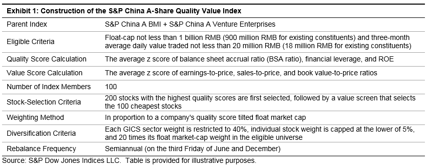
As discussed in my previous blog, quality investing has gained attraction in China, as high-quality stocks recorded remarkable performance in the first nine months of 2017.  As a result, the risk of paying too much for high-quality stocks has become a concern.  To address the issue, on Sept. 29, 2017 we launched the S&P China A-Share Quality Value Index, which is designed to measure the performance of the top 100 high-quality stocks with reasonable valuation, (see Exhibit 1).[1]

Historically, the S&P China A-Share Quality Value Index has outperformed the S&P China A BMI (the benchmark) on an absolute and risk-adjusted basis.  It is important to note that, after adding the value screen, the S&P China A-Share Quality Value Index recorded higher absolute and risk-adjusted returns with slightly higher return volatility and bigger drawdown than the hypothetical S&P China A-Share Quality 200 Portfolio without an additional value screen.[2]  This demonstrated the benefit of using the value screen to exclude those high-quality stocks with expensive prices (see Exhibit 2).

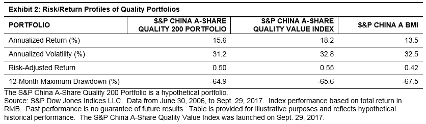
From June 30, 2006, to Sept. 29, 2017, the S&P China A-Share Quality Value Index outperformed the benchmark and the S&P China A-Share Quality 200 Portfolio in 9 and 8 out of 12 periods, respectively.

Exhibit 3 shows the performance of quality portfolios in up and down markets.  Compared to the quality portfolio without value screen, the S&P China A-Share Quality Value Index had more balanced performance with more than 50% of win ratios and positive excess returns in both up and down markets, without much sacrifice in downside protection.

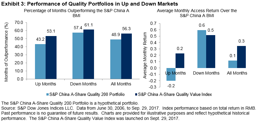
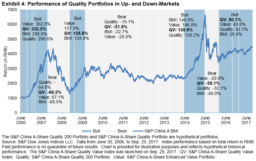
Exhibit 4 shows the performance of the S&P China A-Share Quality Value Index versus the hypothetical quality portfolio and value portfolio[3] across different China A-share equity market cycle phases, defined with respect to the S&P China A BMI’s (BMI’s) performance trends (three bearish and four bullish cycle phases).  The S&P China A-Share Quality Value Index outperformed the benchmark in six out of seven market cycle phases, while the value portfolio and quality portfolios only outperformed the benchmark in five and four out of the seven phases, respectively.  With the aid of the value screen, the S&P China A-Share Quality Value Index exhibited more consistent outperformance than purely value or quality screened/weighted portfolio.

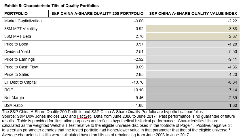
As we expected, the S&P China A-Share Quality Value Index exhibited cheaper valuation with some sacrifices in quality features (see Exhibit 5).  It is interesting to note that it had higher dividend yield than the quality portfolio without additional value screen, due to the lower valuation of stocks.

Historically, most of the constituents of the S&P China A-Share Quality Value Index were from the industrials and consumer discretionary sectors.  Compared to the broad China A-share market, most of the time, it was overweight in consumer discretionary and underweight in real estate and financials.

[1]   For detailed index methodology, please see https://spindices.com/indices/strategy/sp-china-a-share-quality-value-index-cny.

[2]   The S&P China A-Share Quality 200 Portfolio is a hypothetical portfolio that consists of 200 high-quality stocks before the value screening, with eligible criteria, weighting method, and rebalancing schedule following the S&P China A-Share Quality Value Index methodology.

[3]  The S&P China A-Share Enhanced Value Portfolio was constructed based on the same parent indices with the same size and liquidity criteria.  The top 100 stocks with the highest value scores in the eligible universe are selected, subject to 20% rebalance buffer by number of stocks.  The value score is measured as the average z score of earnings-to-price, sales-to-price, and book value-to-price ratios.  Constituents are weighted by score-tilted market cap, subject to security and sector constraints such that the weight of each security is between 0.05% and the lower of 5% and 20 times its float-adjusted market-cap weight in the eligible universe, and the maximum weight of any given GICS sector is 40%.  The portfolio is rebalanced semiannually on the third Friday in June and December.

The posts on this blog are opinions, not advice. Please read our Disclaimers.

A Study of the Classics – Part 2

Contributor Image
Jamie Farmer

Former Chief Commercial Officer

S&P Dow Jones Indices

This scene came to mind after I recently posited a few indexing milestones.

My intent was to opine on watershed moments in design, those individual indices that marked advancement, a change in approach, or increased utility.  Almost immediately, I received “Yeah, but what about…?” communiques.

So forthwith I complete my all-too-brief, original list with the expectation of eventually correcting a few glaring omissions.

Dow Jones Sustainability Index (1999): Today, we take for granted that ESG—environment, social, and governance factors—are important considerations for corporations and market participants alike.  In 1999, however, the concept was nascent at best.  The Dow Jones Sustainability Indices were the first benchmarks to focus exclusively on companies that adhered to “best-in-class” sustainable practices.  Since that time, the S&P ESG suite has developed into a fast-growing and comprehensive framework that includes such dynamics as carbon emissions, environmental impact, corporate citizenship, and human capital development, among others.  As ESG matures as an investing discipline, it has become clear that individual perceptions can vary on highly granular dimensions, so such a framework is necessary in order to construct indices to meet bespoke needs.

TIE – Dow Jones U.S. Select Dividend Index (2003) and S&P 500® Dividend Aristocrats® (2005): Since 1926, dividends have contributed approximately one-third of the total return of the S&P 500.  Few, then, would suggest that investing with an eye toward optimizing that income was uncharted territory.  In 2003, however, President George W. Bush signed tax law changes that offered more favorable treatment of dividends and the stage was set for the introduction of the Dow Jones U.S. Select Dividend Index.  With components weighted according to indicated dividend yield, “Select Div” pioneered the category of dividend indexing and is often considered among the first wave of smart beta indices.  Two years later, the S&P 500 Dividend Aristocrats offered a different take on dividend exposure by encapsulating shares with consistent records of increasing payouts.  These two index series remain early testimony to the idea that there are always catalysts for new index development.

S&P 500 Low Volatility Index (2011): Finally, if one accepts that weighting components according to dividend yield can be considered the earliest appearance of smart beta, then the S&P 500 Low Volatility Index truly established the concept in the indexing firmament.  This index was the first genuinely successful entry into the factor-based space, which seeks to amplify or attenuate the drivers of investment performance (cap size, value versus growth, momentum, etc.).  At its heart is the somewhat counterintuitive, though heavily documented, notion that lower volatility stocks can offer superior risk-adjusted returns over time.  By indexing what was once solely the province of quantitative active managers, these strategies democratized and lowered the cost of access for all market participants.

So, there you have it—seven major milestones on the timeline of index development.  Invitation to (further) dissent in 3, 2, 1…go.

The posts on this blog are opinions, not advice. Please read our Disclaimers.

The Trump Rally – One Year Later

Contributor Image
Phillip Brzenk

Managing Director, Global Head of Multi-Asset Indices

S&P Dow Jones Indices

The results of the 2016 U.S. presidential election, which were widely considered surprising, had many market participants believing that the proposed economic policies of Donald Trump, “Trumponomics”, would be swiftly implemented.  During his campaign run, Trump called for tax cuts, reduced corporate regulations, increased foreign trade tariffs, and increased defense and infrastructure spending.[1]  Initial expectations held by many were that his policies would be a boon to the overall U.S. economy in the short term.  In particular, companies and industries most closely tied to the U.S. economy and economic proposals would reap the majority of the benefits.[2][3]

Given that we are at the one-year mark since the election, we wanted to see how things have played out since.  This will be the first installment in a series of posts that reviews performance since the 2016 U.S. election.

If the hypothesis is that companies most tied to the U.S. economy would benefit the most under the new presidential regime, we can test as such by forming two portfolios based on geographic revenue data.  The S&P 500® Focused U.S Revenue Exposure Index (Domestic Revenue Portfolio) comprises the top 25% of companies in the S&P 500 that receive the highest proportion of their total revenue from the U.S., while the S&P 500 Focused Foreign Revenue Exposure Index (Foreign Revenue Portfolio) holds the top 25% of companies most exposed to foreign economies.  With the creation of these portfolios, we are able to test the hypothesis by tracking their performance since the election relative to the S&P 500.

As projected, for the immediate months following the election, the Domestic Revenue Portfolio outperformed the Foreign Revenue Portfolio and the S&P 500 by a meaningful margin.  But as 2017 approached spring, a reversal occurred, and the foreign portfolio began to outperform the domestic portfolio—a trend that continued through the end of October 2017.  As of Oct. 31, 2017, the foreign portfolio had an excess return of 7.14% versus the S&P 500, while the domestic portfolio underperformed the S&P 500 by 7.31%—a difference of 14.45%.

To discover why this occurred, we first look at the potential impact that currency movements had on the portfolios.  Intuition would say that a portfolio focused on companies with revenues coming from the U.S. would have little direct, or indirect, exposure to foreign currency movements.  Conversely, a portfolio focused on companies with foreign revenues would be exposed to foreign currency movements as the companies translate foreign currency revenues back to USD.

The U.S. Dollar Index, which is designed to track the relative value of the U.S. dollar to a basket of other major world currencies, is overlaid on the performance chart (plotted to the secondary axis).  Conceivably reflecting the bullish views of the expected future growth of the U.S. economy, the index rose over 4% by the end of 2016.  By early 2017, the U.S. Dollar Index started to decline and trend downward through the end of October, in similar magnitude as the domestic portfolio.  The foreign portfolio saw relative performance versus the S&P 500 and the domestic portfolio rise as the U.S. dollar dropped in value.  The results, therefore, potentially indicate a positive relationship between the domestic portfolio and U.S. Dollar Index and a negative relationship between the foreign portfolio and the U.S. Dollar Index.

To further investigate the relationship between currency movements and portfolio performance, in the next blog we will look at the overall macroeconomic risks of the portfolios.

[1] https://www.nytimes.com/2016/08/09/us/politics/donald-trump-economy-speech.html

[2] http://www.imf.org/external/pubs/ft/weo/2017/update/01/

[3] https://www.nytimes.com/2016/11/10/business/dealbook/stock-markets-election.html

The posts on this blog are opinions, not advice. Please read our Disclaimers.

Tuition Inflation: Indexing the Rising Cost of College

Contributor Image
Jodie Gunzberg

Former Managing Director, Head of U.S. Equities

S&P Dow Jones Indices

Costs associated with college tuition and fees have far outpaced general U.S. inflation, so for individuals saving for college, the ability to accurately measure and potentially keep pace with tuition inflation is important. 
Recently, in this video, S&P Dow Jones Indices joined with Enduring Investments to discuss the newly launched S&P Target Tuition Inflation Index.  Below is a summary of the questions and answers discussed in the interview that may be interesting for college savers:
What are the economic underpinnings and thinking behind the strategy?
In designing a strategy and index to track college tuition inflation over time, it is important to understand how college tuition is set.  Colleges are producing a product just like any other business, but the product is education.  Just as in any business they have expenses and revenues so understanding what are driving those expenses and revenues is an important part of understanding how to build such an index.  On the expense side colleges have mostly labor costs, but they have a number of other things that are that go into creating the educational product, and collectively those things act like general inflation.  Though, on the revenue side, colleges have really two sorts of revenues – internal revenues and external revenues.  The internal revenues are government appropriations if it’s a public university, or the endowment returns if it’s a private university.  The external revenues come from college tuition.  So understanding how college tuition varies depending on how the appropriations or the endowment returns behave is where the rubber meets the road in terms of getting this index to target college tuition inflation.
How does the index design help capture the thesis behind the strategy?

Again, the key is in understanding the relationship on the revenue side between the  endowment returns and appropriations versus the tuition inflation growth.  Recognizing that there’s this large spread of tuition inflation that’s above the general inflation as measured by the CPI is the starting point.  Using the CPI as the base and measuring the driver of that spread can be done by knowing something about the relationship of the revenue components.  What the research behind the index shows is that tuition inflation is a function of the real return plus a break-even inflation, plus a corporate spread, minus an equity risk premium.  This combination has grown in-line with the tuition inflation that is inverse to the endowment or appropriation growth, so that’s the mix that make the mechanics work.

Source: S&P Dow Jones Indices. S&P Target Tuition Inflation Index Methodology. http://us.spindices.com/documents/methodologies/methodology-sp-target-tuition-inflation-index.pdf?force_download=true

How does the index data track tuition inflation compared to a more traditional 60/40 mix?

The 60/40 mix is really designed for optimal diversification in most risk-adjusted return portfolios, but the idea of a college liability is not taken into account in a 60/40 mix.  Since there is a relatively short time frame for college savings, the 60/40 mix may be very volatile, so at moments there is a high chance that tuition inflation is not met.  By moving to the S&P Target Tuition Inflation Index, the probability of tracking tuition inflation increases, and even more so the longer the holding period.

Hypothetically, the S&P Target Tuition Inflation Index is within 2% of the BLS College Tuition and Fees U.S. City Average Inflation more often than the 60-40 mix of stocks and bonds.

In which economic environments might the strategy track tuition inflation most closely?
The index design intends to track college tuition in many different economic environments.  Since any economic environment may be predominant when a child goes to college, it is important to understand that means that the index itself varies with the drivers of fundamental drivers of college tuition inflation.  When overall inflation is accelerating, and the stock market is falling, it is likely endowments aren’t doing very well, so the costs of the university are going up a little faster.  That is when the index is expected to also rise faster.  Conversely, if the stock market has been doing very well for a while, so that endowments are flush, and yet overall inflation is low, then college tuition may not be going up as much.  Therefore, the index may not go up as much either.  Again, the idea for success is for the index to perform over the long run in a comparable way to the college tuition inflation.

The posts on this blog are opinions, not advice. Please read our Disclaimers.

Support or Resistance for Europe?

Contributor Image
Hamish Preston

Head of U.S. Equities

S&P Dow Jones Indices

Subscribers to our European dashboard will know that October was a broadly positive month for the region’s equity markets; the S&P Europe 350 posted a 1.66% total return, while nearly every equity strategy in the region gained.  Additionally, the S&P Europe 350’s closing price level of 1,600 for October brought the benchmark to within touching distance of its record month-end close of 1655, set over a decade ago.

Most European market participants will view this news as cause for celebration, but technical analysts may not.  Exhibit 1 shows that some of the most substantial drawdowns in the S&P Europe 350 have come after the index ended the month above 1,600.  History therefore suggests that 1,600 may be a “resistance level”—the index has closed above this level on several occasions, but has not managed to stay above it for an extended period.

However, there are indications that the S&P Europe 350 may be better equipped at present to do just that.

Exhibit 2 below shows the historical sector weights in the S&P Europe 350.  Prior to the precipitous drawdowns at the start of the century, the information technology sector obtained a relatively large weight courtesy of its substantial returns (orange circle); in the 24 months ending in August 2001, it posted a 278% price return—235% higher than the average for the other sectors.  Six years later, the weight of the industrials sector (blue circle) grew in the two-year period leading up to the Global Financial Crisis as the sector posted a price return of 97%, 53% higher than the average for the other sectors. In other words, the period leading up to the previous highs was dominated by extreme performances in a few sectors.  With more exposure to these sectors, the S&P Europe 350 was more heavily affected when trends reversed.  In contrast, recent returns have not been driven by any specific part of the market (or at least not as much)—only 29% separated the best 24-month sector price return from the average of the rest of the market as of Oct. 31, 2017 (excluding real estate).

In contrast, price returns from October 2015 to October 2017 were not been driven by any specific part of the market (or at least not as much)—only 29% separates the best sector return from the average of the rest of the market (excluding real estate).

Although upcoming events may conspire against the entire market, if the S&P Europe 350 is able to maintain its current form without suffering from the drawdowns observed historically, perhaps we will come to view 1,600 as a new support for this index.

The posts on this blog are opinions, not advice. Please read our Disclaimers.