Get Indexology® Blog updates via email.

In This List

China’s Green Bond Markets

Bubbles and Housing

Asian Asset Owners Are Leapfrogging Into ESG

Australian Markets: Mid Caps a Sweet Spot for Investors

U.S. Yield Curve Moved by Europe

China’s Green Bond Markets

Contributor Image
Tianyin Cheng

Former Senior Director, ESG Indices

S&P Dow Jones Indices

China has emerged as a global leader in green finance, especially green bonds, and from 2014 to 2016, it was the fastest-growing market in the region for sustainable investing.  The total amount of green-labeled bond issuances amounted to USD 93.4 billion at the end of 2016 and reflected strong China-based issuances (40% of labeled green bond issuance in 2016 was from China) and momentum from the Paris Agreement.

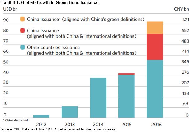
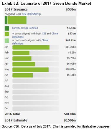
According to the Climate Change Initiative’s estimate, the labeled green bond issuances that are aligned with the Climate Bonds Initiative (CBI) definition could reach up to USD 150 billion in 2017 (see Exhibit 2).  The total issuances year-to-date reflect China’s position as a leader.

S&P Dow Jones Indices has also been part of the green bond development.  We were one of the first to market when we launched the S&P Green Bond Index in 2014 to encourage market growth and momentum.  In February 2017, S&P DJI broadened its green bond effort and launched the S&P Green Bond Select Index.  The index forms the basis for one of the world’s first green bond ETFs.

The posts on this blog are opinions, not advice. Please read our Disclaimers.

Bubbles and Housing

Contributor Image
David Blitzer

Former Managing Director and Chairman of the Index Committee

S&P Dow Jones Indices

Home prices nationally are rising two to three times faster than inflation. They are up 5.5% from a year ago with some cities rising at double-digit rates. Looking at the chart of the S&P Corelogic Case-Shiller Home Price Indices, many are wondering if we’re in another housing bubble.

While prices are rising, the following charts do not point to any bubble.  The next charts cover sales and the visible supply of existing single family homes. Both show a sharp peak immediately before and during the financial crisis followed by a drop.  Home sales have recovered to an annual rate between four and five million units despite stable visible supply of about four months. Condominium sales are roughly flat.

New home supply and sales appear weaker than existing homes.  The supply of new homes is measured by homes on the market, not months-supply and shows that supply remains low. Annual sales are close to the pre-bubble range but far below anything that the peak in 2005.  A similar pattern is seen in housing starts which measure construction activity.

The next S&P Corelogic Case-Shiller release is Tuesday July 25th.

The posts on this blog are opinions, not advice. Please read our Disclaimers.

Asian Asset Owners Are Leapfrogging Into ESG

Contributor Image
Tianyin Cheng

Former Senior Director, ESG Indices

S&P Dow Jones Indices

Sustainable investing has become particularly popular in Europe, across many countries.  In the Asia Pacific region, certain countries such as Japan and Australia have shown stronger interest in ESG thanks to asset owner demand, availability of ESG data, and regulatory pressures.  In the last couple of years, we have seen some of Japan’s largest institutional investors, including the Government Pension Investment Fund, which is the biggest pension fund in the world, incorporating ESG into their investment practices.  This has had a major trickle-down effect on the investment value chain, from asset managers to providers of data.

According to a new report launched in May 2017 by BNP Paribas, asset owners and asset managers in the Asia Pacific region have leapt ahead of their European and North American counterparts when it comes to incorporating ESG-related strategies into their investing.  The report, “Great Expectations: ESG – what’s next for asset owners and managers,” found that “84% of the Asia Pacific-based institutional investors surveyed currently incorporate ESG into their investment decision making, compared with 82% in Europe, and only 70% for North America.  And while a fifth of APAC institutional investors currently market a majority of their funds as ESG-compliant, more than 60% expect to do so within two years, highlighting the world’s fastest-growing region is also moving fast in the direction of sustainability.  At present, the largest markets for sustainable investing in Asia, excluding Japan, are Malaysia (30%), Hong Kong (26%), South Korea (14%) and China (14%).”

In terms of strategy, green bonds, sustainable bonds, thematic funds, and investing based on ESG profiles are most popular, although there are some regional differences.

The posts on this blog are opinions, not advice. Please read our Disclaimers.

Australian Markets: Mid Caps a Sweet Spot for Investors

Contributor Image
John Welling

Senior Director, Head of Global Equity Indices

S&P Dow Jones Indices

We have previously taken a dive into performance differences between Australian market cap segments and observed that mid caps offer a “sweet spot” for market participants.  Year-to-date, this message continues to resonate—the S&P/ASX MidCap 50 has returned 10.1% as of July 13, 2017.  Meanwhile, corresponding large-, small-, and broad market indices have returned measurably less (see Exhibit 1).

Examining some differences between the indices, the S&P/ASX MidCap 50 has a more diverse sector representation than the large-cap and broad market Australian benchmarks, which are dominated by banks.  As shown in Exhibit 2, the financials sector makes up 43% of the S&P/ASX 50, while only representing 19% of the S&P/ASX MidCap 50.  The mid-cap and small-cap indices also have higher proportions of exposure to consumer discretionary stocks, while The S&P/ASX Mid-Cap 50 has higher allocations to health care, industrials, and materials than the other market cap indices.

Due to large allocations to financials among large-cap and broad market indices, these segments have been more negatively affected by new bank levies.  These levies aim to tax the liabilities of the country’s five largest banks, which account for 36% of the value of the S&P/ASX 50 and are subsequently excluded from mid-cap and small-cap indices.  Amid these forces, Australia’s financial sector, as measured by the S&P/ASX 200 Financials, has underperformed the broad market, limited to a gain of 1.8% for the year.

Meanwhile, despite having relatively diversified sector exposures and a lower allocation to the financials sector, small-cap stocks still lag the other market cap segments year-to-date.

The mid-cap segment of the Australian stock market is often overlooked and underappreciated.  Pure mid-cap investing is not common, and often, mid- and small-cap companies are lumped together for investment purposes, diluting the unique characteristics of mid-sized companies.  Those looking for an edge in Australian equities might note that mid caps tend to offer a unique balance between the high growth (and therefore higher risk) of small caps and the stability (but slower growth) of large caps, which has led to meaningful outperformance year-to-date.

The posts on this blog are opinions, not advice. Please read our Disclaimers.

U.S. Yield Curve Moved by Europe

Contributor Image
Kevin Horan

Former Director, Fixed Income Indices

S&P Dow Jones Indices

The U.S. Treasury yield curve, as represented by the S&P U.S. Treasury Bond Current Indices, ended June 14, 2017, tighter (lower in yield) than the previous day.  The importance of June 14 is that it was the day on which the U.S. Federal Reserve raised the target rate by 25 bps, from 1% to 1.25%.  The following day, the yield curve increased, but only by an average of 2 bps.

The yield on the two-year bond, as measured by the S&P U.S. Treasury Bond Current 2-Year Index, remained consistent and actually ended June at 1.37%, only 1 bp higher than the day after the rate hike.  As shown in Exhibit 1, the spread between the 2-year and the 30-year U.S. Treasury bond trended downward for most of June.  The yield of the 30-year bond was 2.86% the day prior to the rate hike and moved as low as a 2.70% on June 26, 2017, before moving back up to close the month at 2.83%. The result of this was a flatter yield curve for most of June and can be seen in Exhibit 2 as the comparison between the yellow and navy yield curves.

Exhibit 1: 2-year versus 30-year U.S. Treasury Spread

Source: S&P Dow Jones Indices, LLC. Data as of July 10, 2017. Past performance is no guarantee of future results. Chart is provided for illustrative purposes.

Exhibit 2: Yield Curve

Source: S&P Dow Jones Indices, LLC. Data as of July 10, 2017. Past performance is no guarantee of future results. Chart is provided for illustrative purposes.

The pivotal point for the U.S. Treasury curve happened on June 27, 2017, and the influence on valuation came not from the U.S., but from Europe.  Mario Draghi, President of the European Central Bank (ECB), made comments in regard to the ECB’s ability to adjust its policy tools of sub-zero interest rates and bond purchases as the economic condition improves in Europe.  Draghi’s comments resulted in higher yields and speculation that the ECB and possibly others were poised to start withdrawing monetary policy stimulus.

Since June 27, 2017, yields across the curve have continued to rise (see Exhibit 2) and the curve flattening has ended.

Exhibit 3: Index Data

Source: S&P Dow Jones Indices LLC. Data as of July 10, 2017. Past performance is no guarantee of future results. Table is provided for illustrative purposes.


The posts on this blog are opinions, not advice. Please read our Disclaimers.