Get Indexology® Blog updates via email.

In This List

Rieger Report: Corporate Junk Bonds - "Danger, Will Robinson!"

Know your Price Return versus Total Return Indices

Rieger Report: Illinois G.O.s on the Edge

Asian Fixed Income: An Update on the Indian Bond Market

Is Mexico Still Attractive to Foreigners?

Rieger Report: Corporate Junk Bonds - "Danger, Will Robinson!"

Contributor Image
J.R. Rieger

Former Head of Fixed Income Indices

S&P Dow Jones Indices

The bond markets are certainly not “Lost in Space”1. There is good rationale as to why the bond markets are in the position they are today; compressed spreads are the result of low rates coupled with strong demand out pacing supply for yield assets.   However, the homogenization of the US corporate bond markets is worrisome and should begin to raise some eyebrows in the junk bond markets.  What am I worried about? Credit spreads widening.

Chart 1: The S&P 500 BB High Yield Corporate Bond Index spread to the S&P 500 Investment Grade Corporate Bond Index:

Source: S&P Dow Jones Indices, LLC. Data as of June 7, 2017. Chart is provided for illustrative purposes. It is not possible to invest directly in an index. Past performance is no guarantee of future results.

Some rationale behind the angst:

Chart 2: Select indices and their yields over time:

Source: S&P Dow Jones Indices, LLC. Data as of June 7, 2017. Chart is provided for illustrative purposes. It is not possible to invest directly in an index. Past performance is no guarantee of future results.

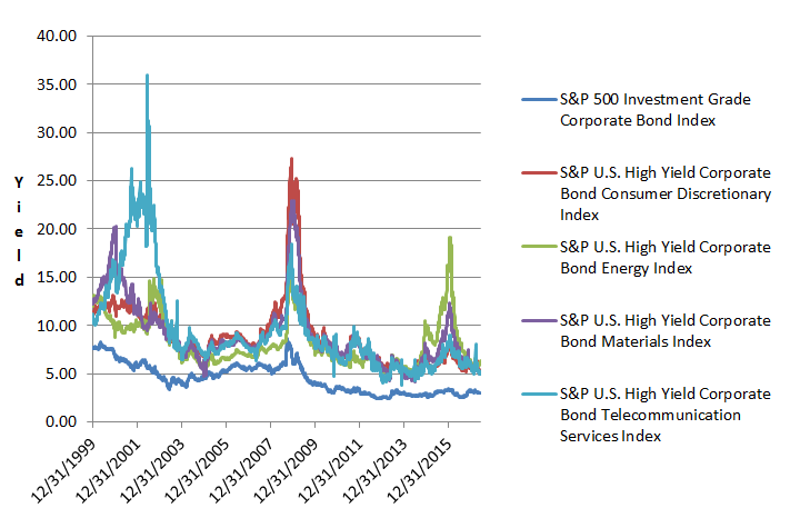
The past is not prologue and no one has ever seen this type of market before. Monitoring the spread risk in the high yield sectors seems prudent at this juncture.

1Lost in Space was a 1960’s sci-fi television series of the Robinson family traveling through space. The protagonist son, Will, was protected by a robot who would warn him of pending danger by waiving its arms and saying “Danger, Will Robinson”.

For more information on S&P’s bond indices including methodologies and time series information please go to SPDJI.com.

Please also join me on LinkedIn .

The posts on this blog are opinions, not advice. Please read our Disclaimers.

Know your Price Return versus Total Return Indices

Contributor Image
Mahavir Kaswa

Former Associate Director, Product Management

S&P BSE Indices

Recently, the S&P BSE SENSEX closed above 30,000 (and 31,000 as of 26th May 2017) for the first time, recording a lifetime high in its 31 years of live history.  Immediately, print and online media were flooded with news articles discussing various milestones of the S&P BSE SENSEX.

There were columns explaining how market participant wealth grew over the past 30 years, comparing different asset classes (equity, fixed income, gold, etc.), with the S&P BSE SENSEX being used as proxy for equities.  What amazed me is that almost all of them used the price return (PR) version of the S&P BSE SENSEX, completely missing out on the cash dividend component.  The version of the S&P BSE SENSEX that is tracked on television or in newspapers is the price return index, which is designed to measure only the capital appreciation (price change) of its constituents.  Like all S&P BSE indices, the S&P BSE SENSEX also has a total return version that measures not just returns from price change, but also returns earned due to cash dividends and their reinvestment, called the S&P BSE SENSEX Total Return (TR).  The cash dividends earned are assumed to be reinvested in the index as of dividend ex-date.

The TR version of S&P BSE SENSEX starts from 19th Aug 1996. The first TR value is exactly same as PR value i.e. 3,281.49 as of 19th Aug 1996. The S&P BSE SENSEX index close value of PR and TR versions as of 26th May 2017 (first time when S&P BSE SENSEX closed above 31,000) is 31,028.21 and 43,778.32 respectively. This shows power of compounding of reinvestment of dividends.

Exhibit 1: S&P BSE SENSEX and S&P BSE SENSEX 50 Index Performance 

Source: Asia Index Pvt. Ltd.  Data from May 29, 2007, to May 26, 2017.  Index performance based on price and total return in INR.  Past performance is no guarantee of future results.  Charts are provided for illustrative purposes and reflect hypothetical historical performance.  The S&P BSE SENSEX and S&P BSE SENSEX 50 were launched on Jan 2, 1986, and Dec 6, 2016, respectively.

Exhibit 2: 10-Year CAGR of the S&P BSE SENSEX and S&P BSE SENSEX 50
S&P BSE SENSEX S&P BSE SENSEX (TR) S&P BSE SENSEX 50 S&P BSE SENSEX 50 TR
7.9% 9.4% 8.5% 10.0%

Source: Asia Index Pvt. Ltd.  Data from May 29, 2007, to May 26, 2017.  Index performance based on price and total return in INR.  Past performance is no guarantee of future results.  Table is provided for illustrative purposes and reflects hypothetical historical performance.  The S&P BSE SENSEX and S&P BSE SENSEX 50 were launched on Jan 2, 1986, and Dec 6, 2016, respectively.

Why Is It Important to Take Note of the TR Index?

Equity investments generally generate returns from two sources—capital appreciation (or price changes) and cash dividends.  In order to have a fair, apples-to-apples comparison, it is important to compare the portfolio returns with the TR version of the index.  For instance, if an investor with a single-stock portfolio compares the returns earned from the portfolio with the returns from the S&P BSE SENSEX (PR), it would be an unfair comparison.  Apart from capital appreciation, the portfolio returns include cash dividends earned.

Exhibit 3: Comparison of a Hypothetical Single-Stock Portfolio and Index
CATEGORY PRICE0

(INR)

PRICE1

(INR)

PRICE RETURN (%) DIVIDEND1

(INR)

DIVIDEND RETURN (%) TOTAL RETURN (%)
Stock A 100 110 10 2 2 12
Index 100 110 10 3 3 13

Source: S&P Dow Jones Indices LLC.  Table is provided for illustrative purposes.

In Exhibit 3, we can see that if we compare stock A’s total return of 12% with the index’s price return of 10%, we would falsely assume that stock A outperformed the index; however, when the same is compared with the index’s total return of 13%, we realize that stock A underperformed.

As TR includes not just PR, but also cash dividends, the TR index will be always be higher than the PR index, because cash dividends can’t be negative.

To conclude, it is absolutely fine to track the PR index on a daily basis.  However, it may be a good idea to use the TR index when one has to measure or compare the returns or performance of asset(s) and scheme(s) with an index, as it is the TR version that would more closely represent what a market participant would take home.

To learn more about TR index calculation, check out Index Basics: Calculating an Index’s Total Return.

The posts on this blog are opinions, not advice. Please read our Disclaimers.

Rieger Report: Illinois G.O.s on the Edge

Contributor Image
J.R. Rieger

Former Head of Fixed Income Indices

S&P Dow Jones Indices

The recent ratings downgrades by both Moody’s and S&P Global Ratings have placed the State of Illinois general obligation bonds on the edge of becoming junk.  As of this writing, the ratings are Baa3/BBB-/BBB by Moody’s, S&P and Fitch.

The fiscal struggle endured by Illinois has indeed been a long one, now yields for Illinois G.O.s have finally begun to widen with the impetus of the downgrades. While there has been a spread between investment grade bonds and Illinois G.O.s  the muni market kept the yields for these bonds relatively consistent up until now.  Yield blindness or stated another way, the insatiable search for yield coupled with the low supply of higher yielding bonds has kept many weaker credits including Illinois from seeing higher spreads.

Chart 1: Yields of the S&P Municipal Bond Illinois General Obligation Index and the S&P Municipal Bond Investment Grade Index:

Source:: S&P Dow Jones Indices, LLC. Data as of June 5, 2017. Chart is provided for illustrative purposes. It is not possible to invest directly in an index. Past performance is no guarantee of future results.

S&P Dow Jones Indices tracks approximately $8.5billion of State of Illinois G.O.s in our indices. The table below provides a snapshot of the percentage those bonds represent.  Note: Under S&P Dow Jones Indices methodology, the lowest rating determines if the bonds remain in the investment grade indices or are shifted to the high yield category.

Table 1: Percentage of total par value the State of Illinois G.O. bonds represent in select indices:

Source: S&P Dow Jones Indices, LLC. Data as of June 5, 2017. Table is provided for illustrative purposes. It is not possible to invest directly in an index. Past performance is no guarantee of future results.

For more information on S&P’s bond indices including methodologies and time series information please go to SPDJI.com.

Please join me on LinkedIn .

The posts on this blog are opinions, not advice. Please read our Disclaimers.

Asian Fixed Income: An Update on the Indian Bond Market

Contributor Image
Michele Leung

Former Director, Fixed Income Indices

S&P Dow Jones Indices

As of June 5, 2017, the yield of Indian sovereign bonds, as tracked by the S&P BSE India Sovereign Bond Index, stood at 7.03%—the second-highest sovereign bond yield among the Pan Asian countries, following that of Indonesia, at 7.09%. The yield of the S&P BSE India Sovereign Bond Index climbed 19 bps YTD as of the same date, though it was still at a seven-year low (see Exhibit 1).   RBI has cut rates six times since January 2015.

Indian sovereign bonds currently represent 70% of the overall Indian bond market. Their total market value expanded fivefold to INR 52.7 billion in the past 10-years, outpacing the growth of the corporate bond market, which doubled to INR 24.2 during the same period.  Among corporate bonds, the biggest sector was financials, which represented 9% of the S&P BSE India Bond Index, while other sectors like services, utilities, and industrials contributed around 1% to the overall market.

Although the S&P BSE India Bond Index jumped 13.22% in 2016, Indian bonds have been lagging other Pan Asia countries in 2017; the index advanced only 1.71% YTD as of June 5, 2017. Looking at the risk/return profile in Exhibit 2, all indices have consistently delivered solid returns, in the range of 8% to 10%.  It is interesting to note that the S&P BSE India Corporate Bond Index had lower risk than sovereign bonds during all periods studied; this could probably be explained by the Indian corporate bond characteristics, which are relatively fragmented and less liquid than the sovereign bonds.

Exhibit 1: Yield-to-Worst of the S&P BSE India Sovereign Bond Index

The posts on this blog are opinions, not advice. Please read our Disclaimers.

Is Mexico Still Attractive to Foreigners?

Contributor Image
Jaime Merino

Former Director, Asset Owners Channel

S&P Dow Jones Indices

In an environment of increasing rates, Mexico has not been left behind.  As seen in my last blog, since December 2015, Mexico’s Central Bank (Banxico) has increased the reference rate by 375 bps, with the last 25 bps being a surprise for analysts and the market on May 19, 2017.  I remember the days when everyone was saying that Banxico would move with the U.S. Fed, but as of the same date, the U.S. Fed has increased its reference rate by only 75 bps. Their next meeting is in June 2017, and many analysts estimate an increase of 25 bps.  Exhibit 1 shows the spread between the Mexican 10-Year Bond and the U.S. 10-Year Treasury Bond for the 10–year period ending May 29, 2017, along with the performance of the S&P/BMV Government MBONOS 5-10 Year Bond Index.

For the past three years, the spread trend has been positive, with the most recent data above 500 bps.  Has this affected the inflows and outflows for sovereign instruments?  People often talk about Mbonos (fixed-rate sovereign instruments) that are held by non-residents, but let’s dig further into other issuances and total assets.  First, Exhibit 2 shows the historical behavior of the total percentage of sovereign debt held outside of Mexico.  As of May 22, 2017, a little bit more than one-third was held outside the country.  We also see a rapid increase between 2010 and 2012, from nearly 10% to 35%.  Exhibit 3 shows the annual inflows and outflows, expressed in millions of Mexican pesos, from January 2000 to May 22, 2017.

The trend for Mbonos is still positive, but by this time last year, the inflows were double what they are now.  For Udibonos and Cetes, the trend for the past three years has been downward, making 2016 the first year with total outflows since 2002.

Exhibit 4 shows the percentage of Mbonos, Udibonos, and Cetes held by international market participants; note that since September 2012, one-half of the total Mbonos have been held internationally, and at one point non-resident holdings of Cetes hit nearly 70%.

Sovereign bonds are still attractive to foreigners, but not to the same degree as in 2010 to 2014, when the search for yield spiked.  Over the past few years, no new inflows were presented, and we can assume that the position from Cetes moved to Mbonos.  Inflation instruments might be more attractive now, since, as shown in my last post, inflation has increased significantly, reaching 5.86% year-over-year in April 2017.

For more information about the indices following these instruments, please see: S&P/BMV Government CETES Bond Index, S&P/BMV Government MBONOS 1-5 Year Bond Index, S&P/BMV Government MBONOS 5-10 Year Bond Index, S&P/BMV Government Inflation-Linked UDIBONOS 1+ Year Bond Index.

The posts on this blog are opinions, not advice. Please read our Disclaimers.