Measuring the away-from-benchmark exposures of active portfolios (or “smart beta” indices) is not inherently complicated. To what degree, for example, is a portfolio cheaper than its benchmark, or more tilted toward high quality stocks? Practitioners typically approach the question in one of several ways:
- Calculating weighted average differences – e.g., the yield on my portfolio is 3.0% vs. my benchmark’s yield of 2.1%.
- Calculating standardized (Z) scores – e.g., my portfolio is 0.4 standard deviations cheaper than my benchmark.
- Performing a regression analysis – e.g., 20% of historical return is attributable to my portfolio’s exposure to the momentum factor.
Each of these methods (especially the first) has some intuitive appeal, but none of them tells us how difficult or easy it might be to achieve a given level of factor exposure. If I want to target 0.4 standard deviations of cheapness, in other words, or 90 basis points of incremental yield, how easy is it to get there?
Here’s a simple and intuitive approach:
- List every stock in the benchmark in factor order, noting also each stock’s benchmark weight. If quality is a factor of interest, e.g., rank each benchmark stock by its quality score, and keep track of its benchmark weight.
- Form portfolios. Portfolio 1 owns 1% of index cap — the 1% with the lowest quality score. (Depending on the interaction of quality and index cap, Portfolio 1 might hold only one stock.) Portfolio 2 is the lowest quality 2% of the index, Portfolio 3 is the lowest quality 3%, etc.
- Portfolio 100, in this construction, is the benchmark itself. The weighted average factor exposure of Portfolio 100 tells us our benchmark’s factor exposure.
- We can keep going: Portfolio 101 excludes the lowest quality 1%, Portfolio 102 excludes the lowest quality 2%, and so on. In this way we proceed to Portfolio 199, which includes only the highest quality 1% of the benchmark. (Alternatively, portfolio 199 excludes the lowest quality 99% of the benchmark.)
- We now have a series of portfolios from 1 to 199, with decreasing exposure to the factor in question. We can compare any other index (or active portfolio) to these portfolios by calculating its weighted average factor score.
Defining portfolios in this way provides a useful link to the concept of active share . The active share of portfolio 100 is 0%. The active share of portfolios 99 and 101 is 1%, the active share of portfolios 98 and 102 is 2% – and so on until we reach portfolios 199 and 1, both with active share of 99%. Since active share is an indicator of portfolio aggressiveness, it gives us a way to answer the question we asked earlier — if I want to target 0.4 standard deviations of cheapness or 90 basis points of incremental yield, how easy is it to get there? If 90 basis points of incremental yield requires an active share of 40%, say, it’s not a big deal. If it requires an active share of 80%, it’s much tougher to do.
For every factor in which we’re interested, we can create a series of 199 portfolios with steadily increasing factor exposure. We can then position any portfolio of interest on a scale derived from these 199 factor portfolios (in fact, 7 times 199 such portfolios, one set of portfolios for each factor). For example:
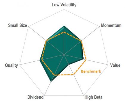
The dotted orange line represents the S&P 500 benchmark, with an active share of 0%. The origin, and the outer rim of the chart, both reflect an active share of 100%. The origin represents tilts away from the factor, while the outer rim reflects tilts towards the factor. This means that, although low volatility and value, say, are scaled differently, on our graph they achieve an analogous and logical representation.
The posts on this blog are opinions, not advice. Please read our Disclaimers.