Get Indexology® Blog updates via email.

In This List

Asian Fixed Income: Chinese Bond Market Was Slow in 2016

This Is How Much Commodity Money Might Move in 2017

What Is ESG Investing?

Rieger Report: Retail Bond Transaction Costs Show Improvement

P/E Ratios: Friend or Foe?

Asian Fixed Income: Chinese Bond Market Was Slow in 2016

Contributor Image
Michele Leung

Former Director, Fixed Income Indices

S&P Dow Jones Indices

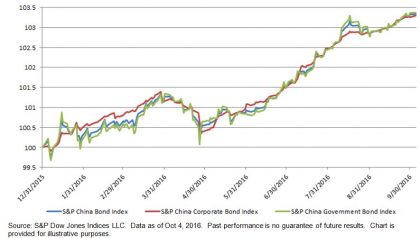
The performance of China’s fixed income market has lagged other Asian countries this year.  According to the S&P China Bond Index, the fixed income market delivered a YTD total return of 3.57% as of Oct. 11, 2016.  China was one of the top three outperforming countries in the S&P Pan Asia Bond Index last year; the other two countries measured by the index, Indonesia and India, increased 17% and 9% YTD, respectively.  Despite China opening up its bond market to offshore market participants, the country still underperformed, and in February there was a short rally following the Chinese Interbank Bond Market (CIMB) announcement, yet the gain was reversed in April.

The size of China’s bond market has continued to expand nevertheless.  The market value tracked by the index reached CNY 48 trillion, whereas corporate bonds represented 34% of the overall market.

The yield of Chinese bonds trended lower, aligning with the global market.  The yield-to-worst of the S&P China Bond Index tightened 17 bps to 2.93% YTD.  The yields of the government and corporate bonds were 2.73% and 3.34% respectively.  Among all the sector-level subindices, the S&P China Industrials Bond Index had the highest yield, at 3.56%.

The S&P China Bond Index is designed to track the performance of local-currency-denominated bonds from China.  S&P Dow Jones Indices has launched both broad-based and investible indices of the S&P China Bond Index Series.

Exhibit 1: Total Return Performance of the S&P China Bond Index, S&P China Government Bond Index, and the S&P China Corporate Bond Index

20161012

The posts on this blog are opinions, not advice. Please read our Disclaimers.

This Is How Much Commodity Money Might Move in 2017

Contributor Image
Jodie Gunzberg

Former Managing Director, Head of U.S. Equities

S&P Dow Jones Indices

Rebalancing season is underway again for the S&P GSCI. Last week, the index committee announced the proforma results for the 2017 weights in the S&P GSCI. While it is possible the target weights may change before the official press release, the proforma results are now listed on our website.

One way to look at the results is simply by the weight (Reference Percentage Dollar Weight found on page 11 of the methodology) but most traders want to know how much money is moving as a result of the rebalance to the new target weights.  Given the weights today, Oct.11, 2016 will change by the year’s end, and that the weights announced are still proforma, the numbers calculated here are still approximate.  The example shows the percentage weight changes and how many dollars are estimated to move for every $10 billion.  The biggest shift is out of brent crude and into live cattle with an estimated $275 million out of brent and $150 million into live cattle for every $10 billion tracking the index.  The energy sector is slated for the biggest outflow of over $570 million and livestock is set for the biggest inflow of near $320 million per $10 billion tracking the S&P GSCI.  The (WTI) crude oil in the index is positioned to remain as the biggest commodity with a proforma 2017 target weight of 22.8%.

Source: S&P Dow Jones Indices

For information on total AUM tracking commodity indices, please view our replay of the S&P Dow Jones 10th Annual Commodities Seminar and specifically watch Keynote Address: Where in Commodities is the Smart Money Flowing?

The posts on this blog are opinions, not advice. Please read our Disclaimers.

What Is ESG Investing?

Contributor Image
Emily Ulrich

Former Senior Product Manager, ESG Indices

S&P Dow Jones Indices

Sustainability investing is one of the fastest-growing segments of the asset management industry.  It is also one of its most complex.  This posts aims to provide some clarity on this increasingly relevant topic.

Sustainable investing means looking at “extra-financial” variables, i.e., environmental, social, and governance (ESG) factors (together or separately) when making investment decisions.  Such investing may take various forms, from ethical exclusions to comprehensive ESG integration, on the basis of which portfolios may be constructed as best-in-class selection (to maximize extra-financial benefits) or by simply avoiding what may be perceived as unacceptable companies or industries (to either minimize extra-financial detractions or to promote bottom-up ESG change).  ESG is a comprehensive field that comprises many dynamics such as carbon emissions, environmental impact, corporate citizenship, and human capital development.

In the industry lexicon, ESG is often distinguished from carbon (also referred to as “green”).  Of course low carbon is, in itself, an important component of the environmental dimension of ESG, but it also stands alone in significance due to the global threat of climate change, which is why S&P DJI typically splits sustainability into two categories: ESG and green/low carbon.  For our purposes, the environmental dimension of the ESG framework tends to capture more factors, while green tends to focus on a few factors that are considered key in the threat of global climate change.  Figure 1 further outlines the distinctions between the three dimensions.

capture

The environmental component encompasses waste management, water management, and use of other environmental resources.  Social includes stakeholder analysis—customers, employees, and all those affected by the presence of the entity-like people living in the vicinity of an industrial unit.  Governance focuses on stakeholder impact as it specifically relates to shareholders and management while also addressing board structure, management compensation, and shareholder rights.  These three factors have combined in different ways to shape distinct periods in the history of the sustainability movement (particularly as it relates to finance).

The posts on this blog are opinions, not advice. Please read our Disclaimers.

Rieger Report: Retail Bond Transaction Costs Show Improvement

Contributor Image
J.R. Rieger

Former Head of Fixed Income Indices

S&P Dow Jones Indices

Tracking the mark up on retail size bond transactions can be a tricky effort particularly as mark ups have not be disclosed in the past.  By comparing trades of bonds of similar characteristics we are able to isolate and calculate estimated transaction costs published in our study “Unveiling the Hidden Costs of Retail Buying & Selling”.

The good news is the transaction costs of retail size trades for municipal bonds have dropped to low points since we started tracking this data in 2011. In addition, transaction costs for corporate bonds have also improved.

Some important observations:

  • As yields have fallen the annual average calculated transaction costs for retail size trades has also fallen.
  • Retail size trades of municipal bonds have reflected transaction costs that have become, over time, more in line with retail size trades of corporate bonds.  In 2011, the average municipal retail size trade had a trade cost of 2.08% while retail size trades of corporate bonds had a trade cost of 1.44%.  As of June 2016, the municipal retail trade cost had fallen to 1.11% compared to 1.01% for corporate bonds.
  • While there remains a significant difference in the cost of a retail trade vs. an institutional size trade the difference appears to be more consistent and comparable between municipal bonds and corporate bonds.  Please refer to Table 1.

A few factors could be driving the compression in calculated transaction costs:

  • The evolution of the Department of Labor (DOL) rules.
  • MSRB and FINRA efforts related to trade price transparency & disclosure.
  • A compression in the interest rate environment.

Chart 1) Yields of the S&P National AMT-Free Municipal Bond Index and annual average transaction costs of retail size municipal bond trades of bonds in the index:

Source: S&P Dow Jones Indices, LLC. Average transaction cost data as of June 30, 2016, yield to worst data as of October 5 2016. Chart is provided for illustrative purposes. It is not possible to invest directly in an index. Past performance is no guarantee of future results
Source: S&P Dow Jones Indices, LLC. Average transaction cost data as of June 30, 2016, yield to worst data as of October 5 2016. Chart is provided for illustrative purposes. It is not possible to invest directly in an index. Past performance is no guarantee of future results.

Table 1) Calculated trade costs of retail and institutional size blocks of bonds as of June 30 2016:

blog-10-6-2016-table-on-costs

The posts on this blog are opinions, not advice. Please read our Disclaimers.

P/E Ratios: Friend or Foe?

Contributor Image
Philip Murphy

Former Managing Director, Global Head of Index Governance

S&P Dow Jones Indices

In a recent Financial Times column[1], Miles Johnson cautioned readers not to rely too heavily on index p/e ratios to gauge buying opportunities in the market. I wholeheartedly agree that investors should avoid over-reliance upon any single metric, but it is important to consider how p/e ratios are calculated, what their limitations are, and what they may convey about market conditions.

Mr. Johnson referred to an S&P 500 p/e of “more than twenty” around the market trough of the financial crisis, and he is looking for an answer to why “… the index appeared expensive at its bottom…” He poses a good question, but goes on to mistakenly confuse the inherent challenges of using p/e ratios to time markets with a misplaced critique of the method used by S&P DJI to calculate index earnings. I’ve discussed the calculation of index earnings before, so here I’ll address the nature of p/e ratios. The answer to why the market may have appeared expensive at its trough really has only to do with the nature of earnings cycles – particularly around inflection points.

What did we know, and when did we know it?

Consider data frequency of the numerator and denominator of a frequently cited p/e ratio, price to trailing earnings. Price is revised moment to moment during trading hours, and even after hours. Earnings, on the other hand, are accounting estimates updated quarterly (and sometimes historically restated) with a substantial lag of about 6-8 weeks for most S&P 500 companies.

Reviewing the Index Earnings file[2] compiled by Howard Silverblatt, Senior Index Analyst here at S&P DJI, reveals that the Q4 2008 reporting period saw S&P 500 losses of $.09 per share on an operating basis[3] and $23.25 per share on a GAAP basis. This was the trough of the financial crisis earnings cycle. However, the index did not record its daily closing low of 676.53 until March 9, 2009 – which is about the time when the full extent of Q4 losses would have become clear due to the reporting lag of financial statements. The chart below therefore lags GAAP index earnings by 2 months to reveal earnings for the previous quarter’s reporting period around the time they would have been known historically. The chart covers 5 years from June 2004 through June 2009.

spx-chart
Source: S&P Dow Jones Indices, LLC

The chart shows that when earnings grow, as they have tended to do most of the time, p/e ratios can serve as pretty reliable indicators of the richness of the market. As the market peaked at 1565.15 on October 9, 2007 its earnings multiple of 18.4 times trailing GAAP EPS was probably considered reasonable (or at least not unreasonable) by many observers. However, the earnings cycle was at an inflection point and about to turn down. Only forward looking p/e ratios could possibly take this into account, but consensus estimates of securities analysts also have several inherent weaknesses such as herding, short-term focus, hindsight bias, and potential conflicts of interest.

As the downturn in the earnings cycle played out, the index price noisily responded to expectations until the market convinced itself that the worst of the earnings news had been priced in. By this time the price level of the S&P 500 was more than cut in half and a backward looking GAAP p/e ratio looked horrific. The key to the buying opportunity was in recognizing that while the S&P 500 price had been cut in half its earning power had not been. The historic buying opportunity of early 2009 had nothing to do with p/e ratios, which only serve reliably when earnings are in a trend – not an infection point.

[1] Miles Johnson (September 20, 2016). Don’t be fooled by p/e ratios when the next big sell-off comes. The Financial Times Smart Money Column.

[2] Available at http://us.spindices.com/indices/equity/sp-500 in the “Additional Info” dropdown menu.

[3] Operating earnings in Howard Silverblatt’s file are defined as income from sale of goods and services excluding corporate transactions such as M&A, financing, and layoffs, as well as unusual items.

The posts on this blog are opinions, not advice. Please read our Disclaimers.