Get Indexology® Blog updates via email.

In This List

The Payroll Surge and the Fed

Indexing Alternatives To Survive Brexit

Indexing Listed Property Stocks in New Zealand

The SPIVA® Scorecard: More Than the Sum of Its Parts

The Current Dispersion-Correlation Map …and Brexit

The Payroll Surge and the Fed

Contributor Image
David Blitzer

Former Managing Director and Chairman of the Index Committee

S&P Dow Jones Indices

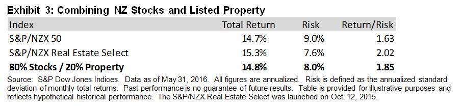
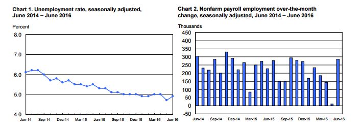
Payrolls jumped with 287,000 new jobs in today’s employment report sparking a stock market rally that boosted the S&P 500 to within five points of a new record high and renewed questions about a Fed rate hike. The employment report was welcome and put to rest worries that the labor markets were weakening. However, the Fed is likely to remain on hold until the fourth quarter or longer. Even with this report, job growth is easing a bit: over the last three months job growth has averaged 147,000 per month compared to 199,000 per month over the 12 months through June.  The labor force participation rate and the employment population ratio remain flat; the unemployment rate ticked up to 4.9%.  Labor market conditions look better than they did before the report, but the overall picture is little changed.

Source: Employment Situation Report, Bureau of Labor Statistics

The big cloud on the horizon is neither the labor market nor inflation – it is the expected fallout from Brexit.  From the last FOMC minutes it is clear that the Fed, like almost everyone else, is trying to figure out what happens next in Great Britain and Europe. A few things can be identified and are likely to discourage any early Fed action to raise interest rates. First the dollar’s strength may dampen US exports and put further downward pressure on inflation, deterring any thoughts of a rate hike. The larger concern is that financial markets may react the way they did when the vote was announced, adding to uncertainty and volatility. Moreover, Brexit may be dominating the headlines but there are other issues across Europe with concerns about debt levels and banks. All this suggests that stable monetary policy is a better choice than trying to raise interest rates.

For investors and the Fed it is a wait and see game. Those who like rock bottom interest rates are likely to enjoy them for a while longer.

The posts on this blog are opinions, not advice. Please read our Disclaimers.

Indexing Alternatives To Survive Brexit

Contributor Image
Jodie Gunzberg

Former Managing Director, Head of U.S. Equities

S&P Dow Jones Indices

Following the vote by UK citizens to officially leave the European Union, the S&P 500 lost 5.3% in 2 days (Jun. 24-27, 2016) before gaining back 4.5% for a total loss 1.1% through July 5.  In those two down days, gold posted its best consecutive 2-day gain since Aug. 8-9, 2011.  Gold is known as a safe haven and was worth its weight on those fearful days, but on a stand alone basis, it is just as volatile as equities and other commodities. Its 10-year annualized volatility is 19.5%, that is just slightly less than the 20.5% of the S&P 500 and 23.8% of the S&P GSCI. Moreover, gold’s volatility is higher than the equally weighted Dow Jones Commodity Index (DJCI) of 17.9% and the “smart beta” Dow Jones RAFI Commodity Index of 16.4%.

While indexing has evolved to offer concentrated exposures to particular sectors or single commodities so investors can choose to invest or benchmark to a specific niche, many investors still prefer the diversification inside an index. However, just because an index is well-diversified it does not need to be exposed to systematic risk of the S&P 500 or market events like Brexit.

There is a group of well-diversified indices that didn’t just lose less than the S&P 500 or S&P GSCI, but posted gains in the 2-day crisis. The strategic futures index family is designed to represent the global macro and managed futures/Commodity Trading Advisor (CTA) universe by using quantitative methodologies to track the prices of a globally diversified portfolio of commodity, foreign exchange and financial futures contracts. All three flagship indices in the family, the S&P DFI, S&P SFI and S&P SGMI, gained on Jun. 24-27, 2016, 0.8%, 1.0% and 2.2%, respectively.

Not only did these three perform positively through the stock market decline but they held onto their gains for an overall positive return while stocks rebounded.  They didn’t rebound as much as the 4.5% gain from the S&P 500 but the S&P SGMI gained 1.8% while the S&P SFI and S&P DFI lost just 10 and 70 basis points.  Overall through the 7-day period, when the S&P 500 lost 1.1%, the S&P SGMI gained 4.0%, S&P SFI gained 1.0% and S&P DFI was up 0.1%.

Source: S&P Dow Jones Indices.

These strategies performed exactly how intended with downside protection and less upside for a total return with less volatility and capital preservation.  The 10-year annualized volatility of the S&P SFI is just over a quarter of the S&P 500. The S&P SGMI, which is the most volatile of the family is still only about half as volatile as the stock market, and annualized over the past 10 years provided a comparable return of 7.1% versus 7.4% of the S&P 500.

Source: S&P Dow Jones Indices.

It may be surprising that these strategies use commodities, but in a diversified framework like in the S&P Real Assets Index and smarter commodity strategies like in the Dow Jones RAFI Commodity Index, the strategic futures that go beyond just commodities can provide an attractive hedge to stock market volatility without the high concentration risk of sectors or single commodities.

The posts on this blog are opinions, not advice. Please read our Disclaimers.

Indexing Listed Property Stocks in New Zealand

Contributor Image
Michael Orzano

Head of Global Exchanges Product Management

S&P Dow Jones Indices

Publicly traded property stocks provide exposure to real estate, an illiquid asset class, without sacrificing the liquidity benefits of listed equities. Also, property stocks typically offer higher yields than the broad equity market, they may serve as an effective inflation hedging tool, and they may help diversify a portfolio due to their generally low correlations to stocks and bonds.

S&P Dow Jones Indices and NZX Limited jointly launched the S&P/NZX Real Estate Select in October 2015 to serve as an investable benchmark for real estate companies listed on the NZX. The index is designed to track the largest, most liquid property companies included in the S&P/NZX All Index. To reduce single-stock concentration, the index employs a semiannual stock cap of 17.5%.

As depicted in Exhibit 1, total returns of New Zealand equities, as measured by the S&P/NZX 50, and property stocks, as measured by the S&P/NZX Real Estate Select, have been relatively similar over the longer term, while volatility has been modestly lower for property stocks. This is somewhat surprising given that global property stocks tend to have meaningfully higher volatility than the broader global equity market.  As expected, investment-grade bond returns have been more modest, but they have been much less volatile compared to both equities and property stocks.

Capture

As shown in Exhibit 2, the S&P/NZX Real Estate Select has historically had relatively low correlations to both the S&P/NZX 50 and S&P/NZX Composite Investment Grade Bond Index. In fact, the correlation of 0.48 between New Zealand equities and New Zealand property stocks is equivalent to the correlation between New Zealand and global equities.

Capture

Exhibits 3 and 4 illustrate the potential diversification benefits of adding a listed property allocation to a stylized equity or equity/bond portfolio over the past five years. For example, a hypothetical 80%/20% combination of the S&P/NZX 50 and S&P/NZX Real Estate Select resulted in a meaningful reduction in volatility compared to a 100% position in the S&P/NZX 50.  This was driven both by the lower risk profile of the S&P/NZX Real Estate Select as well as the relatively low correlation between the indices.

Capture

Similarly, adding a 10% listed property allocation to the equity portion of a 60% S&P/NZX 50 and 40% S&P/NZX Composite Investment Grade Bond Index portfolio resulted in a further reduction in volatility and higher risk-adjusted return over the trailing five-year period.

Capture


The posts on this blog are opinions, not advice. Please read our Disclaimers.

The SPIVA® Scorecard: More Than the Sum of Its Parts

Contributor Image
Aye Soe

Former Managing Director, Global Head of Core and Multi-Asset Product Management

S&P Dow Jones Indices

The active versus passive debate has been going on for years and has inspired passionate supporters on both sides.  As a way to provide market participants with objective information, S&P Dow Jones Indices started publishing the S&P Indices Versus Active (SPIVA) Scorecard for the U.S. in 2002.  The scorecard measures the performance of actively managed domestic equity funds across various market capitalizations and styles, as well as fixed income funds, relative to their respective benchmarks.

After more than 14 years, SPIVA is now a global publication.  The scorecard is published for eight countries and regions: Australia, Canada, Europe, India, Japan, Latin America, South Africa, and the U.S.  It has presence on every continent.  The popularity of the scorecard is a testament to its ability to allow market participants—both retail and institutional—make informed decisions using the findings.  It is also a sign that investors around the world are starting to understand the benefits of passive investing.

We find that the financial media and the majority of our users focus heavily on results from Report 1 of the SPIVA publications, which calculates the percentage of managers underperforming or outperforming their respective benchmarks.  Undoubtedly, Report 1 embodies the theoretical underpinning that lies at the heart of active versus passive investing: that active management in aggregate tends to underperform passive management, after accounting for fees.

At the same time, the rest of the SPIVA Scorecard contains helpful statistics that should be part of a market participant’s decision-making toolkit.  For example, the asset-weighted versus equal-weighted performance figures seek to establish if fund size plays a role in delivering excess returns over the benchmark.  Are investors better off choosing a firm with larger AUM over a smaller one, all being else equal?  What are the asset classes or countries in which fund size plays a role in establishing winners versus losers?  The SPIVA Scorecard helps answer those questions.

The fact that this scorecard  is published in eight regions—in both developed and emerging markets—also means users can perform cross-country comparisons for the same asset class or investment style.  For example, do Japanese managers investing in large-cap U.S equity have a harder time outperforming the benchmark than Canadian managers investing in the same opportunity set?  Is large-cap U.S. equity a universally tough space for active managers to deliver meaningful excess returns?

The SPIVA Scorecard and its related content are more than the sum of their parts.  The scorecard contains a wealth of information that market participants can slice and dice in many different ways to conduct due diligence, make informed decisions, and keep tabs on the active versus passive debate.

If you would like more information on the scorecard, visit www.spdji.com/spiva, a new interactive tool for financial professionals and investors that brings SPIVA to life. The site features key data sampled from SPIVA Scorecards for Australia, Canada, Europe, India, Japan, Latin America, South Africa and the U.S., allowing visitors to compare active and passive performance around the globe.

The posts on this blog are opinions, not advice. Please read our Disclaimers.

The Current Dispersion-Correlation Map …and Brexit

Contributor Image
Fei Mei Chan

Former Director, Core Product Management

S&P Dow Jones Indices

As an exercise in understanding market volatility, we recently introduced the dispersion-correlation map to see how volatility manifests in dispersion and correlation. We saw very high levels of correlation at the beginning of January for both the S&P 500 and S&P Europe 350; the S&P Pan Asia BMI also sat at above average correlation then. We’ve often said that high correlations indicate fragile markets, as indicated by the sharp declines that took place in the following month for all three indices.

Following the results of the June 23rd Brexit referendum, volatility spiked around the globe. In the U.S., correlation is almost as high as it was at the beginning of the year, and dispersion is slightly higher. Similar readings can be seen in Pan Asia where correlation is high but dispersion is below average. The situation in Europe is different. As of the end of June, dispersion for the S&P Europe 350 was well above average, as was index correlation.

Paradoxically, wider dispersion in the S&P Europe 350 also means that there are more places to hide. Current European dispersion levels reflect considerable room to add (or subtract!) value by stock or sector selection.

Heightened correlations make for fragile markets.  Investors in the U.S., Europe, and Asia should prepare for the possibility of a rough ride.


dispersion_correlation1dispersion_correlation2dispersion_correlation3

Source: S&P Dow Jones Indices LLC.  Data from Dec. 31, 1990, through June 30, 2016.  Past performance is no guarantee of future results.  It is not possible to invest directly in an index, and index returns do not reflect expenses an investor would pay.  Chart is provided for illustrative purposes.

The posts on this blog are opinions, not advice. Please read our Disclaimers.